Gillette Guard Razor Packaging
Topics
Details
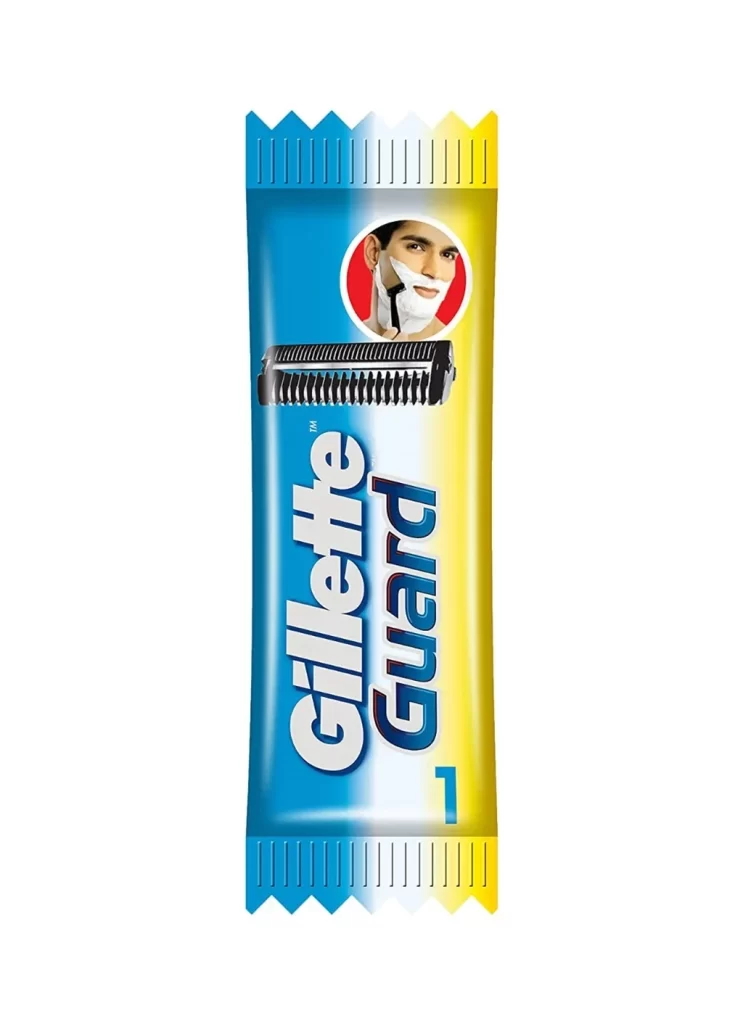
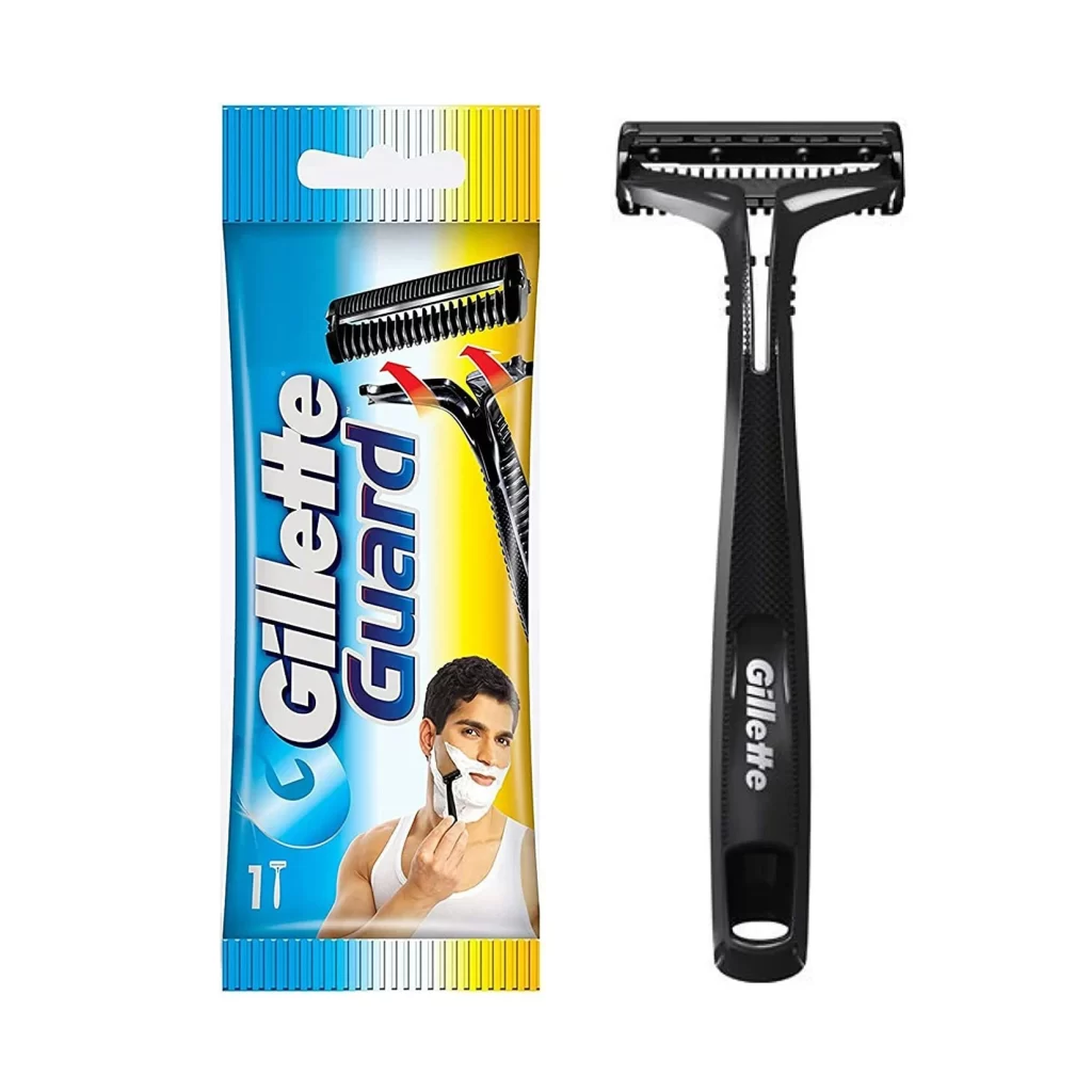
A vertically oriented Gillette Guard razor package features sharp, serrated seals at both the crown and base. The wrapper transitions from deep cerulean blue on the left to vibrant canary yellow on the right, separated by a clean white gradient that anchors the central branding. Bold sans-serif typography spells out 'Gillette' in white.
Visual interest is driven by the high-contrast color blocking, which creates an immediate sense of energy and shelf-presence despite the product’s utilitarian nature. The inclusion of the realistic cartridge illustration serves as a tactile promise of the hardware inside, bridging the gap between the flat packaging surface and the three-dimensional tool. Furthermore, the specific use of the number ‘1’ at the bottom right corner clearly communicates the unit count, utilizing minimalist iconography to convey essential consumer information without cluttering the layout.
Brand historians and packaging analysts might examine this specific iteration to understand Gillette’s market positioning for value-oriented safety razors. Industrial designers could utilize the color ratios and typographic hierarchy as a benchmark for creating legible, small-format retail packaging. Additionally, marketing teams looking to refresh legacy product lines could study how this design balances corporate identity with localized aesthetic preferences for emerging markets.