Title

Gillette Fusion Pro Sensitive Cooling Shave Gel Packaging


Topics

GilletteShave Gel

Details

Uploaded user: Leo

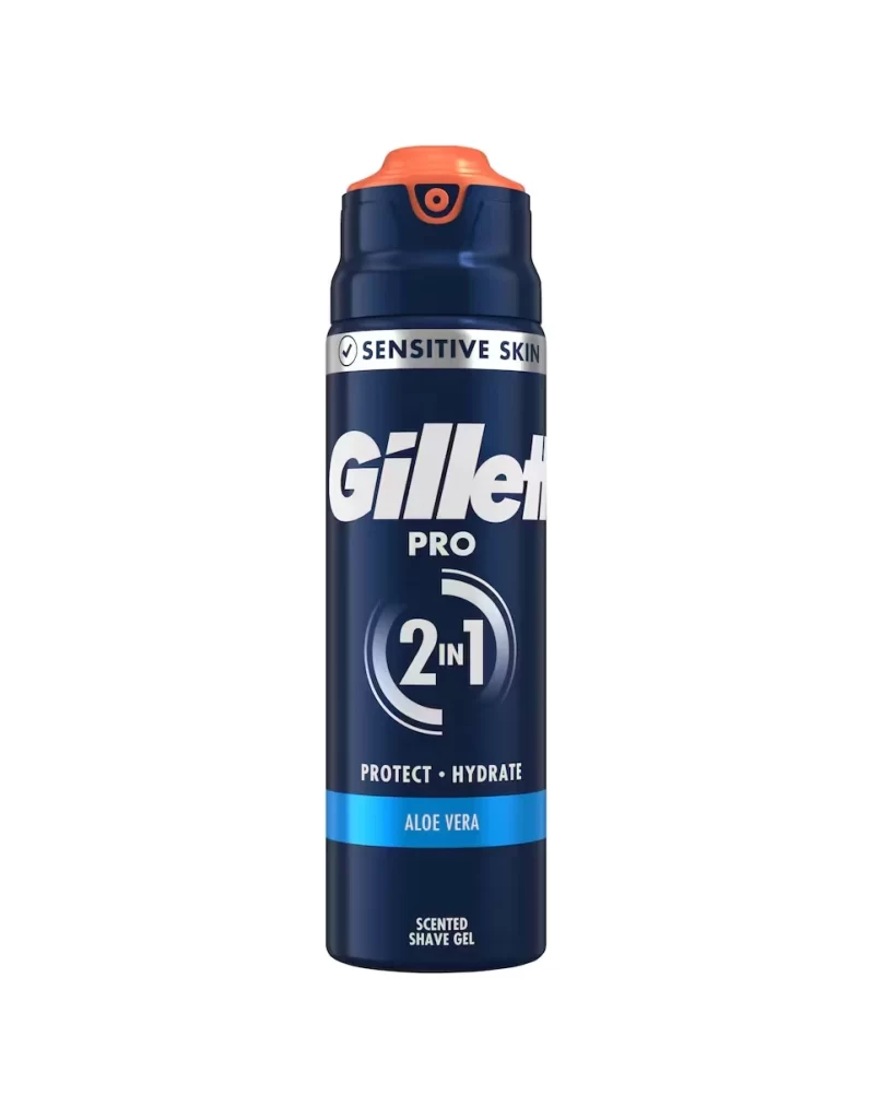
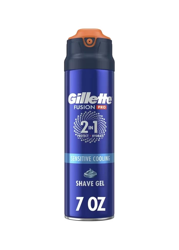
A cylindrical can of Gillette Fusion Pro shave gel stands upright in a direct, eye-level view against a white background. The container features a deep royal blue metallic body that transitions into a dark navy collar, topped by a vibrant orange actuator button with a small central nozzle. Prominent white typography displays the brand name above the 'Fusion Pro' designation.
Visual hierarchy is established through the strategic use of contrasting colors, where the bright orange cap immediately draws attention to the dispensing mechanism while the white text ensures legibility against the saturated blue surface. The circular motif surrounding the ‘2 in 1’ feature creates a focal point that breaks up the verticality of the can, guiding the viewer’s eye downward through the product benefits. Subtle gradients on the metallic finish suggest a premium material quality, distinguishing this sensitive-skin variant from standard formulations through its specific color-coded labeling system.

Packaging designers analyzing competitive grooming products would examine this reference to understand how established brands communicate multi-functional benefits within constrained label spaces. Marketing teams developing product lines for sensitive skin could utilize this visual data to benchmark color palettes and typographic treatments that signal cooling properties to consumers. Industrial designers working on aerosol containers might study the ergonomic relationship between the orange button and the dark collar to inform their own user-interface decisions for pressurized dispensing systems.