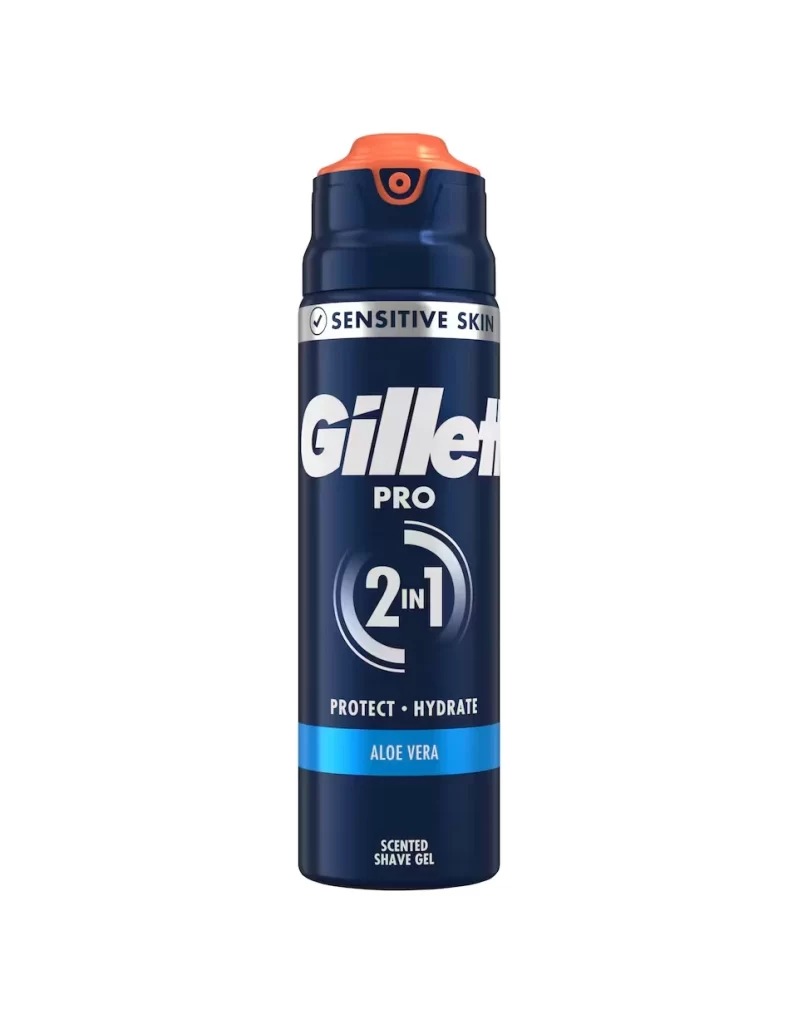
Gillette Razor Packaging
Topics
Details
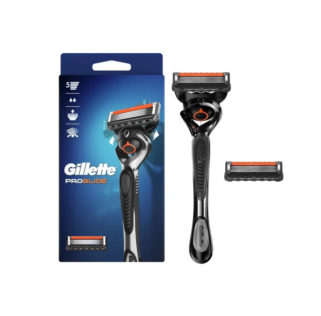
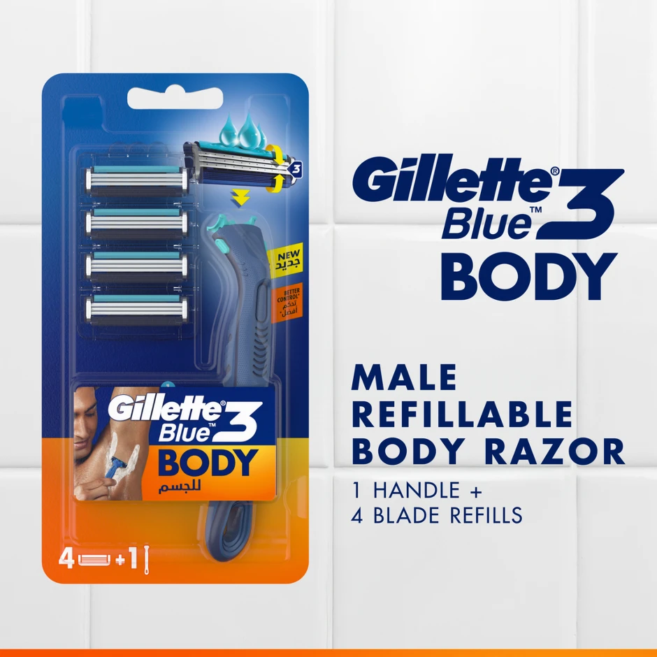
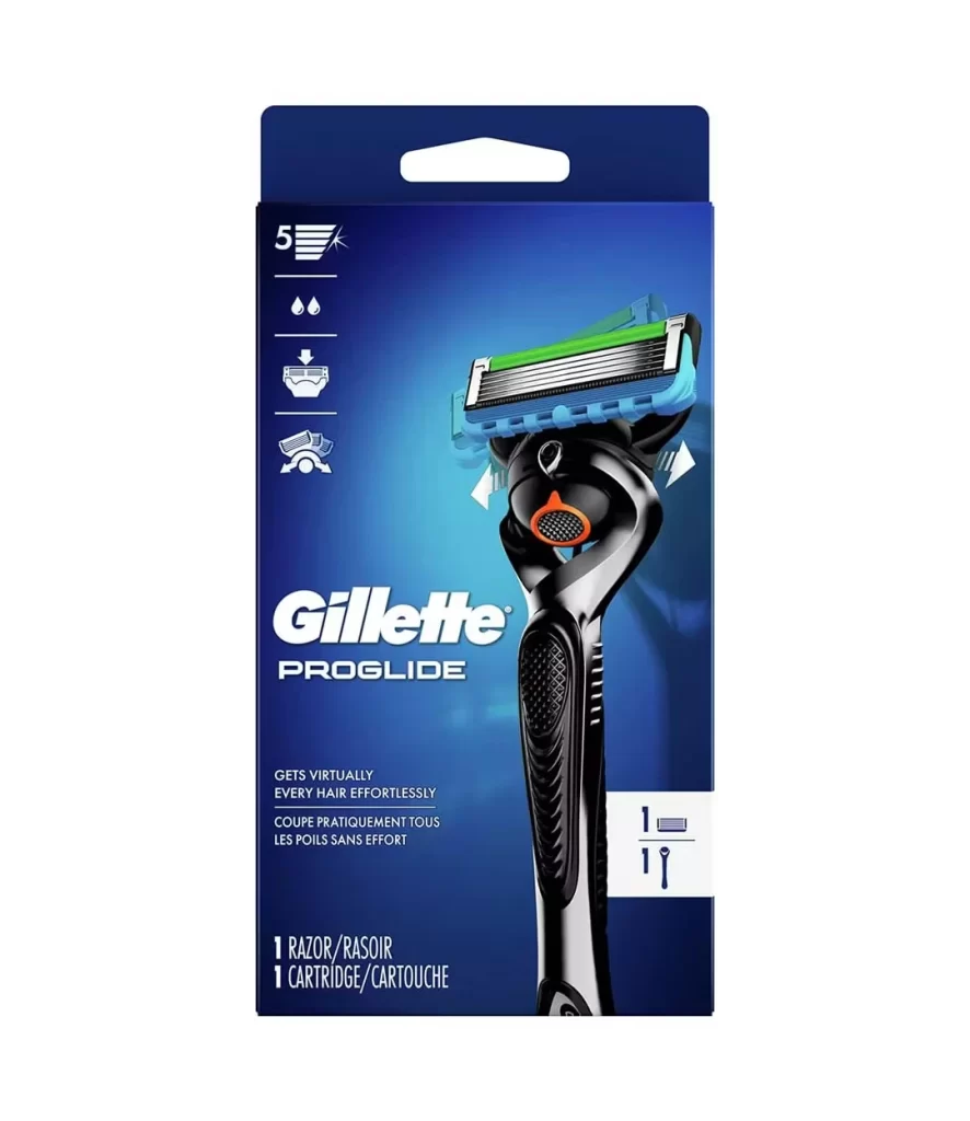
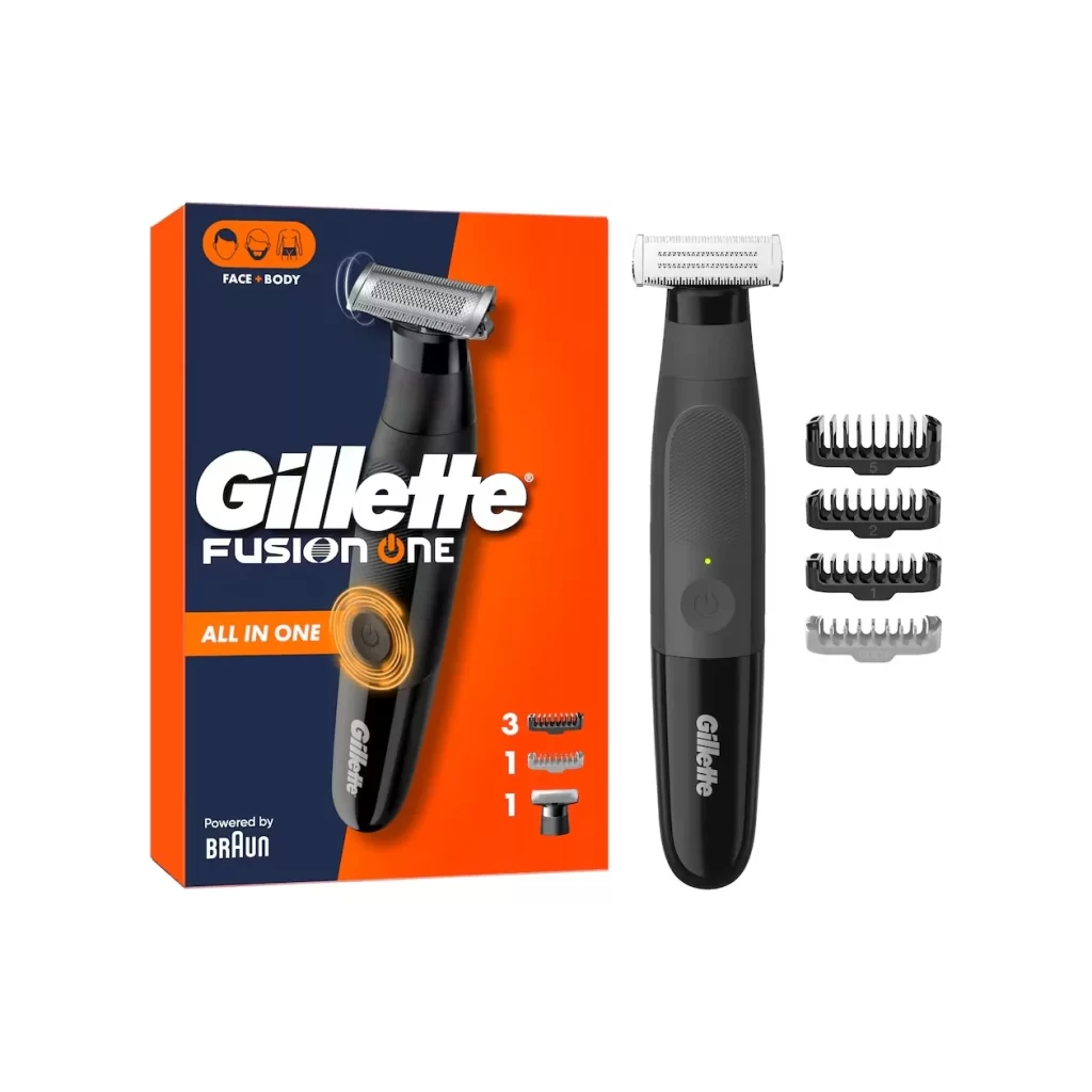
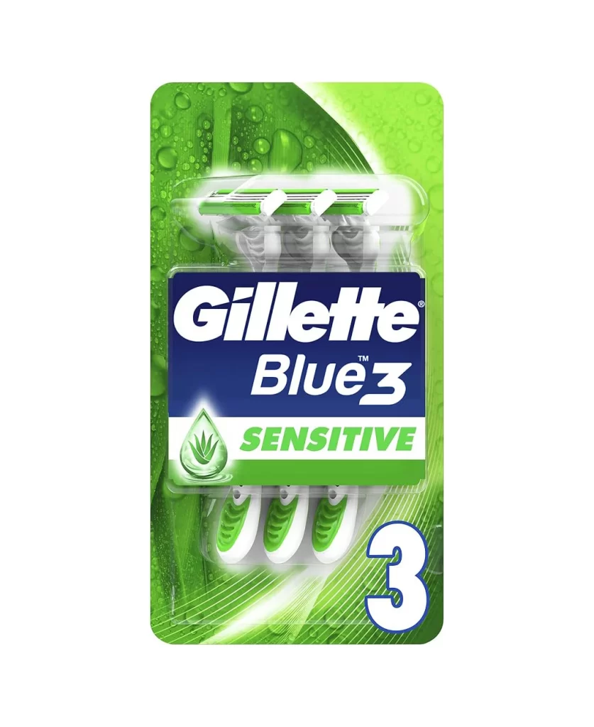
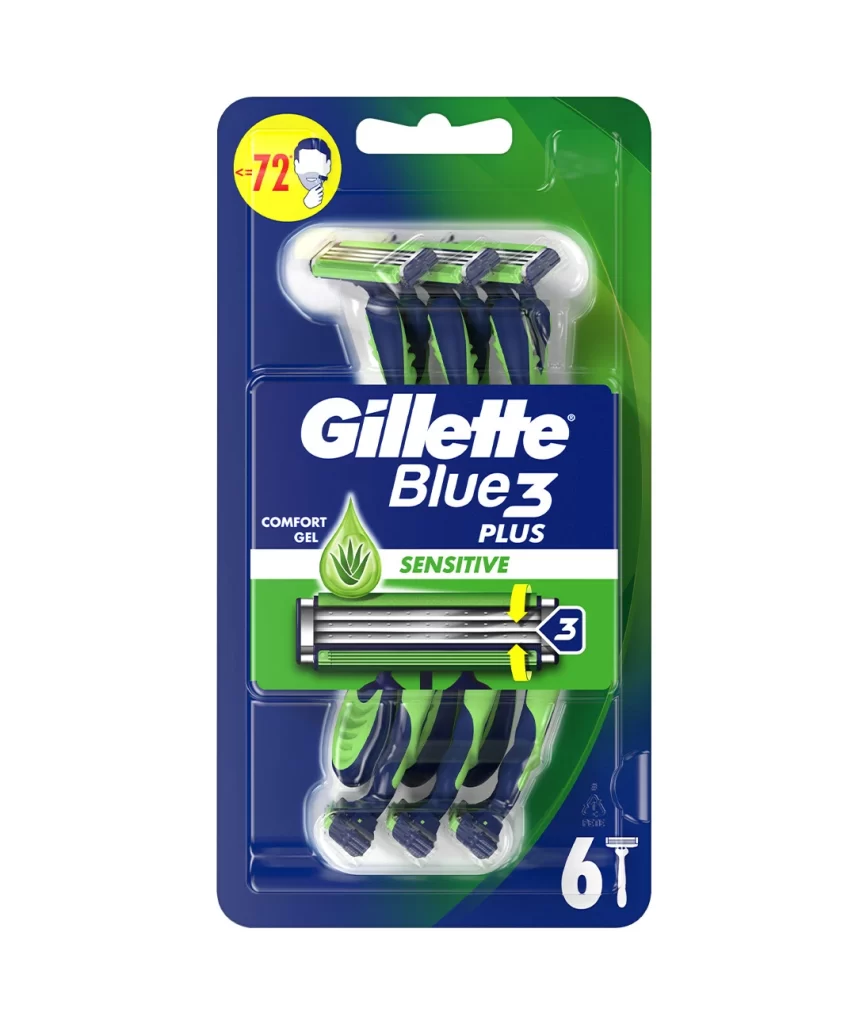
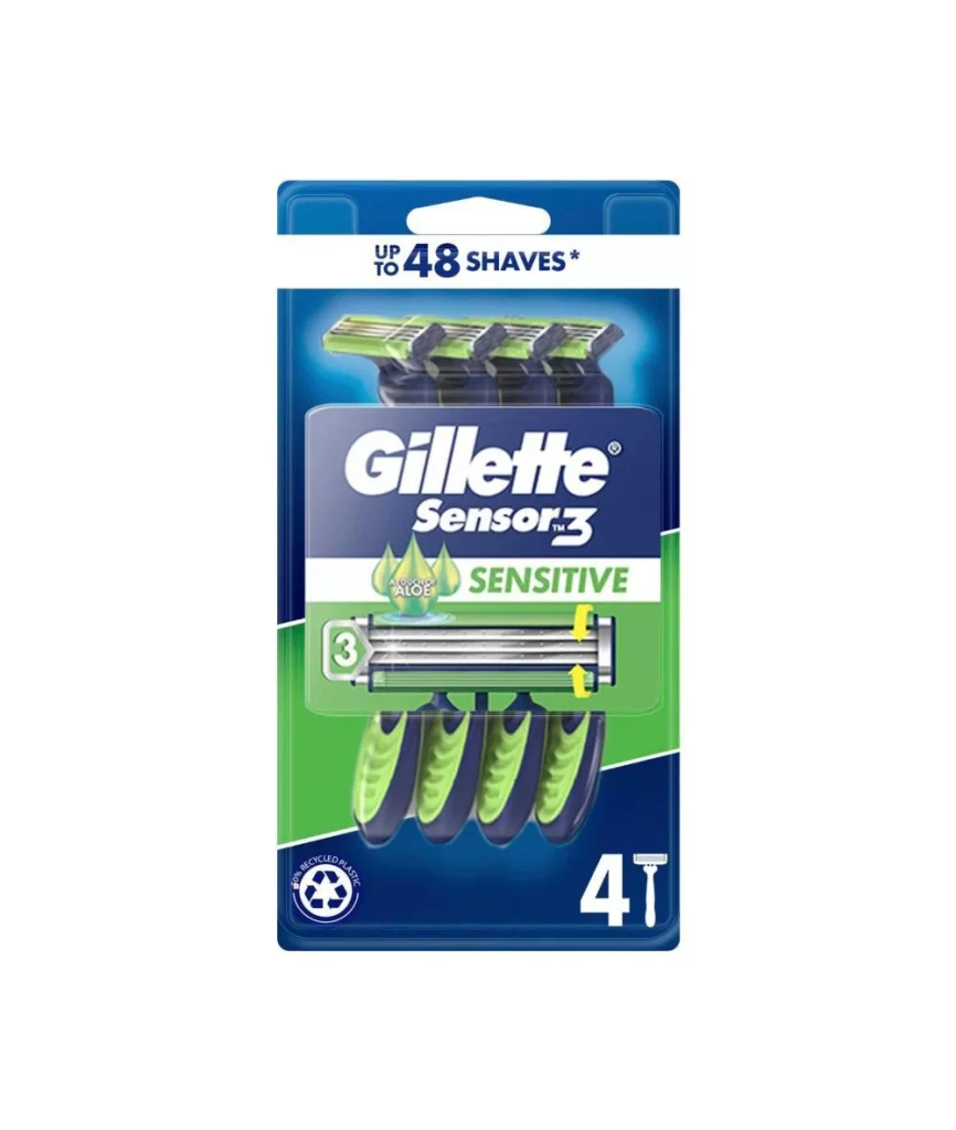
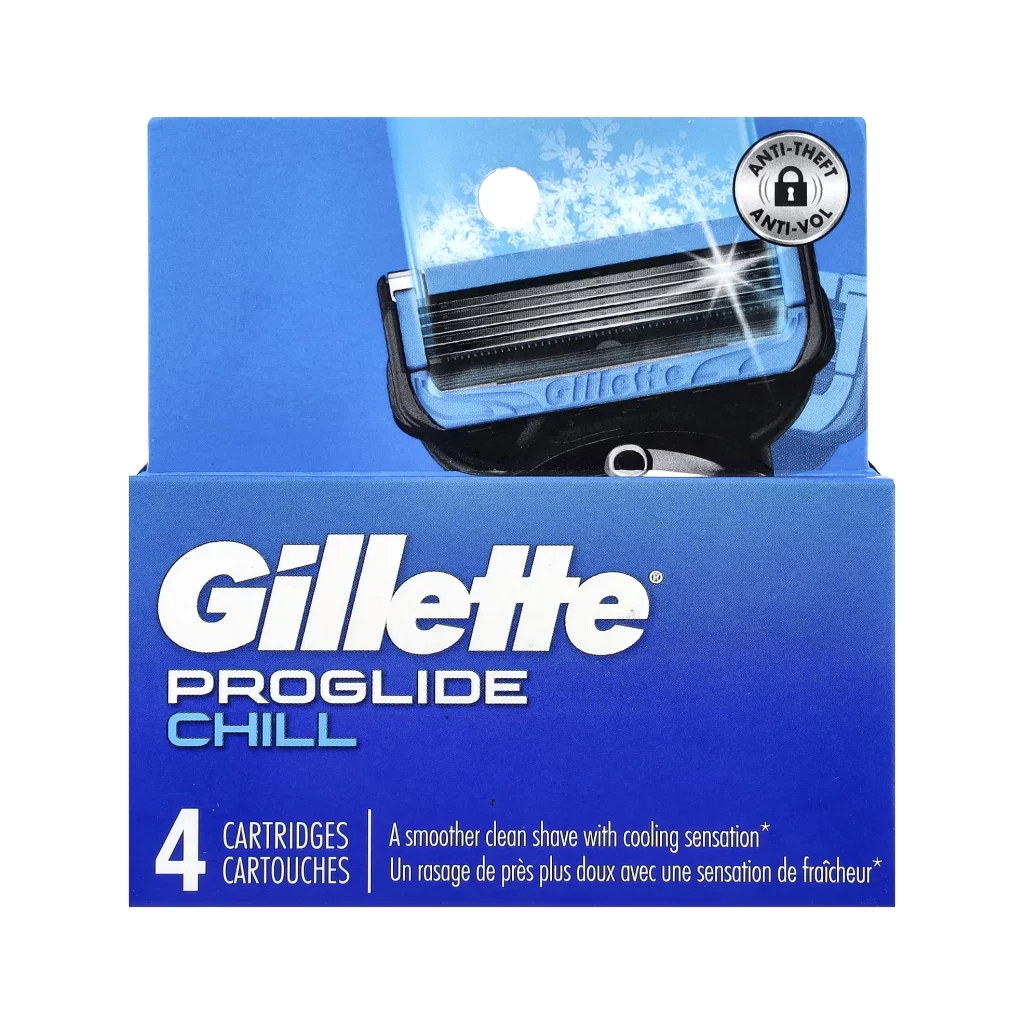
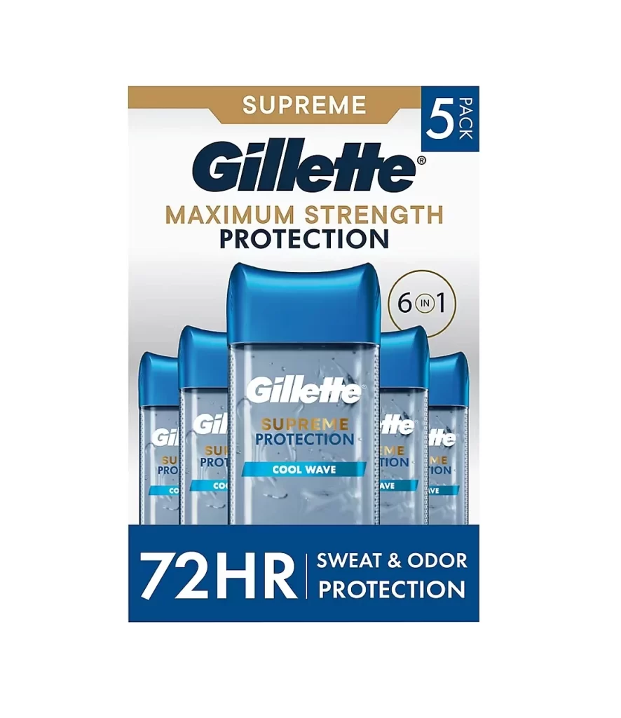
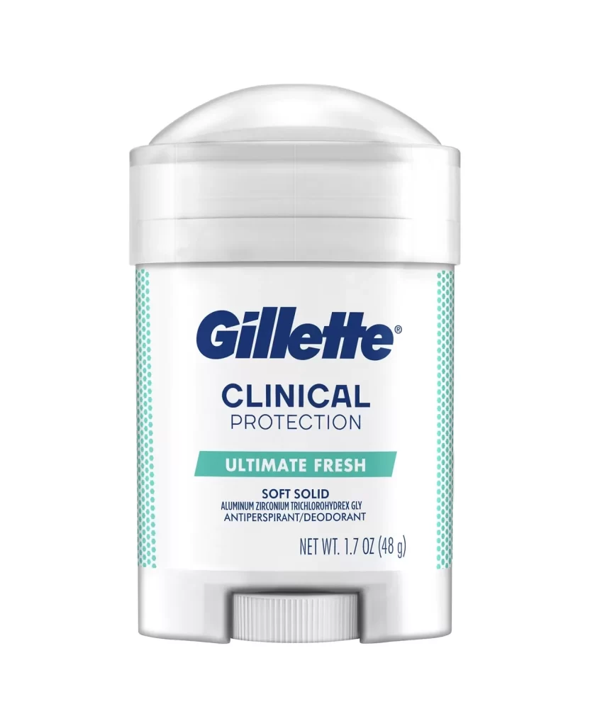
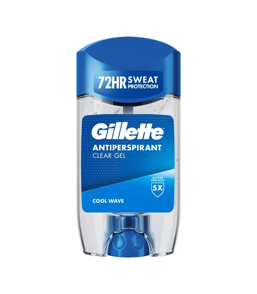
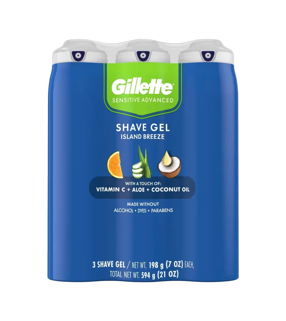
Bold, white sans-serif lettering spells 'Gillette' in a distinctive italicized slant with uniform stroke weight across a deep navy blue field. A small registered trademark symbol occupies the upper right corner beside the final 'e'. The centered text composition maintains even margins and presents a flat, matte finish devoid of gradients or shadows.
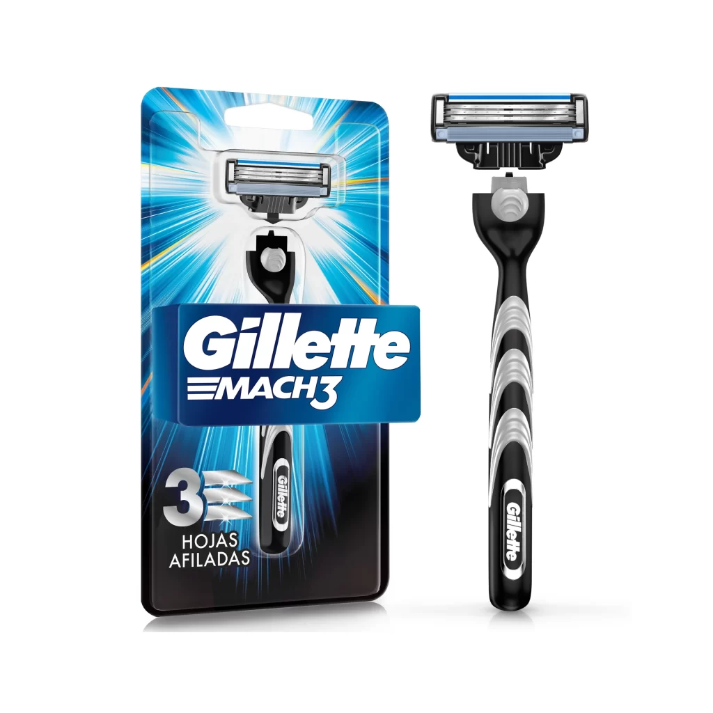
Visual impact derives from the stark contrast between the saturated indigo field and the pure white logotype. The forward-leaning posture of the characters conveys motion and precision. Minimalist execution ensures immediate legibility across various scales while maintaining brand authority through geometric consistency.
Brand historians might analyze this iteration for comparative studies of corporate identity evolution. Packaging engineers could reference the color ratios when developing product line extensions. Marketing teams frequently examine such assets to ensure compliance with visual identity standards across global markets.