Gillette Blue3 Razor Packaging
Topics
Details
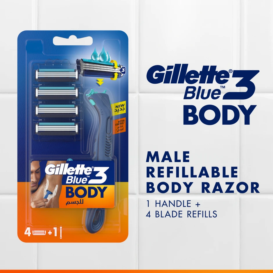
Deep navy blue and vibrant safety orange bisect the vertical blister pack of the Gillette Blue3 Body razor, creating a high-contrast design that showcases four metallic blade cartridges stacked vertically alongside a dark grey ergonomic handle beneath a clear plastic dome. The packaging features bold typography displaying 'Gillette 3 Blue BODY' in dark blue, with an orange lower section containing Arabic text, a small image of a man shaving his underarm, and yellow stickers indicating 'NEW' and 'BETTER CONTROL'. A white tiled surface provides a clean backdrop for the product, which displays '4 + 1' in the bottom left corner to signify the included handle and blade refills.
Visual hierarchy is established through the strategic use of scale and color blocking, where the massive ‘BODY’ text anchors the lower orange field to signal product specificity. A small photographic inset depicting male grooming usage provides human context without disrupting the geometric rigor of the layout. The inclusion of bilingual text, specifically the Arabic script for ‘Body’ and ‘New’, indicates a localized market adaptation that adds typographic complexity to the otherwise clean industrial design.
Brand strategists and packaging engineers would examine this composition to understand how color psychology is leveraged to differentiate body-care products from standard facial shaving lines. Retail merchandisers could utilize this reference to plan shelf-blocking strategies, noting how the orange base creates immediate visual separation from competitors. Furthermore, 3D artists modeling consumer goods might study the specific specular highlights on the blister plastic to accurately recreate the refractive qualities of retail packaging materials.