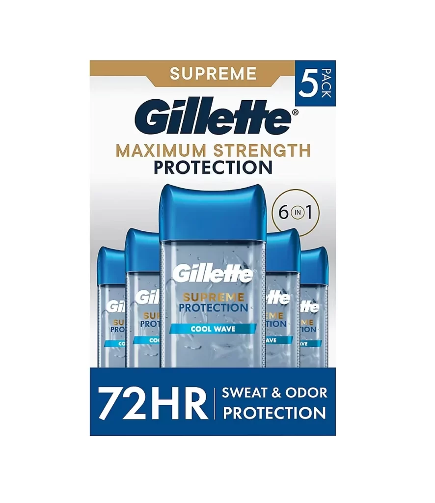
Gillette Supreme Protection Cool Wave Deodorant Packaging
Topics
Details
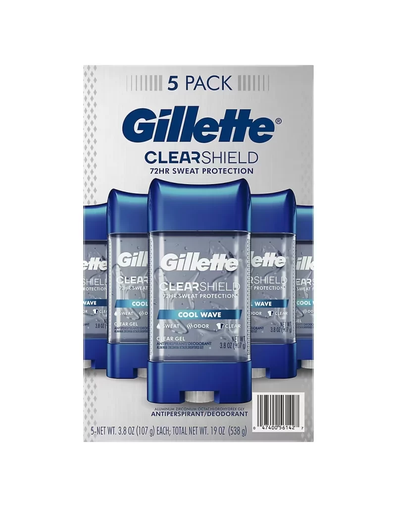
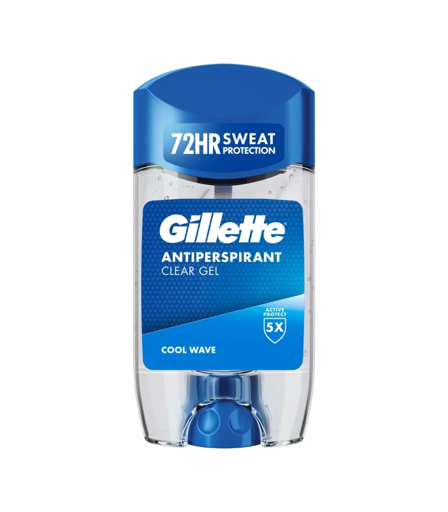
Five cylindrical deodorant containers with translucent silver bodies and vibrant blue lids cluster in a tight, overlapping formation, with the primary vessel positioned prominently in the foreground. A golden banner anchors the upper portion of the composition, displaying 'SUPREME' in white sans-serif text above the bold Gillette logo and 'MAXIMUM STRENGTH PROTECTION' lettering, while a white surface provides minimal backdrop context for the product arrangement.
Visual hierarchy is established through a sophisticated interplay of metallic gold accents and clinical blue tones, signaling premium quality and freshness simultaneously. The ‘6 IN 1’ badge floating to the right of the central bottle adds a layer of technical complexity to the otherwise clean commercial aesthetic. By utilizing transparency on the packaging material, the design allows the viewer to perceive the gel texture inside, bridging the gap between graphic representation and tangible consumer experience.
Brand strategists might analyze this layout to understand how color psychology is leveraged to convey durability and cooling sensations in personal care marketing. Packaging engineers could study the specific geometry of the cap and the placement of informational badges to optimize shelf presence. Furthermore, retail merchandisers would find value in examining how the multi-pack quantity is integrated into the visual field without cluttering the primary brand message.