Title

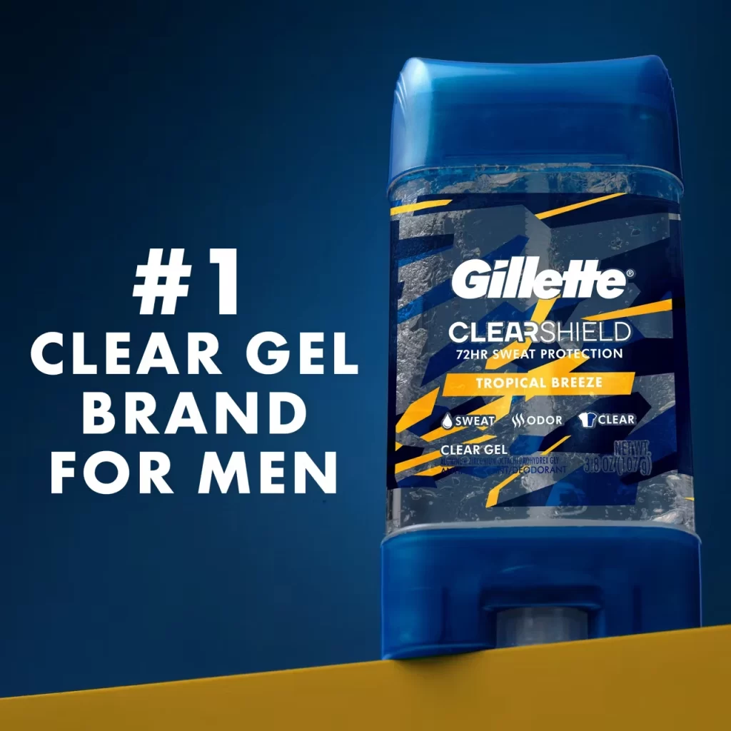
Gillette CLEARSHIELD Tropical Breeze Deodorant Packaging


Topics

DeodorantDeodorant PackagingGillette

Details

Uploaded user: Leo

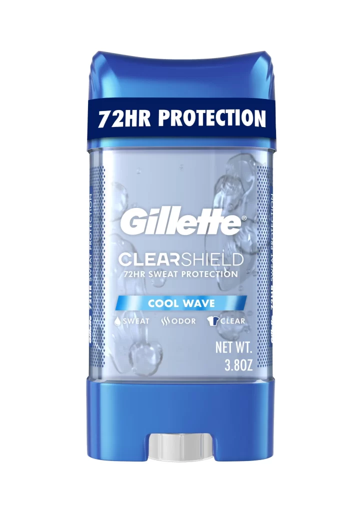
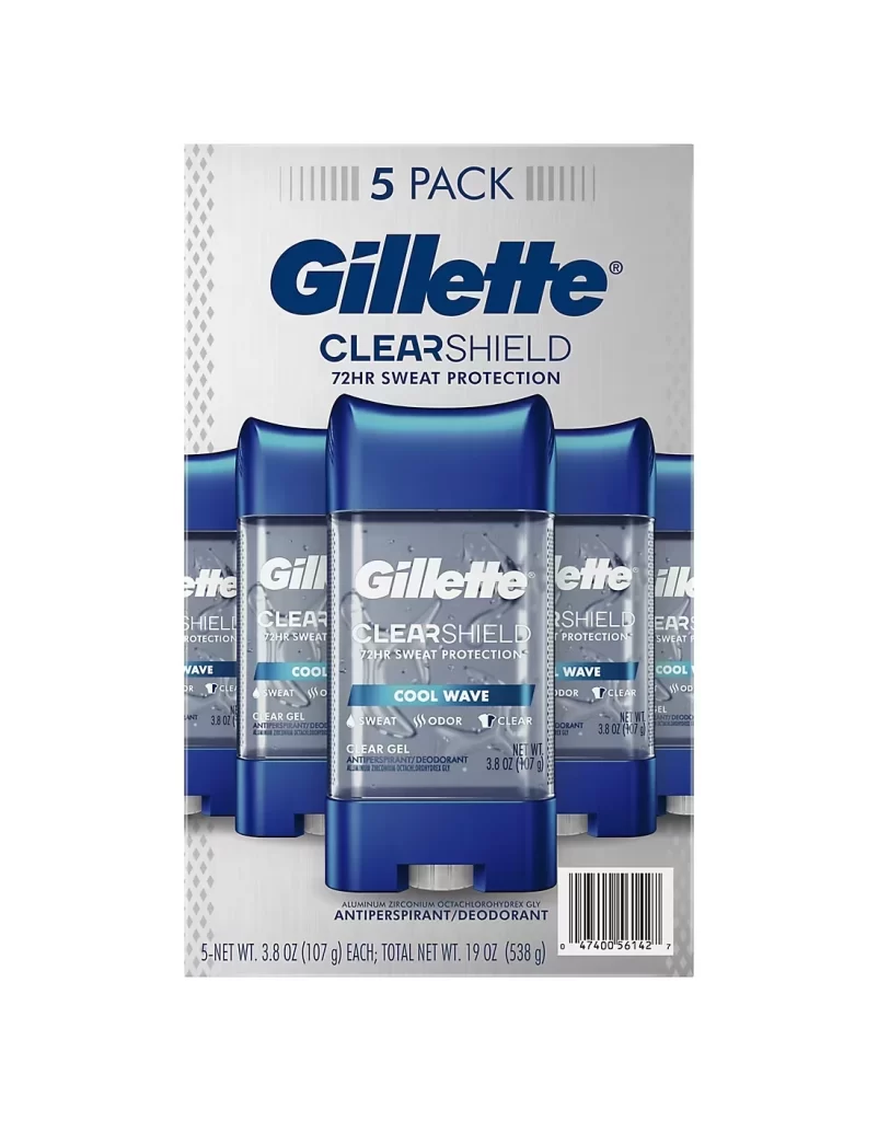
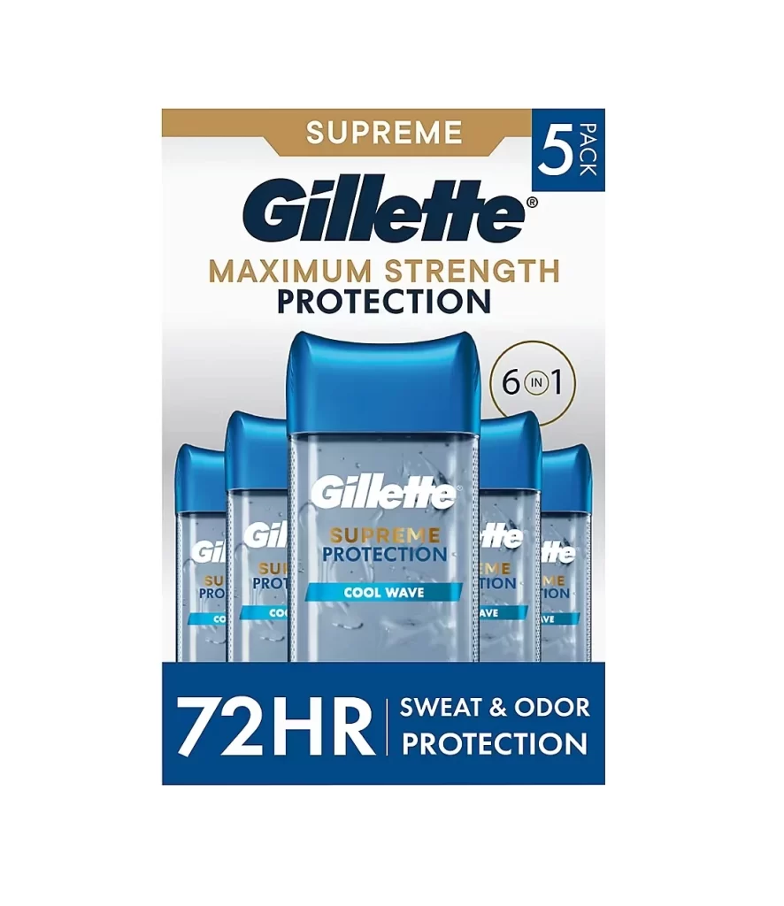
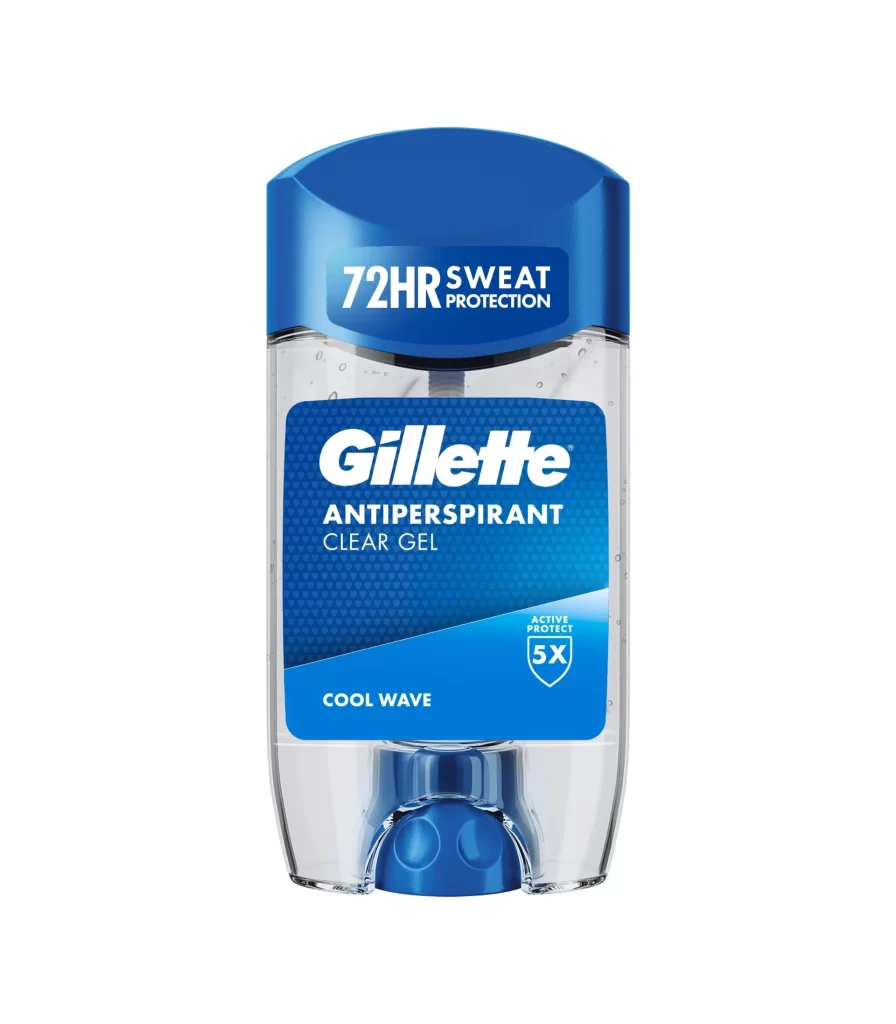
A translucent Gillette ClearShield deodorant bottle reveals the clear gel formula within, capped by a vibrant royal blue lid and decorated with bold geometric patterns of yellow and dark grey. The packaging displays 'Tropical Breeze' and '72HR SWEAT PROTECTION' text alongside icons indicating sweat, odor, and clear protection benefits. Deep navy blue fills the background while a solid golden-yellow surface supports the container from below.
Visual distinction emerges from the aggressive angular graphics that wrap around the cylindrical form, creating a sense of dynamic motion through sharp diagonal yellow stripes against the darker camouflage-like pattern. The transparency of the gel formula serves as a key design element, allowing viewers to see the actual product while the color palette of electric blue and safety yellow establishes immediate visual recognition on retail shelves. Typography hierarchy effectively separates brand identity from functional benefits, with the 72-hour protection claim positioned strategically between the product name and scent variant.

Packaging designers studying masculine grooming products would examine this composition to understand how transparency communicates product purity while bold geometric shapes convey strength and reliability. Marketing teams could reference the color blocking strategy when developing visual systems for athletic or performance-oriented personal care lines. Industrial designers might analyze the structural relationship between the opaque cap and see-through reservoir to inform their own container concepts for similar gel-based formulations.