Gillette Foamy Regular Shave Foam Packaging
Topics
Details
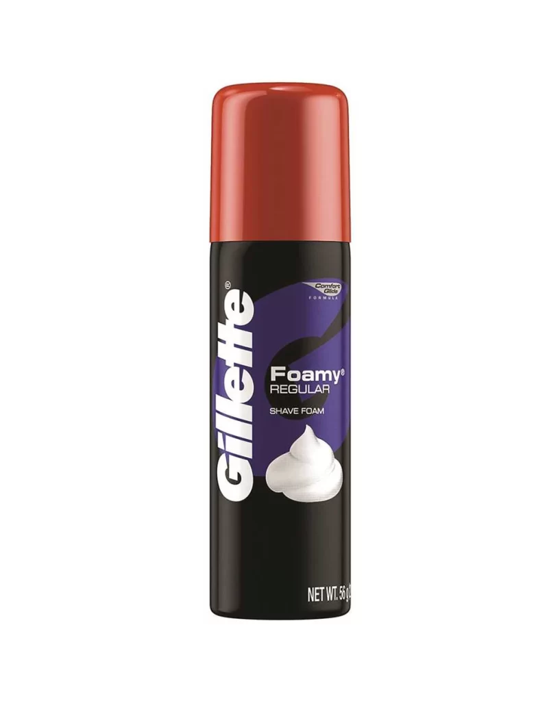
The cylindrical canister combines a glossy, deep red cap with a matte black body, standing on a white surface. A bold purple graphic sweeps across the front, housing the white 'Gillette' logotype vertically on the left and the 'Foamy Regular' branding in a clean sans-serif font to the right. A realistic depiction of a dollop of white cream appears below the product name.
Visual interest is generated through the strategic use of high-contrast color blocking and the interplay between reflective and non-reflective surfaces. The vibrant purple accent breaks the monochromatic black and red scheme, drawing immediate attention to the product’s specific variant. Furthermore, the inclusion of a photographic texture for the foam provides a tactile quality that balances the flat, graphic nature of the typography.
Brand historians and packaging analysts might utilize this visual record to study the evolution of Gillette’s identity systems and color palettes. 3D artists could employ this as a reference for rendering metallic paints and plastic textures under studio lighting conditions. Additionally, marketing teams reviewing retro aesthetics often examine such compositions to understand how vertical text integration affects consumer readability on curved surfaces.