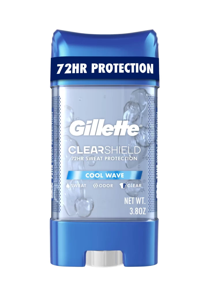
Gillette PRO Sensitive Shave Cream Packaging
Topics
Details
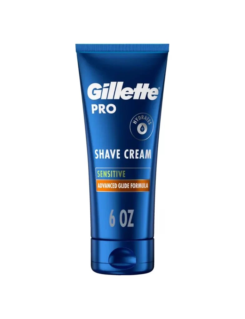
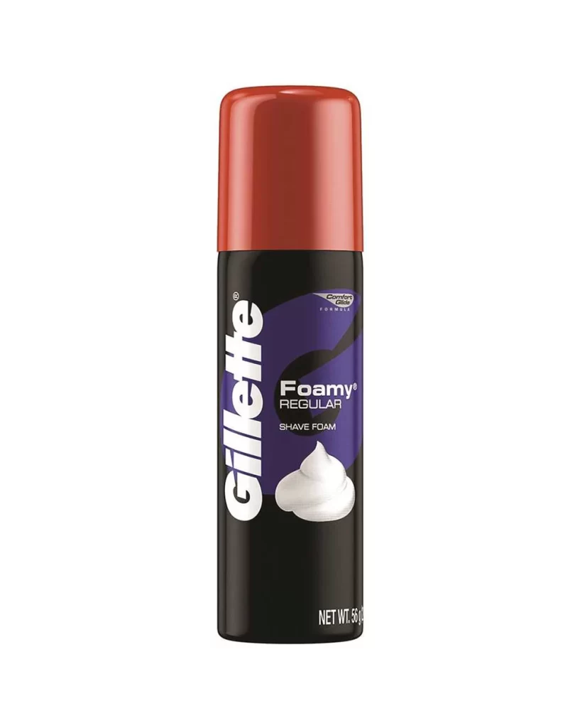
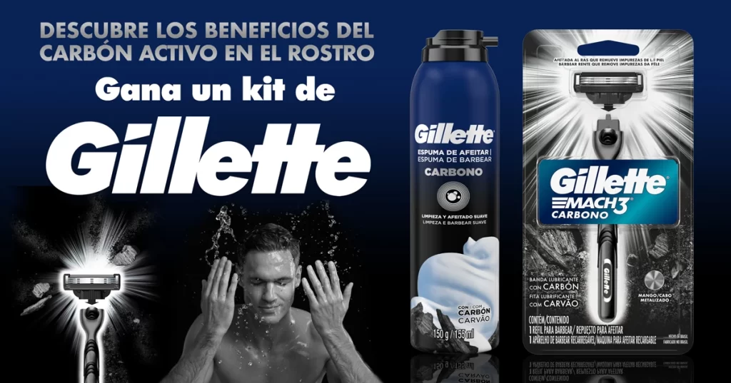
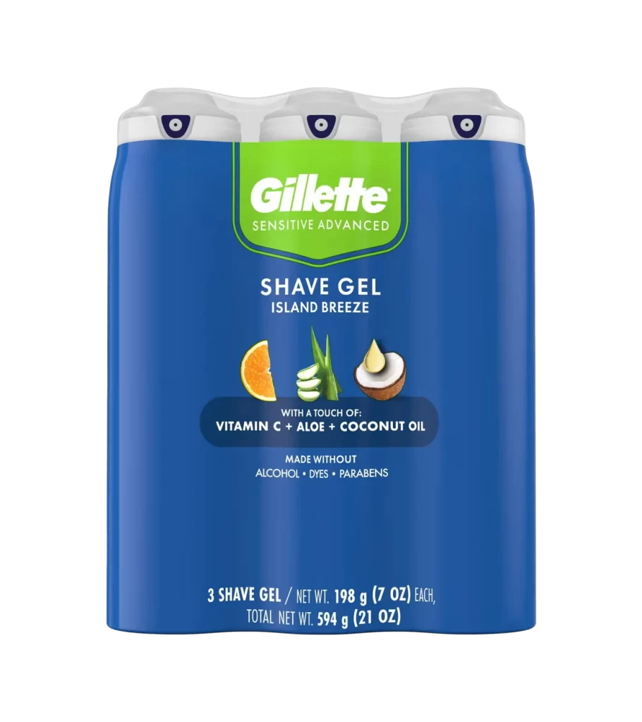
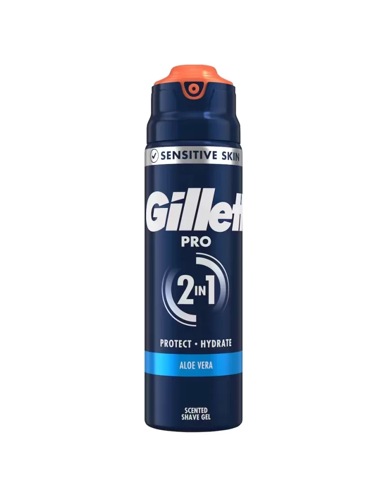
A deep royal blue tube of Gillette PRO shave cream stands upright in a straight-on product shot, its metallic sheen catching the light across the cylindrical surface. Crisp white typography spells out the brand name above a circular 'HYDRATES' badge positioned to the right, while bold 'SHAVE CREAM' lettering sits above a green rectangle highlighting the word 'SENSITIVE' and an orange bar reading 'ADVANCED GLIDE FORMULA'. The 6 OZ container rests on a white background with a flip-top cap visible at the base.
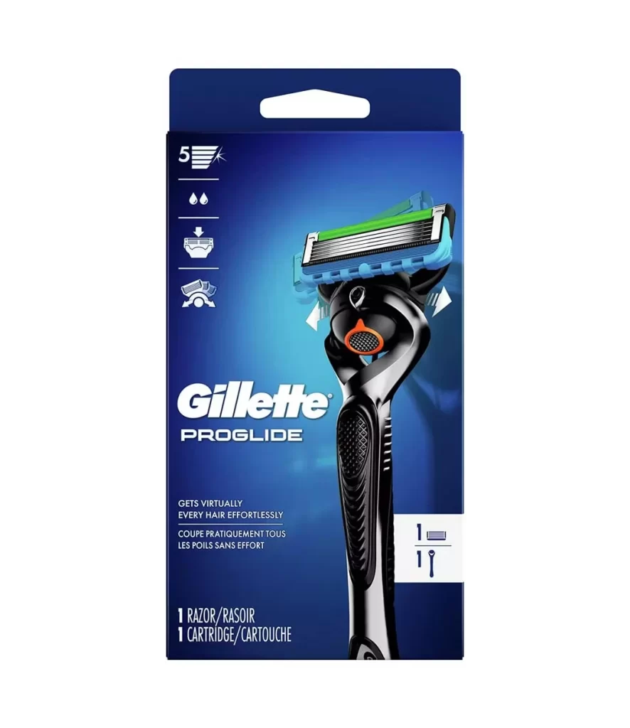
Visual hierarchy plays a crucial role here, as the contrasting color blocks of green and orange immediately signal the product’s specific skin-care benefits without cluttering the layout. The choice of a rich blue hue conveys a sense of clinical professionalism and coolness, which aligns perfectly with the soothing promises made to consumers with delicate skin. Furthermore, the clean sans-serif fonts and generous whitespace ensure that every piece of information remains legible even from a distance.
Brand managers analyzing competitive grooming aesthetics might study this composition to understand how established companies balance functional claims with premium visual cues. Packaging engineers could examine the tube’s structural proportions and cap placement to inform their own container designs for similar viscous liquids. Additionally, marketing teams looking to refresh their own product lines might reference this specific color palette and typographic arrangement to evoke trust and reliability.