Title

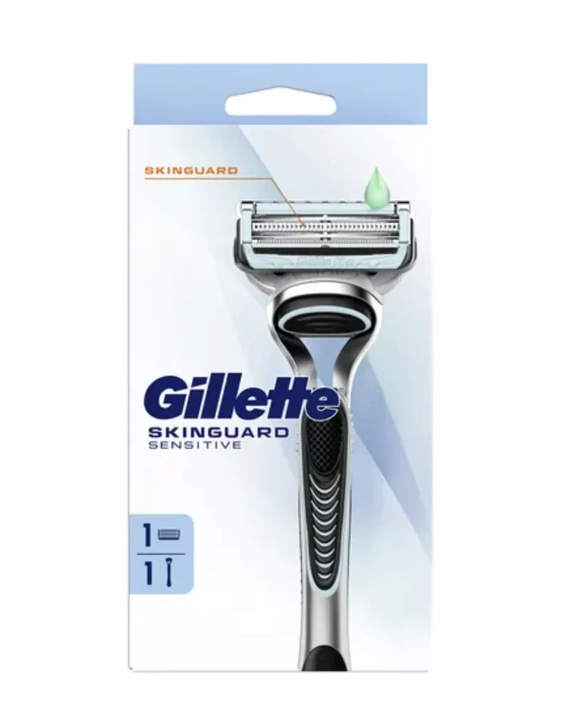
Gillette Skinguard Sensitive Razor Packaging


Topics

GilletteRazor

Details

Uploaded user: Leo

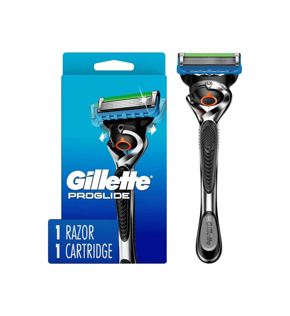
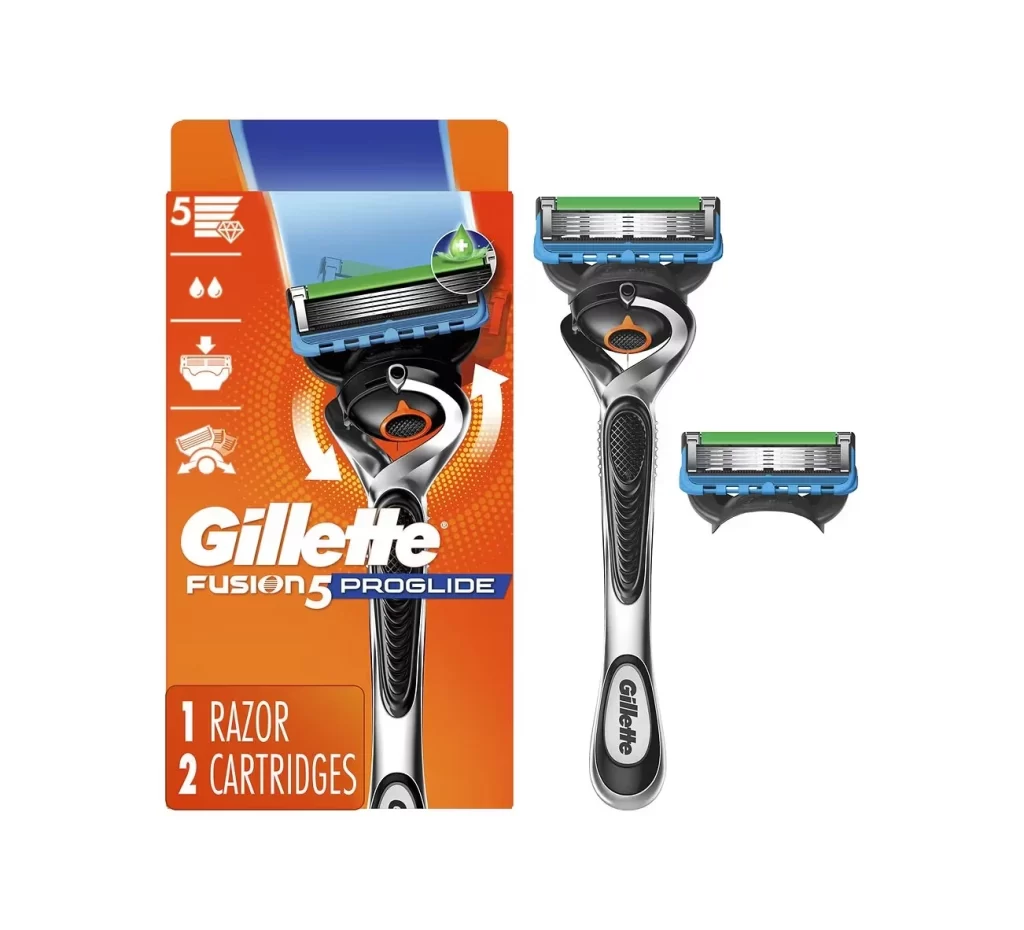
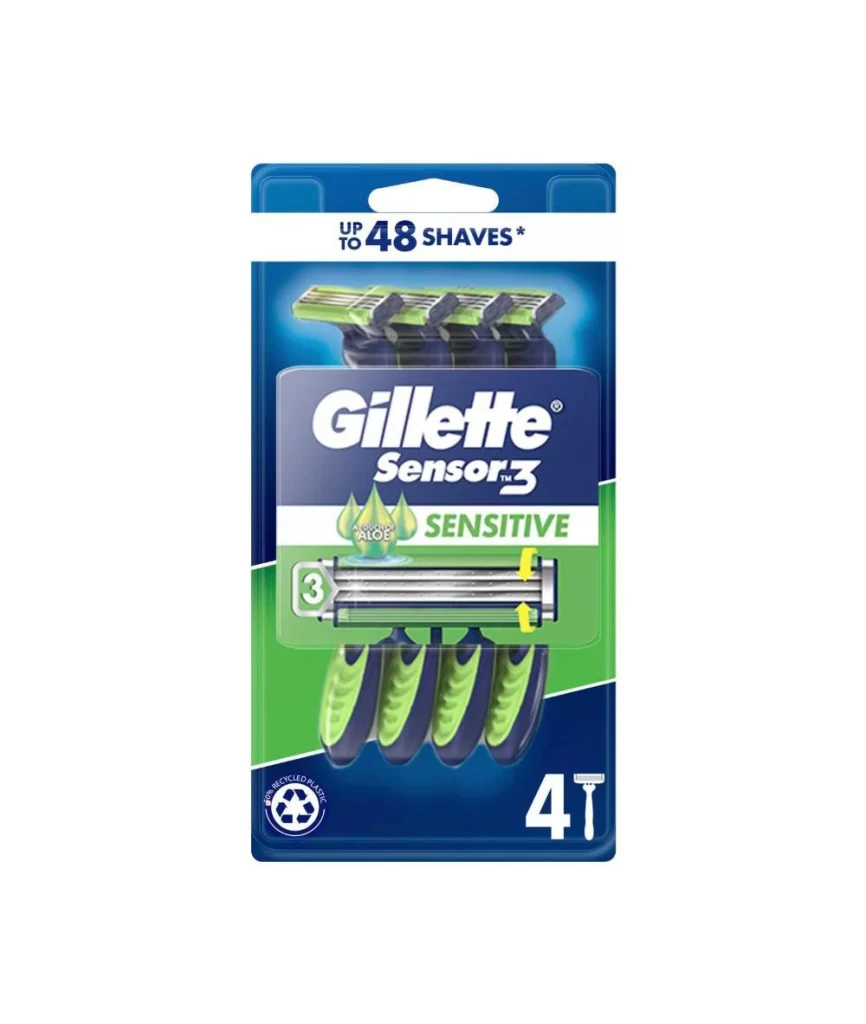
The Gillette SkinGuard Sensitive razor packaging features a silver and black ergonomic handle with a multi-blade cartridge, topped by a single green droplet signifying soothing hydration. Bold navy typography spells out the brand name above the product image, which sits on a white surface with soft blue diagonal gradients. A light blue hang tab crowns the top of the package, while the SkinGuard label points to the cartridge's specialized skin protection technology.
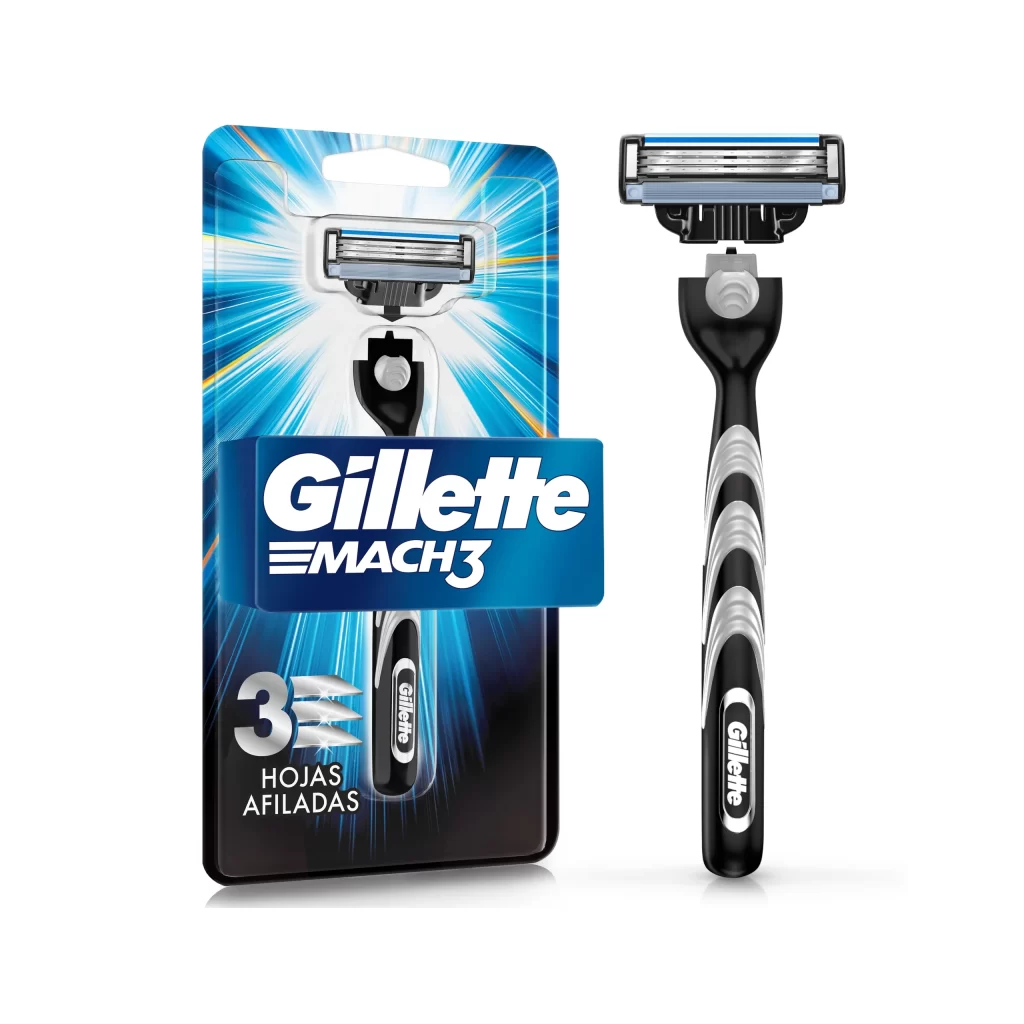
Visual hierarchy plays a crucial role here, guiding the eye from the prominent brand name down through the technical illustration of the skin guard feature marked by an orange pointer line. The color palette deliberately balances cool blues and silvers with that strategic pop of green, immediately communicating the product’s gentle formulation without relying on excessive text. Subtle shadows beneath the razor head lend a three-dimensional quality that emphasizes the precision engineering of the blade assembly.

Packaging designers studying pharmaceutical or personal care aesthetics will find this composition particularly useful for understanding how to balance technical specifications with consumer-friendly visuals. Marketing teams developing campaigns for sensitive-skin products could analyze the effective use of color psychology and iconography to convey gentleness. Additionally, 3D artists requiring reference material for rendering metallic textures and translucent liquid effects on grooming tools would benefit from examining the lighting and material properties displayed here.