Title

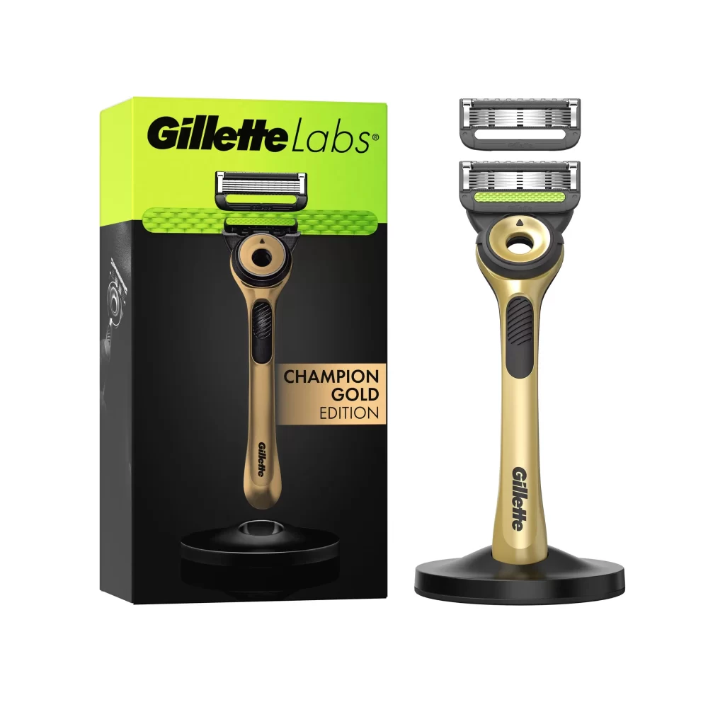
Gillette Champion Gold Edition Razor Packaging


Topics

GilletteRazor

Details

Uploaded user: Leo

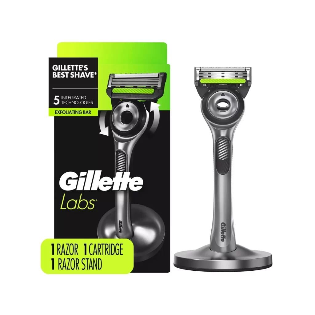
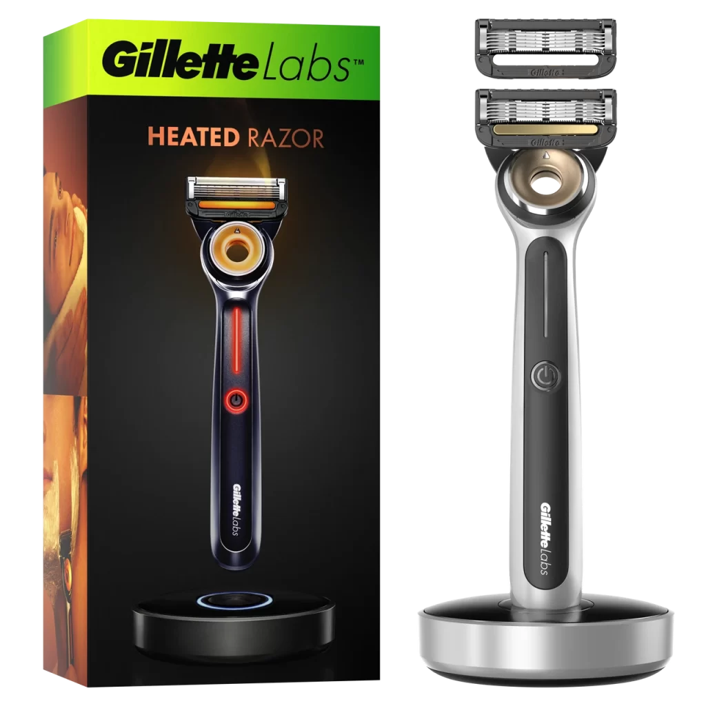
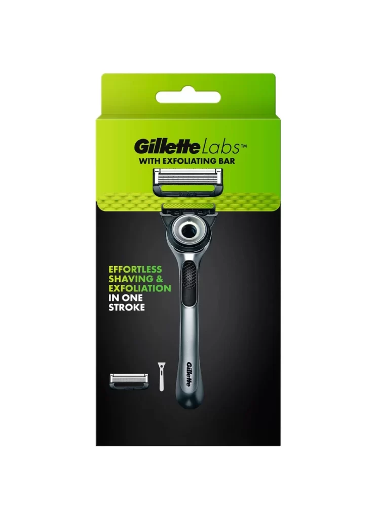
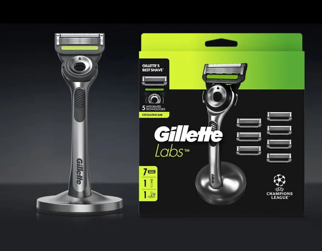
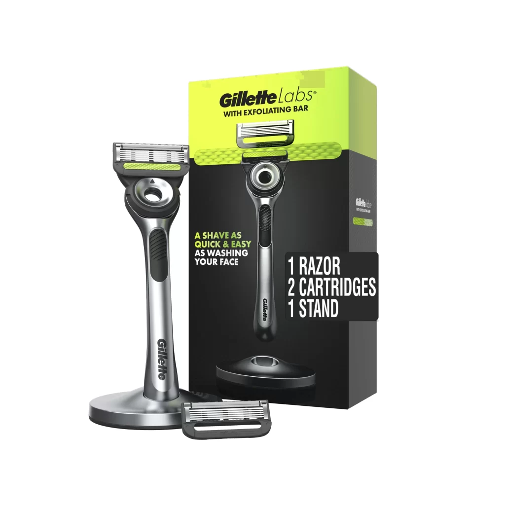
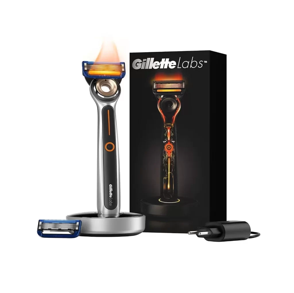
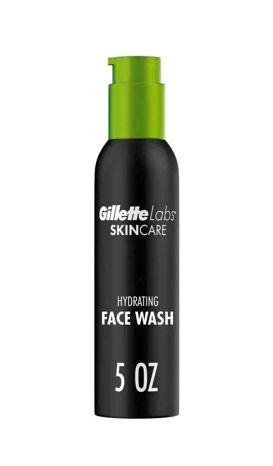
A vibrant lime-green upper section transitions into a deep matte black base on the Gillette Labs Champion Gold Edition packaging, which features a clean, frontal studio composition alongside the metallic champagne-gold razor handle. Black ergonomic grip textures accent the handle, while visible text includes the 'Gillette Labs' brand name and 'CHAMPION GOLD EDITION' designation printed on the box. The product rests on a white surface with an additional blade cartridge positioned above the razor head.
Visual distinction arises from the luxurious material contrast between the brushed metal finish of the handle and the high-gloss black accents surrounding the pivot mechanism. The packaging leverages a bold chromatic split that immediately signals premium positioning, while the inclusion of a weighted circular stand suggests a display-oriented retail strategy rather than purely utilitarian storage. Such deliberate color blocking and metallic sheen differentiate this limited edition from standard mass-market grooming tools through its overt emphasis on trophy-like aesthetics.

Industrial designers examining luxury SKU differentiation will find value in analyzing how metallic finishes and accent colors communicate tiered pricing strategies. Brand strategists could utilize this case study when developing limited-edition cosmetic lines that require balancing heritage identity with contemporary premium cues. Furthermore, packaging engineers might reference the structural integration of the product window and color-blocked panels to understand how physical design elements reinforce perceived value in personal care categories.