Title

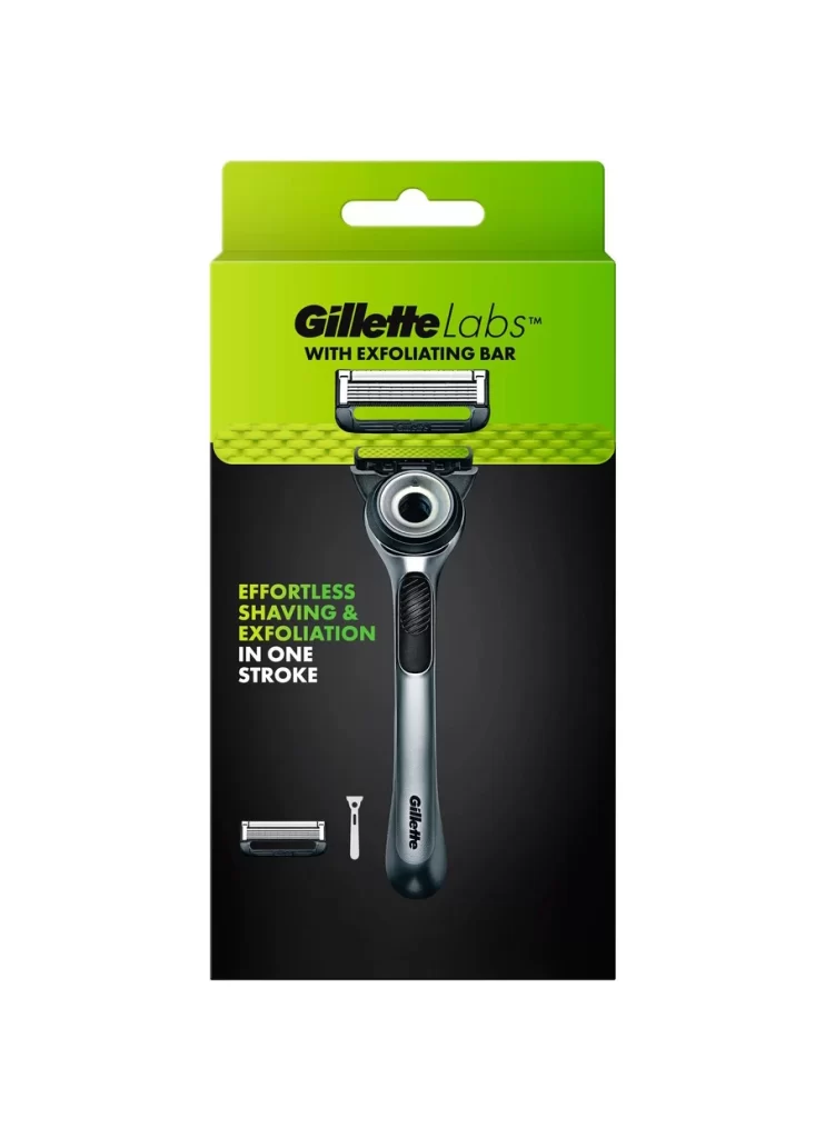
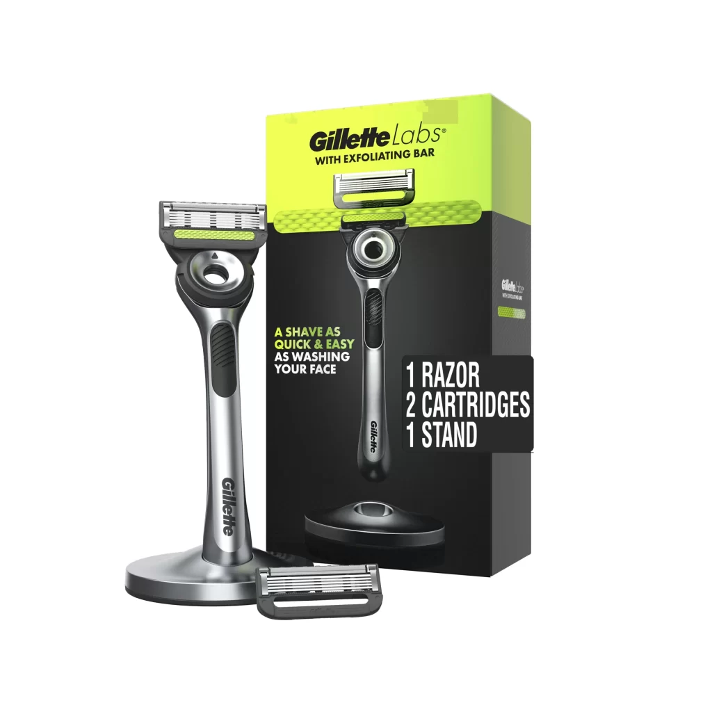
Gillette Labs Exfoliating Bar Razor Box Packaging


Topics

GilletteRazor

Details

Uploaded user: Leo

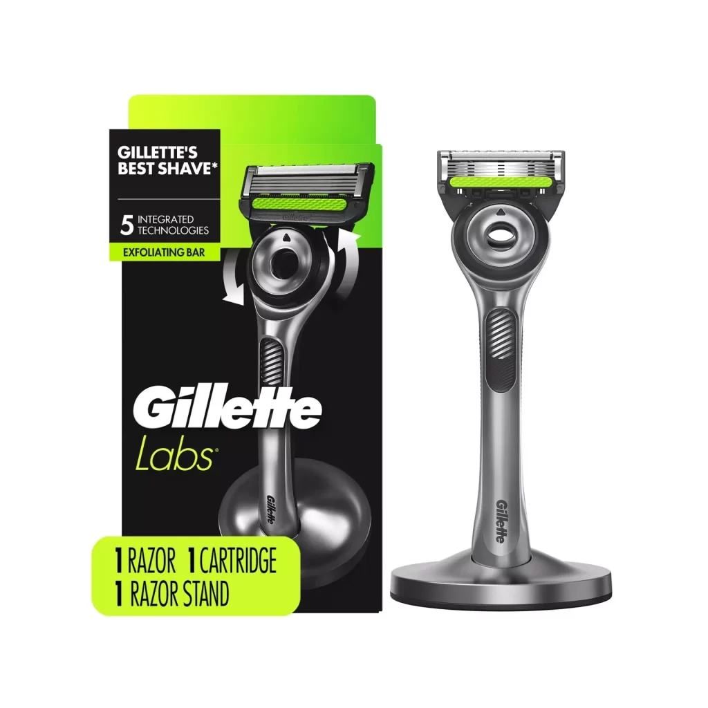
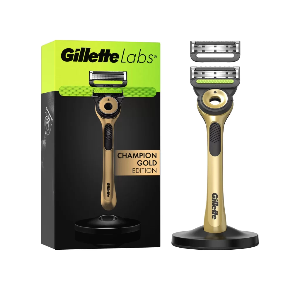
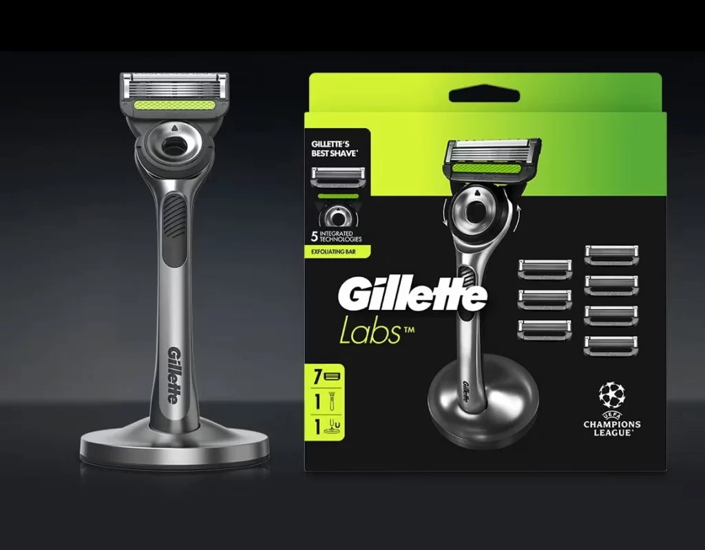
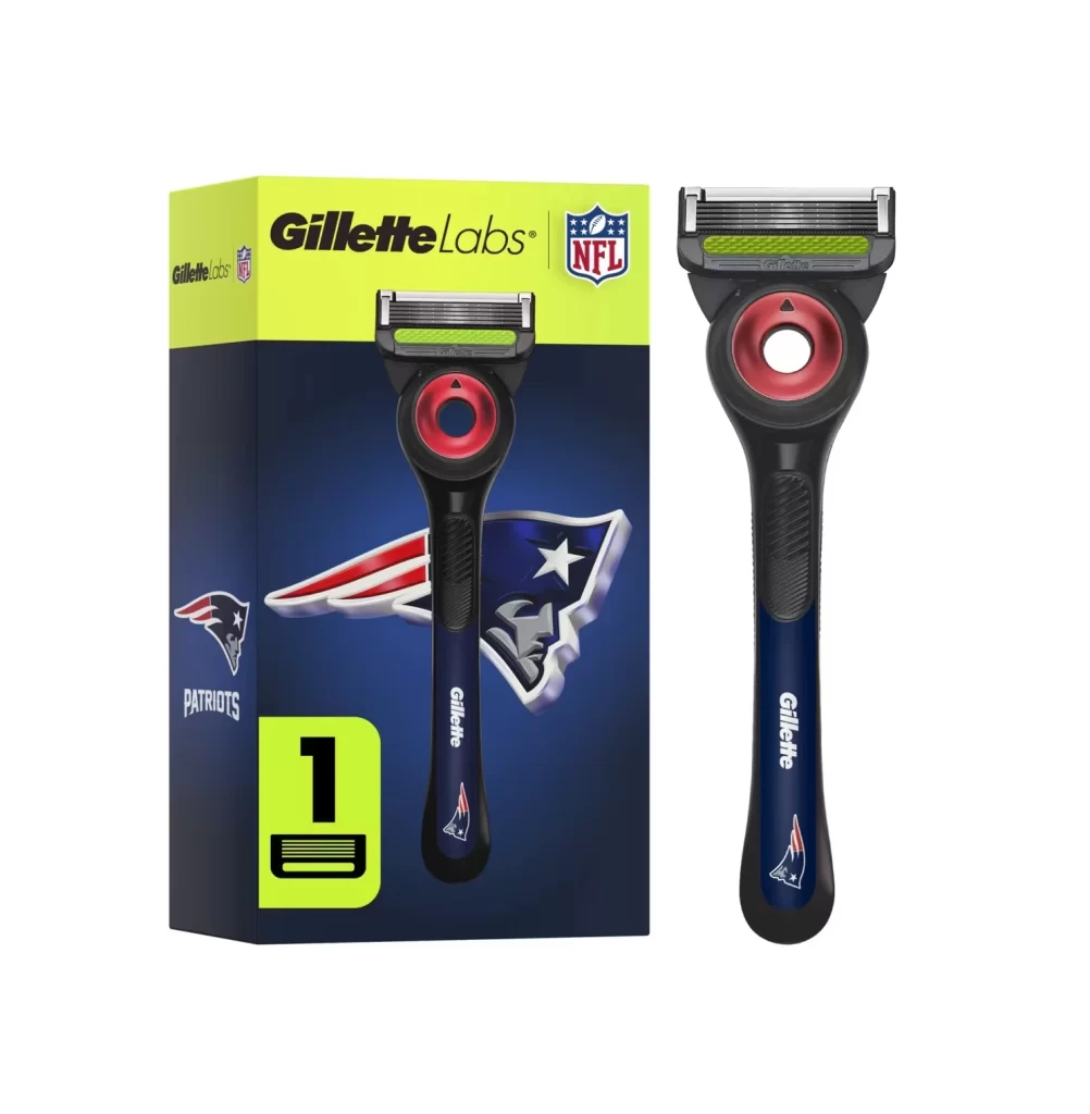
A vibrant lime-green header dominates the upper half of the packaging, transitioning sharply into a deep matte black base that anchors the composition. Centered within this dual-tone field sits the Gillette Labs razor, its metallic silver handle and circular exfoliating bar head rendered with crisp clarity against the dark backdrop. Bold black typography spells out 'Gillette Labs' above the smaller subheading 'WITH EXFOLIATING BAR,' while neon green text to the left promises 'EFFORTLESS SHAVING & EXFOLIATION IN ONE STROKE.' Below the main product image, minimalist line drawings of a replacement blade cartridge and a precision trimmer complete the layout.

Visual tension arises from the striking contrast between the organic, almost citrus-like brightness of the upper carton and the sophisticated darkness of the lower section. The exfoliating bar itself—featuring a textured green surface with a honeycomb pattern—introduces a tactile quality that distinguishes this variant from standard razor packaging. This design choice effectively communicates the product's dual functionality through color psychology alone, using the green to suggest freshness and skin health while the black conveys premium engineering and technological innovation.
Brand strategists analyzing competitive positioning in the men's grooming sector would find this case study particularly instructive for understanding how color blocking can signal product differentiation. Packaging engineers might examine the structural hang-tab integration and the precise spatial relationships between the hero product shot and secondary component icons. Meanwhile, retail merchandising teams could evaluate how the high-contrast palette performs under varying store lighting conditions to ensure shelf visibility remains optimal across different retail environments.