Title

Gillette Mach3 Razor Packaging


Topics

GilletteRazor

Details

Uploaded user: Leo

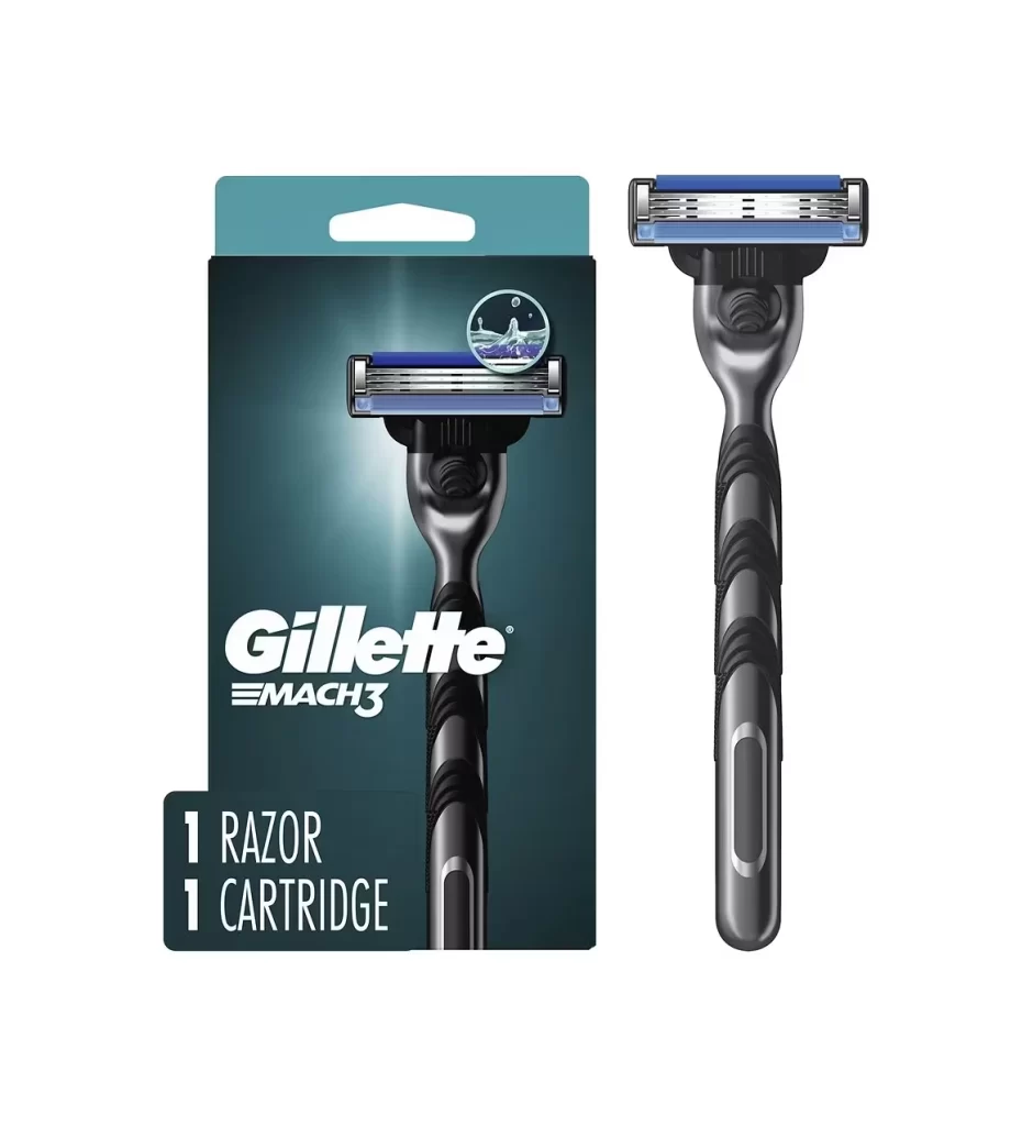
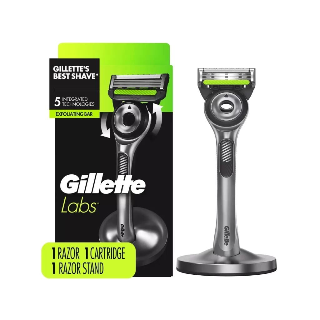
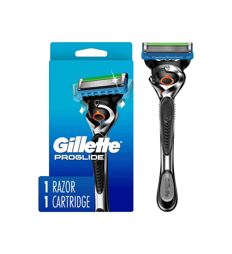
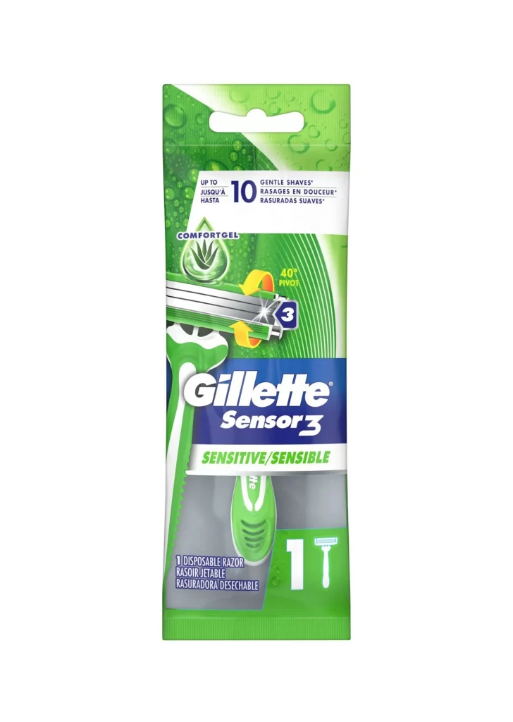
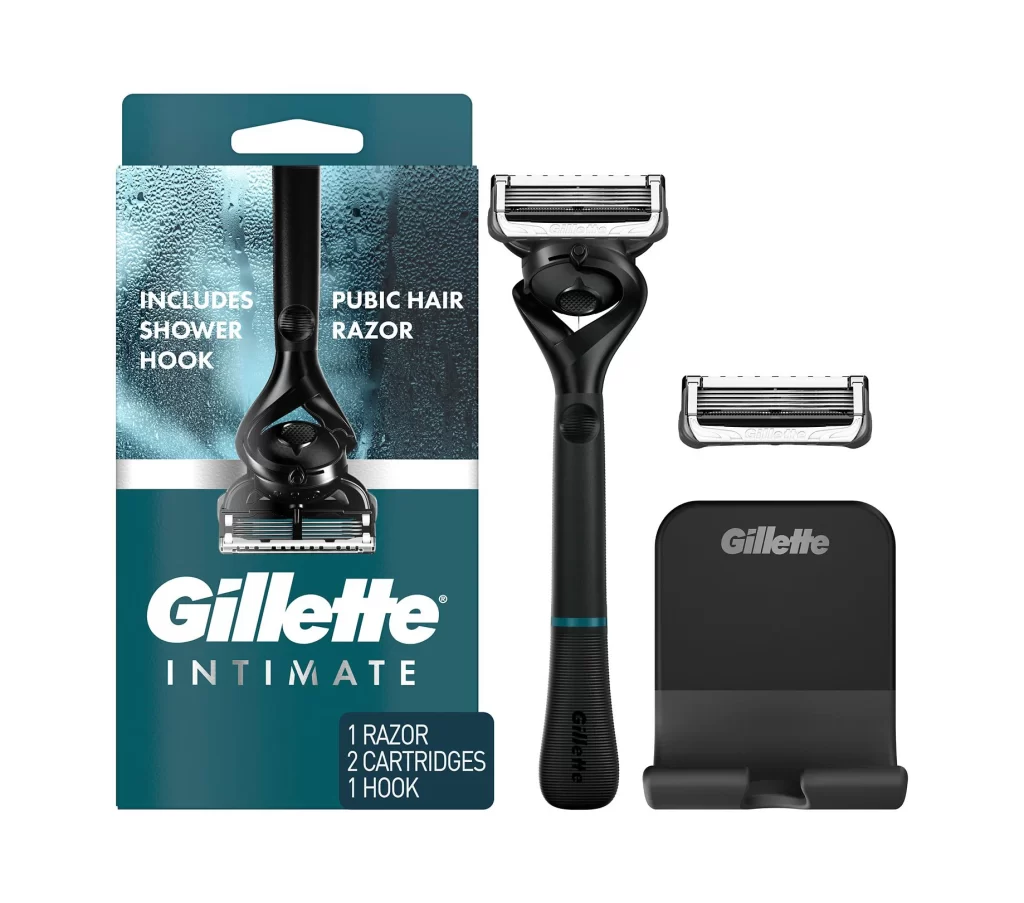
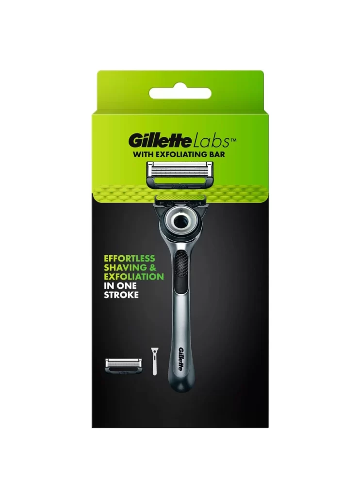
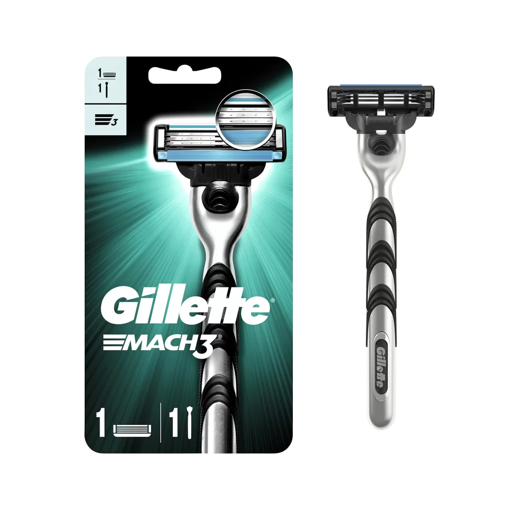
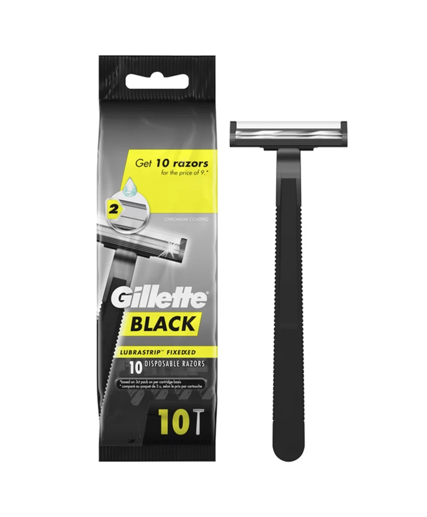
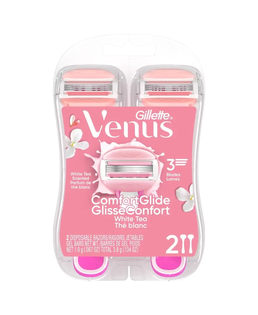
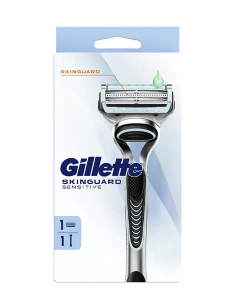
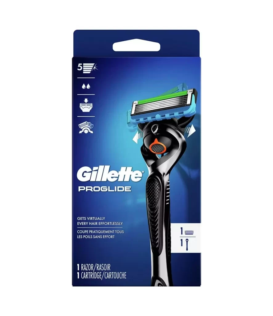
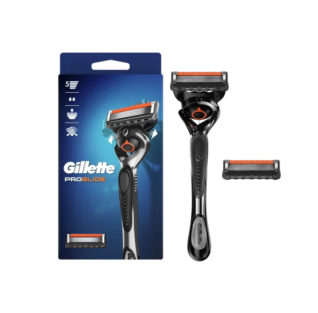
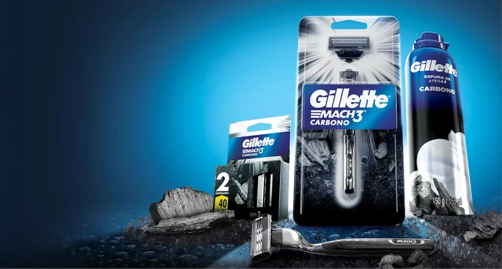
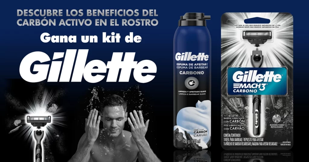
A deep teal-to-black gradient background dominates the Gillette Mach3 retail box, topped by a lighter cyan header featuring a die-cut handle for hanging display. Bold white sans-serif typography occupies the lower half of the cardstock, clearly stating '1 RAZOR 1 CARTRIDGE' alongside the brand name. The physical razor stands adjacent to its packaging, revealing a black handle with textured grip patterns and a blue-trimmed triple-blade cartridge.

Visual hierarchy is established through the stark contrast between the matte finish of the cardboard and the reflective surfaces of the metal razor components. A circular graphic depicting water splashes sits just above the blade image on the box, subtly communicating the product’s functionality without cluttering the layout. The alignment of the razor on the package with the standalone unit creates a satisfying visual continuity, bridging the gap between commercial graphic design and industrial product engineering. Such precise color matching between the printed representation and the physical object demonstrates a high level of brand consistency and manufacturing control.
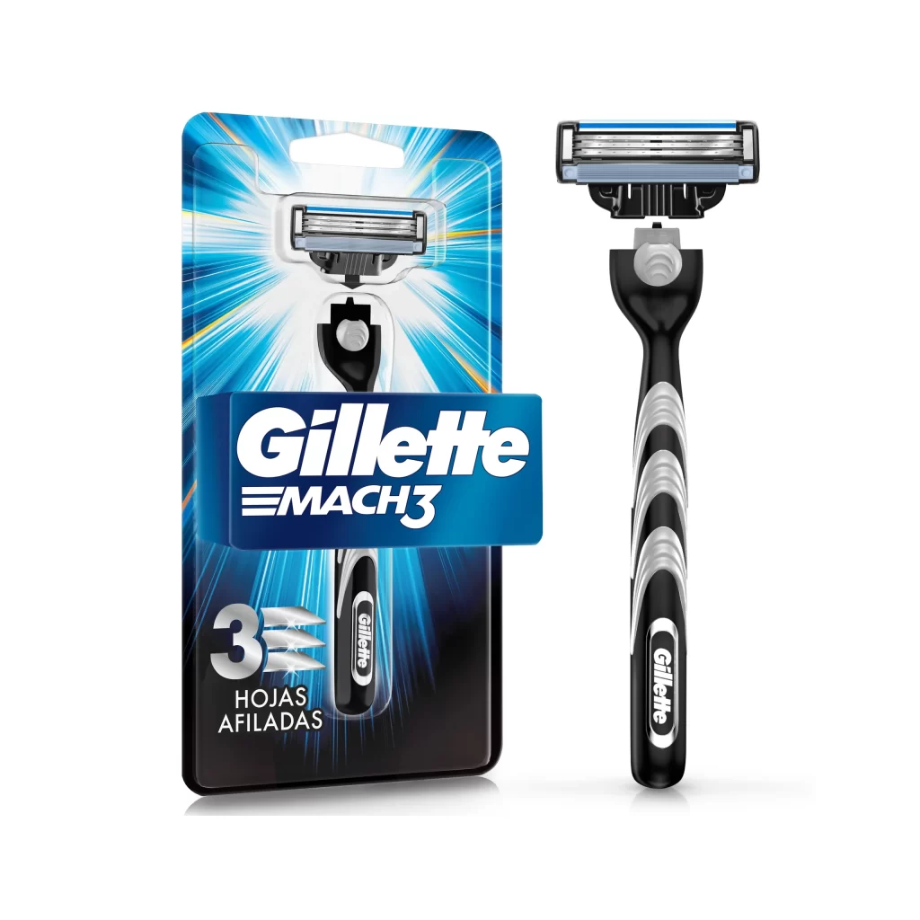
Industrial designers studying ergonomics might analyze the specific texturing patterns on the handle to understand grip dynamics in wet environments. Marketing professionals could utilize this layout to study how minimal text and strategic use of negative space direct consumer attention to key selling points. Furthermore, 3D artists requiring accurate surface references for metallic and rubber materials will find the lighting interplay on the handle particularly useful for texture mapping.