Title

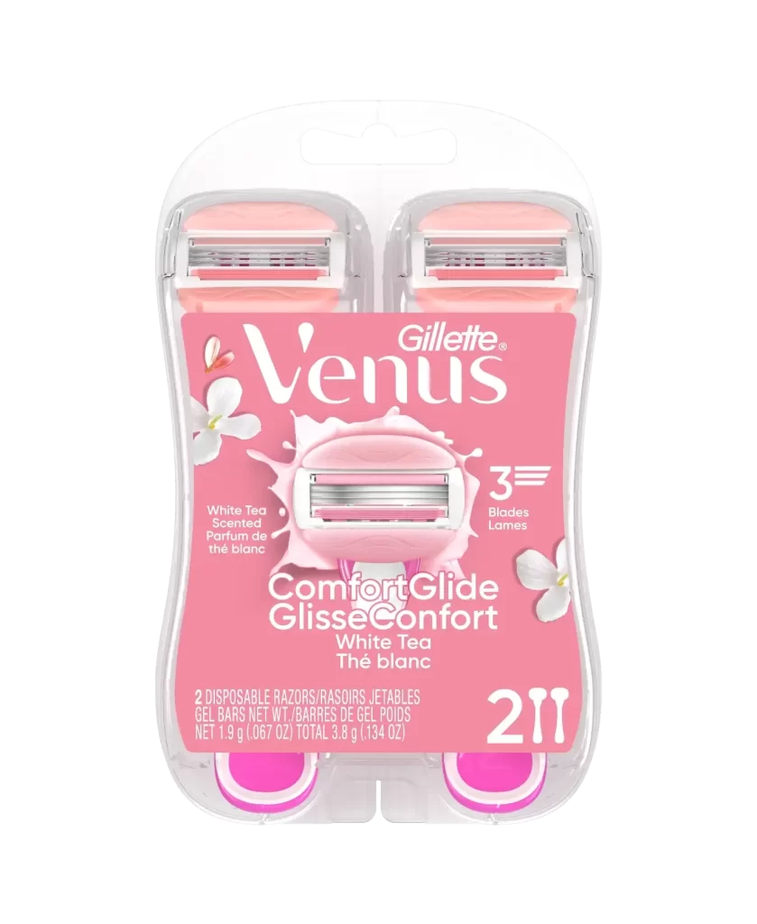
Gillette ComfortGlide White Tea Razor Packaging


Topics

GilletteRazor

Details

Uploaded user: Leo

A clear plastic clamshell encases two disposable razors with pink handles and silver blade cartridges, fronted by a vibrant salmon-pink label displaying the white 'Gillette Venus' logo above a graphic of a razor head surrounded by a liquid splash. White floral accents flank the central image, while the packaging rests on a white surface. The label details 'White Tea' scenting, '3 Blades', and 'ComfortGlide' technology alongside a bold '2' count indicator.

Visual distinction arises from the harmonious blend of soft pastel tones and crisp typography, creating a feminine aesthetic that stands apart from utilitarian shaving products. The transparent casing allows the physical form of the razors to remain visible, bridging the gap between graphic design and tangible consumer goods. Such a composition effectively communicates freshness and comfort through its specific color palette and organic motifs.

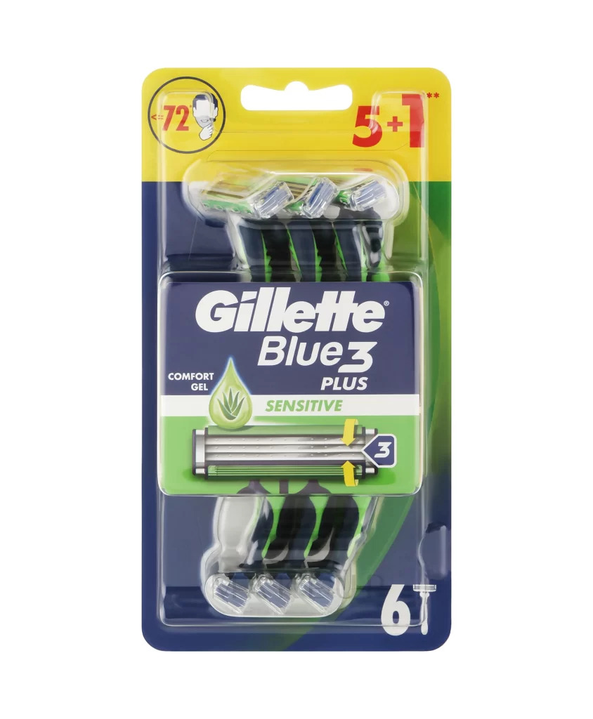
Brand managers analyzing competitive positioning in the personal care sector would find this visual data useful for assessing current market trends in feminine hygiene packaging. Packaging engineers might study the structural layout to understand how transparency is utilized to showcase product features without opening the box. Marketing teams could also leverage these visual elements when planning campaigns that emphasize sensory attributes like scent and smoothness.