Title

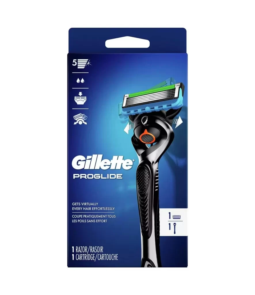
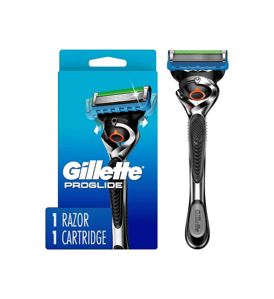
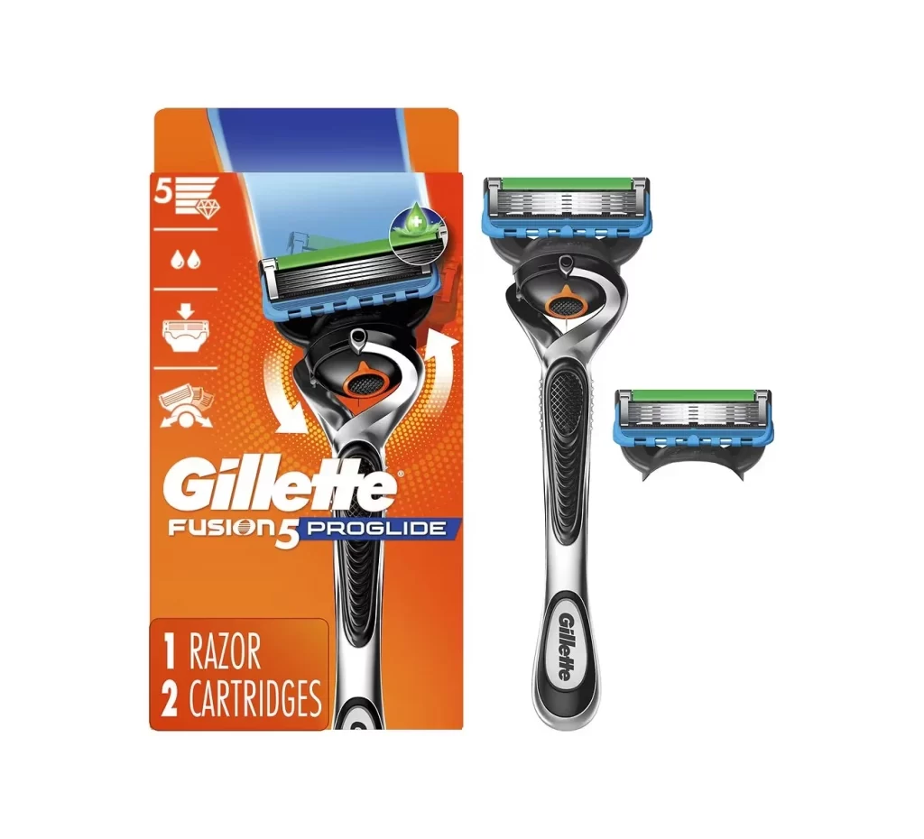
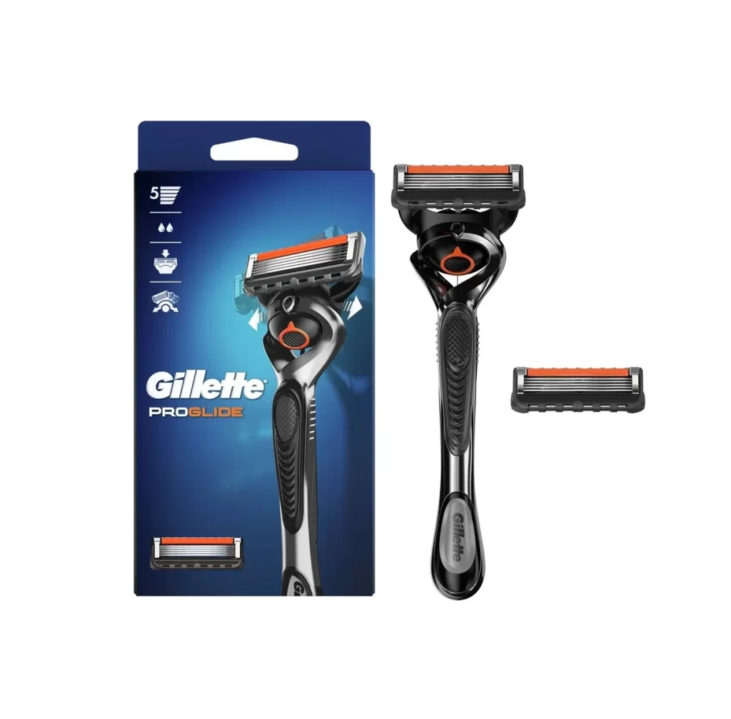
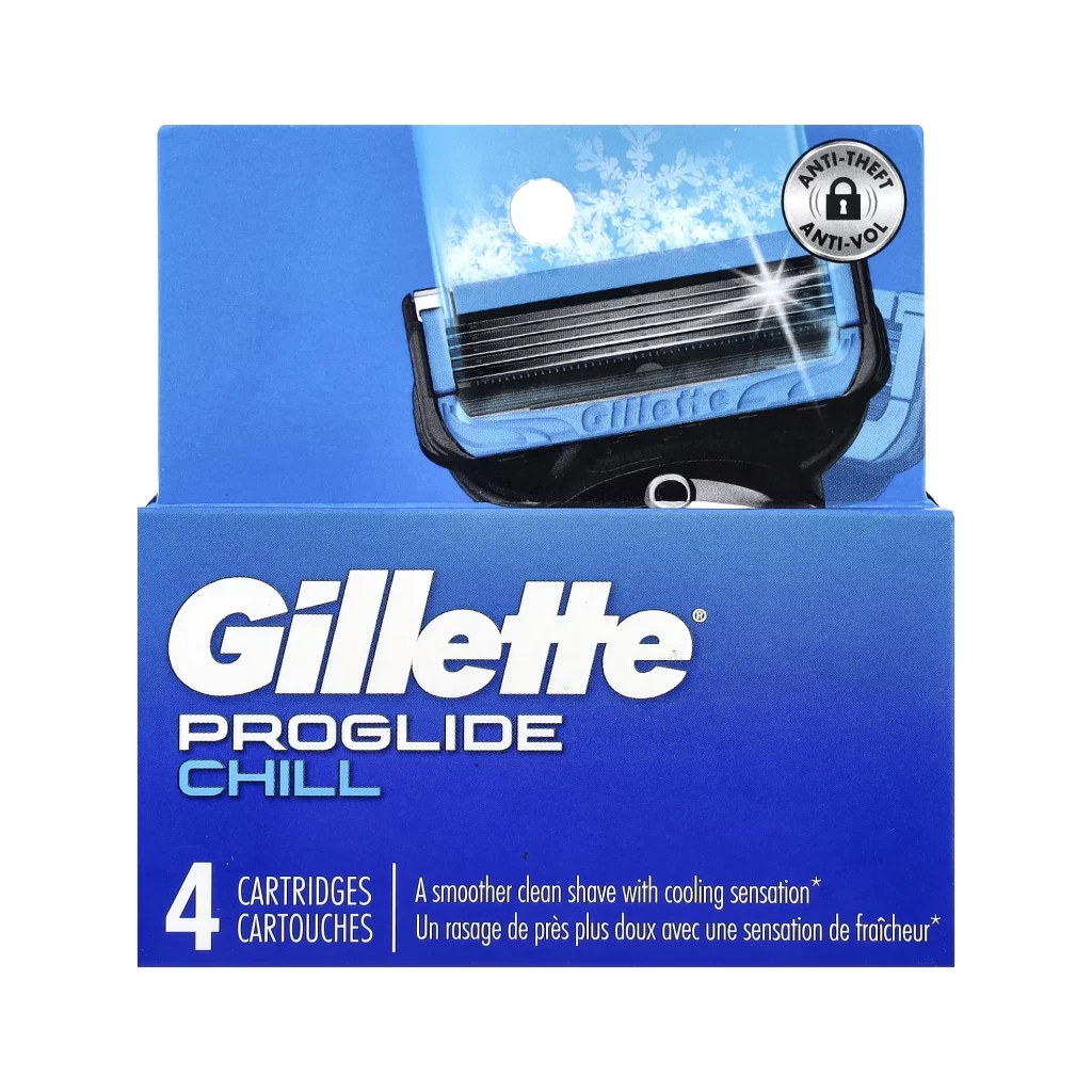
Gillette ProGlide Razor Front Packaging


Topics

GilletteRazor

Details

Uploaded user: Leo

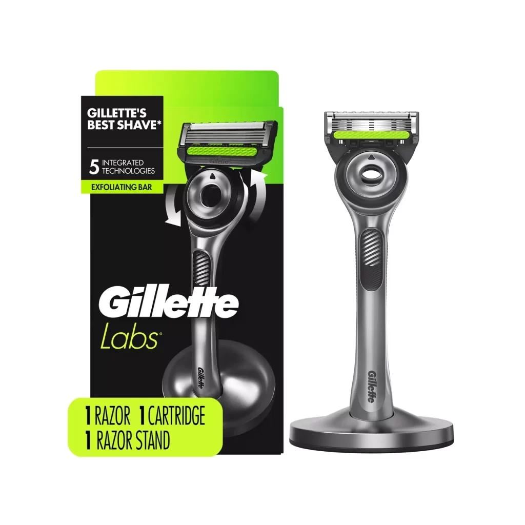
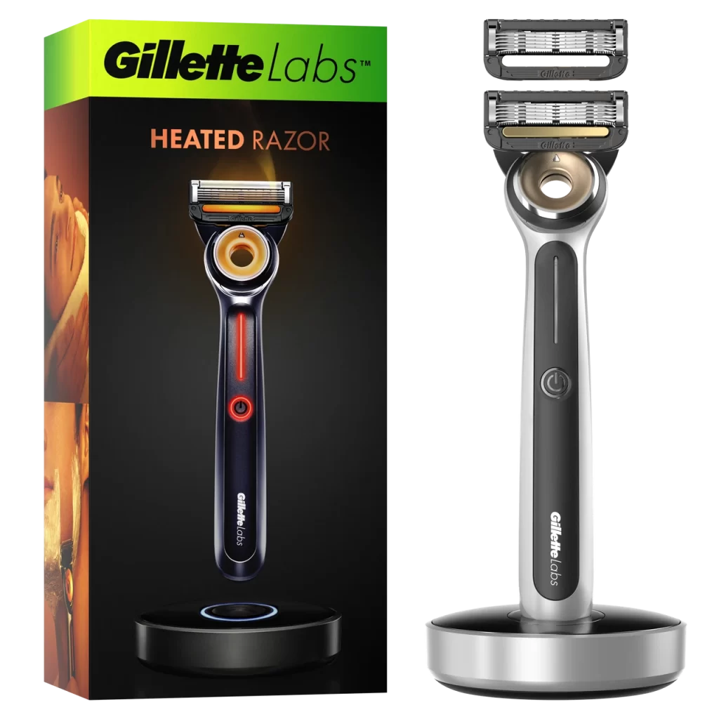
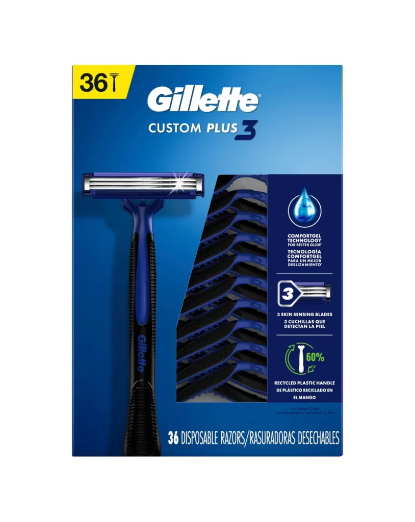
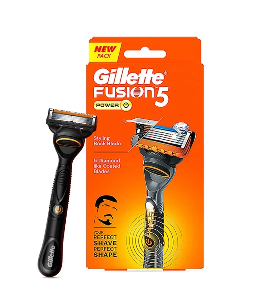
A deep navy blue gradient background frames the Gillette ProGlide razor packaging, where the razor head angles slightly toward the viewer in a high-contrast product shot. The iconic white Gillette logo and 'PROGLIDE' text sit left of center, while the physical razor dominates the right side, showcasing its black ergonomic handle with textured rubber grip and an orange accent button. Visible icons on the upper left indicate five blades, lubrication, trimmer functionality, and flex ball technology.

Visual hierarchy is established through the strategic use of cool tones against metallic silver blade components, creating a clinical yet premium aesthetic typical of personal care branding. The interplay between matte black handle textures and glossy plastic cartridge housing demonstrates sophisticated material differentiation that signals both durability and precision engineering. Such deliberate color blocking—specifically the orange pivot point—serves as a functional visual anchor that guides the eye toward the razor’s mechanical innovation while maintaining overall package cohesion.
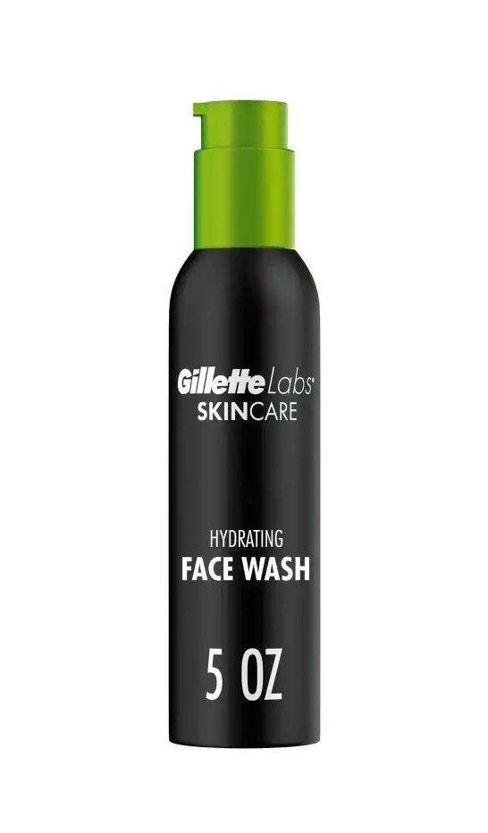
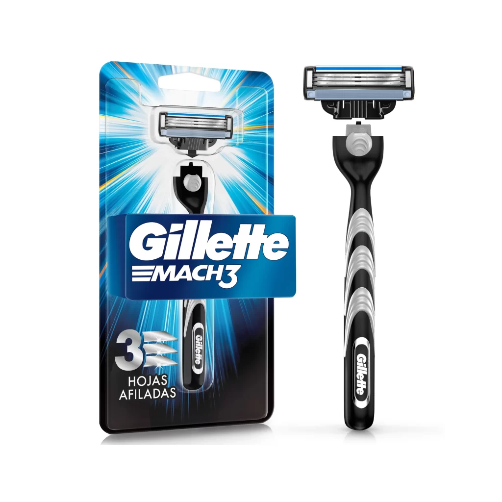
Brand managers analyzing competitive positioning in the men’s grooming sector would examine this layout to understand how typography scales relative to product imagery within constrained vertical formats. Industrial designers studying ergonomics could reference the grip patterns and handle curvature shown here when developing next-generation handheld tools. Marketing teams preparing retail shelf tests might utilize this specific arrangement of iconography and copy to evaluate consumer comprehension of technical features at varying distances.