Title

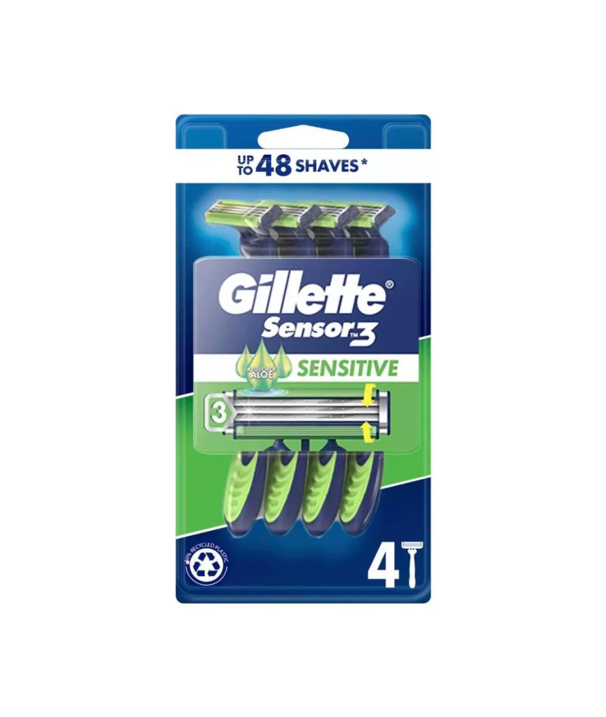
Gillette Sensor3 Sensitive Razor Packaging


Topics

GilletteRazor

Details

Uploaded user: Leo

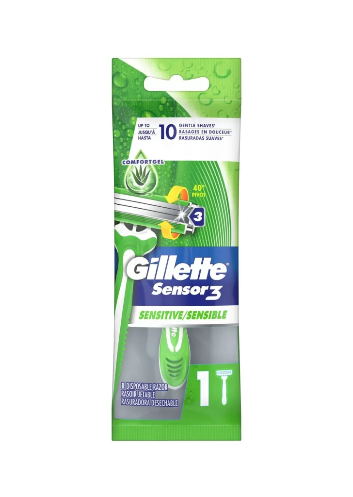
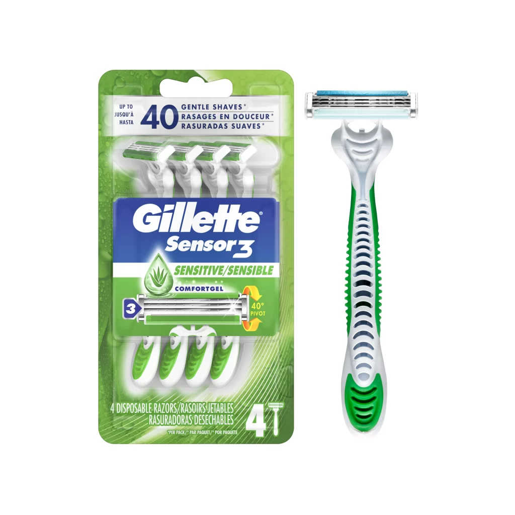
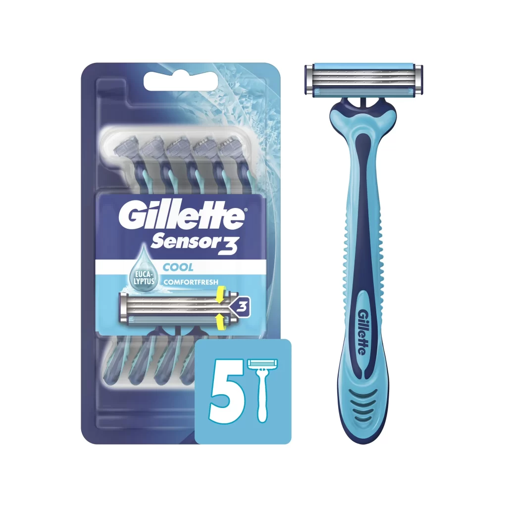
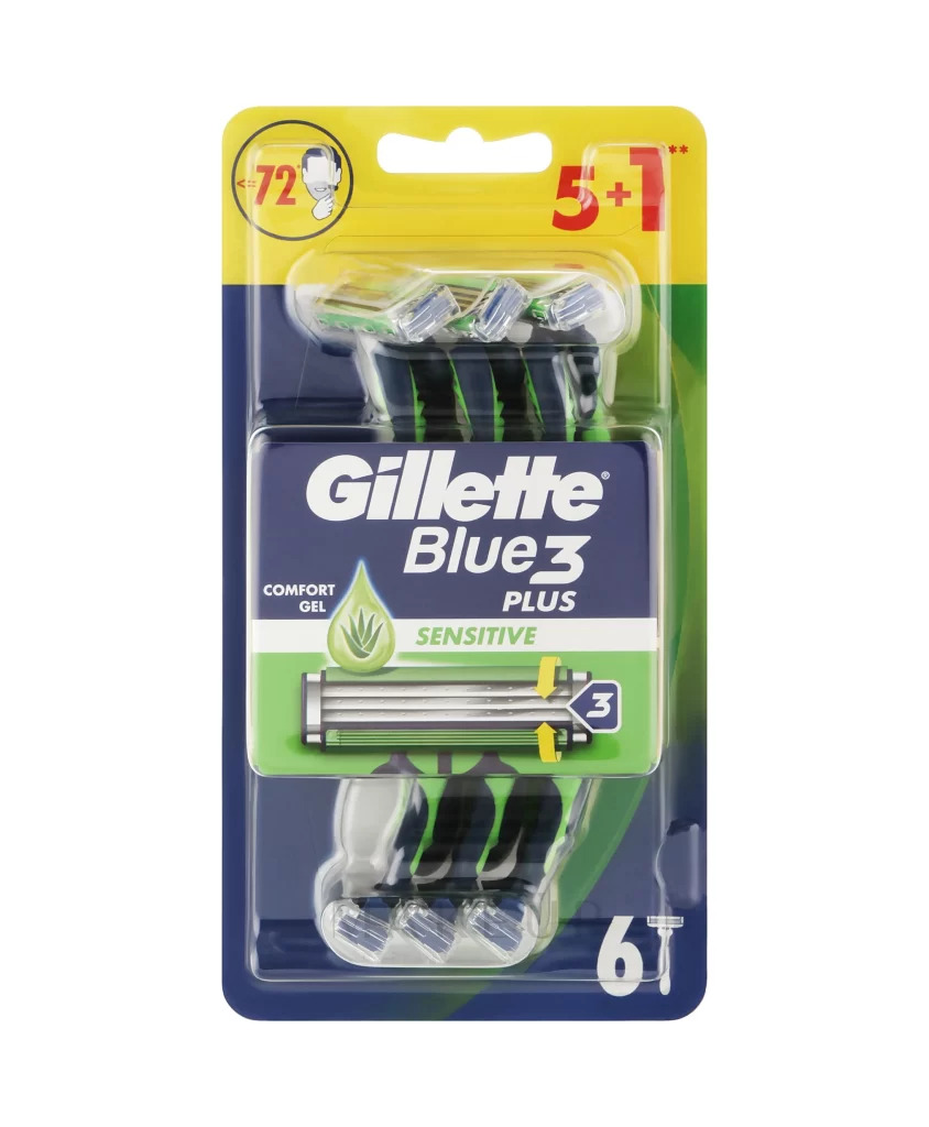
Dominating the frame is a vertical blister pack of the Gillette Sensor3 Sensitive razor, set against a stark white background that emphasizes its vibrant green and blue color palette. The packaging features a translucent upper section with water droplet graphics, while the lower half utilizes a solid green field to anchor the bold, white Gillette logo. A clear plastic window reveals the metallic silver blade cartridge and the ergonomic green handle, with yellow arrows indicating the 40-degree pivot mechanism.
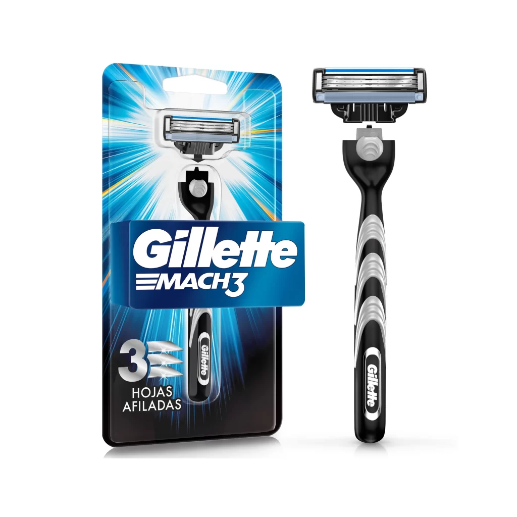
Visual hierarchy is established through the strategic use of the 'ComfortGel' aloe icon, which immediately signals the product's soothing properties to consumers with sensitive skin. The typographic contrast between the heavy blue Sensor3 branding and the delicate white 'Sensitive' subtext creates a balanced aesthetic that feels both clinical and gentle. Furthermore, the inclusion of multilingual text for 'gentle shaves' suggests a design optimized for broad international retail distribution.

Packaging engineers might study this layout to understand how to effectively communicate technical features like the three-blade system within a confined vertical space. Brand strategists could utilize this as a case study in color-coded product differentiation, specifically how green hues are leveraged to denote skin-friendly formulations. Additionally, industrial designers may reference the handle's textured grip patterns visible through the packaging when developing their own ergonomic shaving tools.