Title

Gillette Foamy Sensitive Shave Gel Packaging


Topics

GilletteShave Gel

Details

Uploaded user: Leo

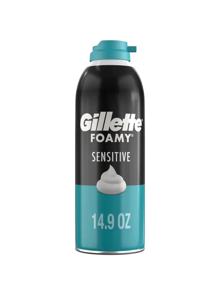
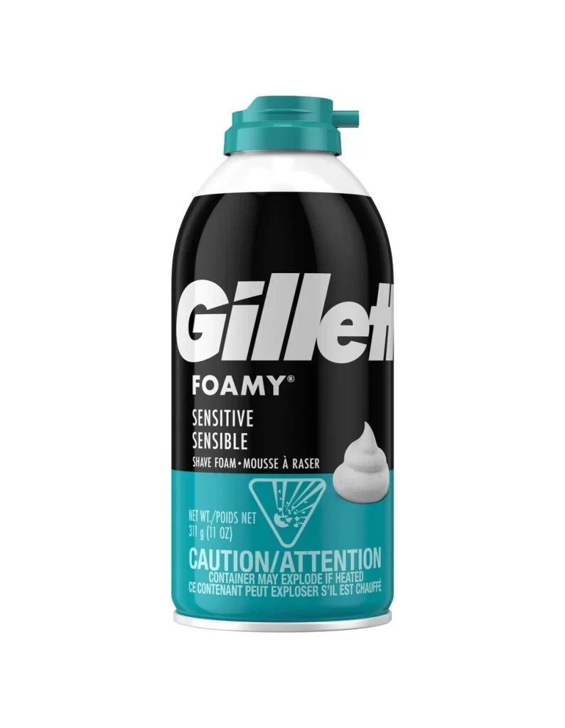
The cylindrical aerosol canister features a two-tone vertical composition with a matte black upper field and a vibrant teal lower band. Bold white sans-serif lettering spells out the 'Gillette' logotype above the smaller 'FOAMY' and 'SENSITIVE' descriptors, while a graphic of white foam sits at the color boundary above the '14.9 OZ' volume marking. A teal plastic cap with an integrated flip-top crowns the metal container, which stands on a white surface.
Visual hierarchy is established through the aggressive contrast between the dark upper register and the saturated cyan base, effectively drawing the eye to the brand identity before settling on product specifics. The inclusion of the tactile foam graphic serves as a direct sensory cue, bridging the gap between the industrial metal packaging and the expected user experience. Such a layout relies on geometric simplicity and high-contrast typography to ensure legibility across various retail environments, utilizing the color block to demarcate functional information from branding elements.

Industrial designers analyzing consumer goods packaging will find value in the precise color matching between the cap and the lower label band. Marketing teams could utilize this visual data to audit shelf presence or study competitor color blocking strategies within the personal care sector. Furthermore, 3D artists requiring accurate texture maps for cosmetic product renders can reference the specific material finishes, from the diffuse black coating to the reflective silver rim.