Pasta Prima Spaghetti Blue and Green Pasta Packaging
Topics
Details
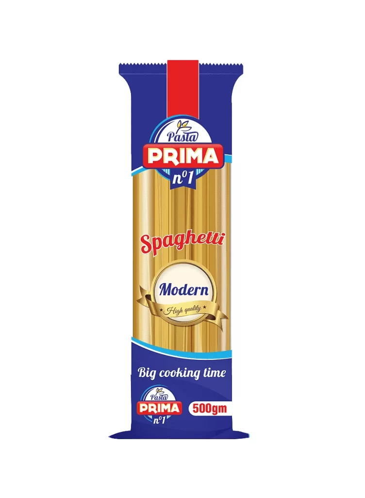
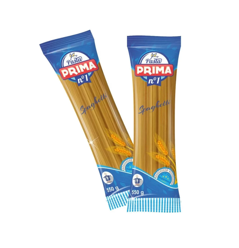
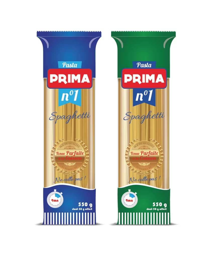
Two vertical packages of Prima brand spaghetti stand side-by-side on a white background, showcasing a clear variation in color schemes. The left package features a deep royal blue header and footer, while the right counterpart utilizes a vibrant forest green for the same sections. Both designs display the 'PRIMA' logo in bold red, flanked by 'Pasta' and 'n°1' text above the word 'Spaghetti' written in elegant cursive script.
Visual interest is generated by the consistent application of branding elements across two distinct color palettes, allowing for immediate product line recognition. A circular gold seal proclaiming ‘Tenue Parfaite à la Cuisson’ anchors the center of each bag, positioned above the instructional text ‘Ne colle pas !’. The inclusion of a stopwatch icon indicating a nine-minute cooking time provides functional data that balances the decorative typography of the ‘Spaghetti’ script.
Brand managers and packaging engineers might utilize this visual to analyze how color coding affects shelf presence and consumer categorization. Illustrators studying commercial food photography can examine the way lighting interacts with the glossy plastic film and the matte texture of the dried wheat. Furthermore, typographers may find value in studying the hierarchy between the sans-serif weight of the primary logo and the elegant cursive used for the specific pasta shape.