Pasta Prima Vermicelli yellow pasta Packaging
Topics
Details
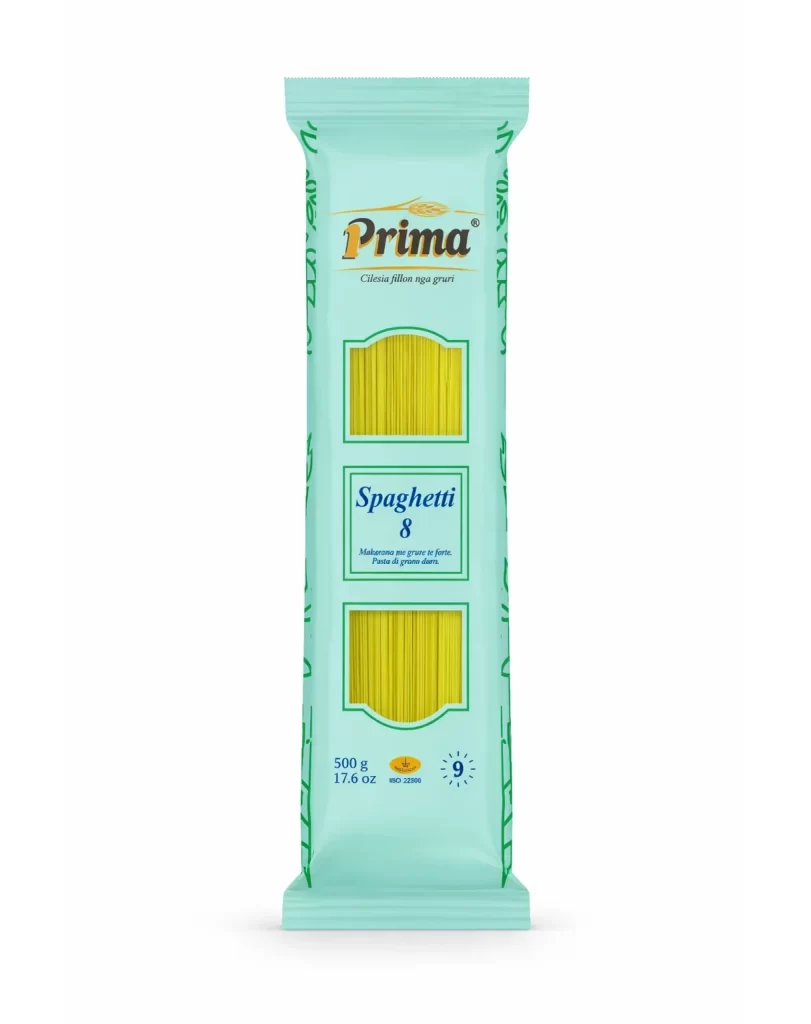
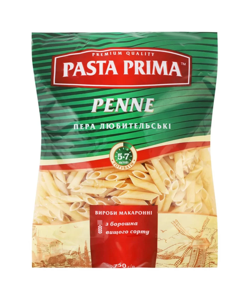
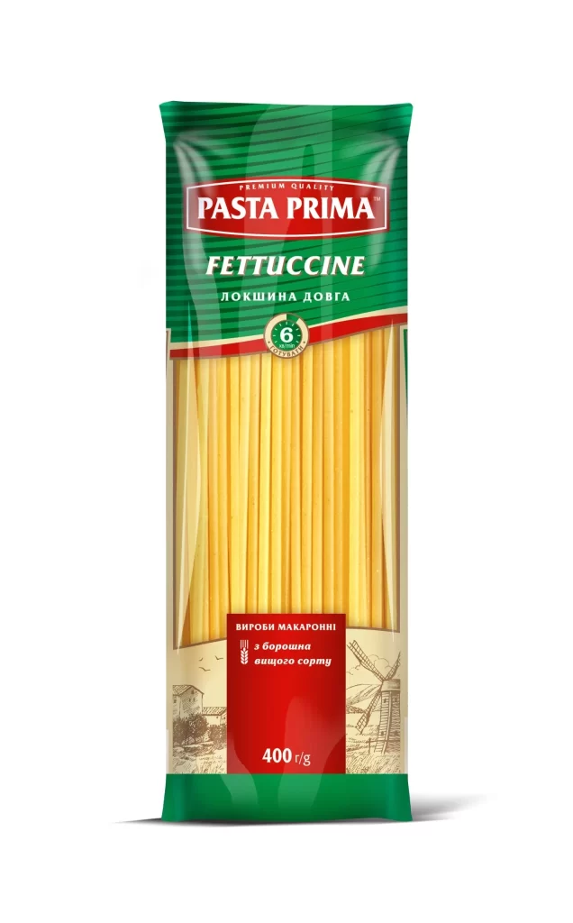
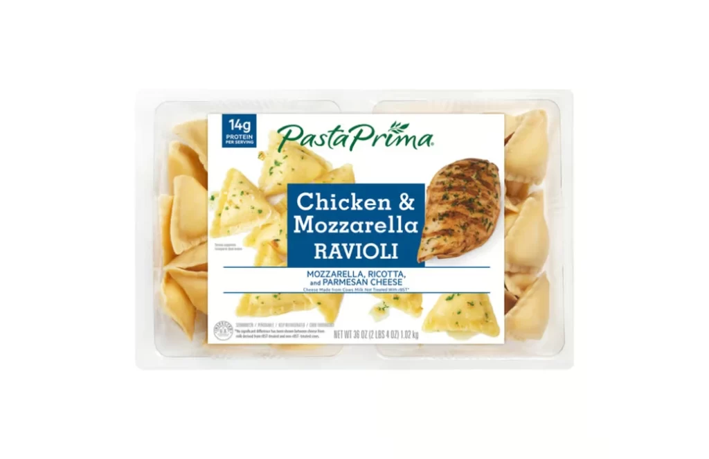
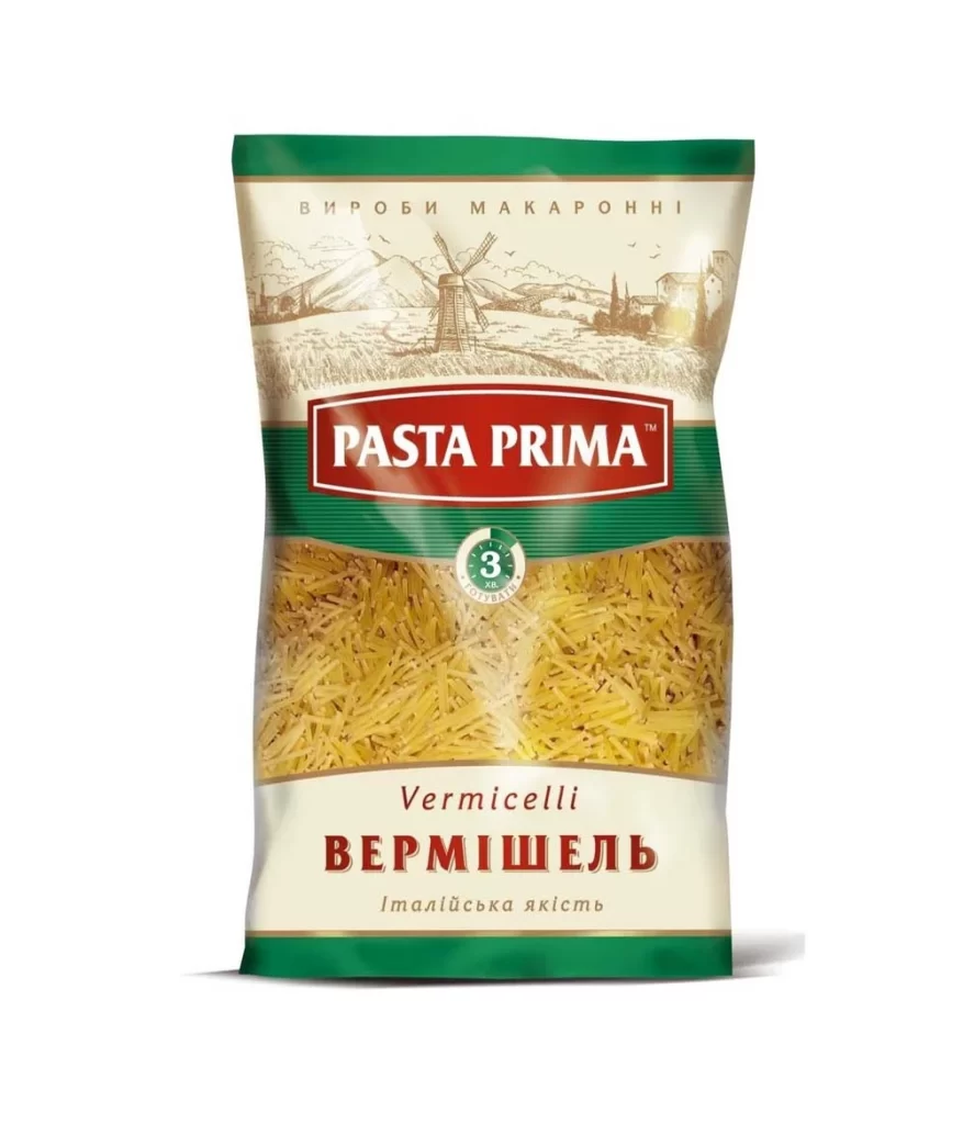
A flexible plastic pouch of Pasta Prima vermicelli stands upright on a white surface, illuminated by soft, even studio lighting that eliminates harsh shadows. The packaging features a distinct tri-band color scheme: deep forest green caps the top and bottom, while the middle section displays the actual golden-yellow pasta through a clear window. A cream-colored header contains the Ukrainian text 'ВИРОБИ МАКАРОННИ' above a pastoral windmill illustration, with the brand name 'PASTA PRIMA' emblazoned in white serif lettering across a central red rectangular field.
Visual hierarchy is established through a prominent burgundy rectangular badge containing ‘PASTA PRIMA’ in bold white serif typography, immediately drawing the eye to the brand identity. Below this, a circular green seal indicates a 3-minute cooking time, providing functional information at a glance. The lower portion balances bilingual labeling, presenting ‘Vermicelli’ in an elegant italic script above the larger, blocky Cyrillic ‘ВЕРМИШЕЛЬ’, creating a clear distinction between international and local market positioning.
Brand managers analyzing Eastern European food packaging trends would examine this layout to understand effective use of agricultural imagery in grain-based product marketing. Packaging engineers could reference the structural proportions of the green bands and the placement of the transparent window when designing similar stand-up pouches for dry goods. Typography specialists might study the contrast between the authoritative red brand mark and the more delicate script used for the product name to inform their own label hierarchy decisions.