Pasta Prima Cheese Ravioli yellow ravioli Packaging
Topics
Details
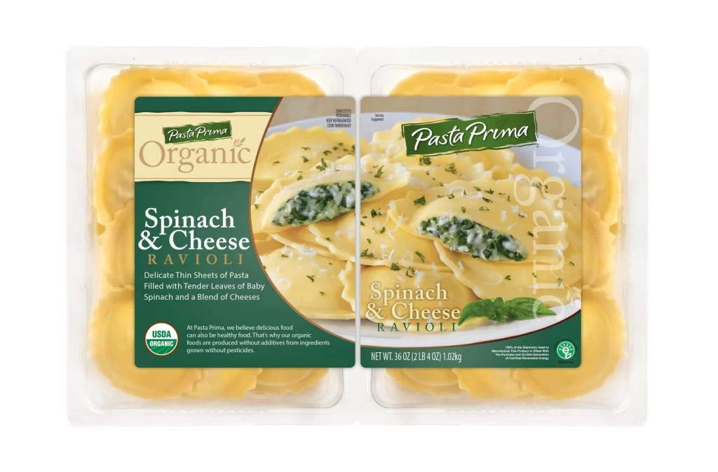
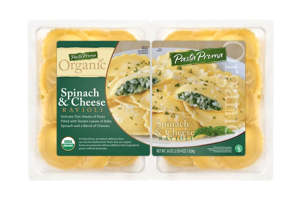
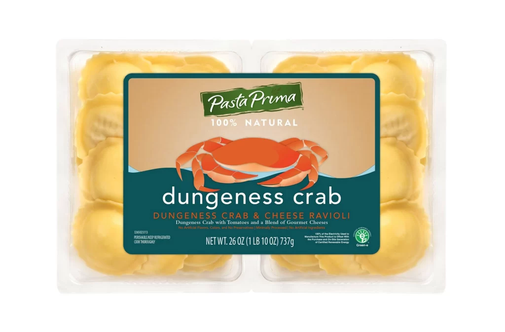
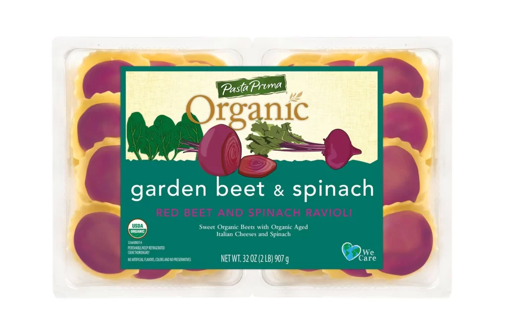
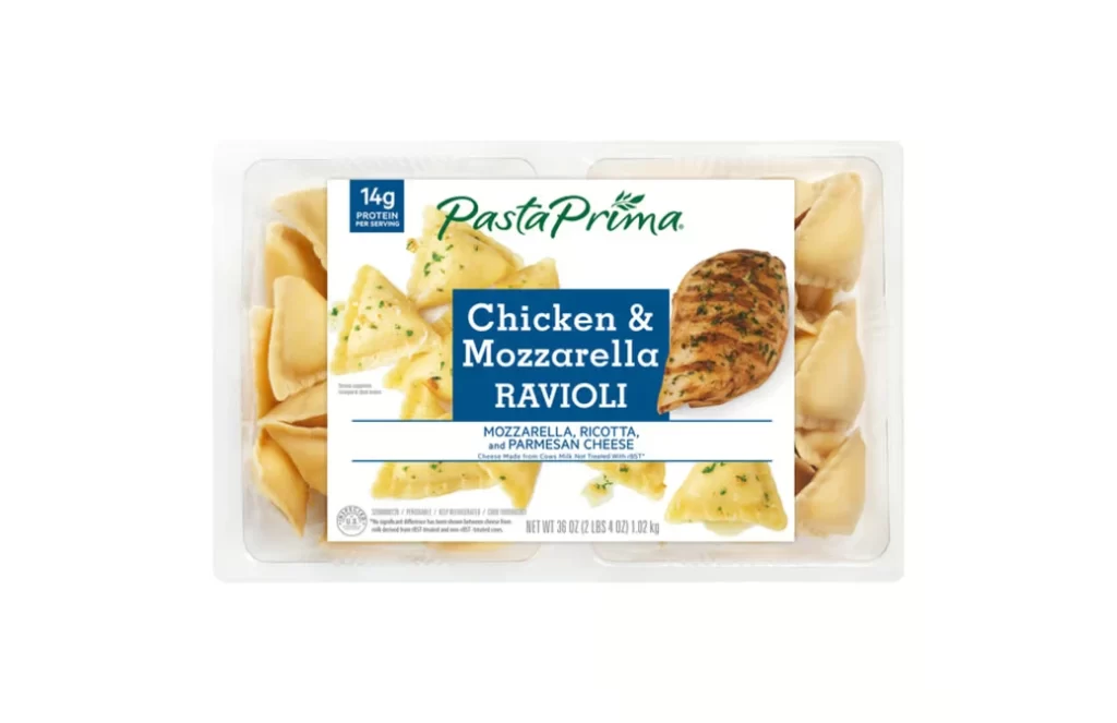
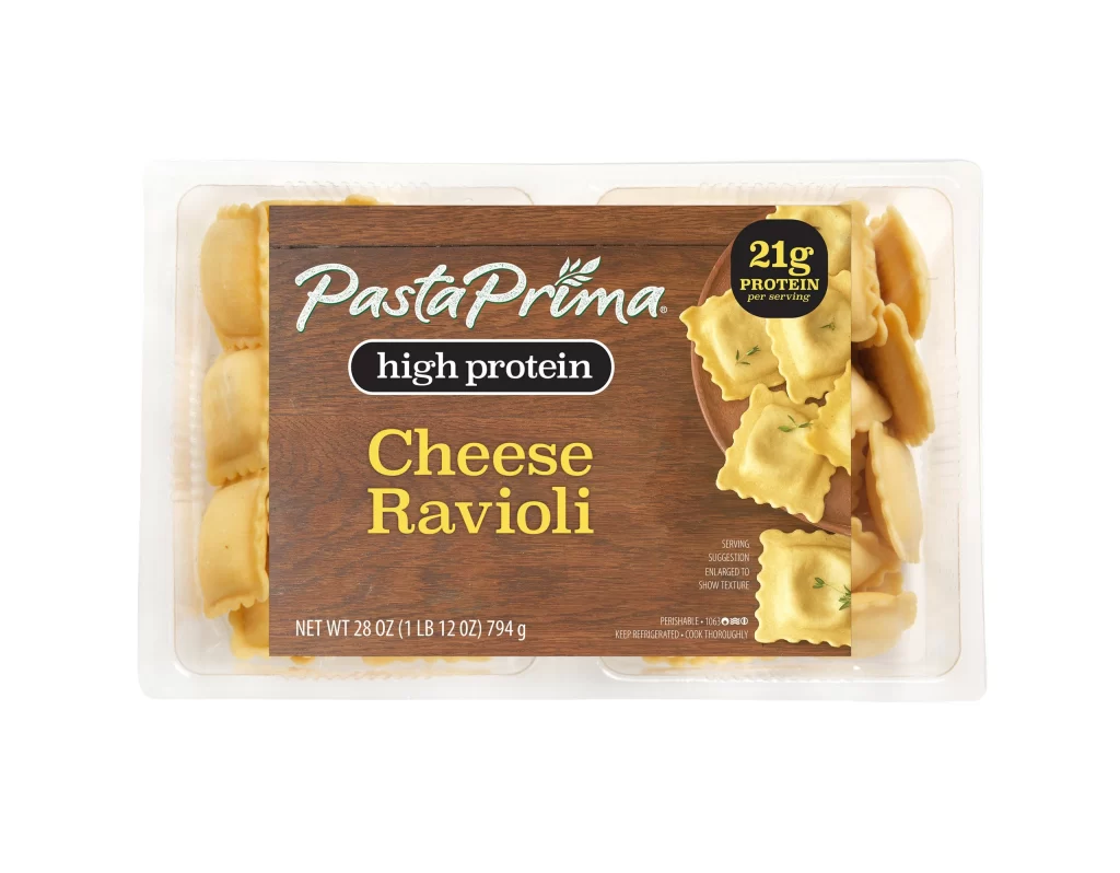
Centered within a clear plastic clamshell container, the Pasta Prima Cheese Ravioli package features a prominent brown label designed to mimic the texture of natural wood grain. The brand name appears in a flowing white script, positioned directly above a stark black oval containing the words 'high protein' in clean white sans-serif type. Below this, the product name 'Cheese Ravioli' is rendered in a bold, golden-yellow serif font that complements the pale yellow pasta visible through the transparent packaging on both sides of the label.
Visual hierarchy plays a crucial role in this design, with a circular black badge in the upper right corner aggressively highlighting '21g PROTEIN per serving' to immediately signal nutritional value to health-conscious shoppers. The juxtaposition of the rustic wood-textured background against the clinical black and white informational elements creates an aesthetic that feels both artisanal and scientifically engineered. Furthermore, the photographic inclusion of actual ravioli garnished with herbs on the right side of the label provides a tangible appetizing cue that bridges the gap between the dry statistics and the edible product.
Food stylists and commercial photographers might study this composition to understand how to balance text-heavy nutritional information with appealing food photography within a confined retail space. Brand strategists could analyze the specific color palette of browns, blacks, and yellows to determine how earthy tones can be leveraged to make processed foods appear more wholesome and premium. Additionally, packaging engineers may examine the structural layout to see how the label integrates with the physical form of the plastic tray without obscuring the view of the actual pasta contents.