Pasta Prima n1 Spaghetti brown spaghetti Packaging
Topics
Details
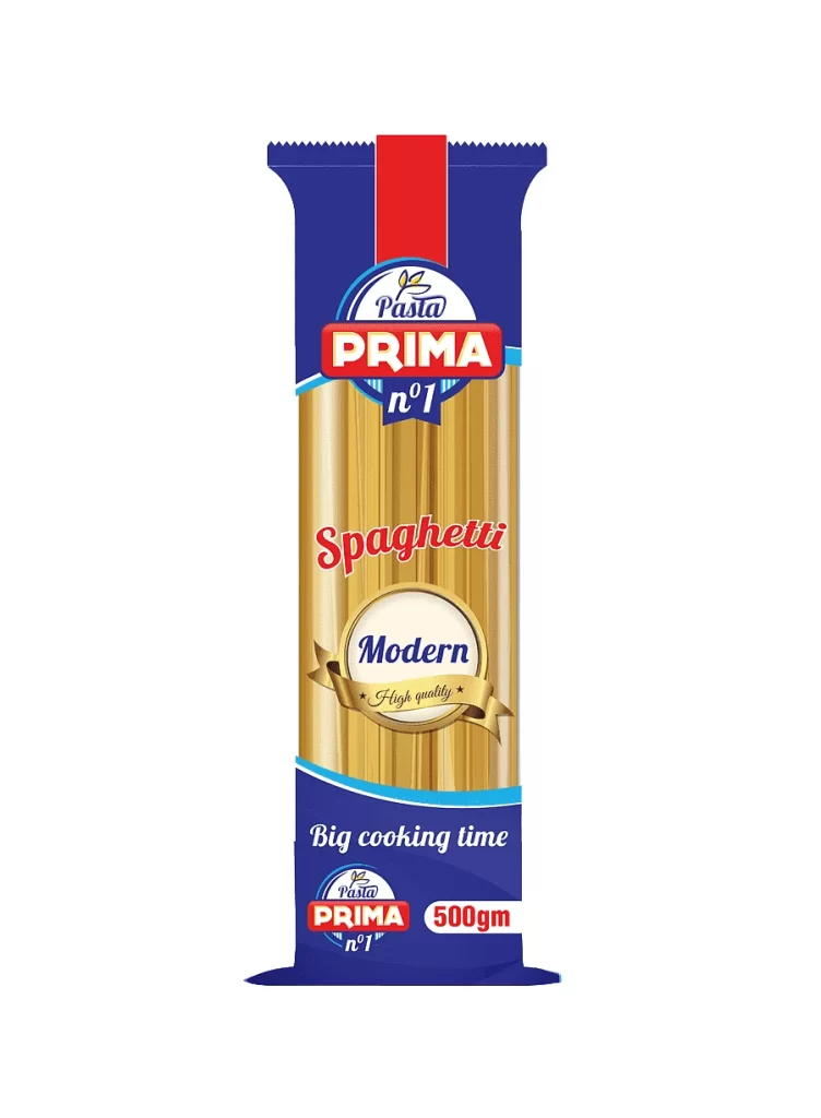
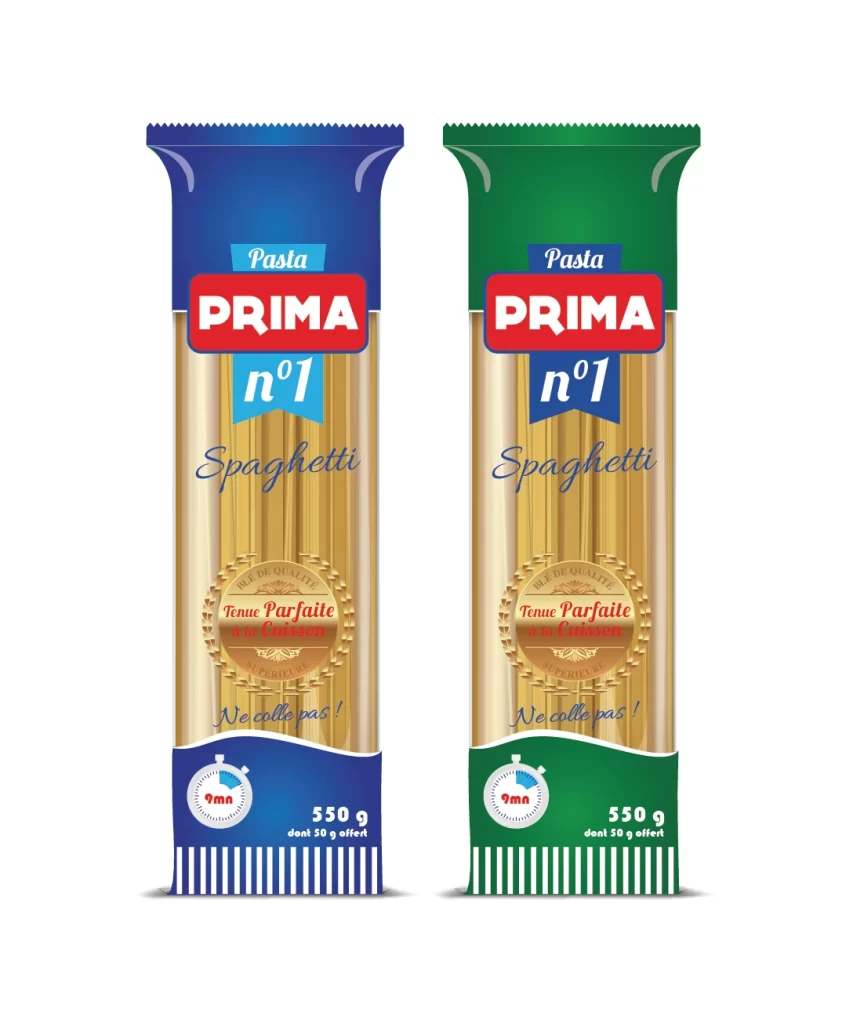
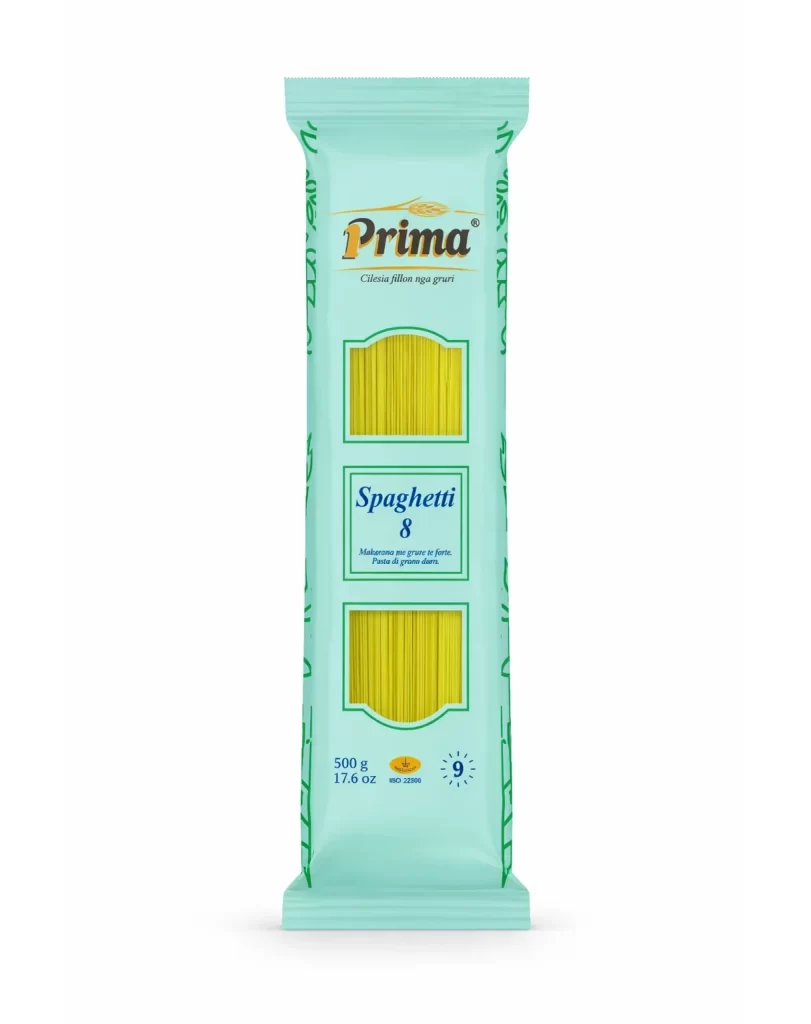
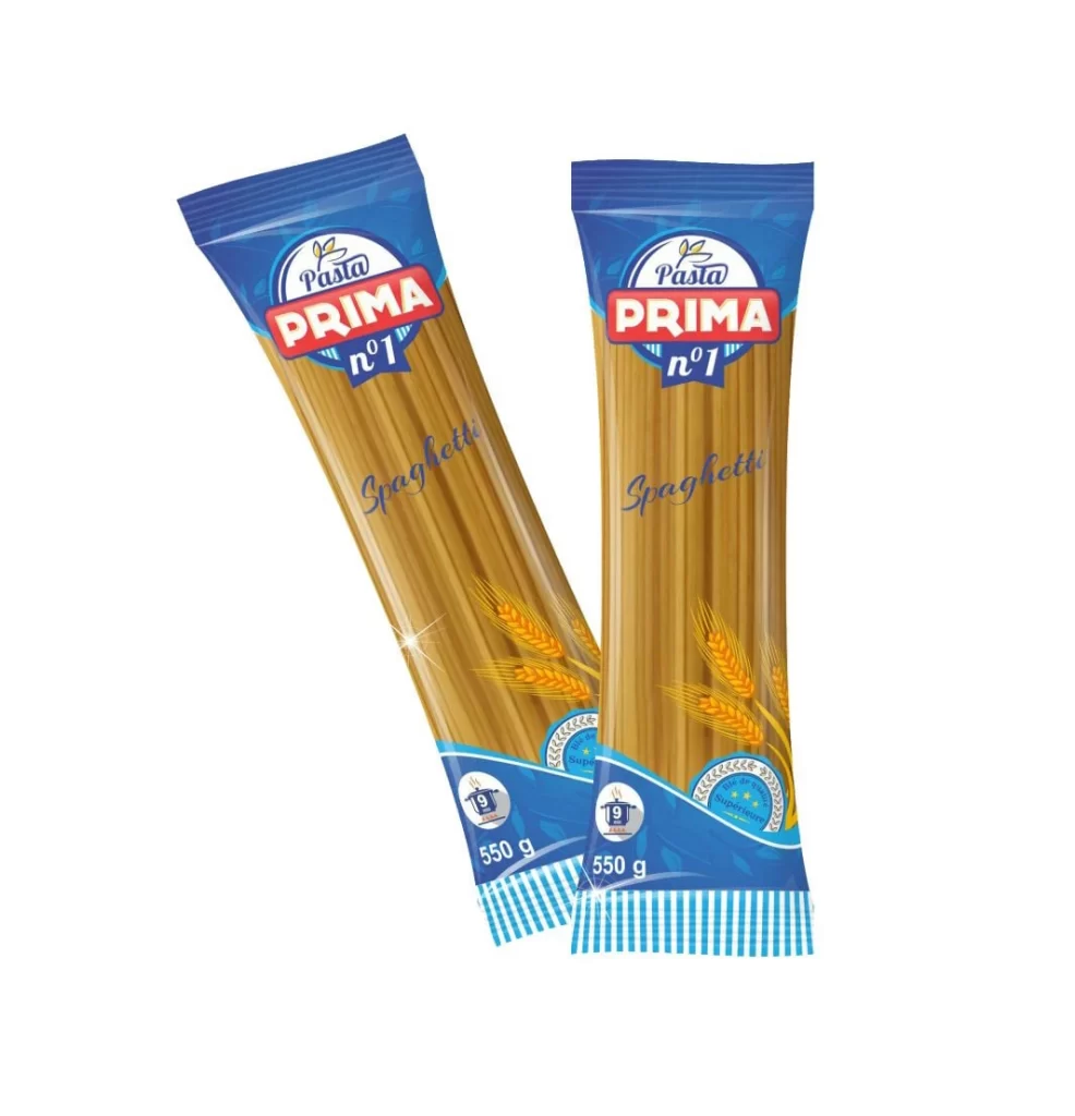
Two identical 550g packets of Pasta Prima n°1 Spaghetti lean casually against one another in a relaxed diagonal composition on a white surface. Vibrant blue headers and footers sandwich a transparent central window that reveals the golden-brown hue of the long pasta strands inside. Prominent red lettering spells out the brand name above a stylized wheat emblem, while the word 'Spaghetti' appears in elegant blue script across the center of each package.
Visual interest is generated through the clever use of transparency, which allows the organic texture of the dried wheat product to serve as the primary design element. The color palette relies on the high contrast between the cool royal blue accents and the warm amber tones of the grain, anchored by the authoritative weight of the bold red typography. Subtle highlights on the plastic film suggest a glossy, reflective material finish that adds a sense of premium quality to the overall presentation.
Commercial illustrators studying food photography will find the lighting angles and reflections on the polymer surface particularly instructive for rendering realistic textures. Brand strategists might analyze the typographic hierarchy to understand how to balance playful script with industrial sans-serif fonts in consumer goods. Furthermore, packaging engineers could utilize this as a case study for integrating agricultural imagery into modern layout structures without cluttering the essential nutritional information.