Pasta Prima Penne beige pasta Packaging
Topics
Details
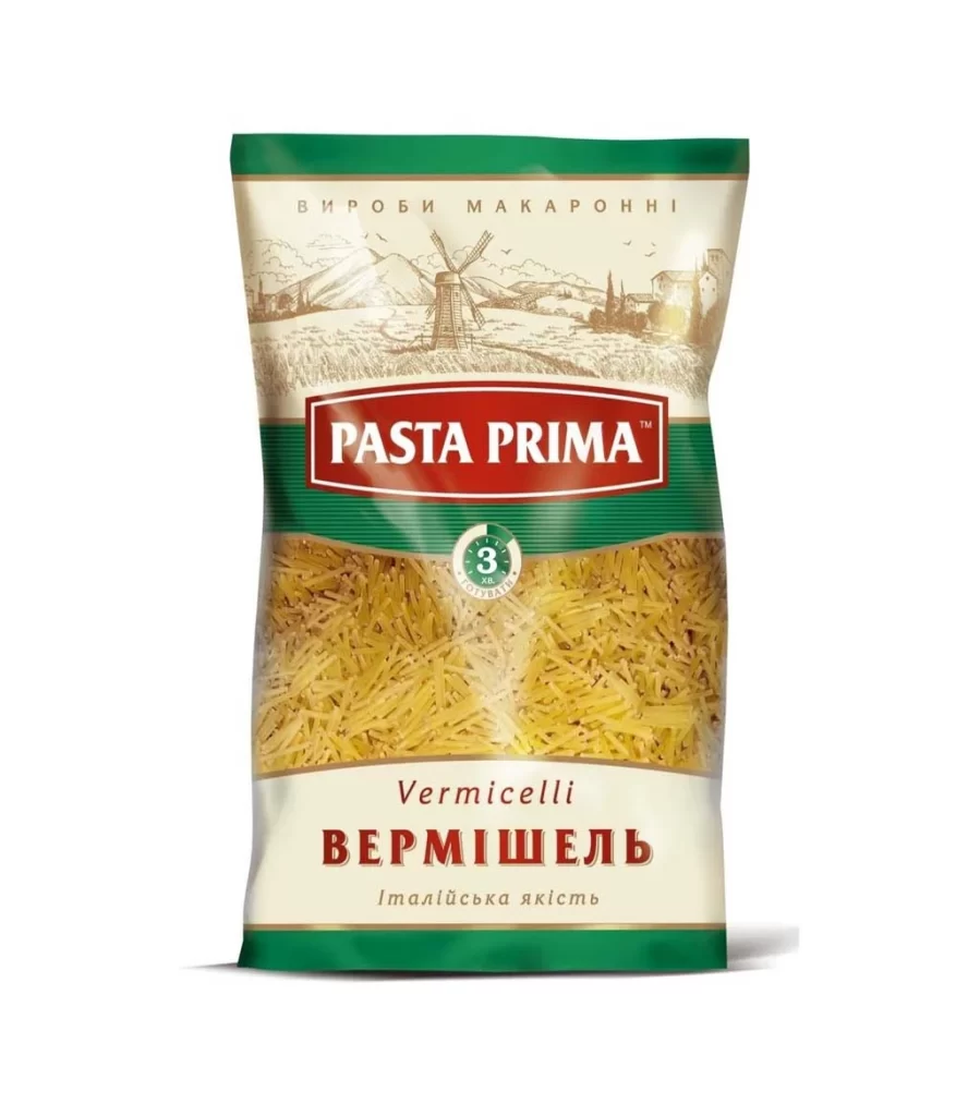
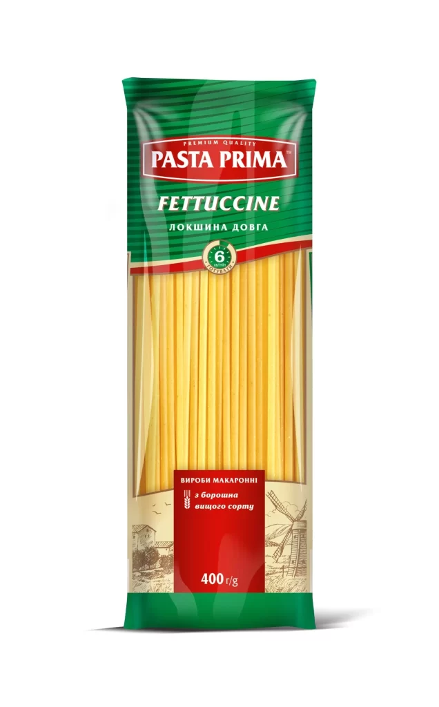
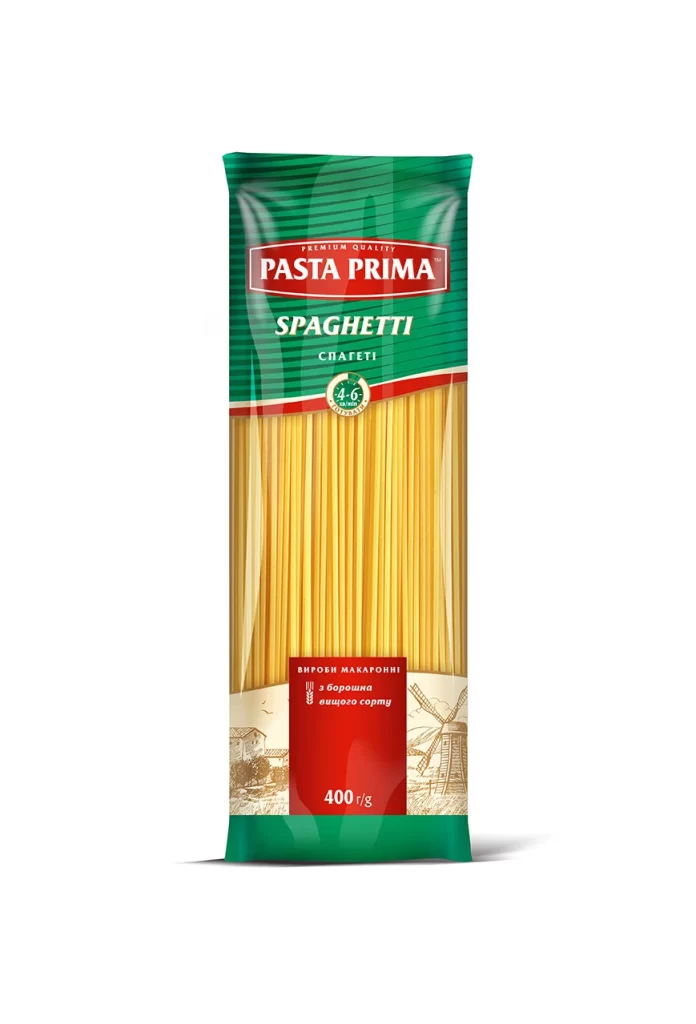
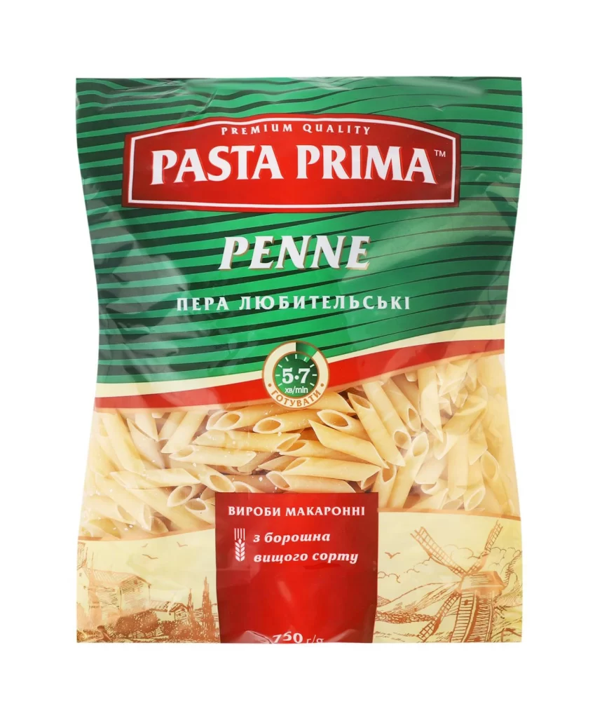
A vibrant green background with diagonal darker stripes sets the stage for this 750g package of Pasta Prima Penne. The upper half is dominated by a bold red rectangular banner containing the brand name in white serif lettering, with 'PREMIUM QUALITY' arched just above it. Below the main logo, 'PENNE' appears in large white sans-serif characters, followed by Cyrillic text translating to 'favorite feathers'. A circular green badge indicates a 57-minute cooking time, while a red ribbon separates the graphic top from the photographic bottom section showing actual penne pasta and vintage windmill illustrations.
What makes this packaging visually striking is its confident use of contrasting color blocks and typographic hierarchy. The combination of emerald green stripes against the deep crimson brand banner creates immediate shelf presence, while the mix of English and Ukrainian text suggests a product tailored for Eastern European markets. The transition from flat graphics to realistic food photography adds dimensional interest, and the inclusion of pastoral sketches at the base lends an artisanal, traditional feel to the mass-market item.
Food packaging designers studying color theory applications in grocery retail would find this example particularly useful for analyzing how primary colors influence purchasing decisions. Brand identity specialists could reference the logo placement and font pairings when developing similar premium-positioned dry goods. Illustrators working on rustic or agricultural-themed projects might draw inspiration from the windmill motifs and landscape elements integrated into the lower design zone.