Pasta Prima Spinach & Mozzarella Fresh Pasta Packaging
Topics
Details
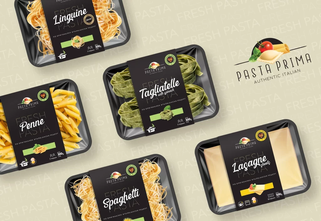
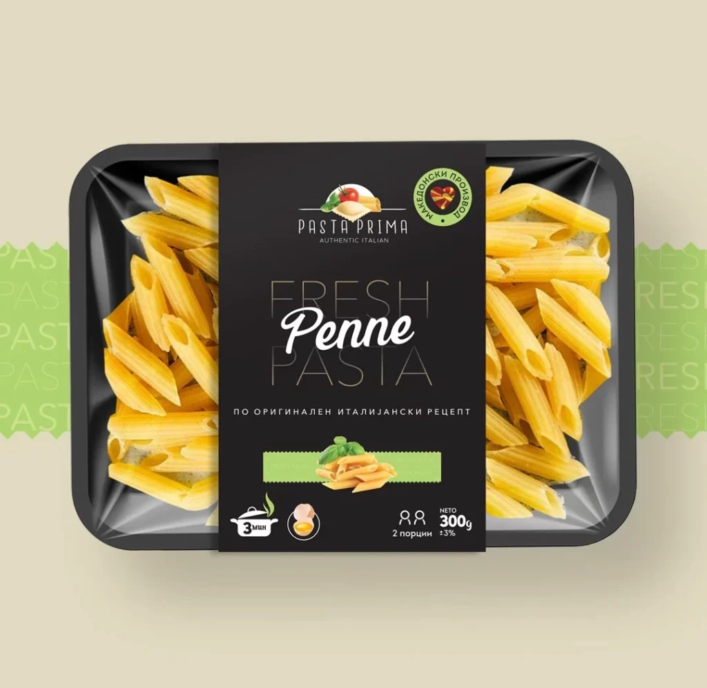
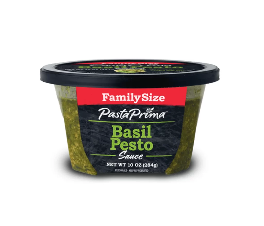
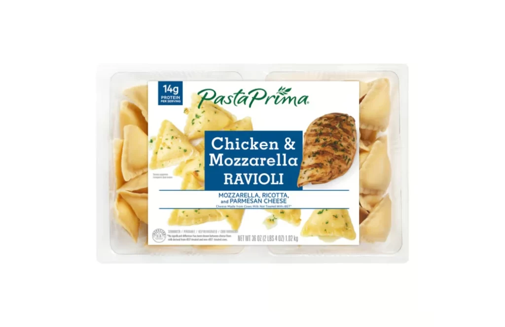
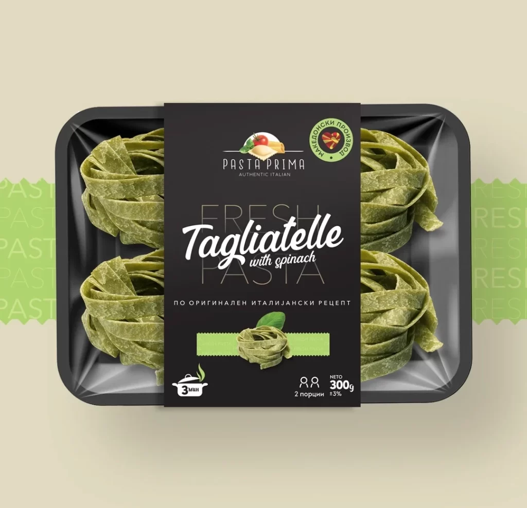
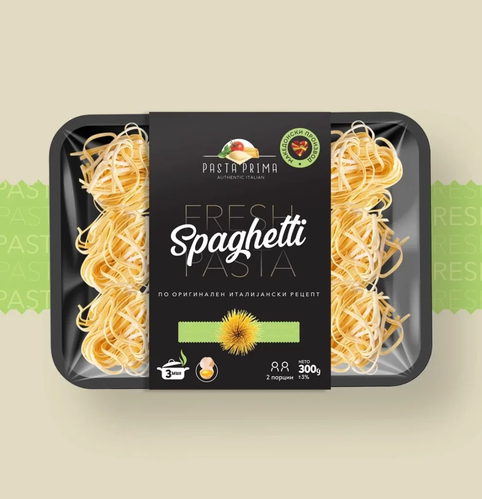
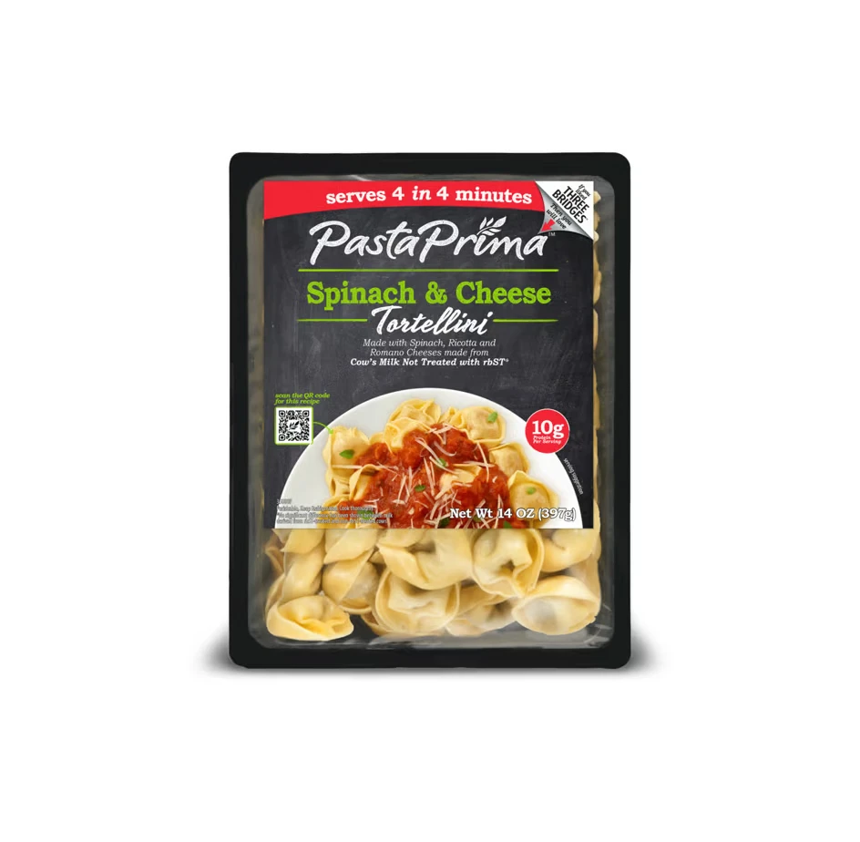
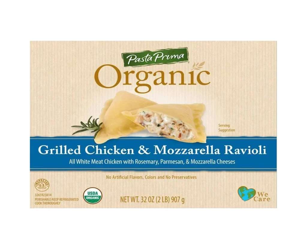
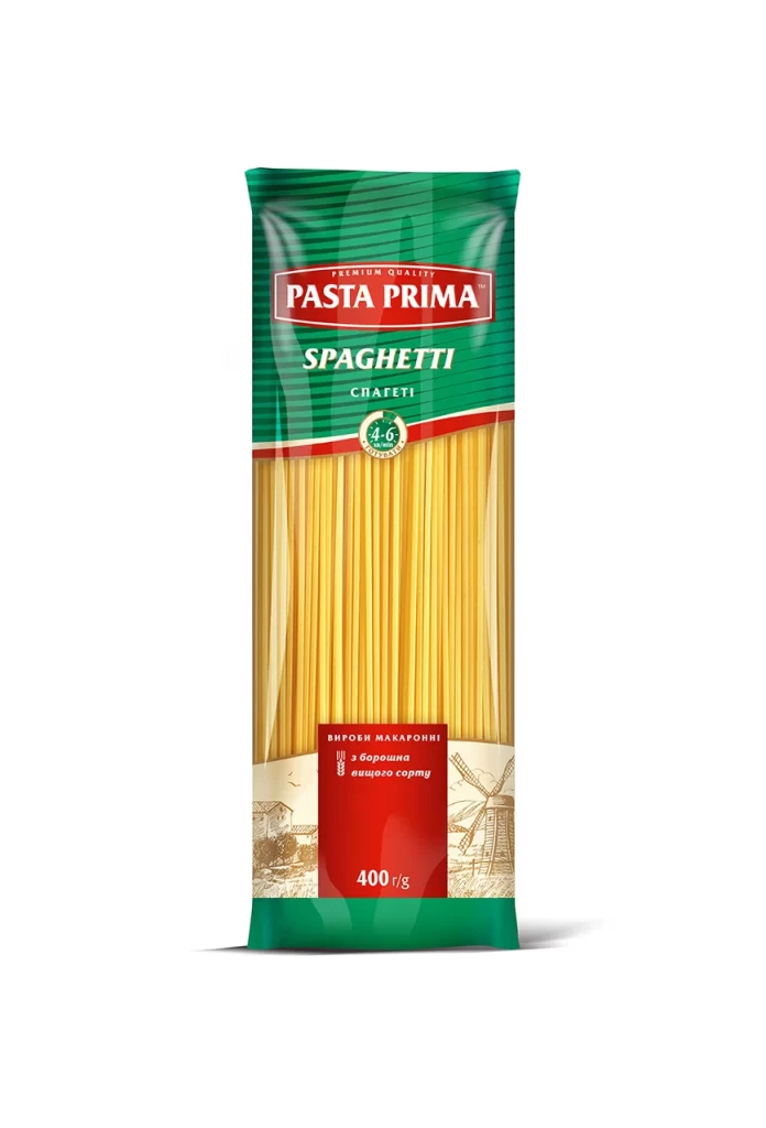
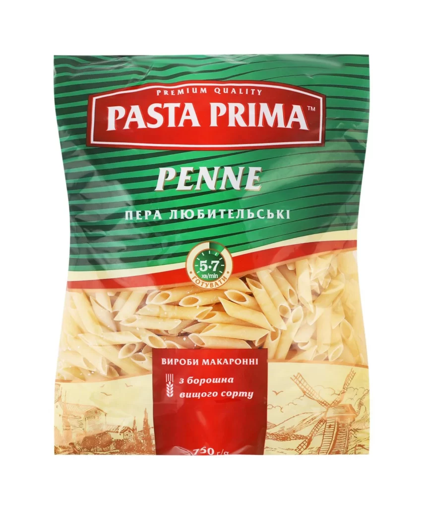
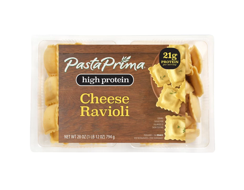
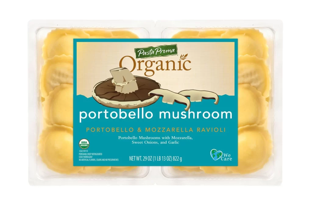
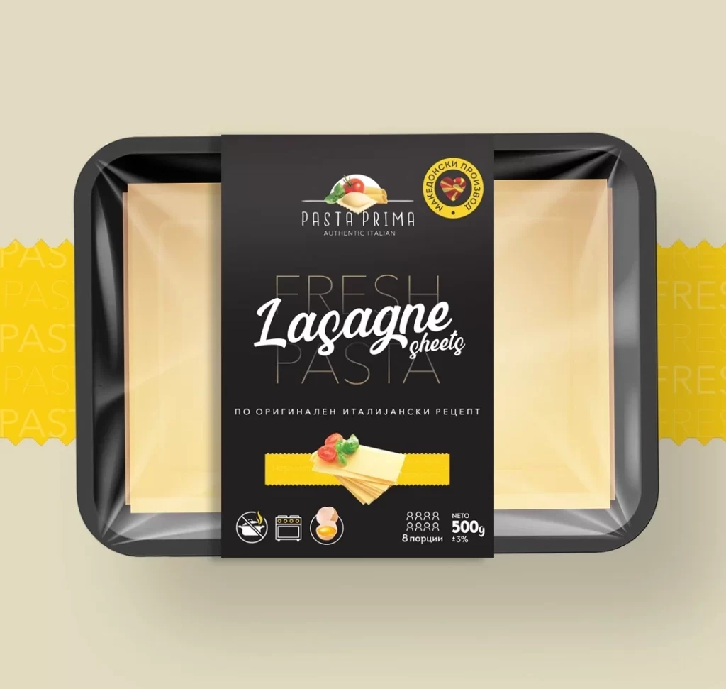
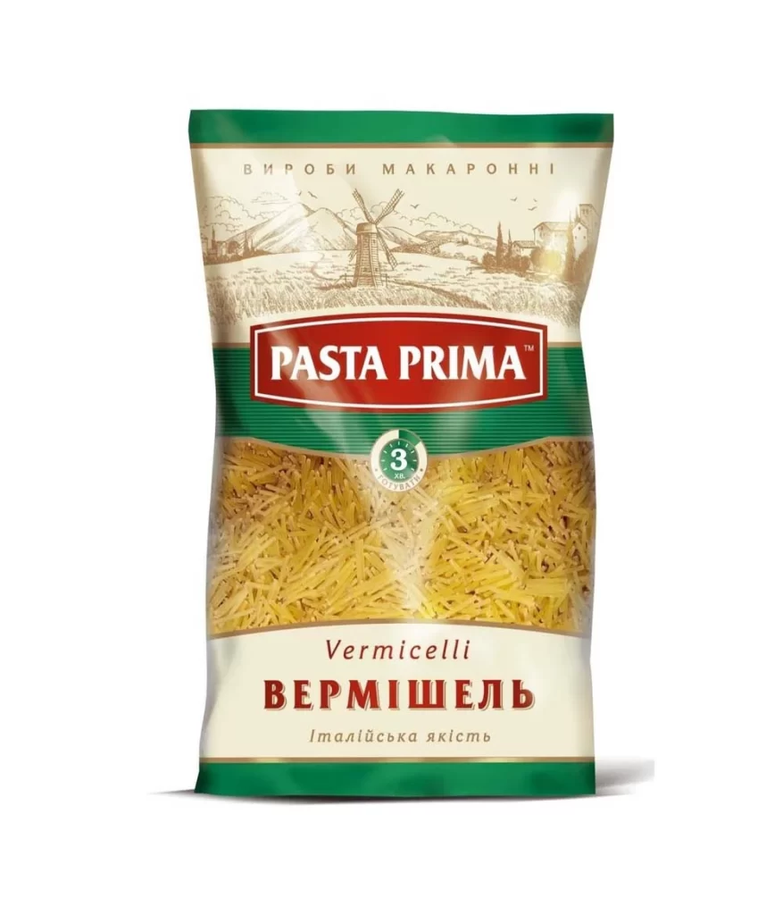
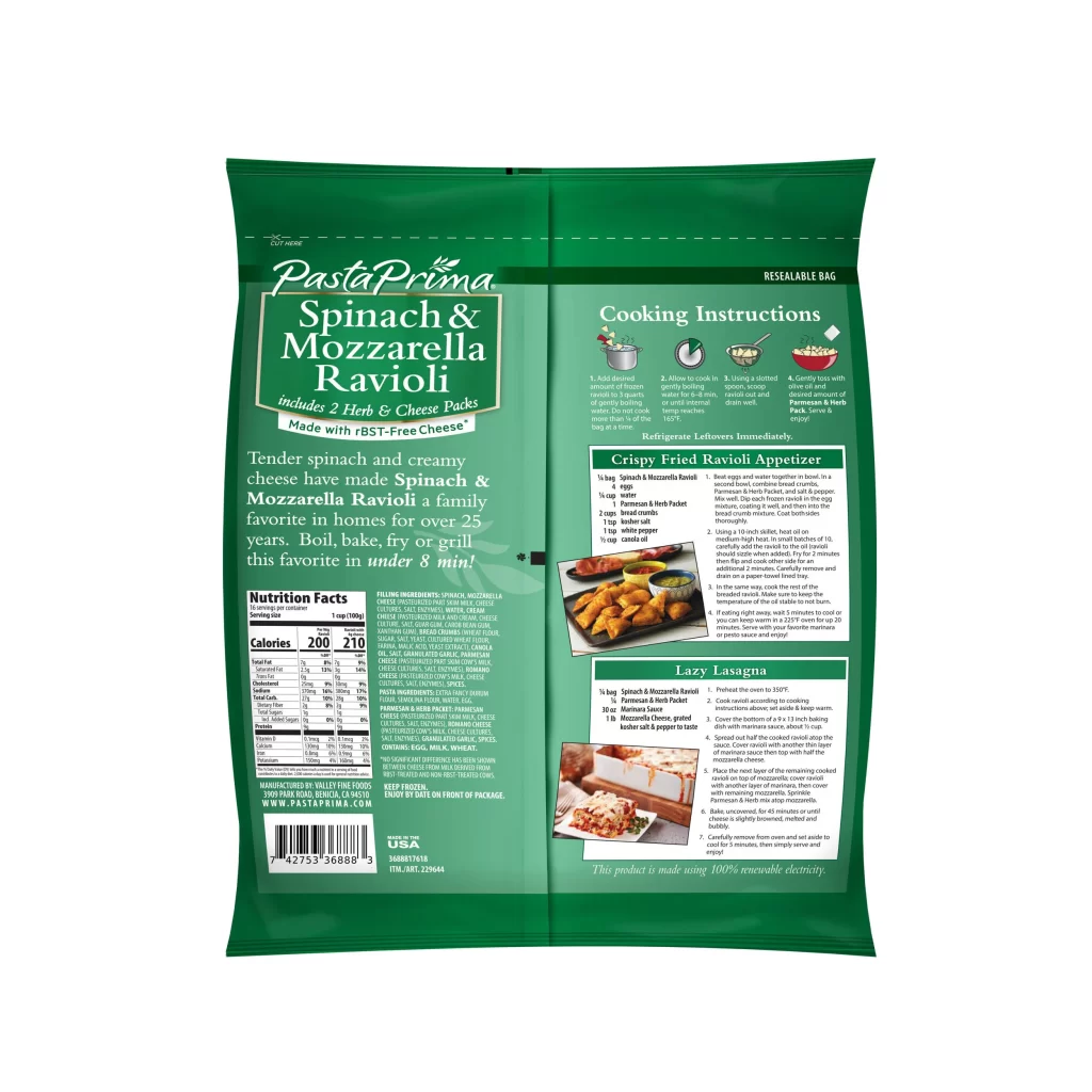
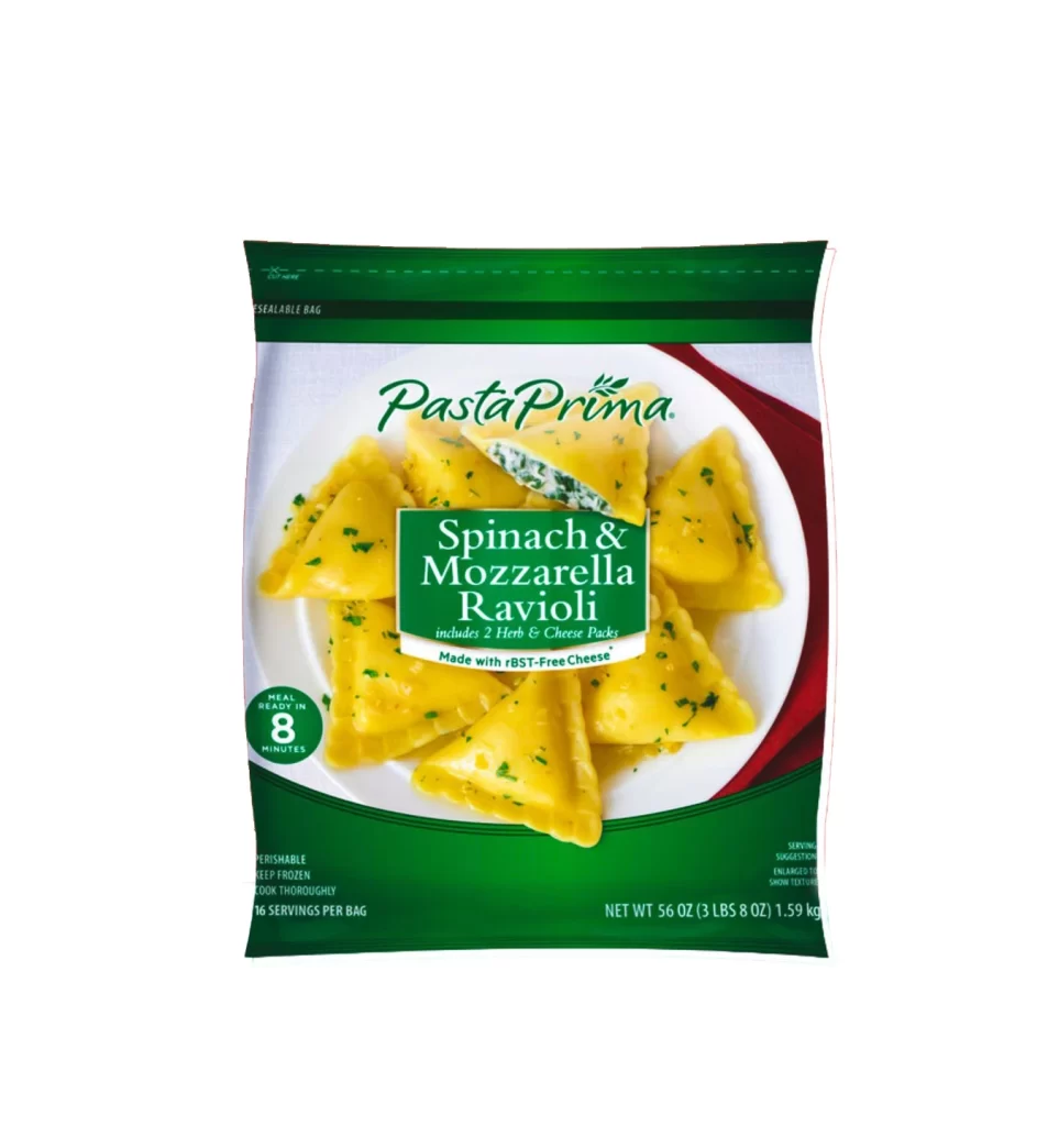
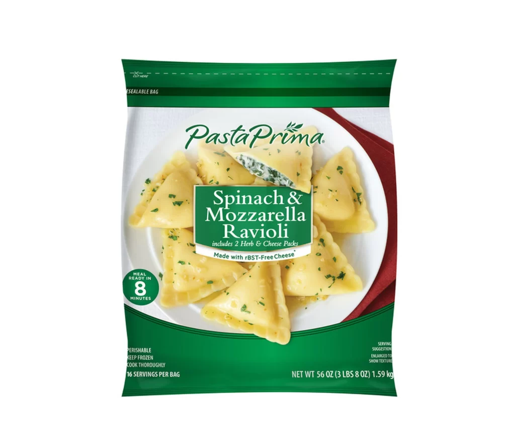
Emerald green bands frame the top and bottom of a flexible plastic pouch, sandwiching a central photographic panel that displays triangular ravioli on a white ceramic plate. The brand name 'PastaPrima' appears in an elegant, italicized serif font above the product title, which is set within a solid green rectangle featuring white sans-serif lettering. A straight-on camera angle captures the glossy surface of the pasta, which is garnished with finely chopped herbs and set against a deep red fabric background.
Visual hierarchy is established through the strategic use of contrasting typefaces, pairing the flowing script of the logo with the blocky, authoritative weight of the flavor description. The composition balances the organic, irregular shapes of the food against the rigid geometry of the packaging borders and text boxes. Such a layout effectively guides the viewer's eye from the brand identity to the appetizing product shot and finally to the essential cooking information located in the lower corners.
Marketing teams analyzing competitive frozen food branding might study this example to understand how color psychology influences consumer perception of freshness. Packaging engineers could utilize the spatial arrangement of text elements as a baseline for optimizing information density on similar flexible film substrates. Culinary photographers may reference the lighting setup used here to achieve a clean, commercial look that highlights texture without creating harsh shadows on reflective surfaces.