Pasta Prima Fusilli Fresh Pasta Packaging
Topics
Details
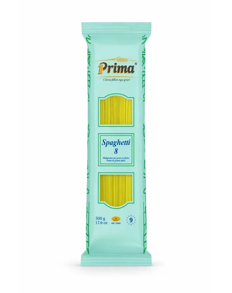
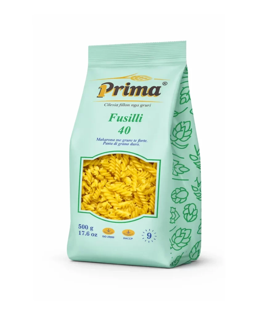
A 500g pouch of Prima Fusilli 40 pasta stands in a three-quarter studio view, revealing both the front face and the right-side panel against a white background. The packaging material is a matte, pale mint-green film, sealed at the top with horizontal crimping that suggests a flexible, resealable texture. Dominating the center is a rectangular die-cut window with rounded corners and a thin green border framing the yellow spiral pasta within.
Visual interest is generated through the deliberate contrast between the cool, clinical tone of the mint substrate and the warm, organic yellows of the dried pasta visible within the transparent aperture. The right flank of the bag breaks the solid color field with a repeating pattern of stylized green line-art illustrations depicting wheat stalks and hop cones, adding textural complexity without overwhelming the primary branding. Typography is hierarchically structured, utilizing varying weights to distinguish the Albanian product claims from the technical certifications like ISO 22000 and HACCP located near the bottom edge.
Brand strategists analyzing emerging market packaging trends in the Balkans would examine this artifact to understand how traditional food products utilize pastel palettes to signal modernity. Packaging engineers could reference the specific placement of the viewing window relative to the fold lines to study how transparency affects consumer perception of product density. Furthermore, typographers studying multilingual label layouts would find value in how the Albanian slogan ‘Makarona me grure te forte’ is integrated alongside international standard icons.