Pasta Prima Chicken & Mozzarella Fresh Pasta Packaging
Topics
Details
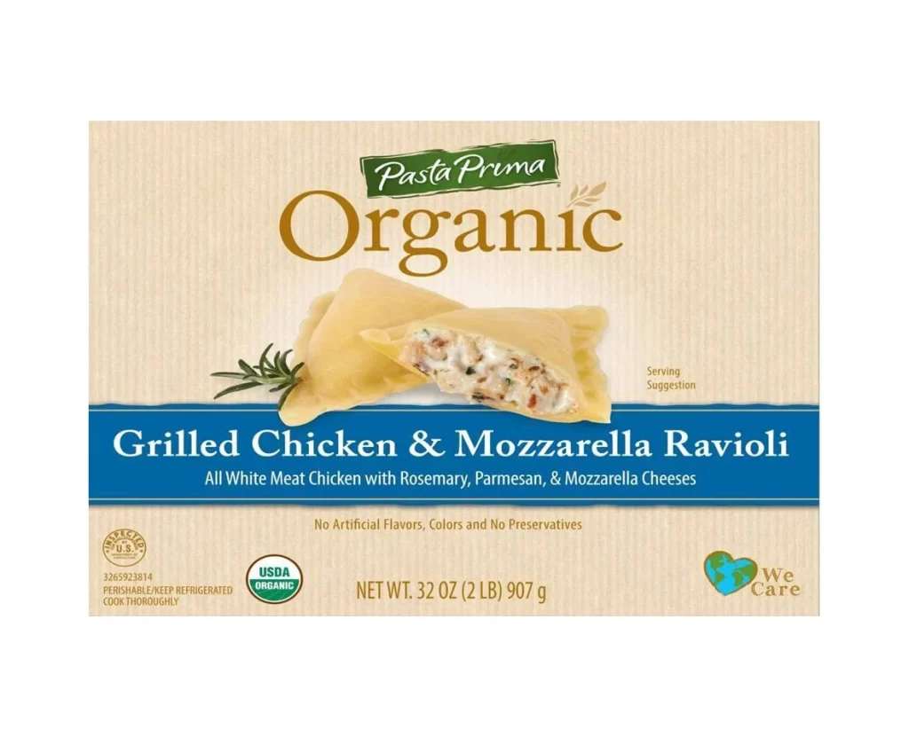
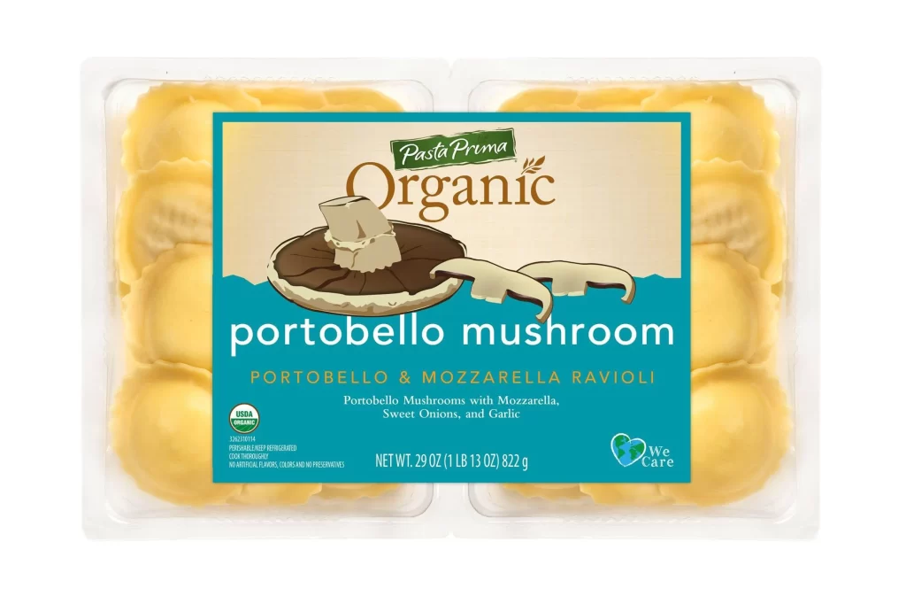
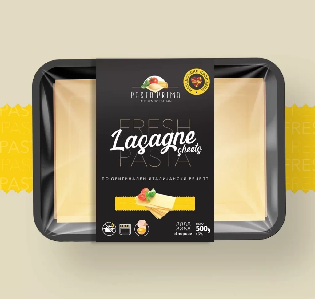
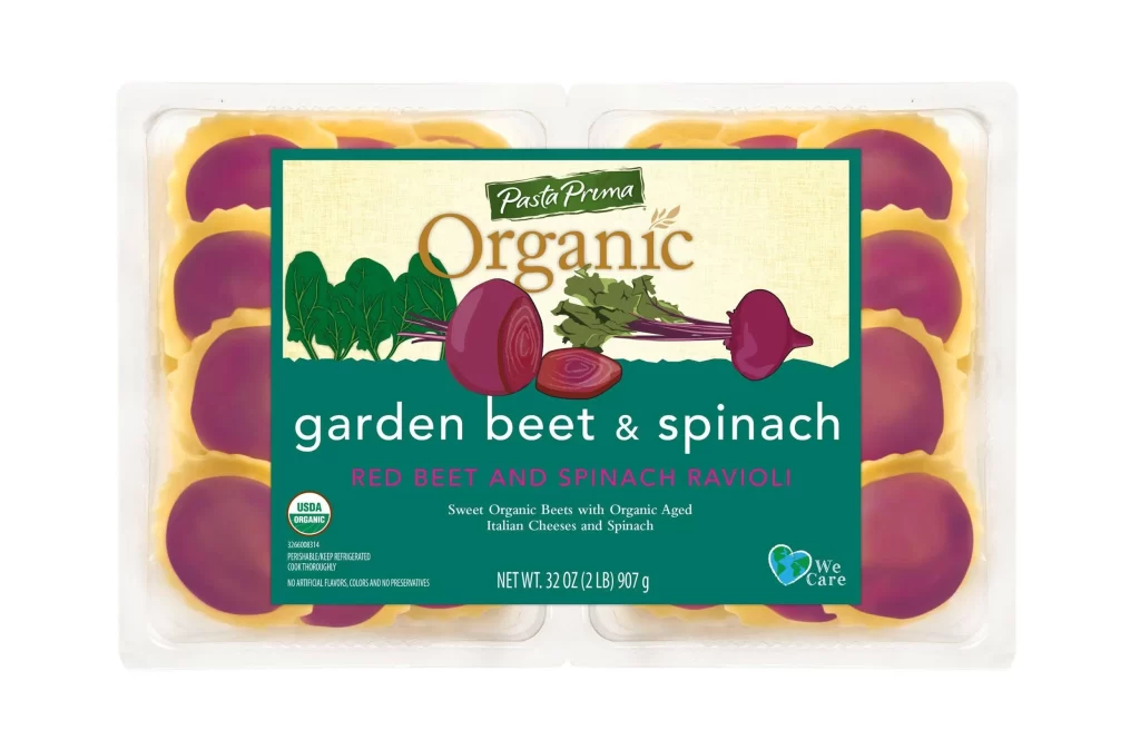
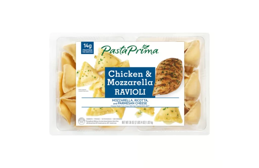
A clear plastic clamshell container holds a package of Pasta Prima Chicken & Mozzarella Ravioli, with pale yellow triangular pasta shapes visible through the transparent packaging on either side of the central label. The label features a white field dominated by a prominent blue rectangular block containing the product name in bold white sans-serif type, while the green organic script brand logo appears above it alongside a blue badge indicating '14g PROTEIN PER SERVING'. A grilled chicken breast image sits to the right of the blue block, and smaller text below specifies the cheese blend of mozzarella, ricotta, and parmesan, all presented on a white background.
Visual hierarchy is established through the strategic use of color blocking, where the deep blue text box creates a strong focal point that anchors the viewer’s attention amidst the lighter elements. The juxtaposition of the actual physical product peeking through the plastic with the idealized food photography on the label bridges the gap between expectation and reality. Furthermore, the placement of the ’14g Protein’ badge in the upper left corner immediately signals nutritional value to health-conscious consumers scanning the shelf.
Packaging designers studying retail food branding would examine this layout to understand how to balance appetizing imagery with mandatory nutritional information and legal text. Marketing teams could analyze the specific typographic choices and color psychology used to differentiate this chicken variety from other flavors in the same product line. Additionally, food stylists might reference the specific garnishing details, such as the flecks of green herbs on the ravioli, when planning their own commercial photography shoots for similar dairy-based filled pastas.