Title

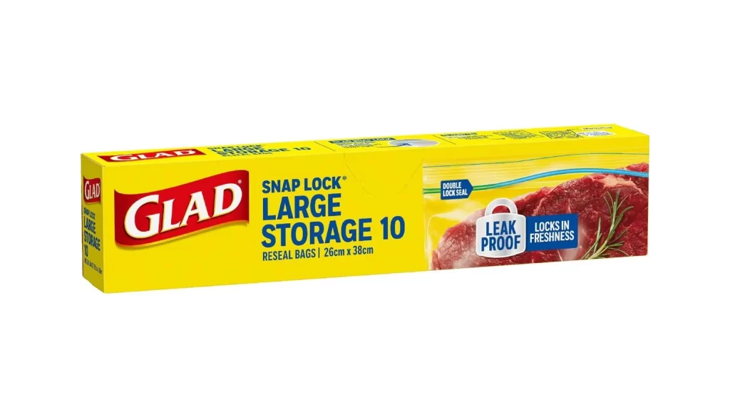
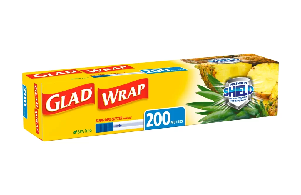
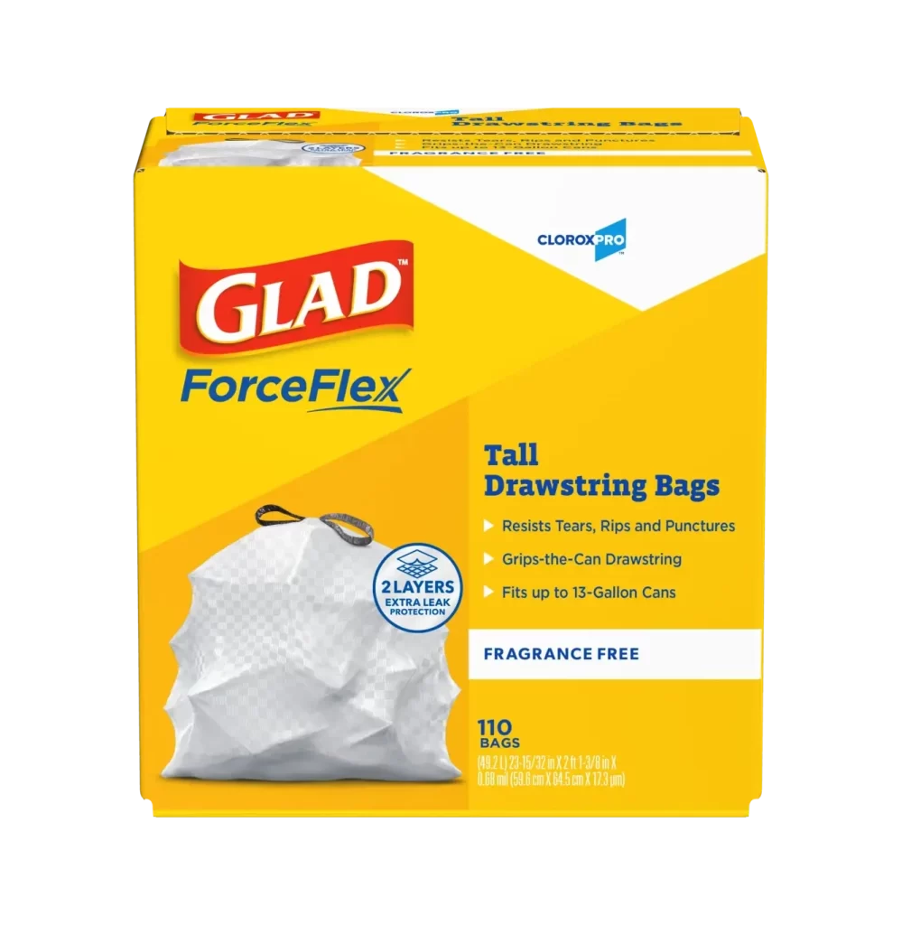
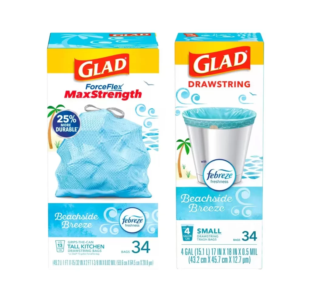
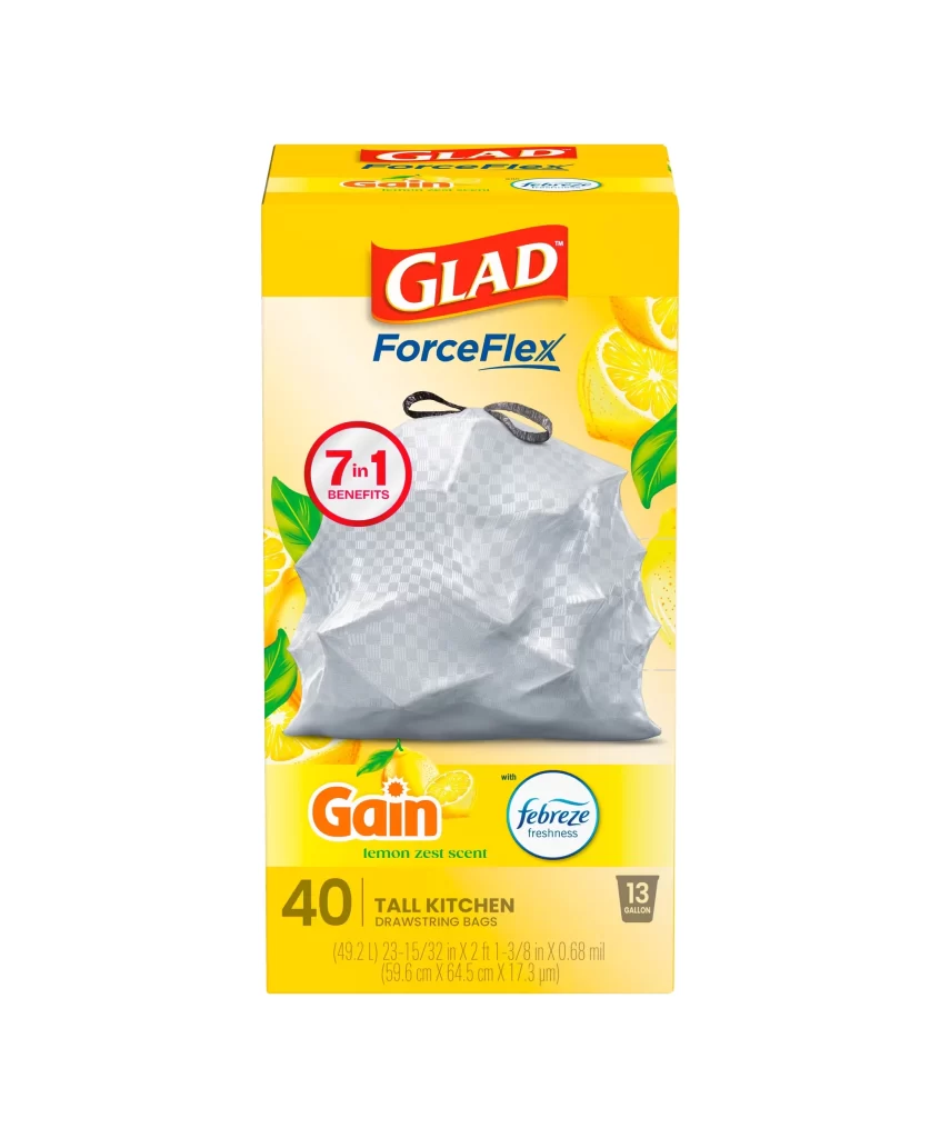
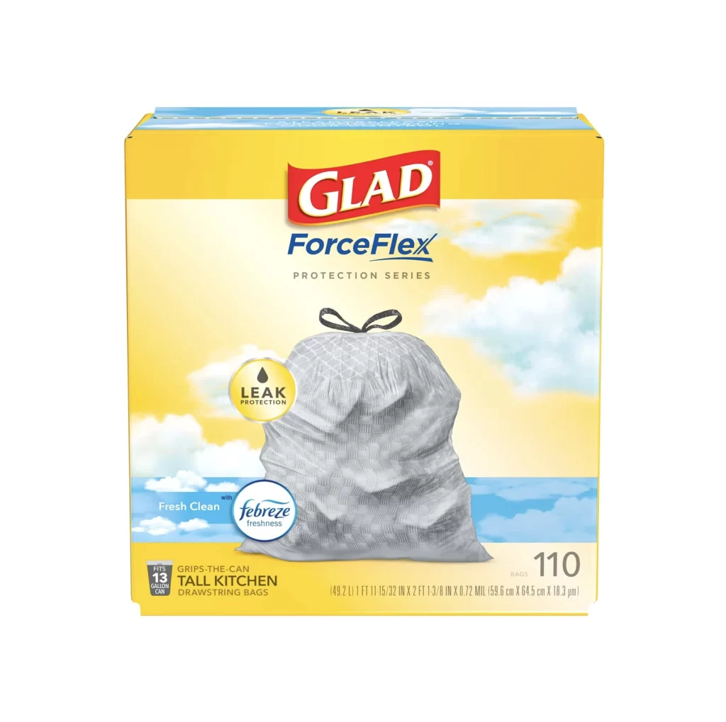
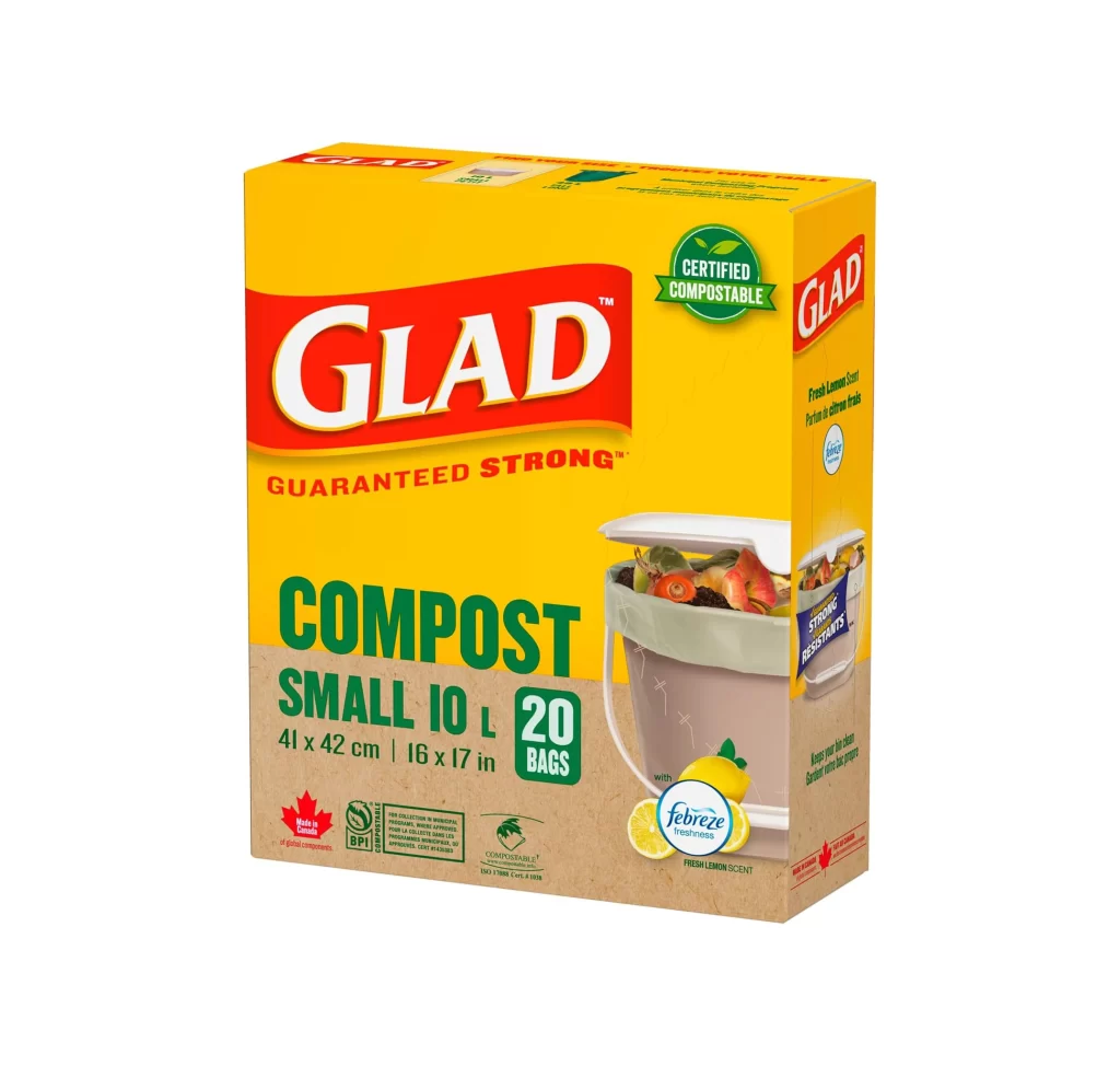
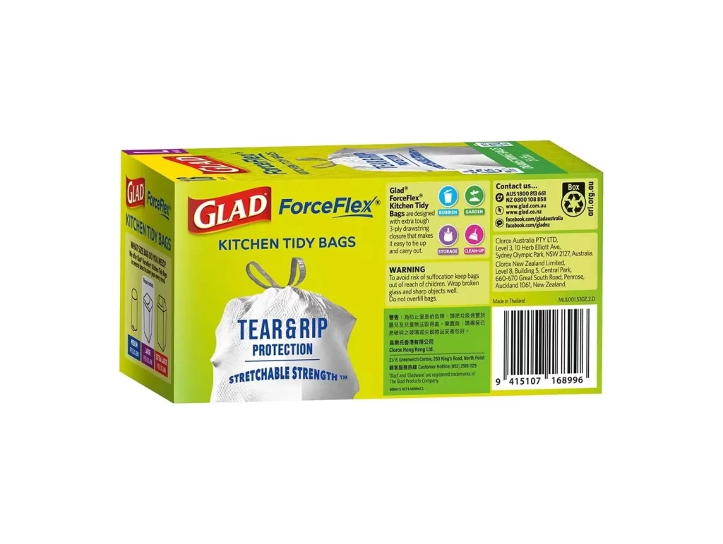
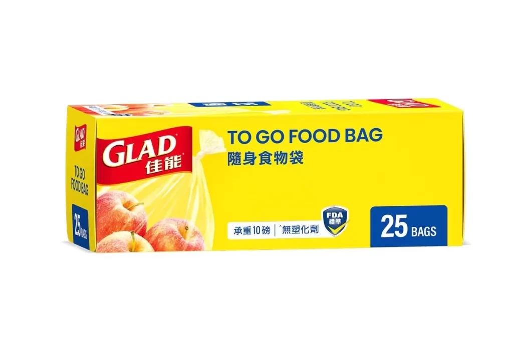
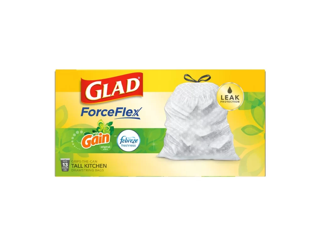
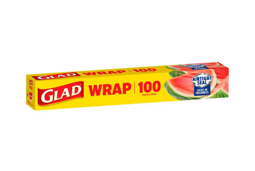
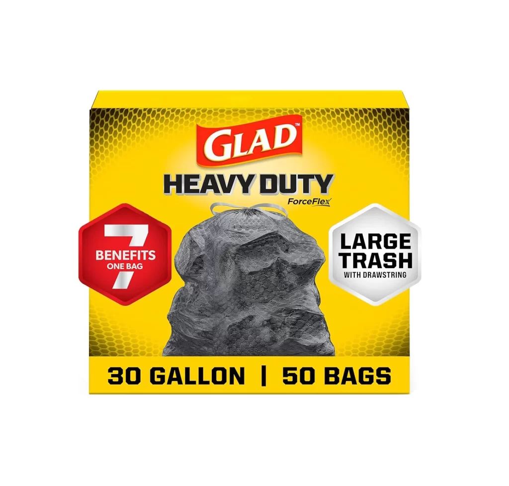
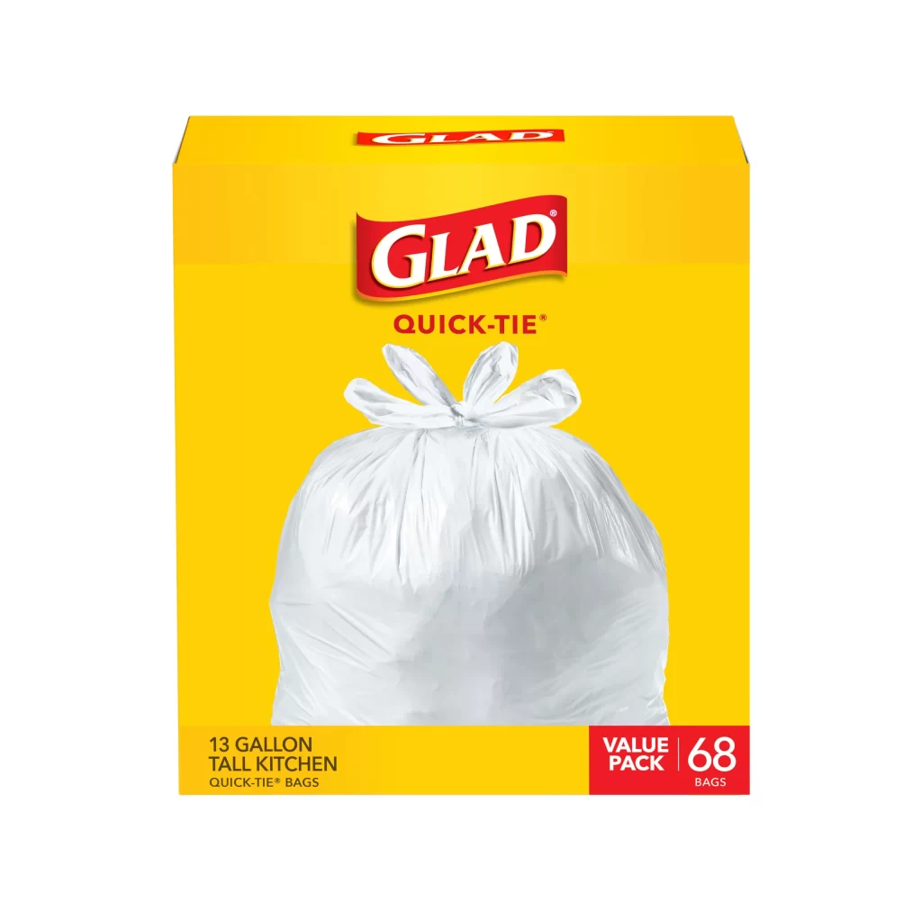
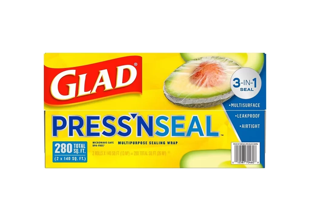
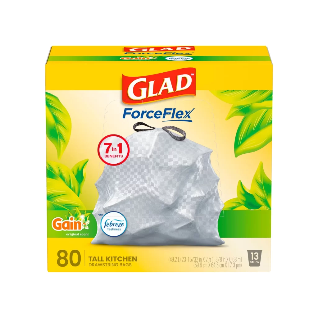
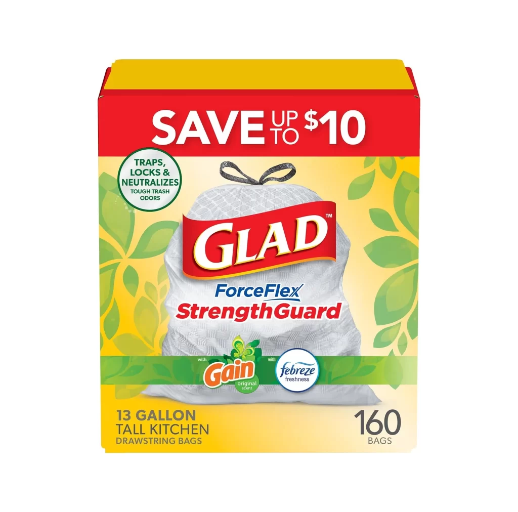
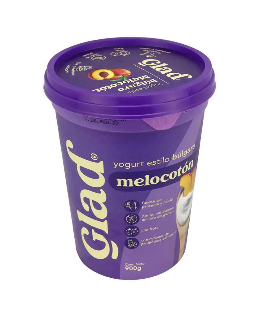
Glad Brand Product Logo Packaging


Topics

GladHousehold

Details

Uploaded user: Leo

A vibrant crimson banner curves with a gentle, wave-like undulation across the frame. The word 'GLAD' dominates the center in heavy, white serif lettering, each character defined by a sharp golden-yellow drop shadow that creates a subtle three-dimensional lift. A thin orange-gold line traces the bottom edge of the red form, while a small registered trademark symbol sits in the upper right corner.
Visual weight is established through the high-contrast pairing of saturated red and pure white, a classic combination that ensures immediate legibility from a distance. The curvature of the background shape introduces dynamic movement that prevents the static text from appearing flat or rigid. Furthermore, the metallic gold outlining adds a premium tactile quality, suggesting durability and household reliability through its slightly embossed appearance.

Brand historians might utilize this specific iteration to track the evolution of corporate identity and packaging aesthetics over decades. Packaging engineers could study the proportions of the banner to understand how to balance logo lockups on flexible film materials. Additionally, color theorists will find the specific relationship between the primary red and the accent gold useful for analyzing effective palette choices in consumer goods marketing.