Glad To Go Food Storage Bag Packaging
Topics
Details
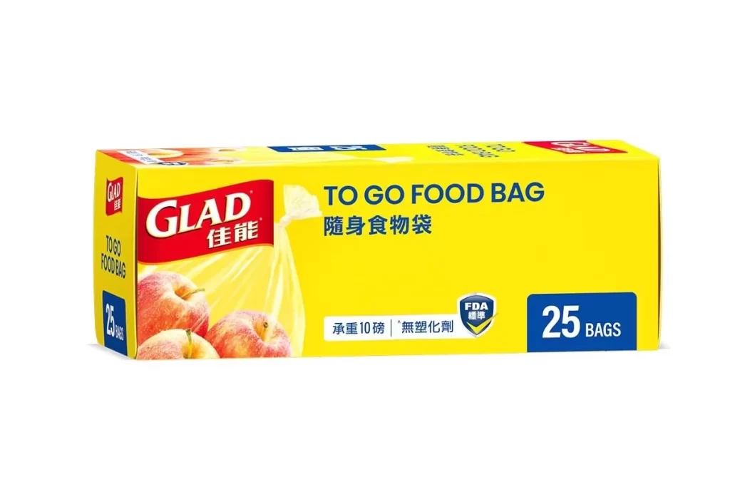
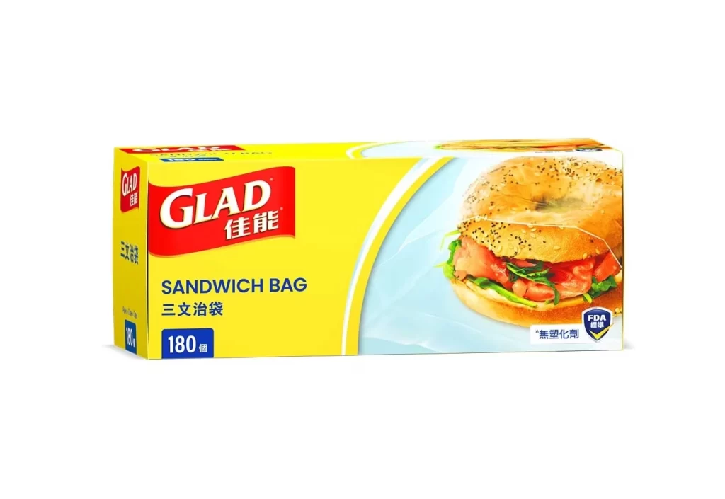
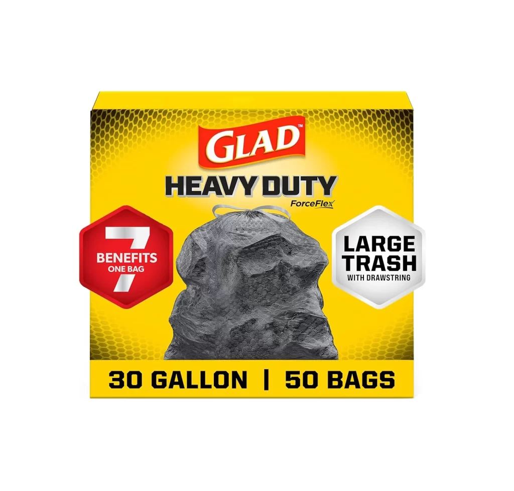
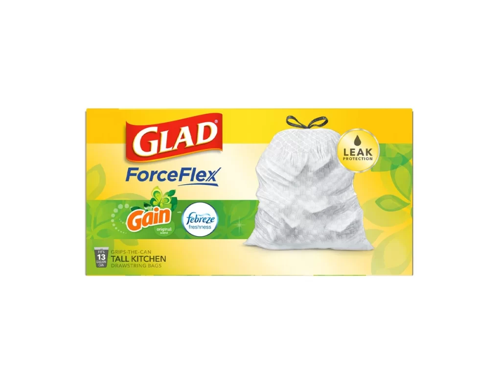
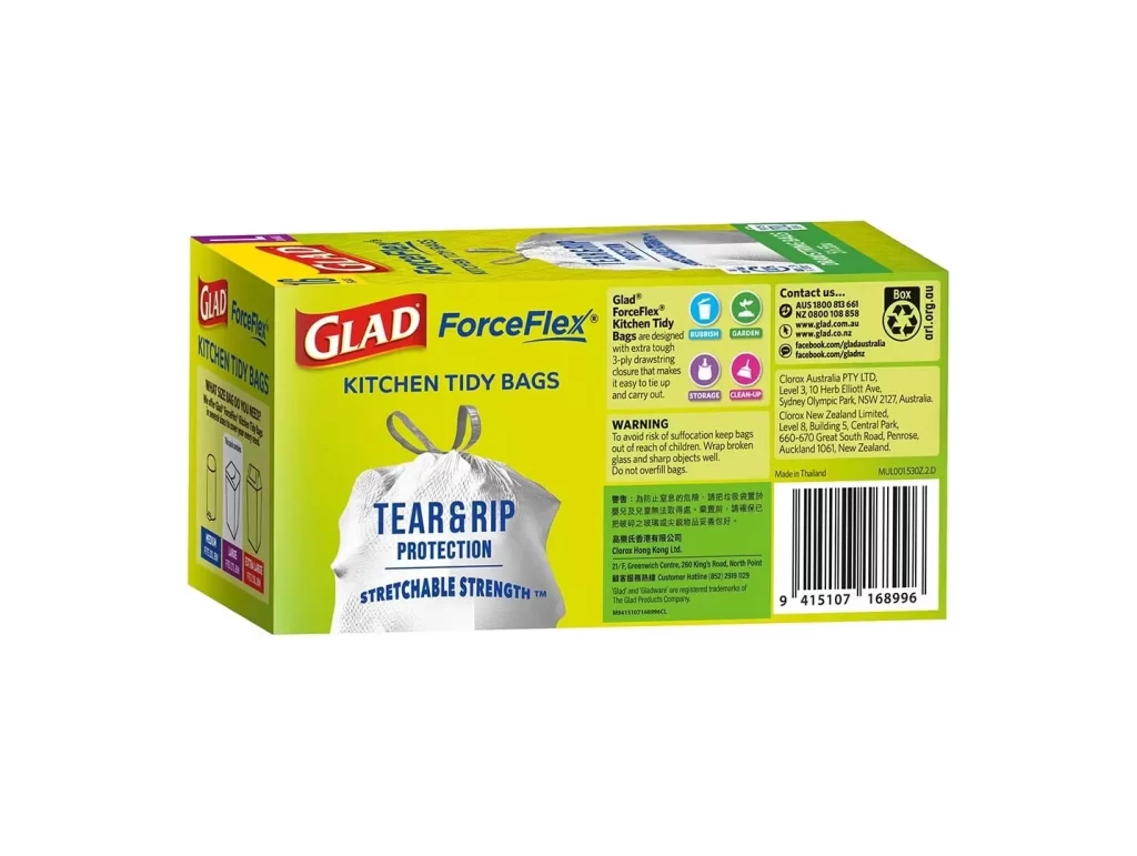
A rectangular cardboard box dominates the frame, rendered in a vibrant, saturated yellow that serves as the primary background for the packaging design. The front face features the brand name 'GLAD' in bold white serif lettering set against a red banner, positioned above the product title 'TO GO FOOD BAG' in dark blue sans-serif type. To the left, photographic imagery of red and yellow apples appears alongside a translucent plastic bag, while the right side displays a blue square containing '25 BAGS' in white text. Centered below the main title, smaller Chinese characters translate to 'portable food bag,' accompanied by an FDA shield logo indicating compliance with food safety standards.

Visual hierarchy is established through the strategic use of contrasting primary colors, with the yellow substrate creating high visibility against the red and blue graphic elements. The inclusion of fresh fruit photography directly communicates the product's intended use for food storage, while the bilingual text layout accommodates diverse consumer markets. Notable is the placement of the quantity indicator in a solid blue block, which anchors the composition's right side and balances the weight of the brand logo on the left.
Packaging designers analyzing retail food storage solutions would examine this reference to understand effective color blocking strategies for household goods. Marketing teams developing multilingual product lines could study the integration of English and Chinese typography within a cohesive visual system. Industrial designers tasked with creating FDA-compliant packaging might utilize this example to observe standard regulatory marking placements on consumer goods containers.