Title

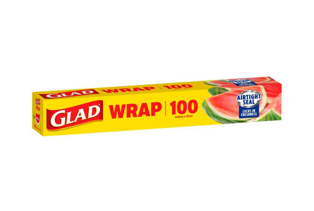
Glad WRAP 100 AIRTIGHT SEAL Wrap Packaging


Topics

Food StorageGlad

Details

Uploaded user: Leo

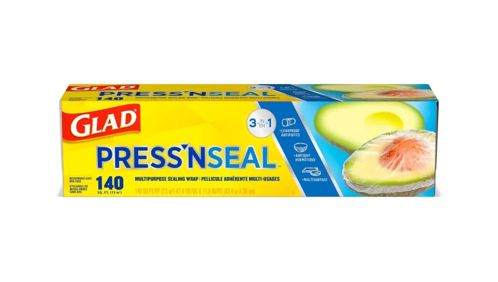
A vibrant yellow rectangular box dominates the frame, showcasing the Glad Wrap 100 product against a stark white void. The packaging features bold red typography for the brand name and the word 'WRAP', with the number '100' positioned prominently to the right. On the far end, a photographic slice of watermelon adds a splash of natural red and green, while a blue circular badge announces the 'AIRTIGHT SEAL' feature in crisp white lettering.

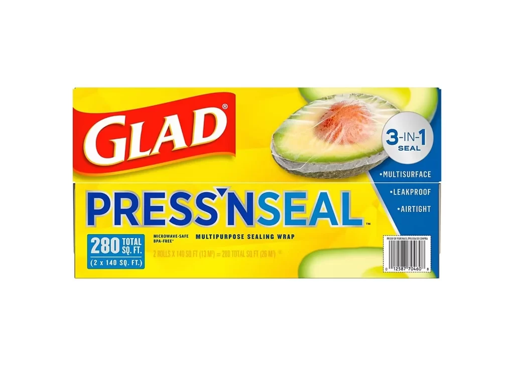
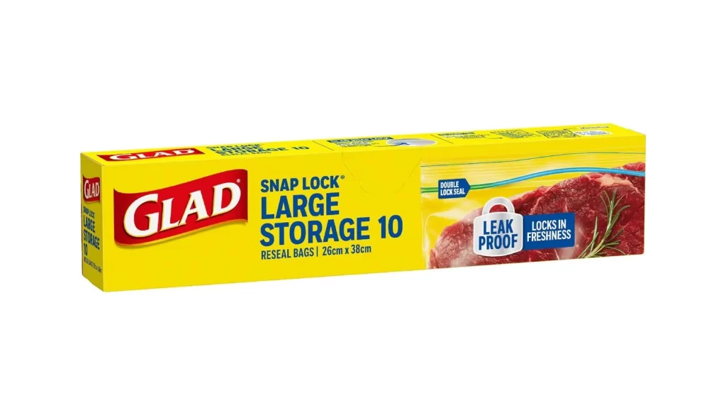
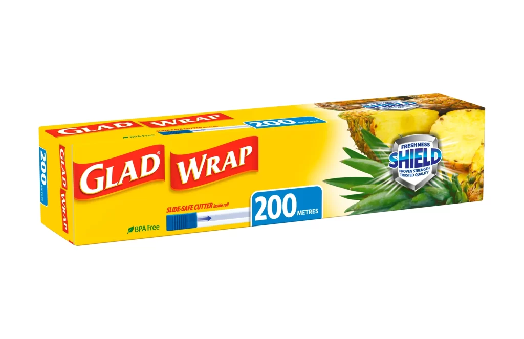
Visual hierarchy is established through a striking contrast between the saturated primary yellow background and the aggressive red text, ensuring immediate legibility from a distance. The inclusion of fresh produce imagery serves a dual purpose, simultaneously suggesting the product's utility for food storage and breaking up the geometric rigidity of the carton's shape. Such a composition relies on high-contrast color theory to communicate freshness and reliability without requiring complex graphical elements.

Brand strategists might analyze this layout to understand how legacy household goods maintain market presence through consistent color coding and straightforward messaging. Packaging engineers could study the spatial arrangement of text and imagery to optimize their own designs for retail shelf impact. Furthermore, marketing teams looking to revitalize existing product lines would benefit from examining how this specific iteration balances functional information with appealing lifestyle visuals.