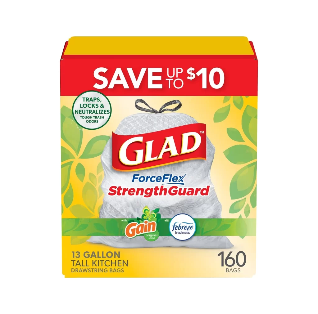
Glad Brand Logo Packaging
Topics
Details
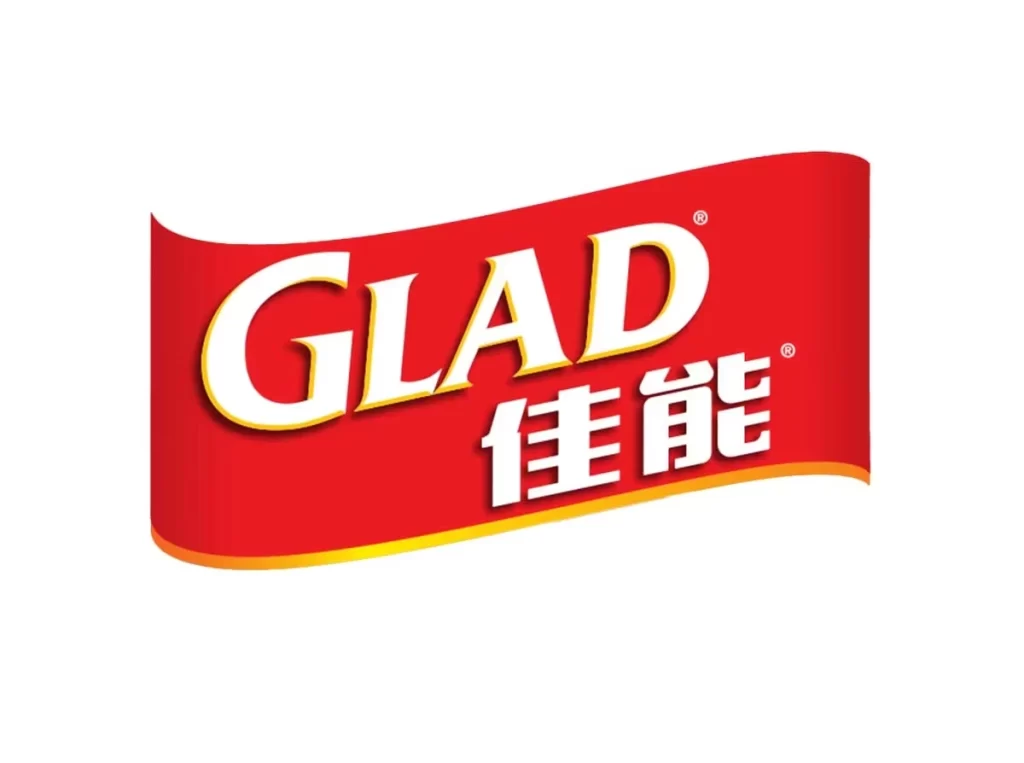
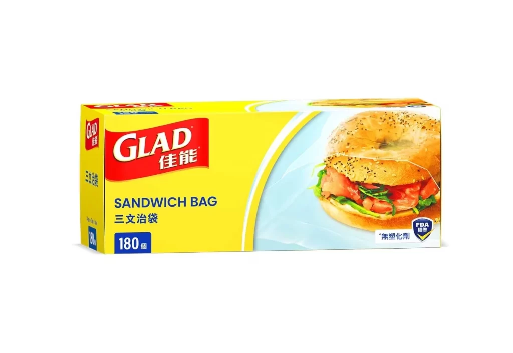
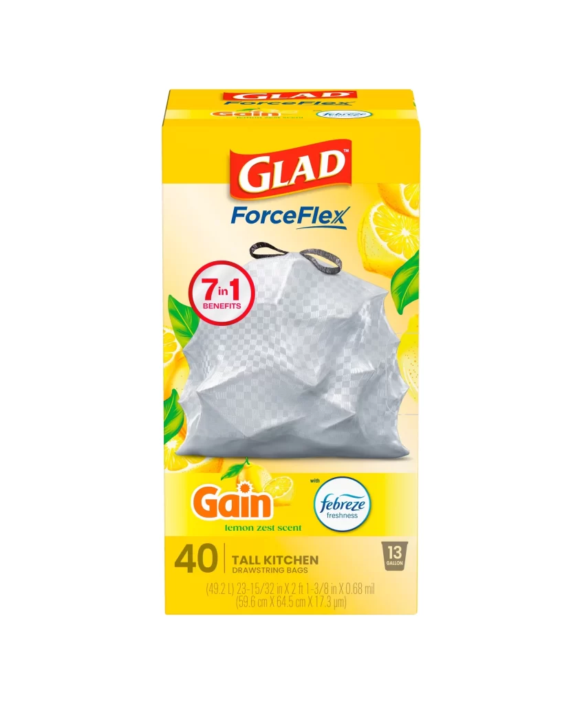
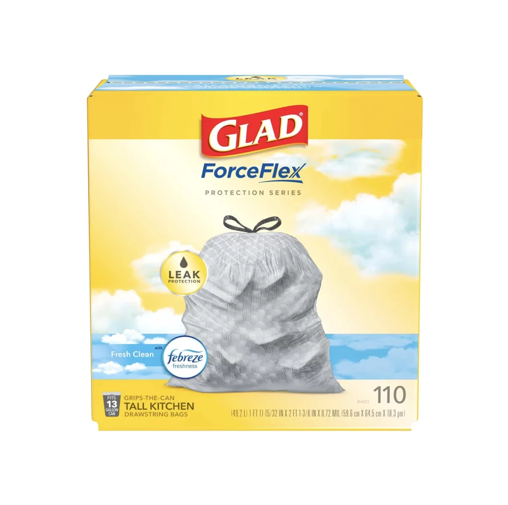
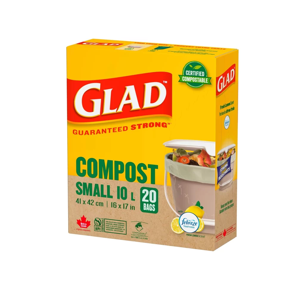
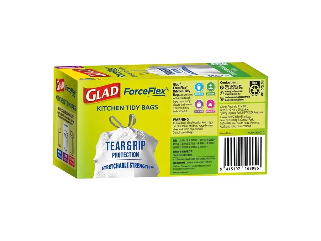
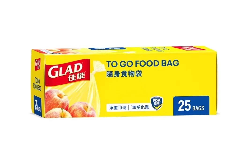
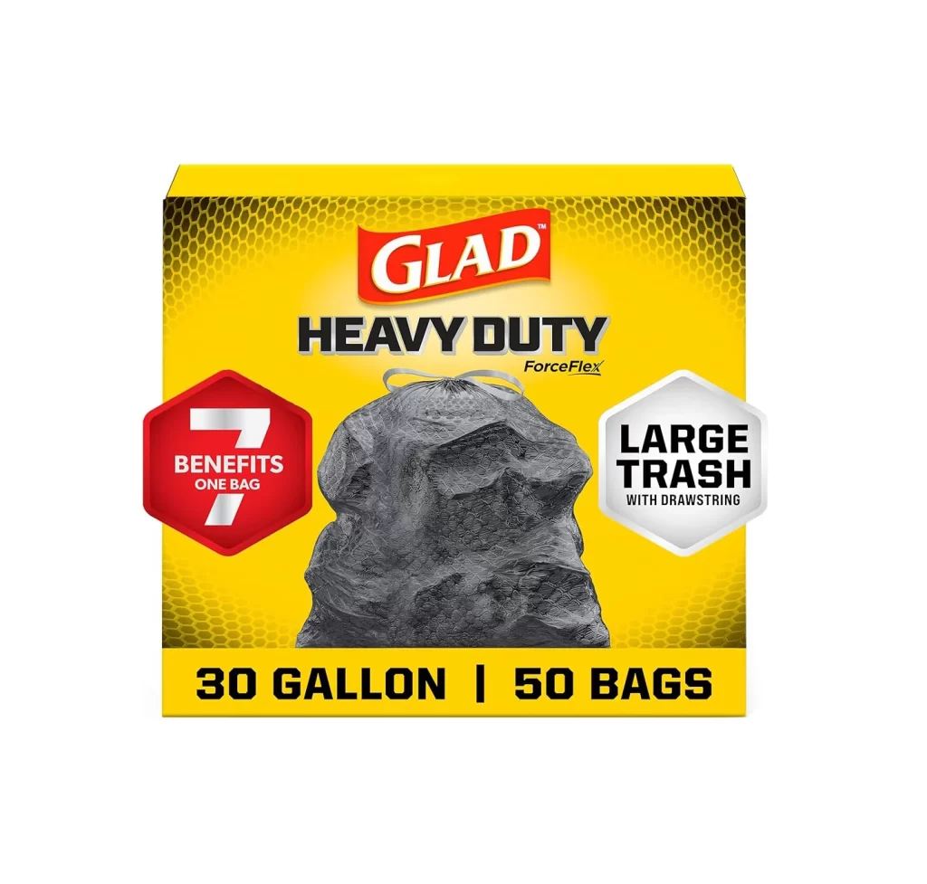
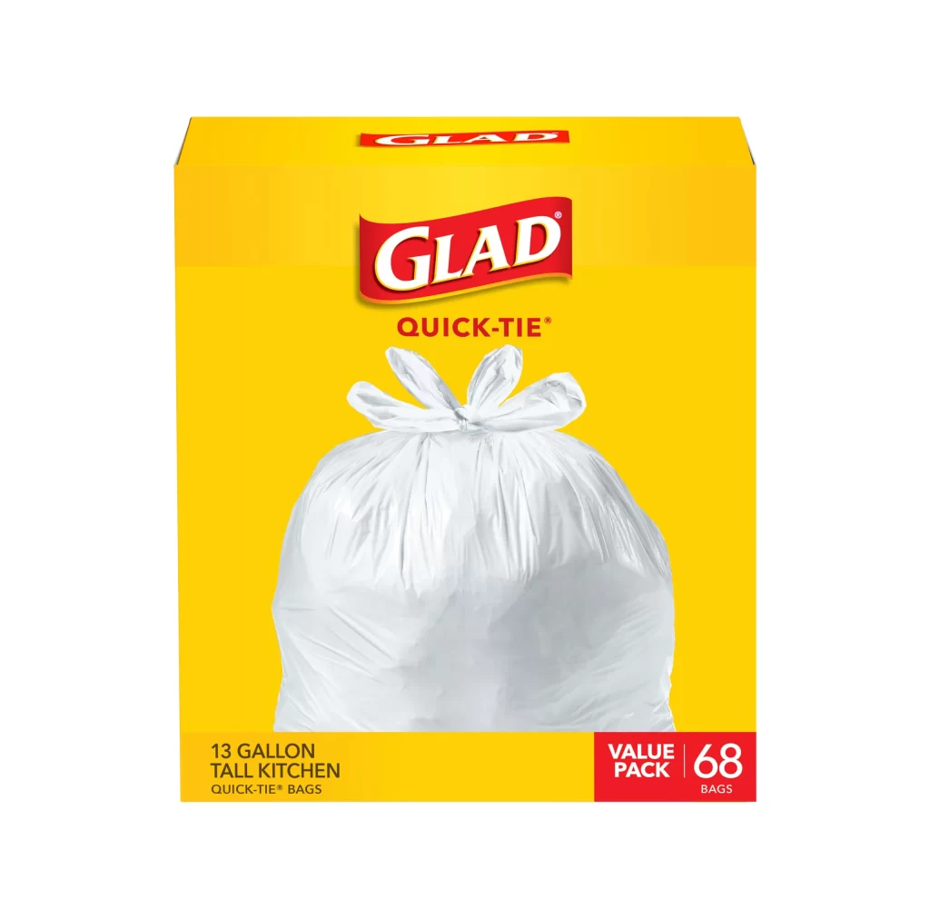
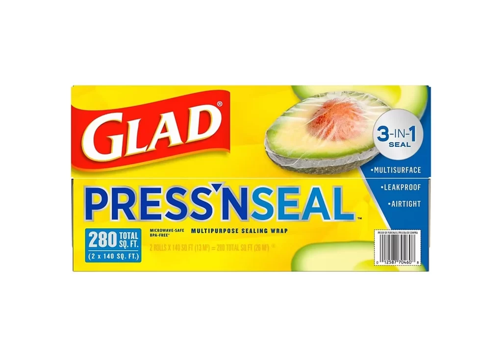
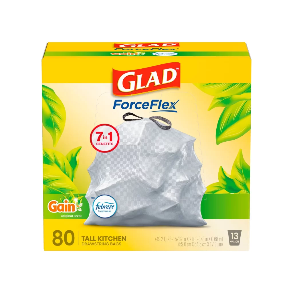
A vibrant red banner curves gently across the frame, featuring the word 'GLAD' in bold white lettering with a subtle golden-yellow drop shadow. Below the English text, two Chinese characters '佳能' appear in solid white, creating a balanced bilingual composition. A thin orange-yellow gradient line traces the bottom edge of the red shape, while the entire design sits on a clean white surface.
The wavy, flag-like form gives this logo dynamic movement compared to standard rectangular brand marks. That specific combination of primary red with metallic gold accents creates high visibility that works well on physical packaging. Including both Latin and Han characters demonstrates how global brands adapt their visual identity for regional markets without losing core recognition.
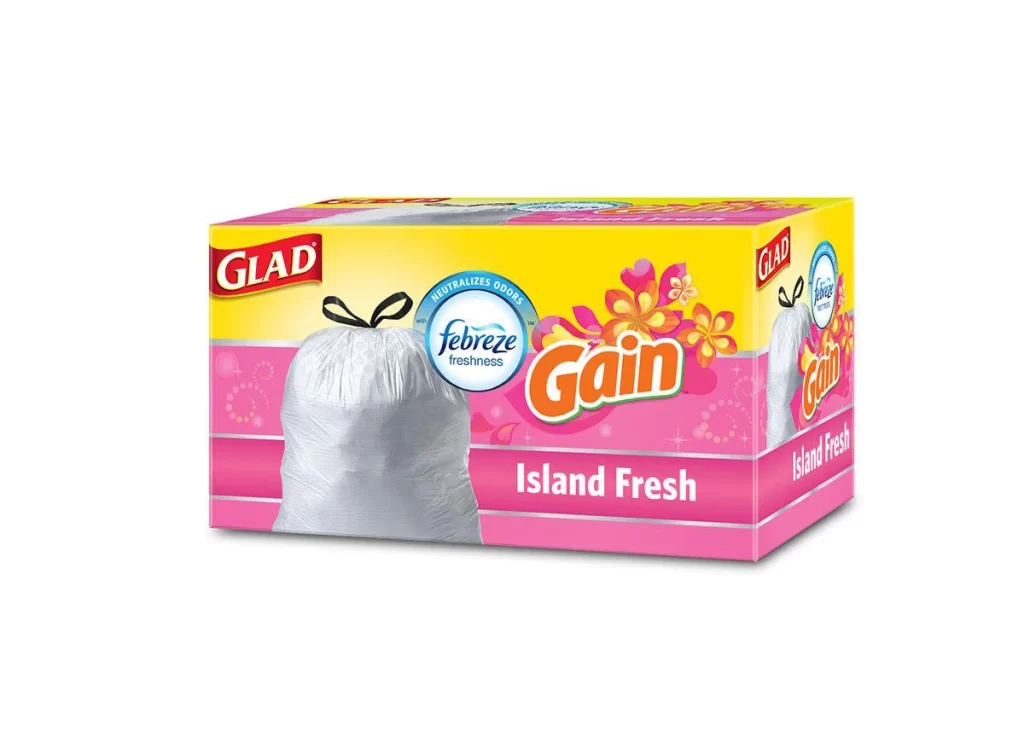
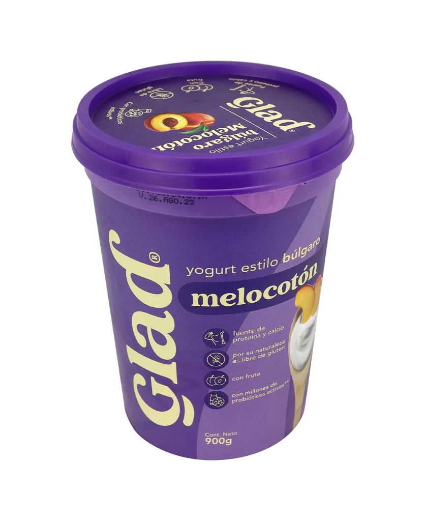
Packaging designers studying multinational branding strategies would find this useful for understanding typographic hierarchy in dual-language layouts. Marketing teams could examine how color psychology applies when translating household product identities across cultural contexts. Students learning about trademark placement in composite logos might analyze the positioning of those registration symbols relative to different script systems.