Glad Non-Stick Aluminum Foil Packaging
Topics
Details
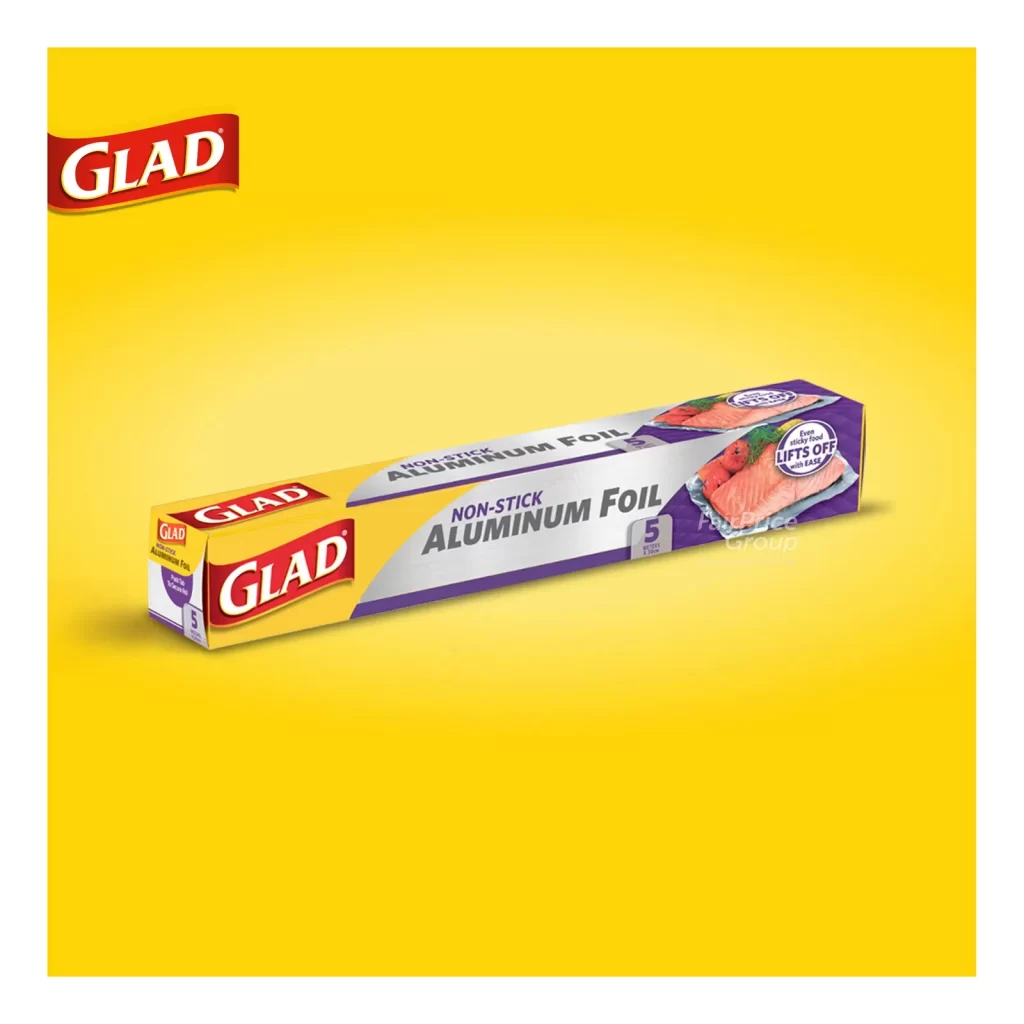
A rectangular box of Glad Non-Stick Aluminum Foil sits at a three-quarter angle, revealing both the front and right-side panels against a vibrant yellow backdrop. The packaging features a color-blocked design with a bright yellow left section containing the red Glad logo in white serif lettering, transitioning into a silver-gray central band and a deep purple right section displaying an image of salmon on foil. The front panel prominently displays 'NON-STICK ALUMINUM FOIL' in bold dark lettering alongside a purple square indicating the 5 square yard size.
Visual distinction emerges from the strategic use of high-contrast primary colors—yellow, red, silver, and purple—that create immediate shelf presence while clearly separating brand identity from product functionality claims. The photographic food element on the side panel serves dual purposes: demonstrating the non-stick feature through visual metaphor while breaking up the geometric color blocks with organic texture. Typography hierarchy effectively guides the eye from the prominent brand mark to the specific product benefit, making this an excellent study in consumer packaging information architecture where every square inch serves either branding or instructional communication.
Packaging designers analyzing competitive foil products would examine this reference to understand how established household brands balance legacy identity with modern feature-based marketing. Industrial design students could deconstruct the color psychology behind the yellow-to-purple gradient transition, noting how warmth suggests kitchen utility while cooler tones imply technological innovation. Marketing teams developing retail displays might reference the three-quarter perspective angle to plan how similar boxes appear on physical store shelves versus digital marketplaces, ensuring key text remains legible across different viewing contexts.