Title

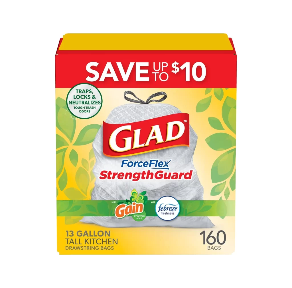
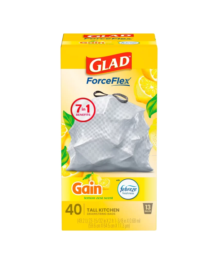
Glad ForceFlex lemon zest scent Trash Bag Packaging


Topics

GladTrash Bags

Details

Uploaded user: Leo

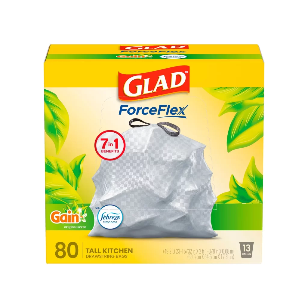
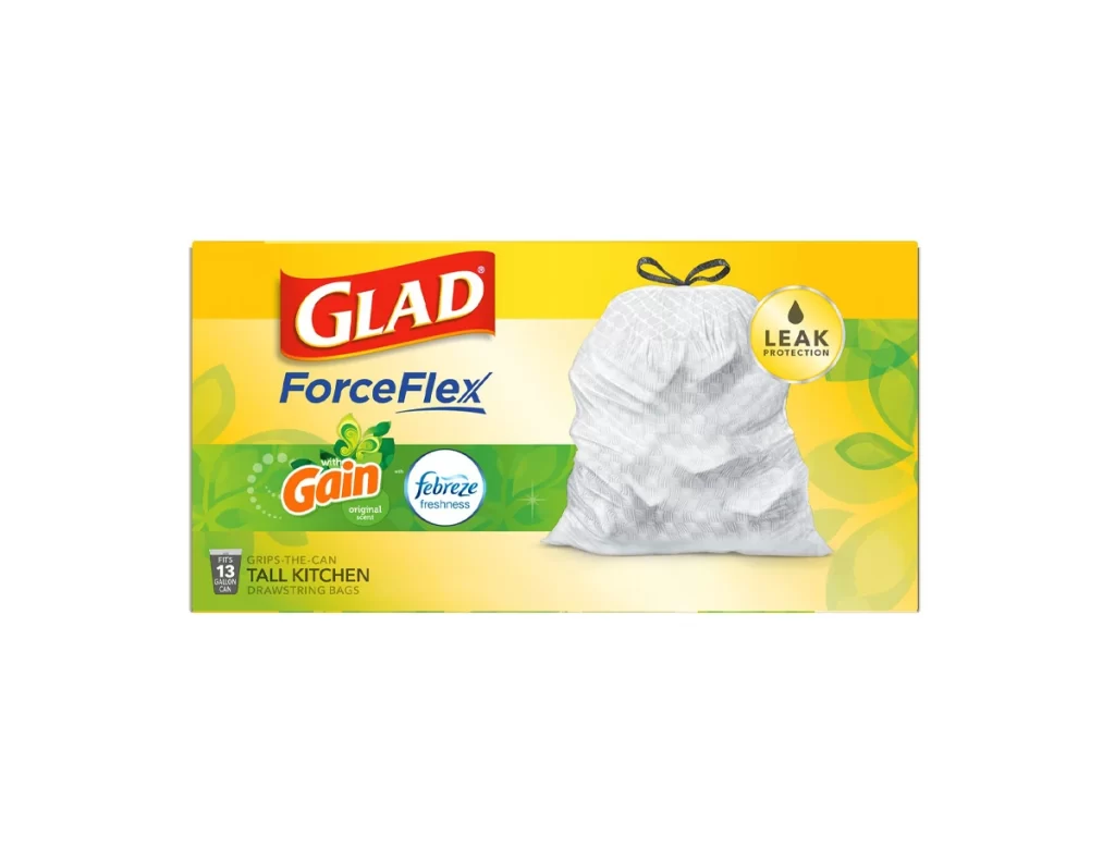
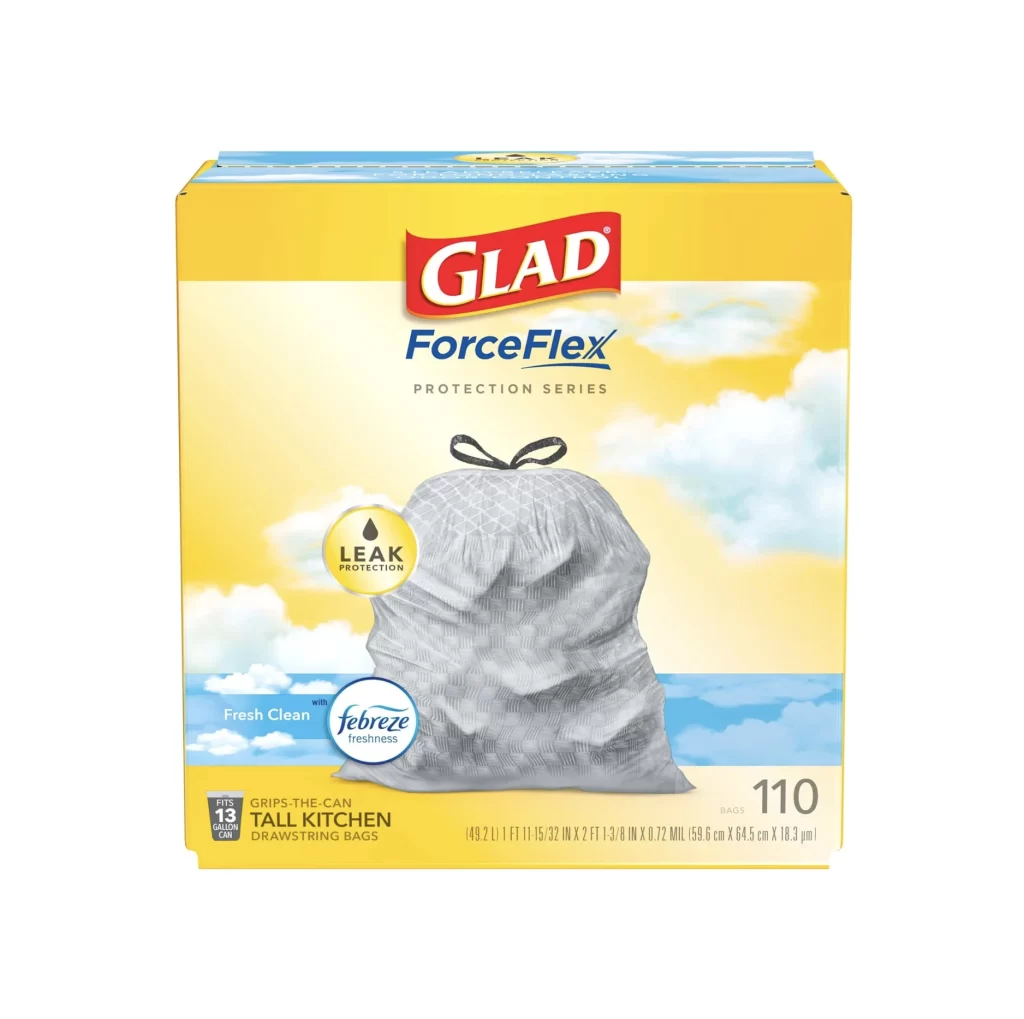
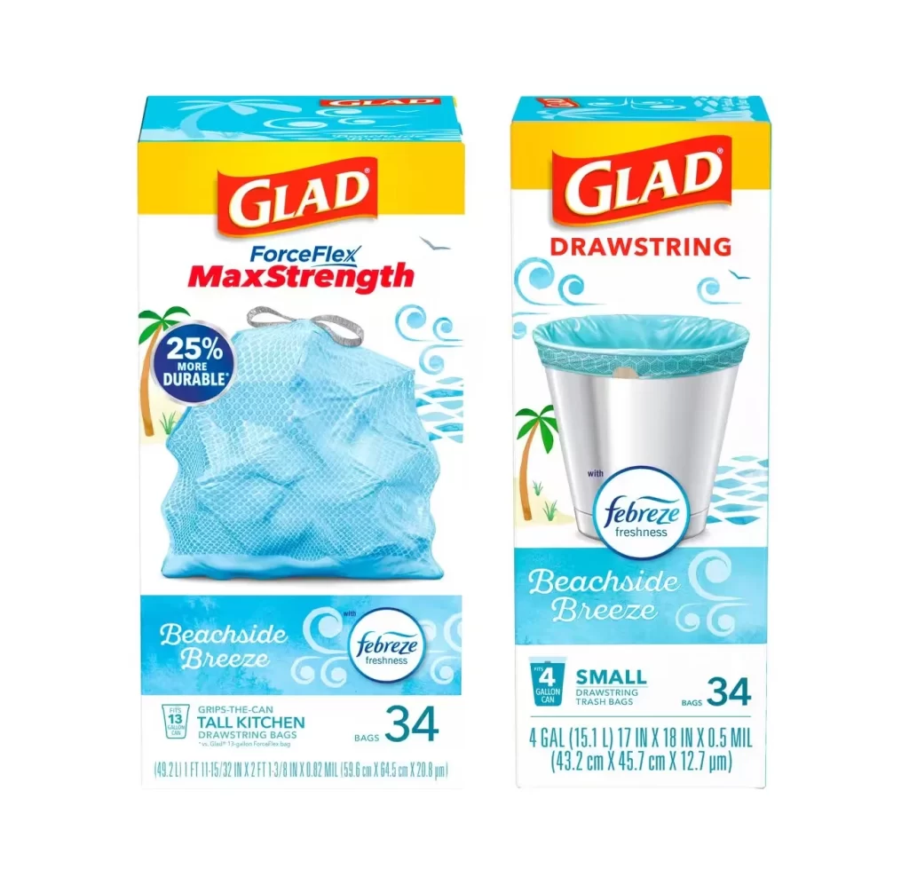
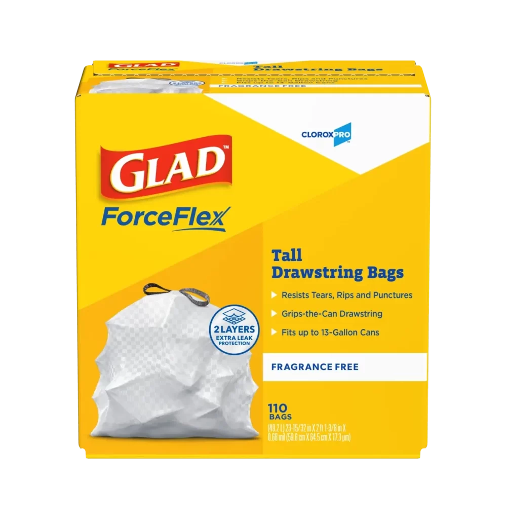
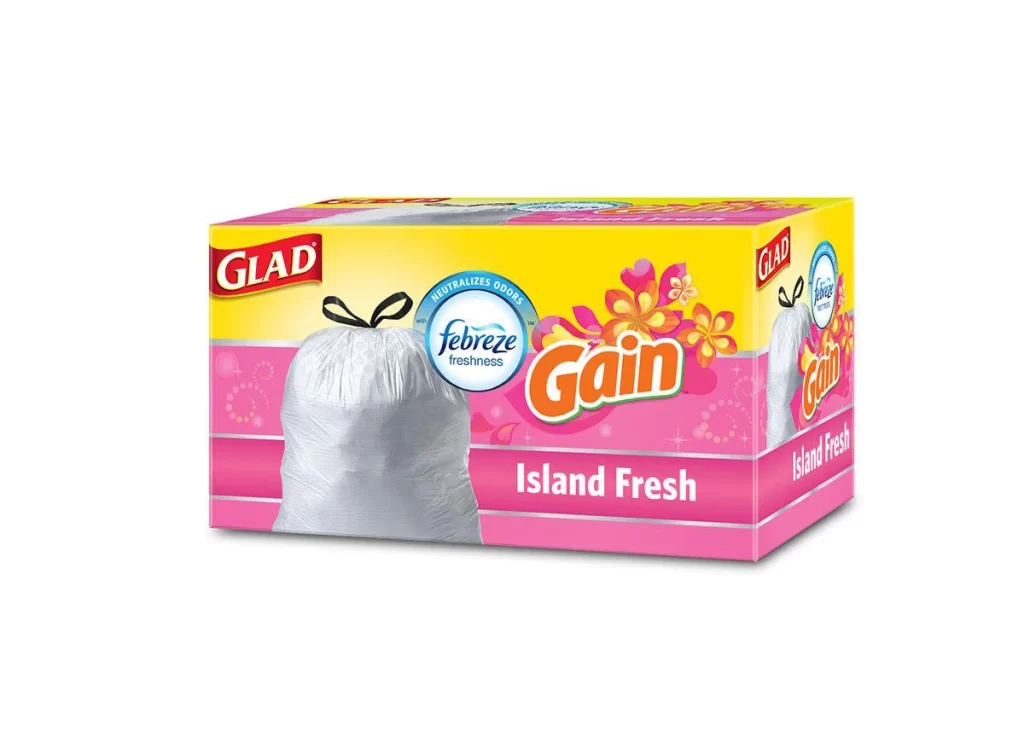
A vibrant yellow box dominates the frame, featuring a central image of a crinkled, translucent white drawstring bag that appears to be made of a flexible plastic material. The packaging is adorned with bold red and blue typography for the 'Glad' and 'ForceFlex' brand names, while bright lemon slices and green leaves flank the product to emphasize the citrus theme. A circular badge on the left highlights '7 in 1 Benefits' in red text, and the bottom section displays orange and teal logos for Gain's lemon zest scent and Febreze freshness, alongside specific dimensions for the 40-count tall kitchen bags.
What makes this particular design stand out is the clever use of color psychology, where the sunny yellow background immediately signals cleanliness and freshness to the consumer. The visual texture of the bag itself is rendered with realistic folds and shadows, effectively communicating the stretchy, durable nature of the ForceFlex material without needing physical interaction. Furthermore, the strategic placement of co-branding elements creates a cohesive narrative about odor control, blending household names into a single, trustworthy package aesthetic.

Product photographers might study this composition to understand how to balance multiple logos while keeping the main item as the focal point. Packaging designers could analyze the hierarchy of information to see how scent indicators are integrated into existing brand architectures without cluttering the layout. Marketing teams looking to launch scented household goods would find this a perfect case study for using fruit imagery to evoke sensory expectations in a static medium.