Title

Glad Quick-Tie 13 Gallon Tall Kitchen Bags Packaging


Topics

GladTrash Bags

Details

Uploaded user: Leo

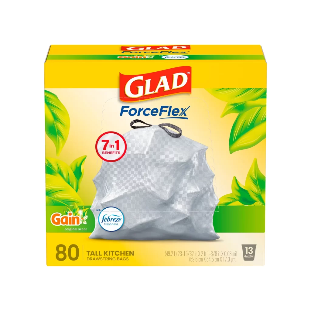
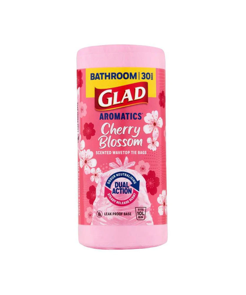
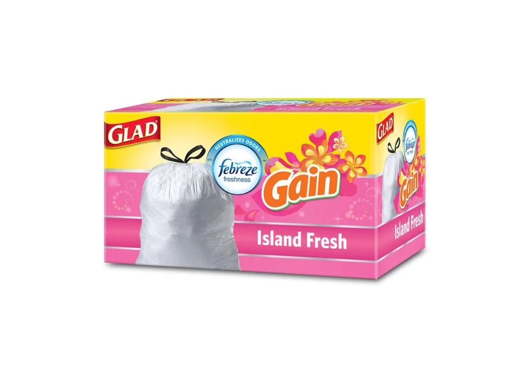
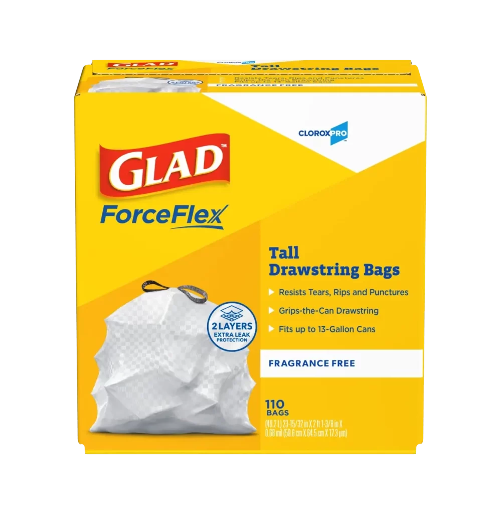
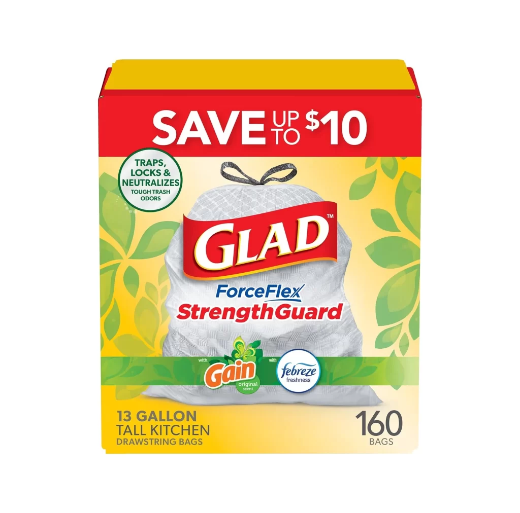
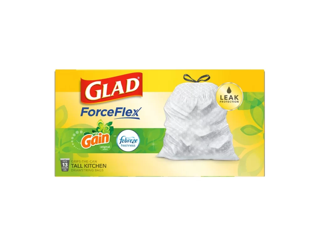
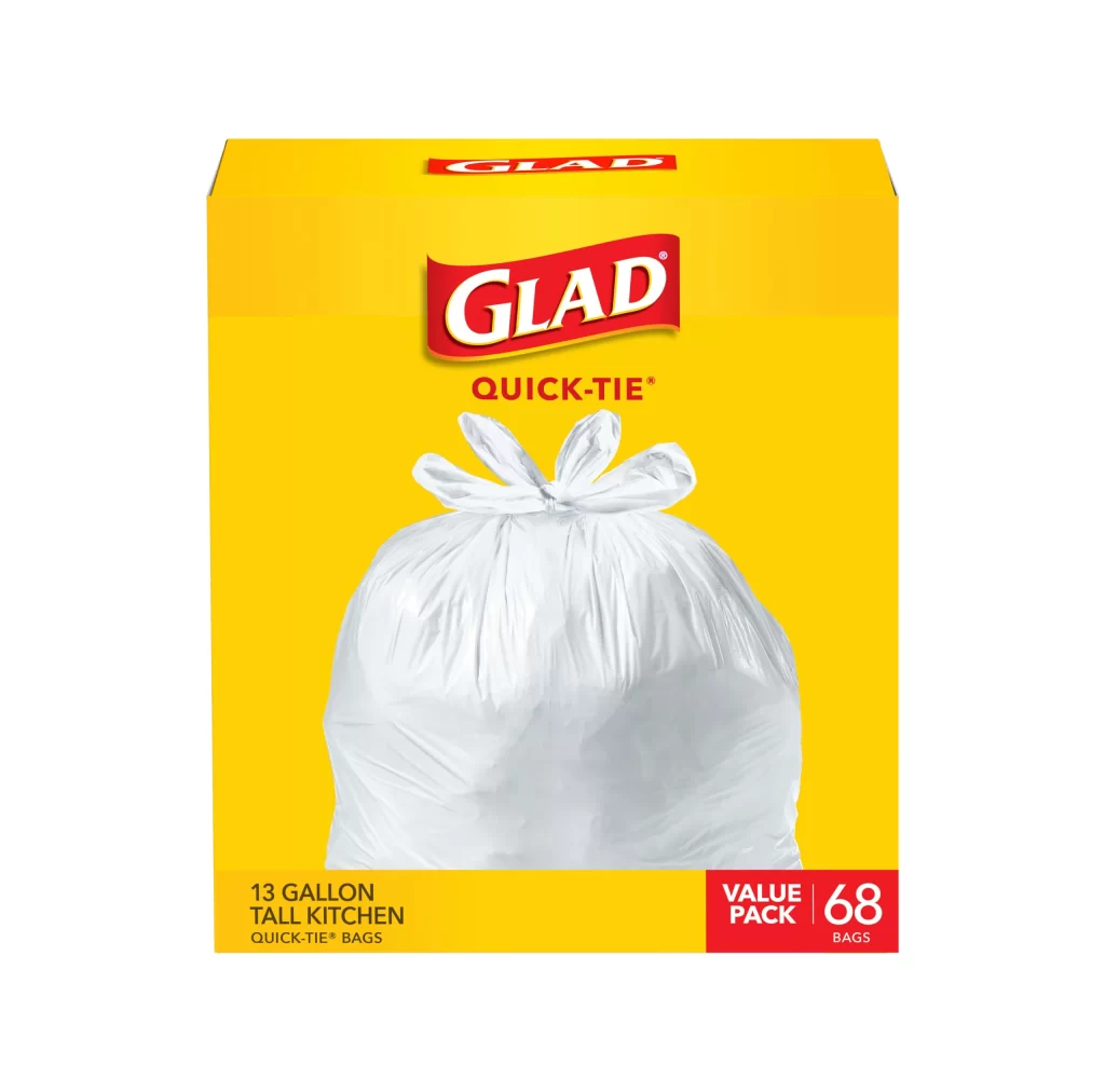
A vibrant, saturated yellow background dominates the rectangular box, creating a high-contrast canvas for the product photography. Centered on the front face sits the iconic red Glad logo with white serif lettering, positioned directly above the 'QUICK-TIE' sub-brand in smaller red capitals. Below this typography, a translucent white plastic bag is rendered in sharp detail, its top gathered into a neat four-loop bow that demonstrates the closure mechanism. The bottom left corner specifies '13 GALLON TALL KITCHEN' in black sans-serif text, while a bold red rectangle at the lower right announces a 'VALUE PACK' of 68 bags in large white numerals.

Visual hierarchy plays a crucial role here, with the red brand elements popping aggressively against the golden-yellow field to ensure shelf visibility from a distance. The photographic treatment of the bag itself deserves particular attention for its realistic rendering of plastic folds and light refraction through the material. By showing the actual tied closure rather than just describing it, the packaging communicates functionality instantly without requiring additional explanation from the consumer.

Brand managers analyzing competitive packaging strategies would find this example useful for studying color psychology in household goods. Industrial designers working on flexible packaging could reference the way the product photograph integrates with flat graphic elements to create a cohesive front panel. Marketing teams might also examine how the 'Value Pack' callout is positioned to influence purchasing decisions at the retail level.