Cigar City Brewing Jai Alai Mixed Pack Can Packaging
Topics
Details
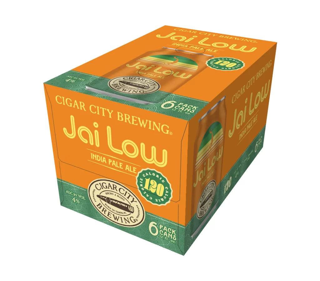
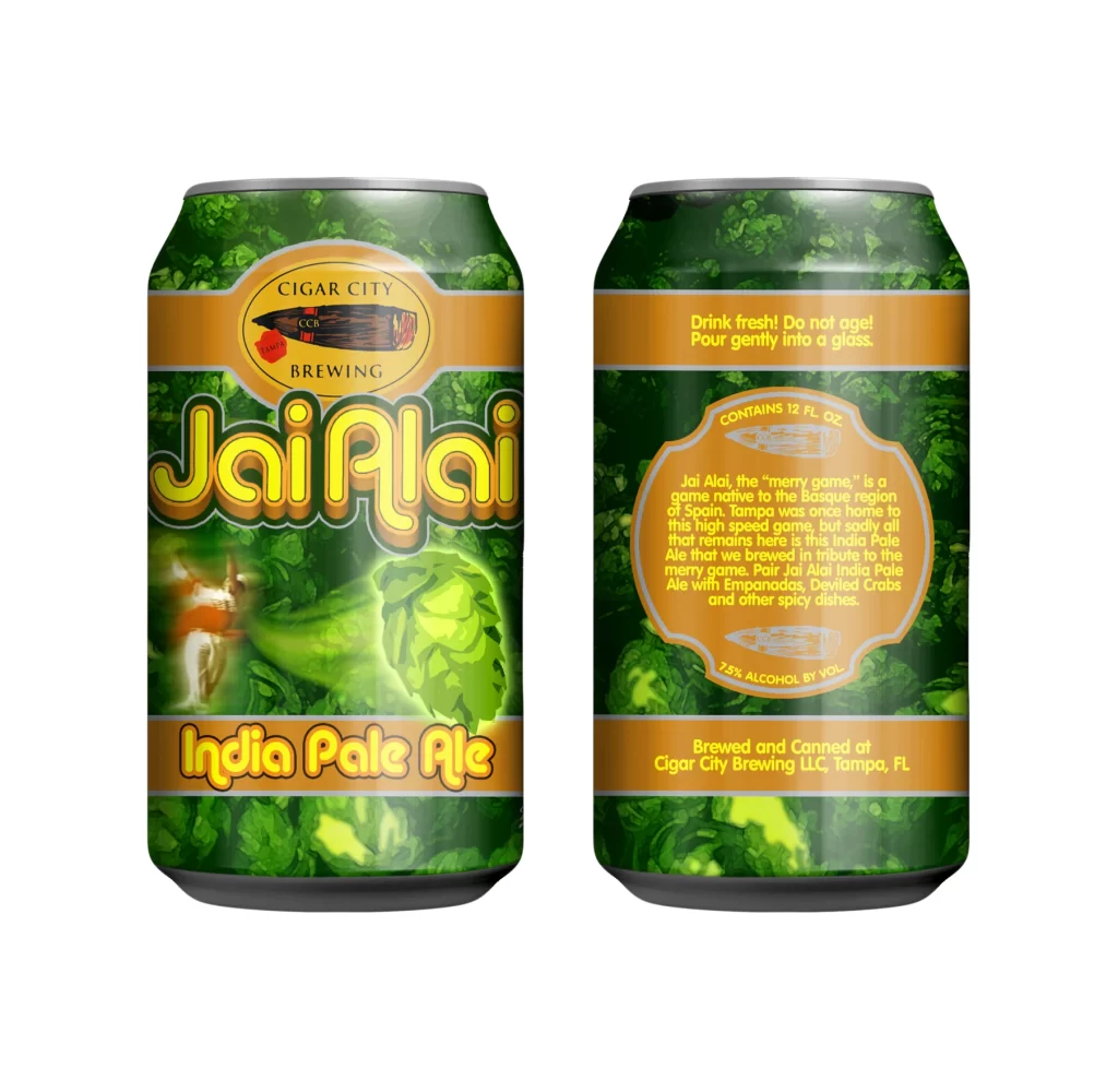
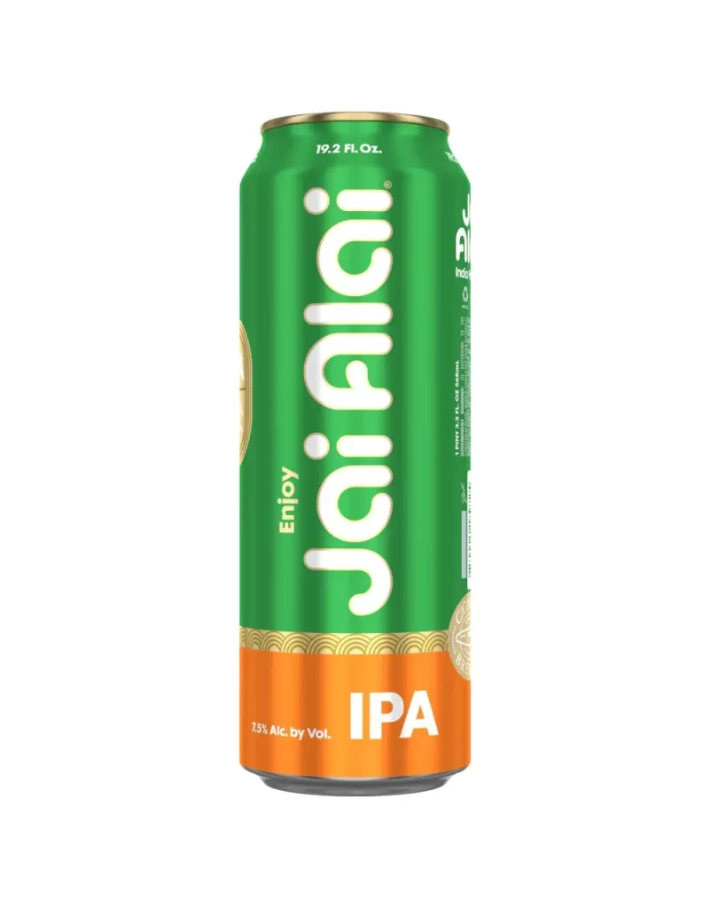
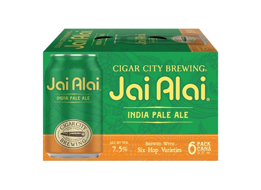
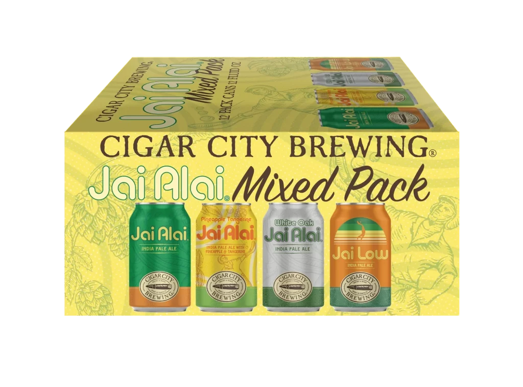
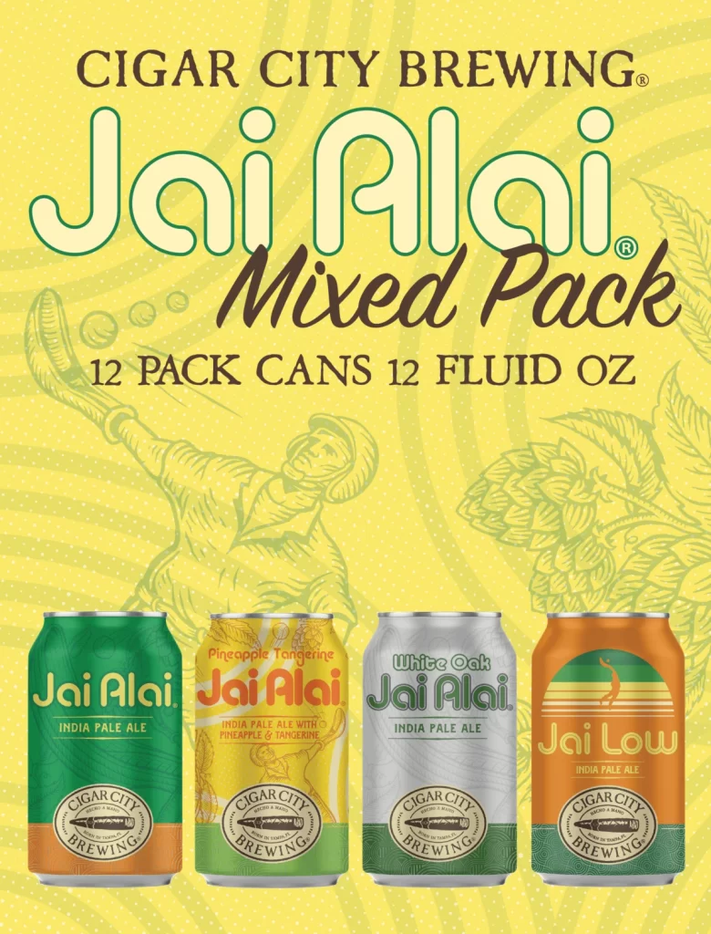
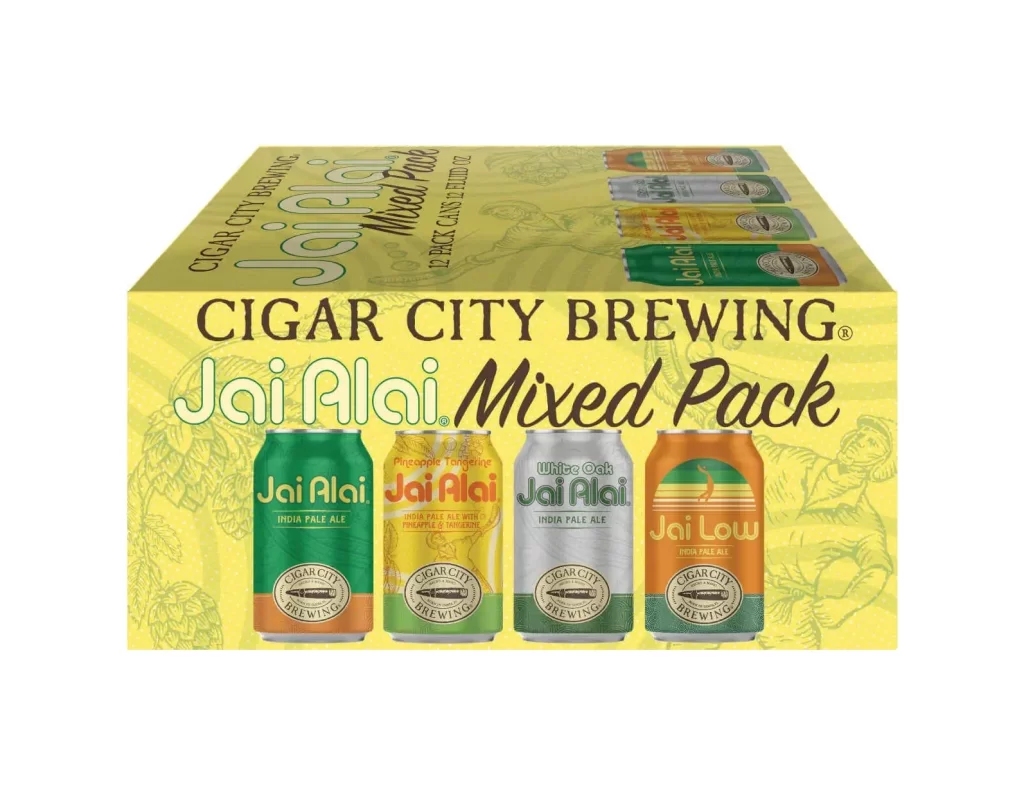
A vibrant, sun-drenched yellow background with subtle radial patterns and faint botanical line art supports a 12-can mixed pack from Cigar City Brewing. Bold typography dominates the upper portion: 'CIGAR CITY BREWING' appears in dark brown serif capitals, followed by the iconic 'Jai Alai' in large, rounded white letters with green outlines and 'Mixed Pack' in a flowing dark brown script beneath it.
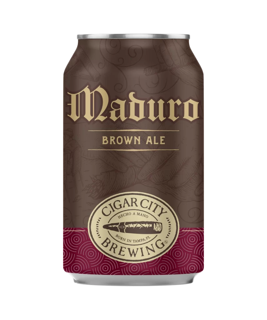
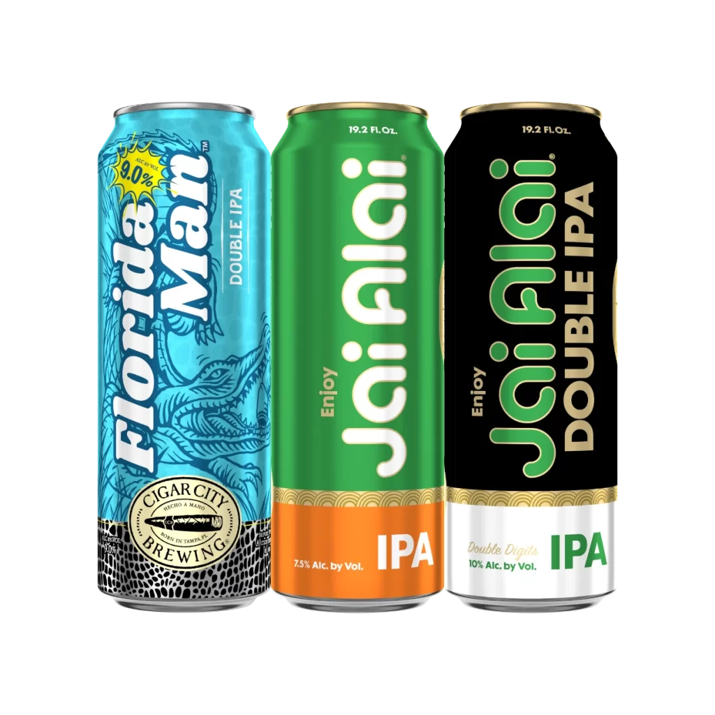
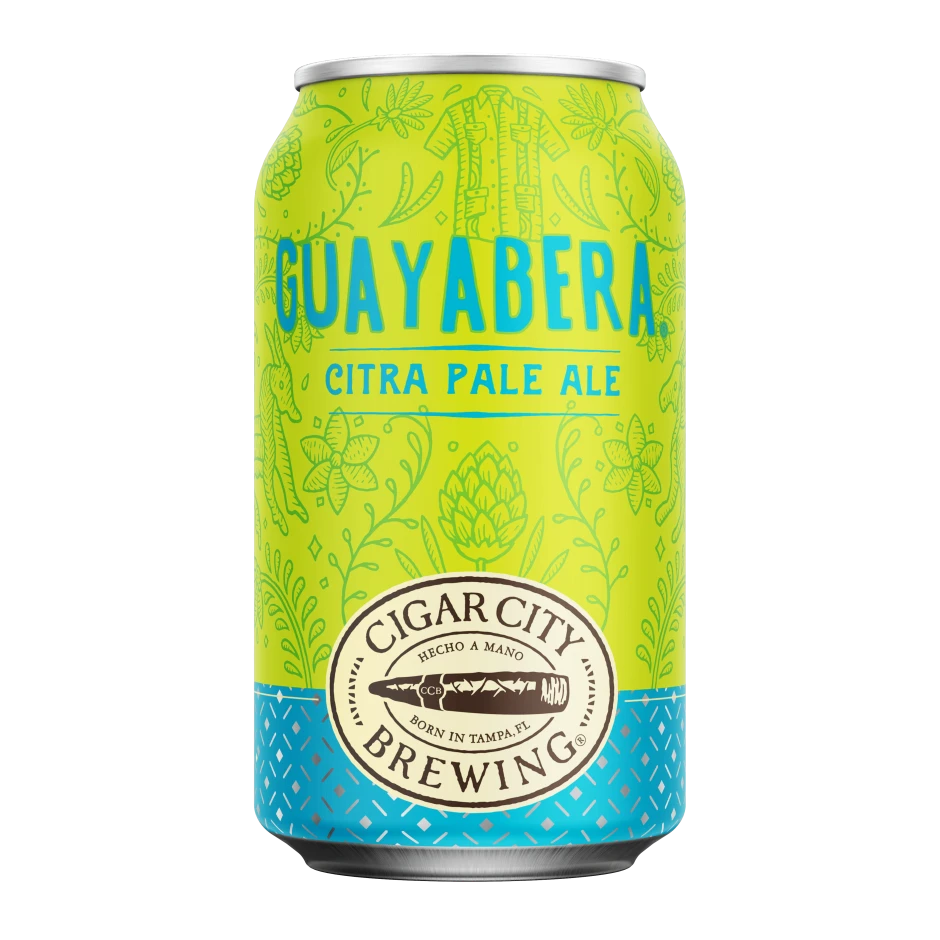
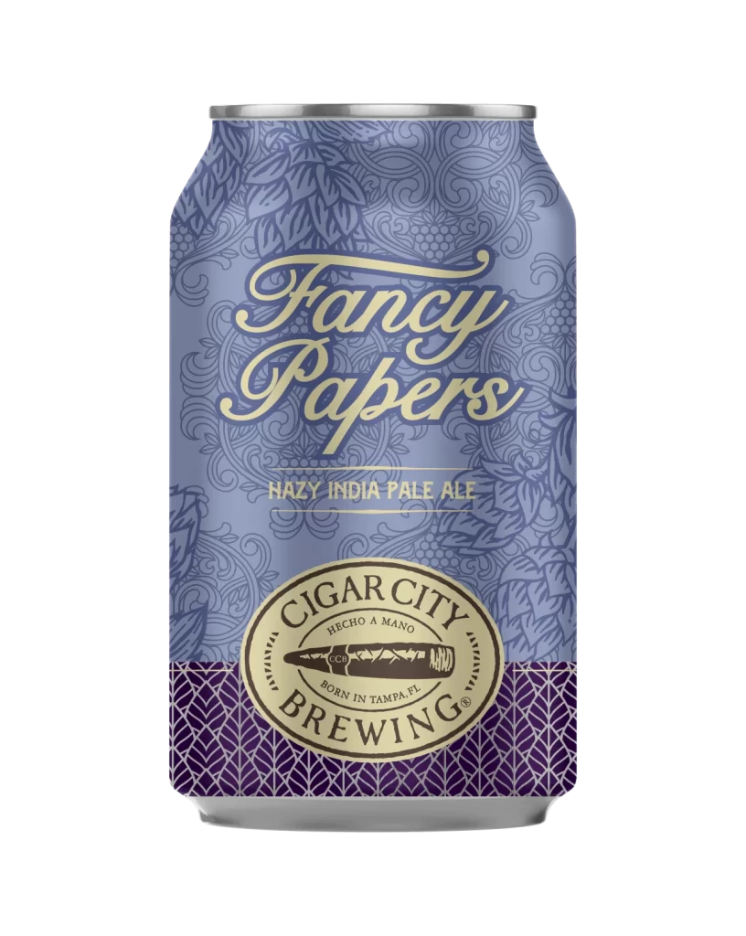
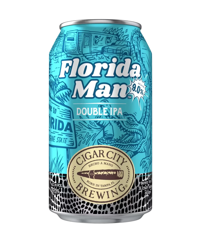
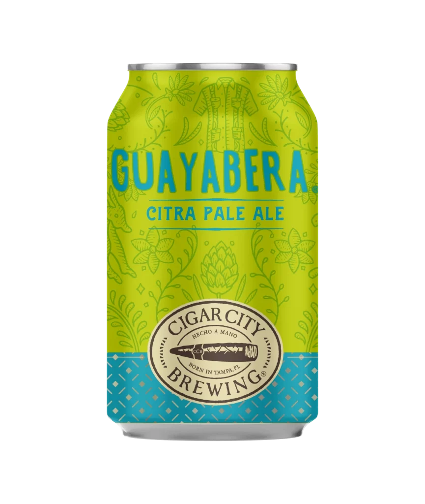
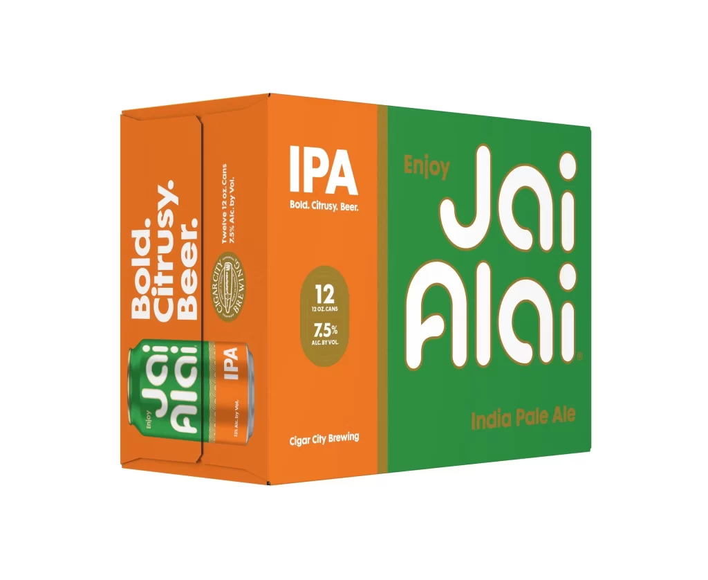
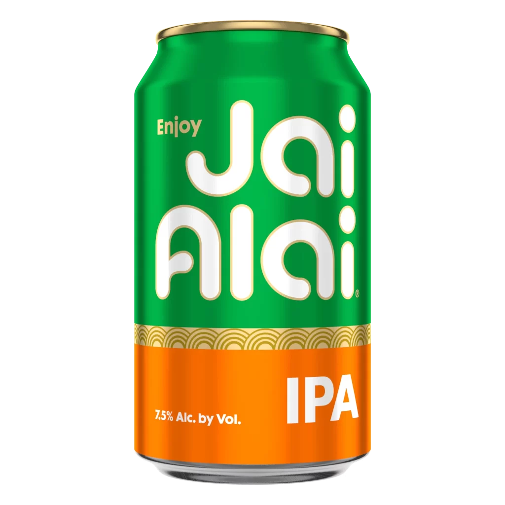
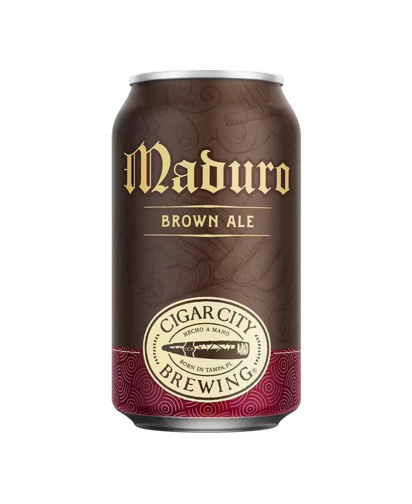
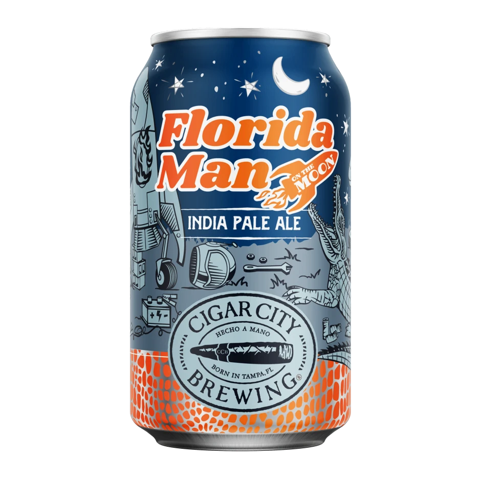
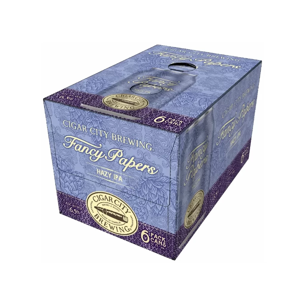
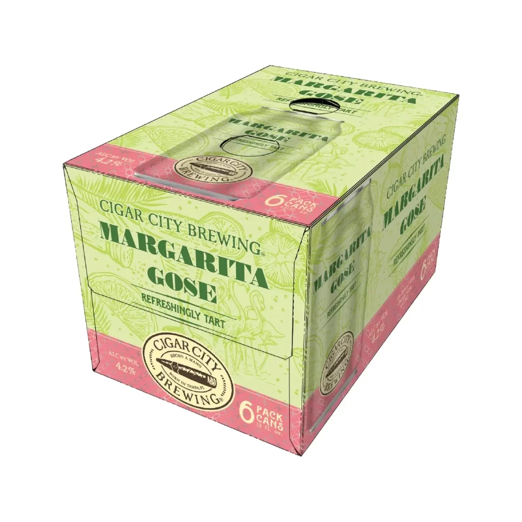
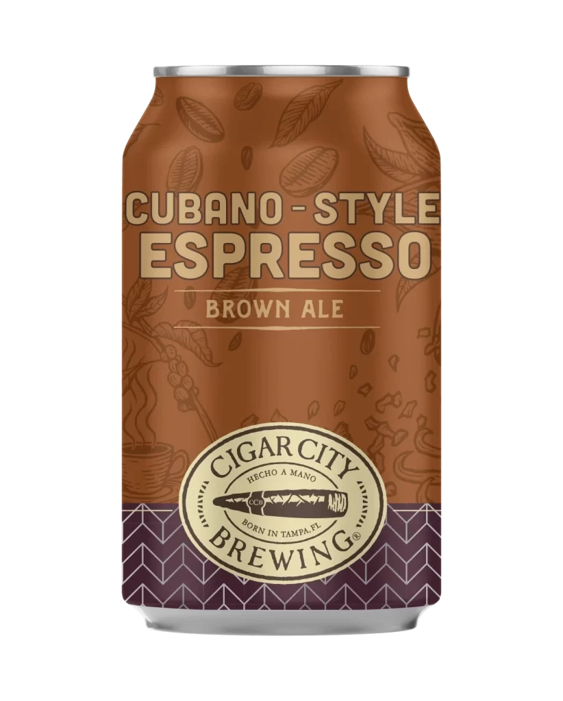
Visual hierarchy is established through the dramatic scale contrast between the oversized product title and the physical cans below, creating immediate brand recognition before revealing the variety within. Each can variant employs color-coded differentiation that corresponds to its specific flavor profile, from the classic green India Pale Ale to the tropical yellow Pineapple Tangerine edition. The consistent placement of the brewery’s seal across all four designs maintains cohesive branding while allowing individual identities to emerge through distinct palette choices and secondary graphic elements like the sunset gradient on the Jai Low variant.
Packaging designers studying beverage industry trends would examine this layout to understand how mixed-pack presentations balance unity with variety across multiple SKUs. Brand strategists could reference the typographic interplay between the playful rounded letterforms of the product name and the sophisticated script used for ‘Mixed Pack’ to inform their own identity systems. Retail merchandising teams might analyze the color-coded system to develop similar visual sorting mechanisms for their own product lines, ensuring consumers can quickly distinguish between variants while recognizing the parent brand.

![Cigar City Brewing Beer Packaging ]](https://gropicture-1323946364.cos.na-siliconvalley.myqcloud.com/wp-content/uploads/2026/07/cigar-city-white-oak-jai-alai-ipa-4-pack-cans-2566-823x1024.webp)