Cigar City Brewing Florida Man Double IPA Can Packaging
Topics
Details
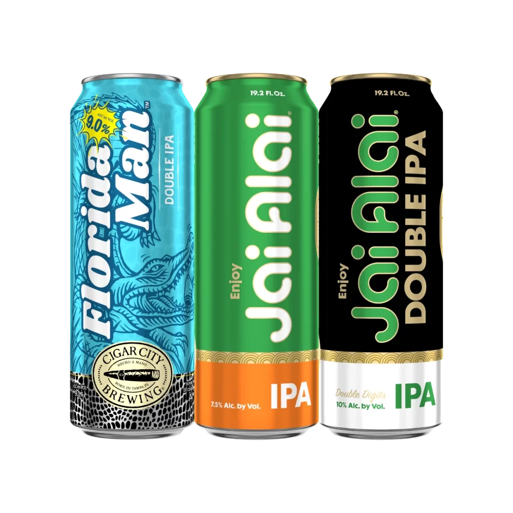
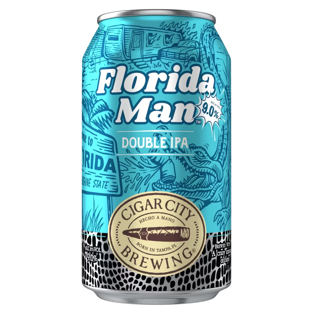
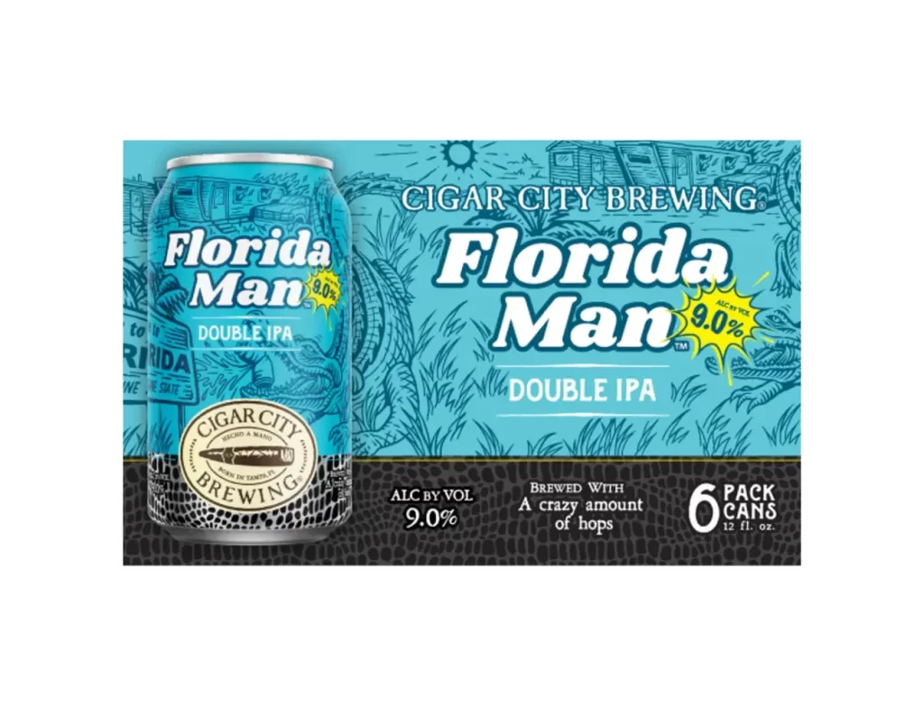
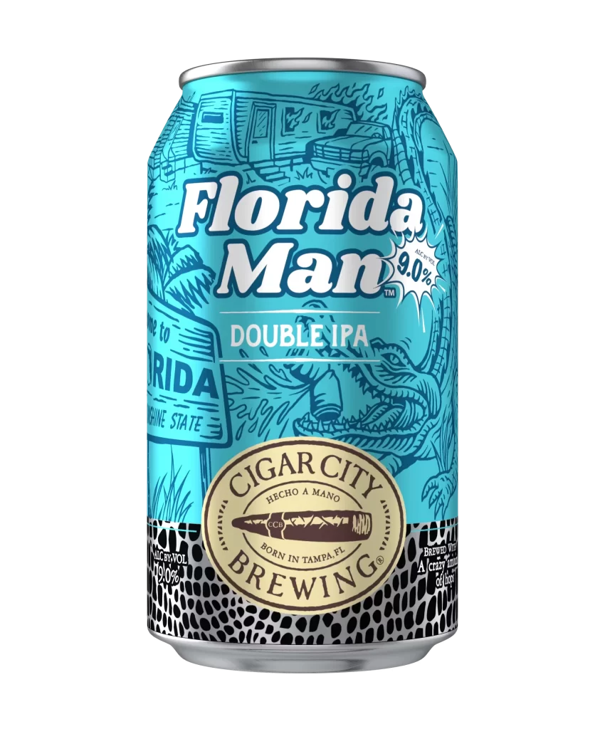
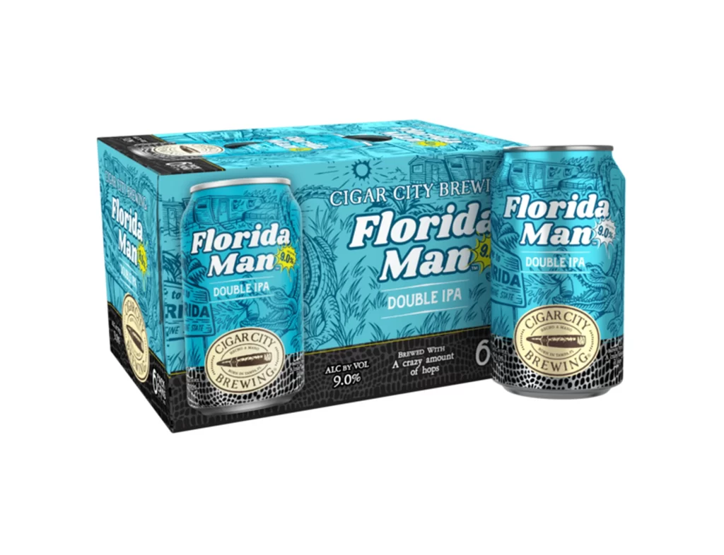
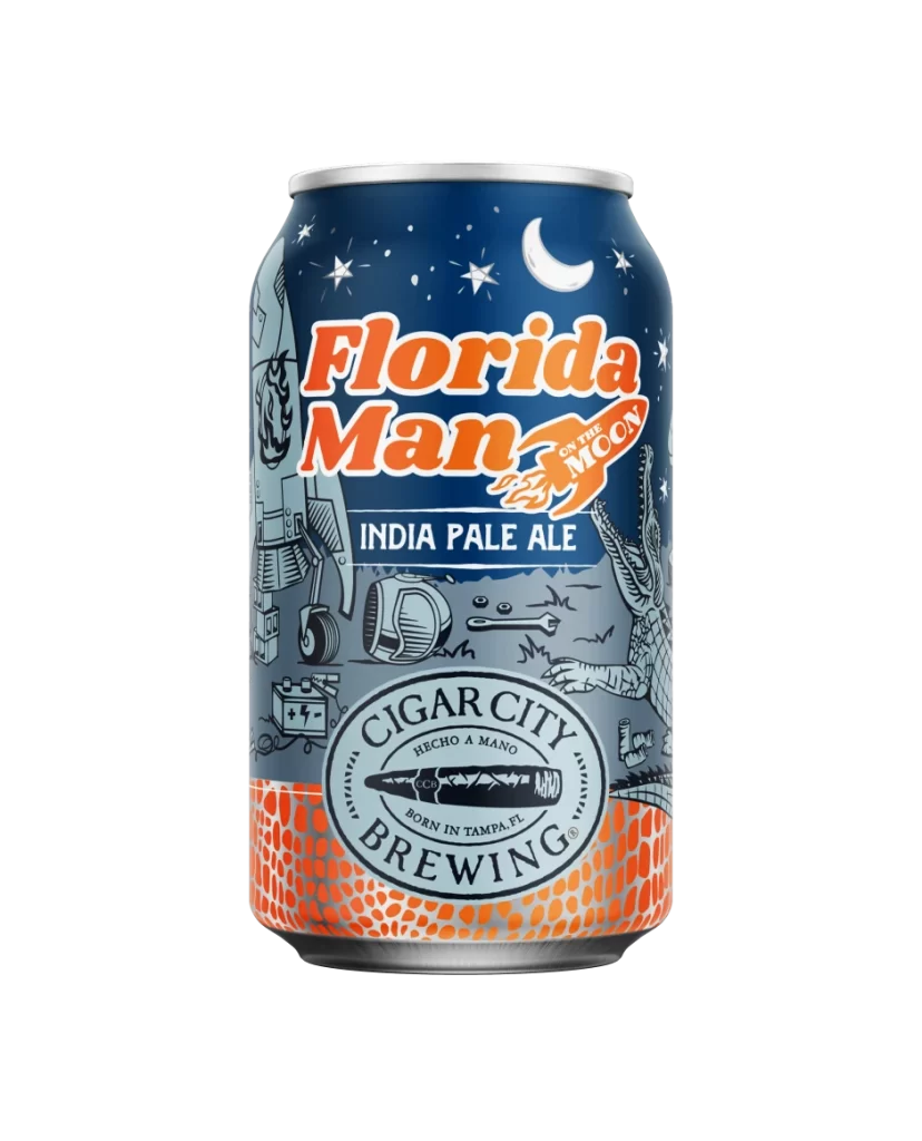
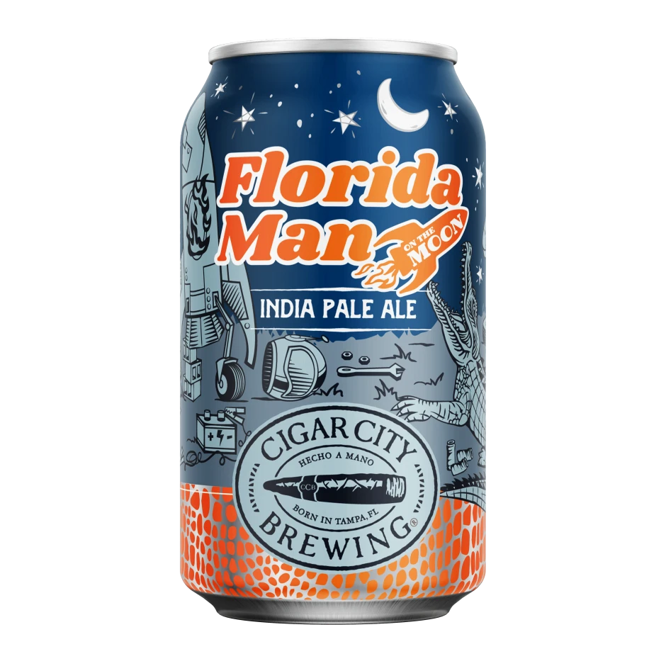
A single aluminum can of Florida Man Double IPA stands prominently on the left side of the frame, featuring bold white serif typography for the brand name and a bright yellow starburst highlighting the 9.0% alcohol content. The can and its surrounding graphics sit atop a vibrant turquoise backdrop filled with line-art illustrations of alligators, mobile homes, and tropical foliage. A dark band with a reptilian scale texture runs across the bottom of the composition.
Visual interest is driven by the clever juxtaposition of the serious craft beer aesthetic with playful ‘Florida Man’ internet culture tropes. The monochromatic blue palette creates a cohesive look that feels both refreshing and distinctly regional, while the detailed background sketches add depth without cluttering the primary product shot. Utilizing the gator-skin pattern at the bottom provides a tactile quality that reinforces the wild, untamed theme suggested by the beer’s name.
Packaging designers studying beverage branding will find this layout useful for balancing illustration-heavy backgrounds with legible foreground text. Marketing teams looking to capture a specific regional vibe can analyze how typography and color work together to evoke a sense of place. Furthermore, illustrators interested in integrating complex line work into commercial products can examine how the background art supports rather than overwhelms the central subject.

![Cigar City Brewing Beer Packaging ]](https://gropicture-1323946364.cos.na-siliconvalley.myqcloud.com/wp-content/uploads/2026/07/cigar-city-white-oak-jai-alai-ipa-4-pack-cans-2566-823x1024.webp)