Cigar City Brewing IPA Bold, Citrusy Beverage Packaging
Topics
Details
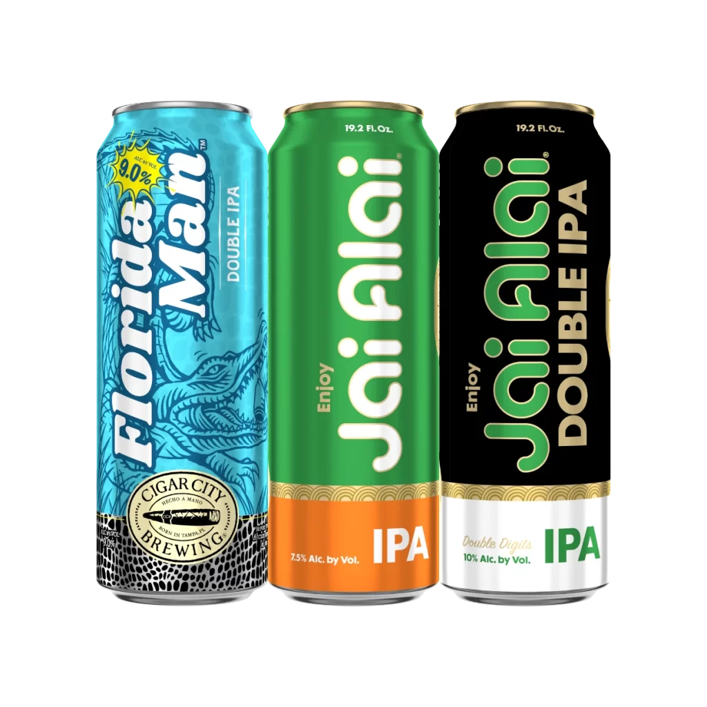
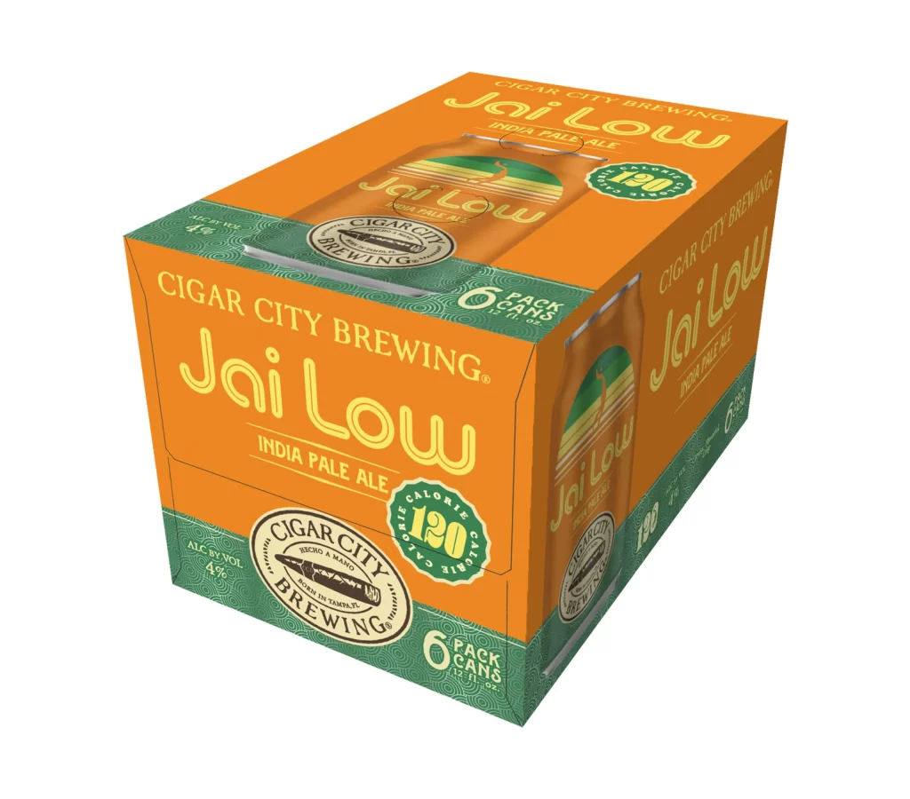
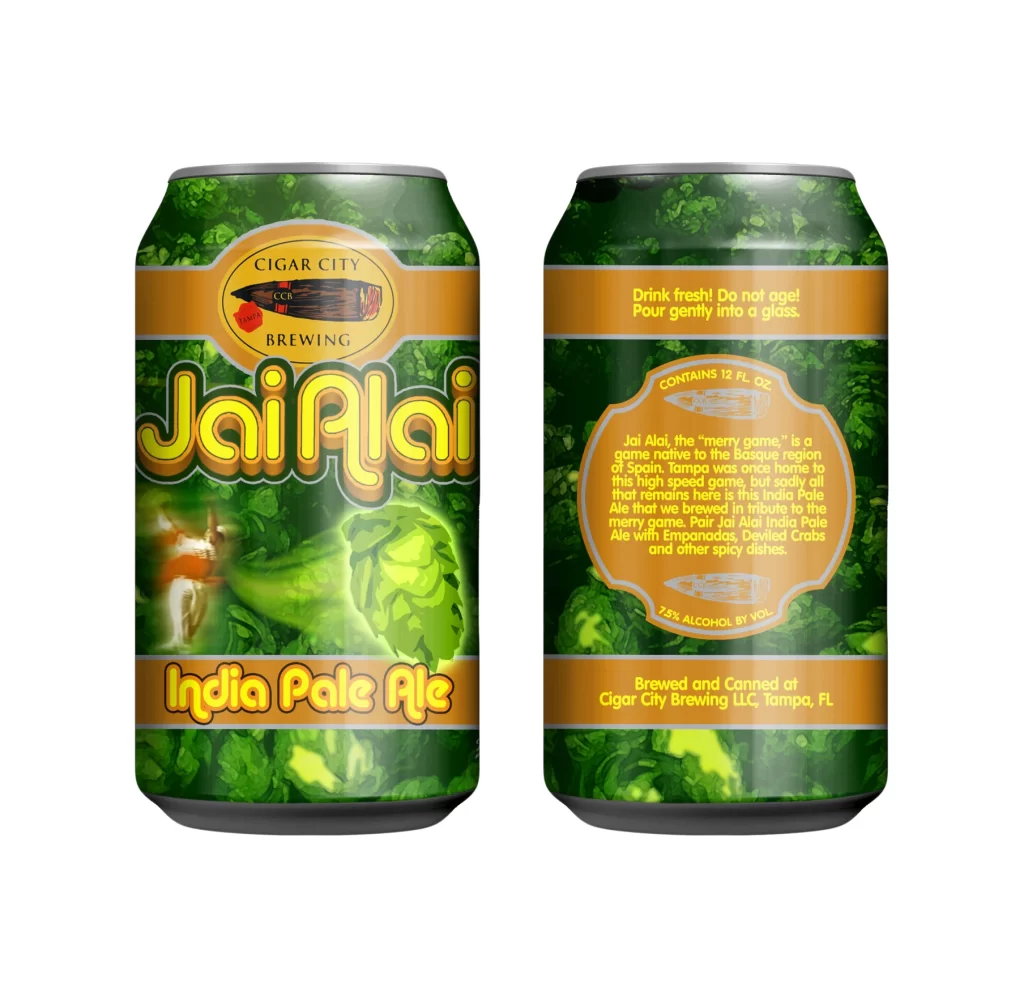
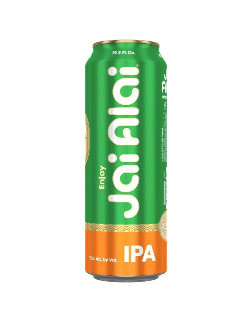
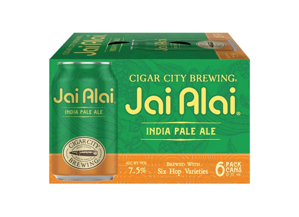
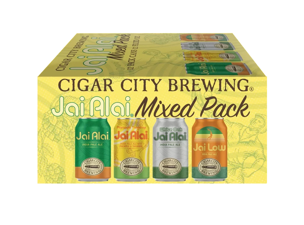
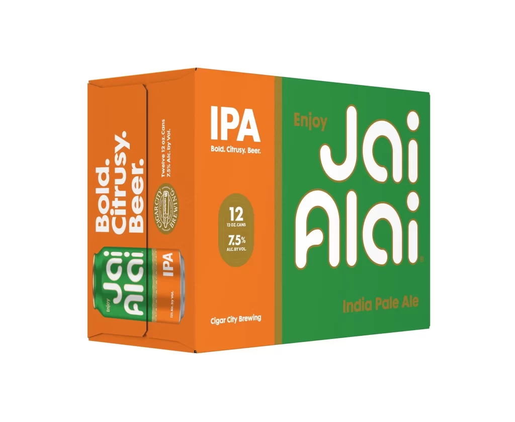
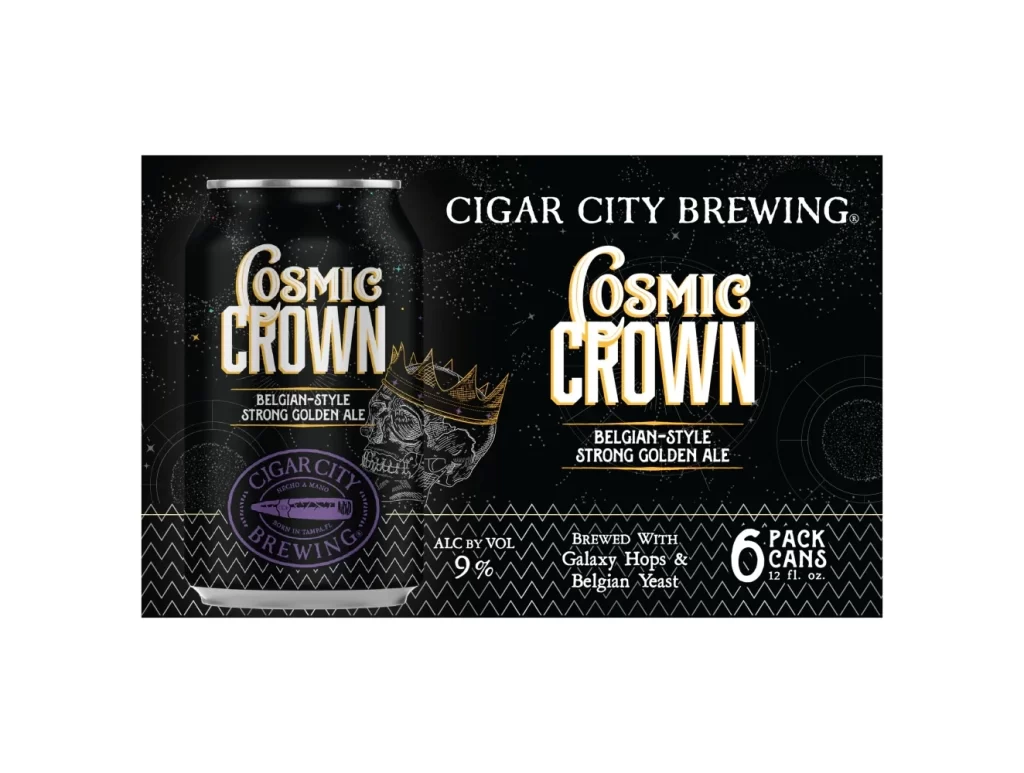
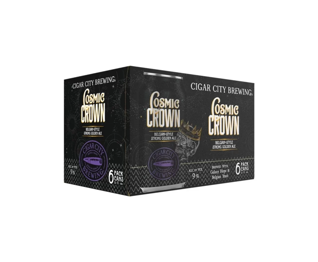
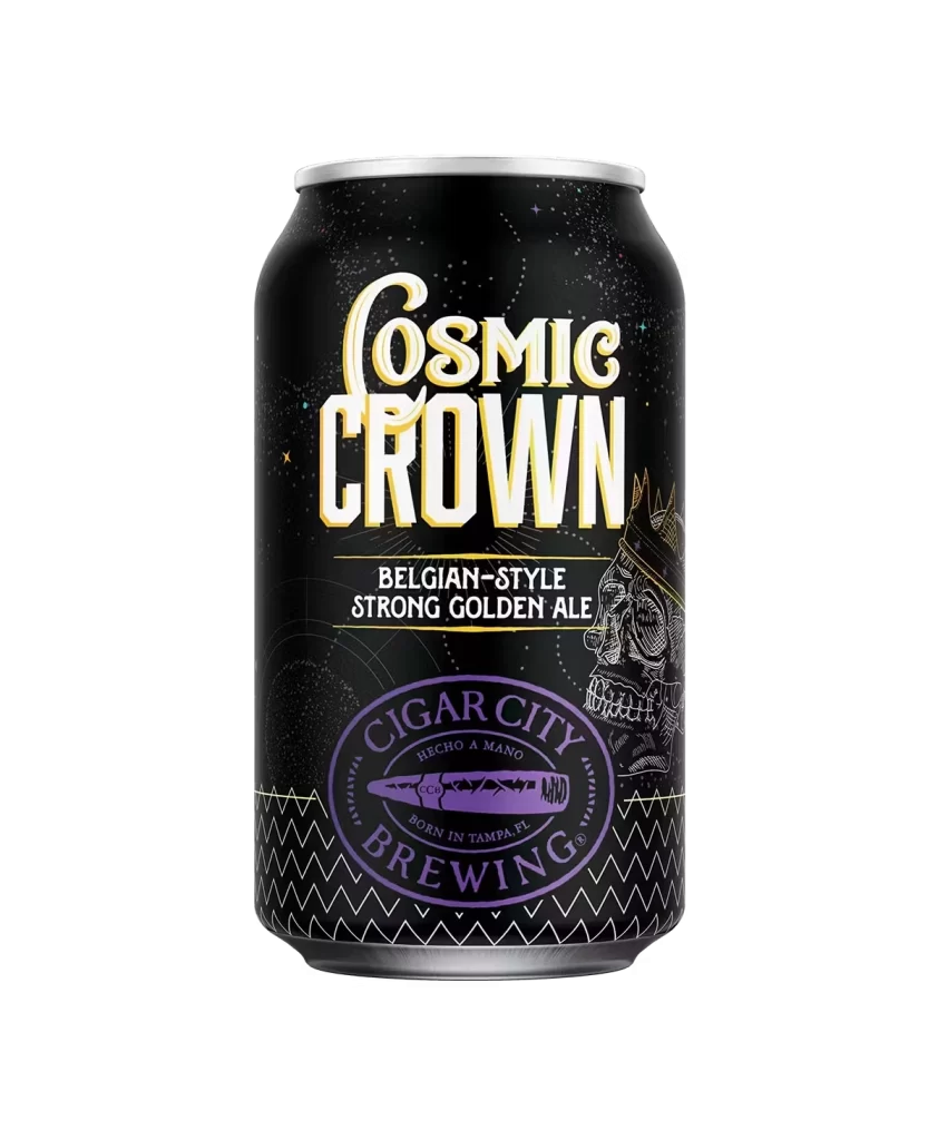
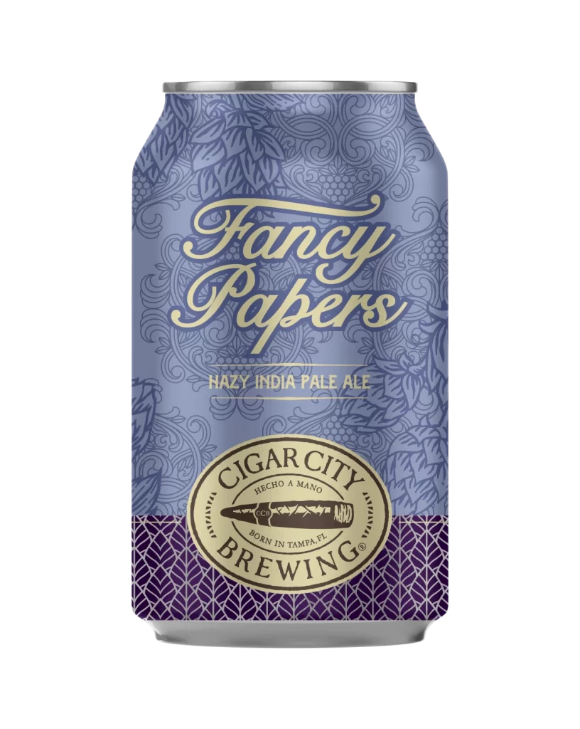
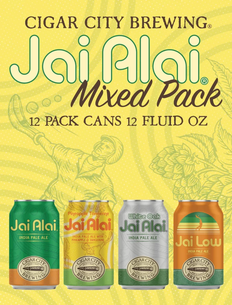
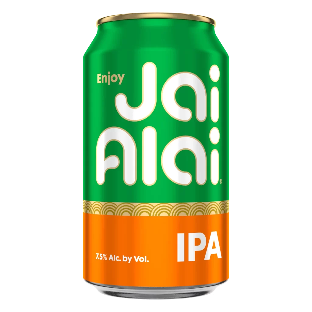
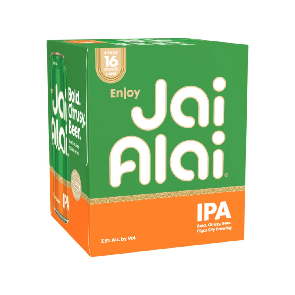
Vibrant orange and deep forest green panels define the visual structure of this twelve-pack carrier, creating a bold, split-composition aesthetic. The left side features the text 'Bold. Citrusy. Beer.' stacked vertically in white sans-serif type, while the central orange face prominently displays 'IPA' in large, heavy lettering above the descriptive tagline. A circular badge on the side panel indicates the contents as twelve 12-ounce cans with 7.5% alcohol by volume, positioned near a realistic rendering of an individual green can that mirrors the packaging's color scheme.
Graphic contrast drives the immediate visual impact of this design, utilizing the complementary relationship between the warm orange and cool green to create energetic tension across the cardboard surface. The typographic hierarchy plays with scale dramatically, particularly on the right-facing panel where 'Jai Alai' appears in oversized, rounded white characters that dominate the green field with playful confidence. Such deliberate use of negative space and geometric color blocking transforms a standard beverage carrier into a statement piece that commands shelf presence through simplified, high-visibility elements rather than intricate illustration.
Brand strategists analyzing successful craft beer market positioning would find this case study valuable for understanding how color psychology influences consumer perception of flavor profiles like citrus and bitterness. Packaging engineers might reference the structural layout when developing carriers that balance informational density with aesthetic appeal for premium beverage lines. Retail merchandising teams could also examine how the orientation of text across multiple faces ensures readability whether the product sits on a shelf or hangs in a display cooler.

![Cigar City Brewing Beer Packaging ]](https://gropicture-1323946364.cos.na-siliconvalley.myqcloud.com/wp-content/uploads/2026/07/cigar-city-white-oak-jai-alai-ipa-4-pack-cans-2566-823x1024.webp)