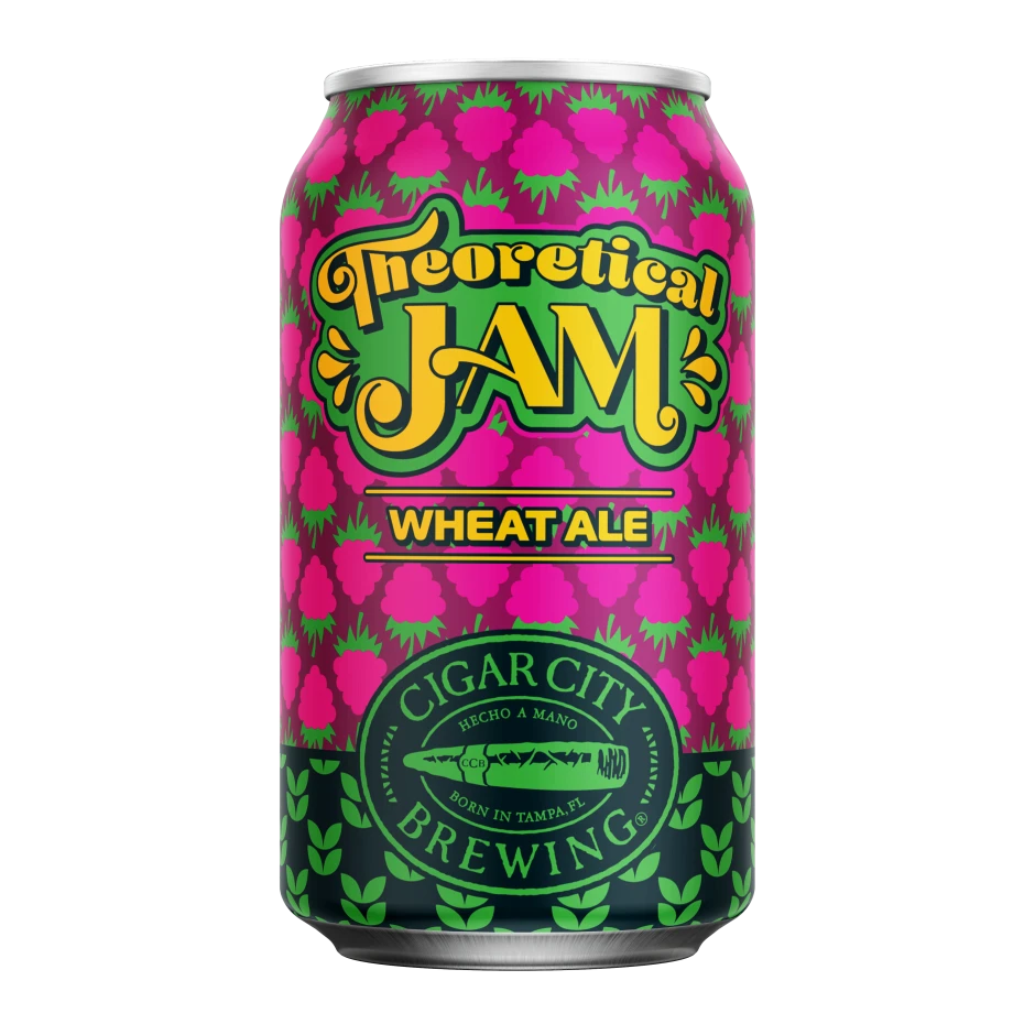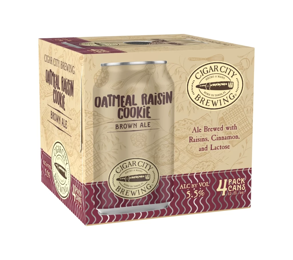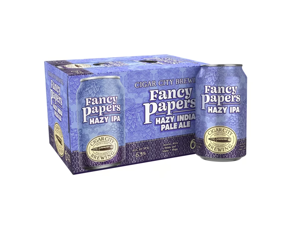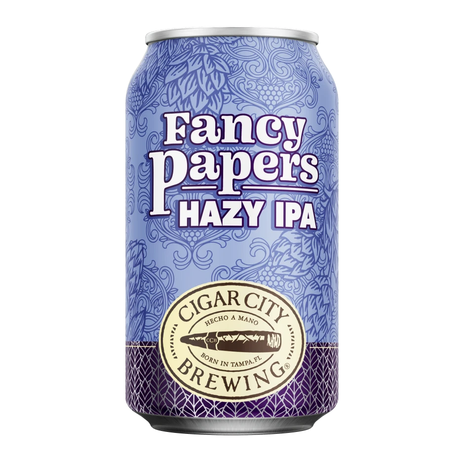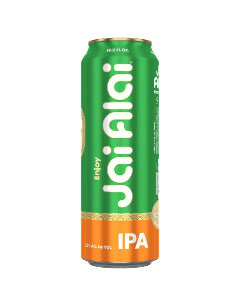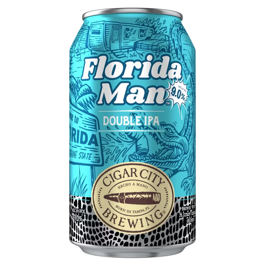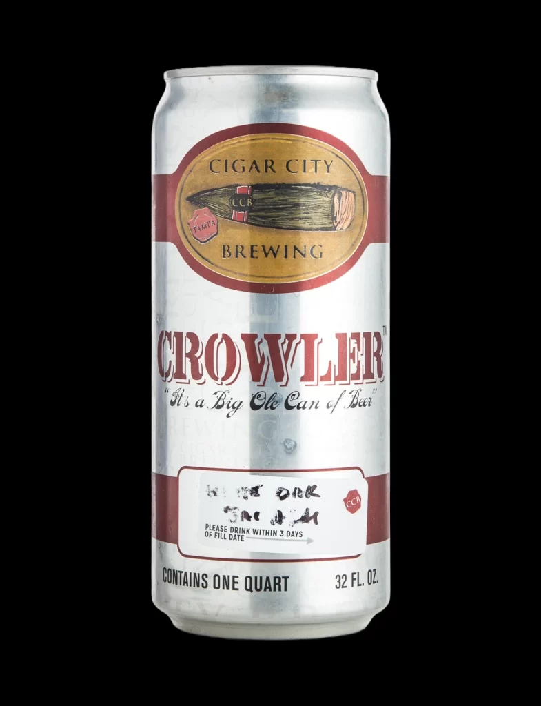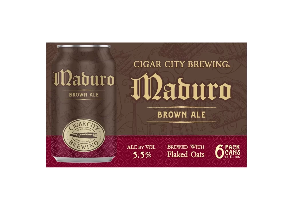
Cigar City Brewing Mixed Pack Beverage Packaging
Topics
Details
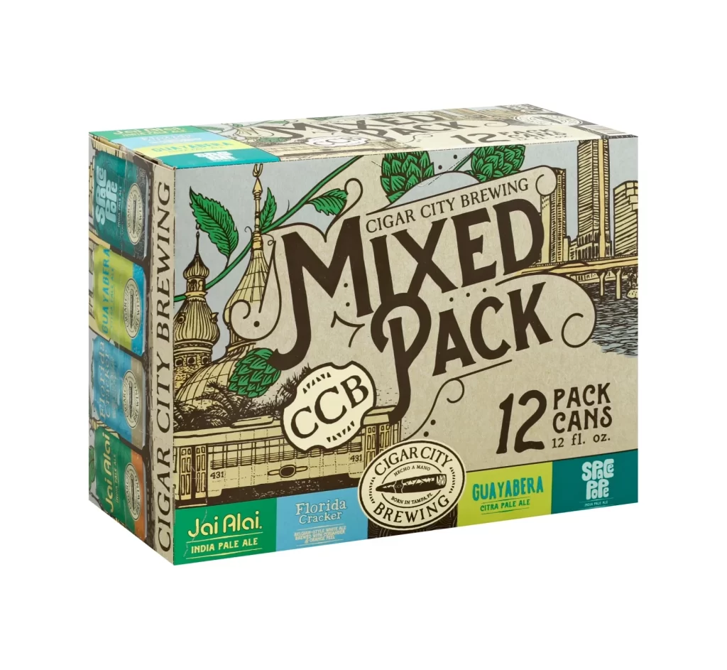
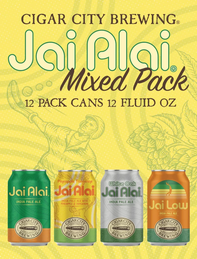
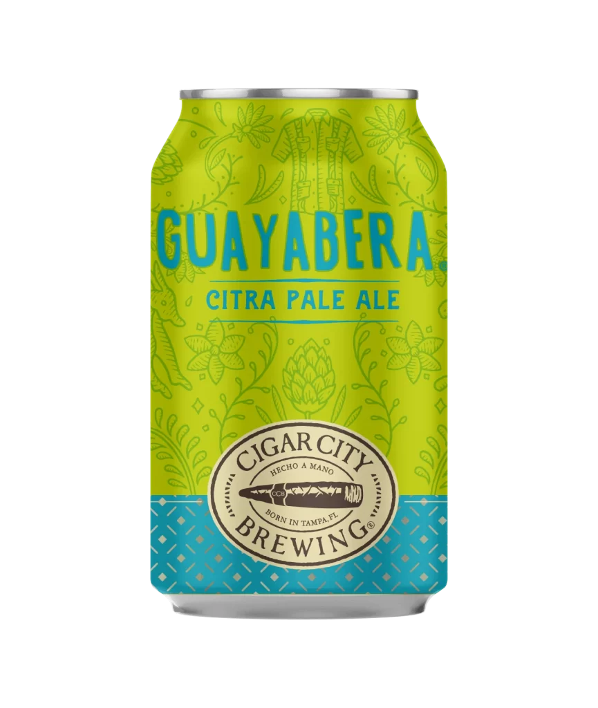
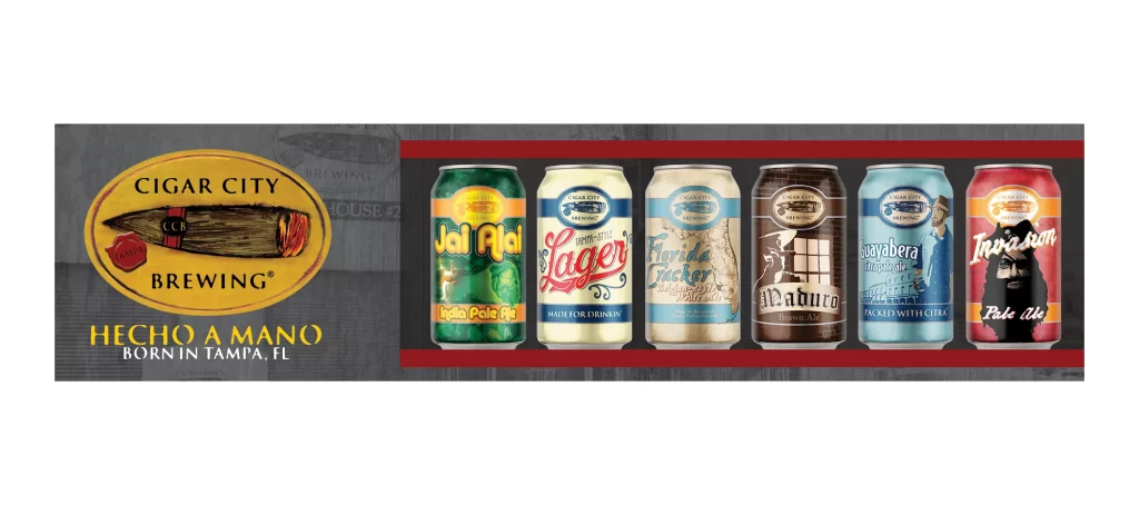
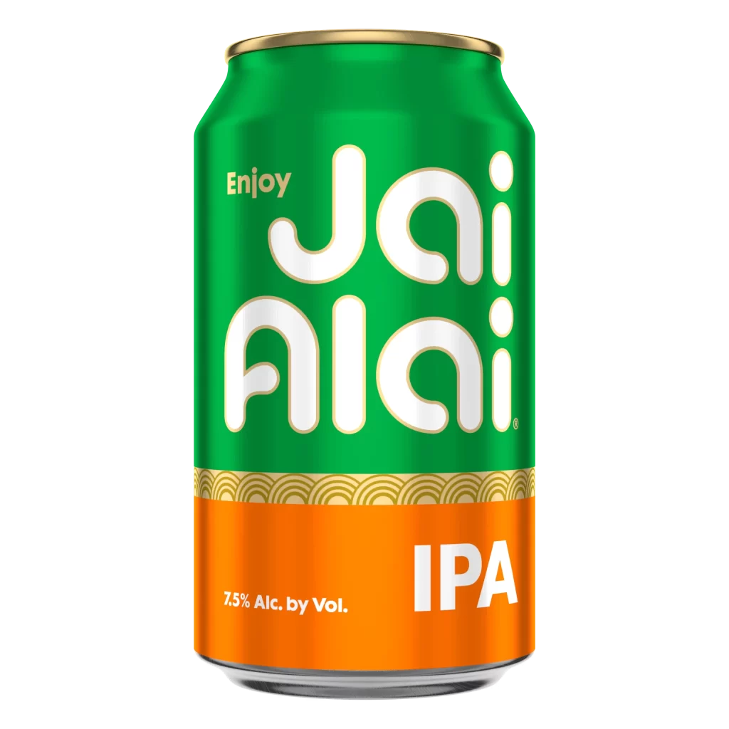
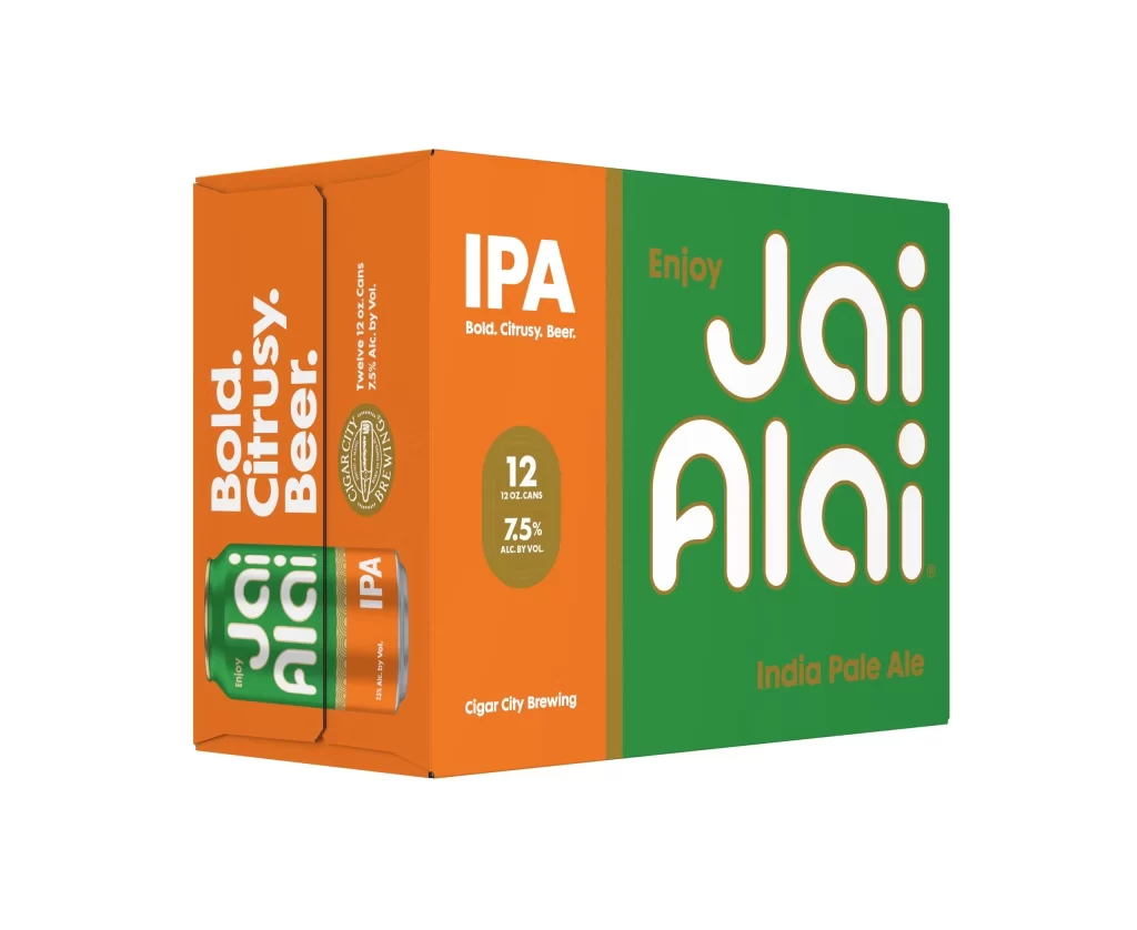
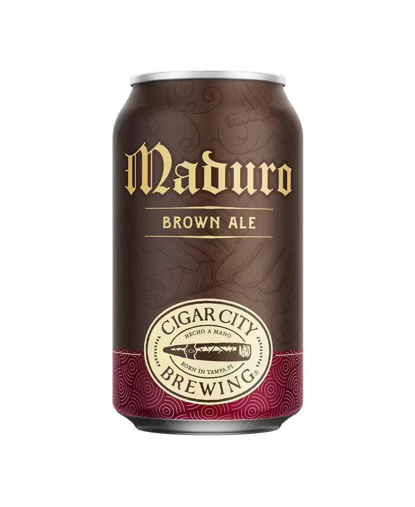
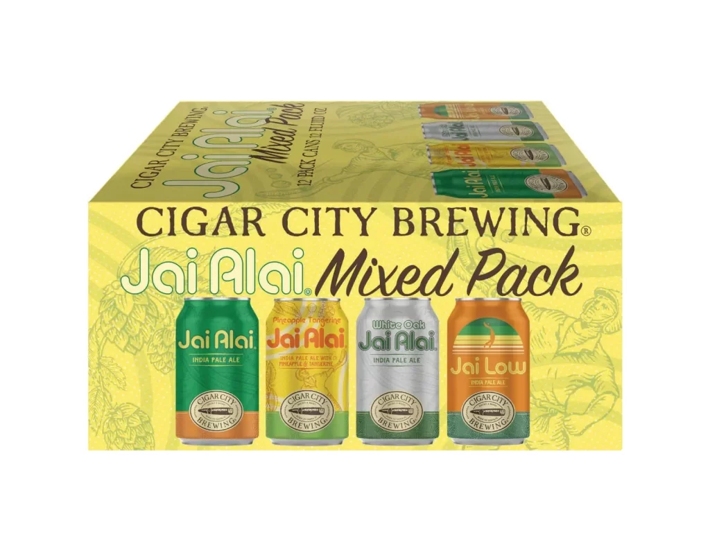
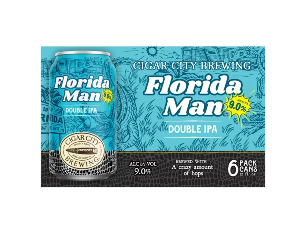
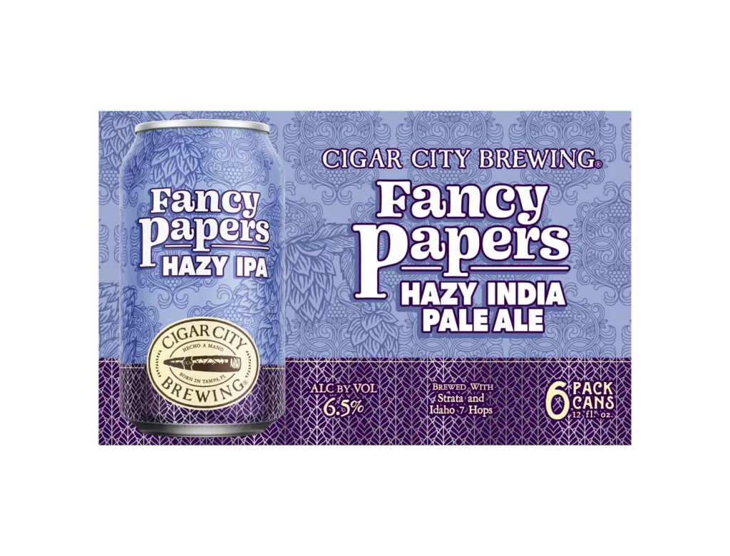
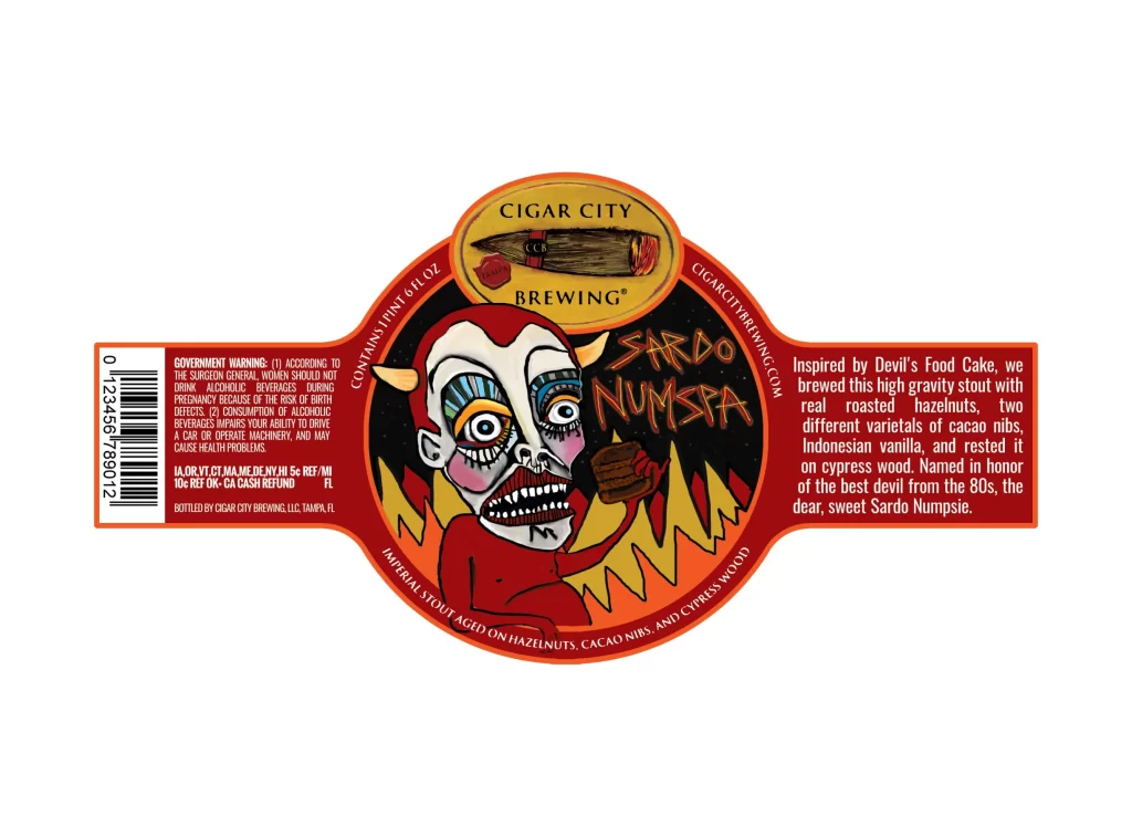
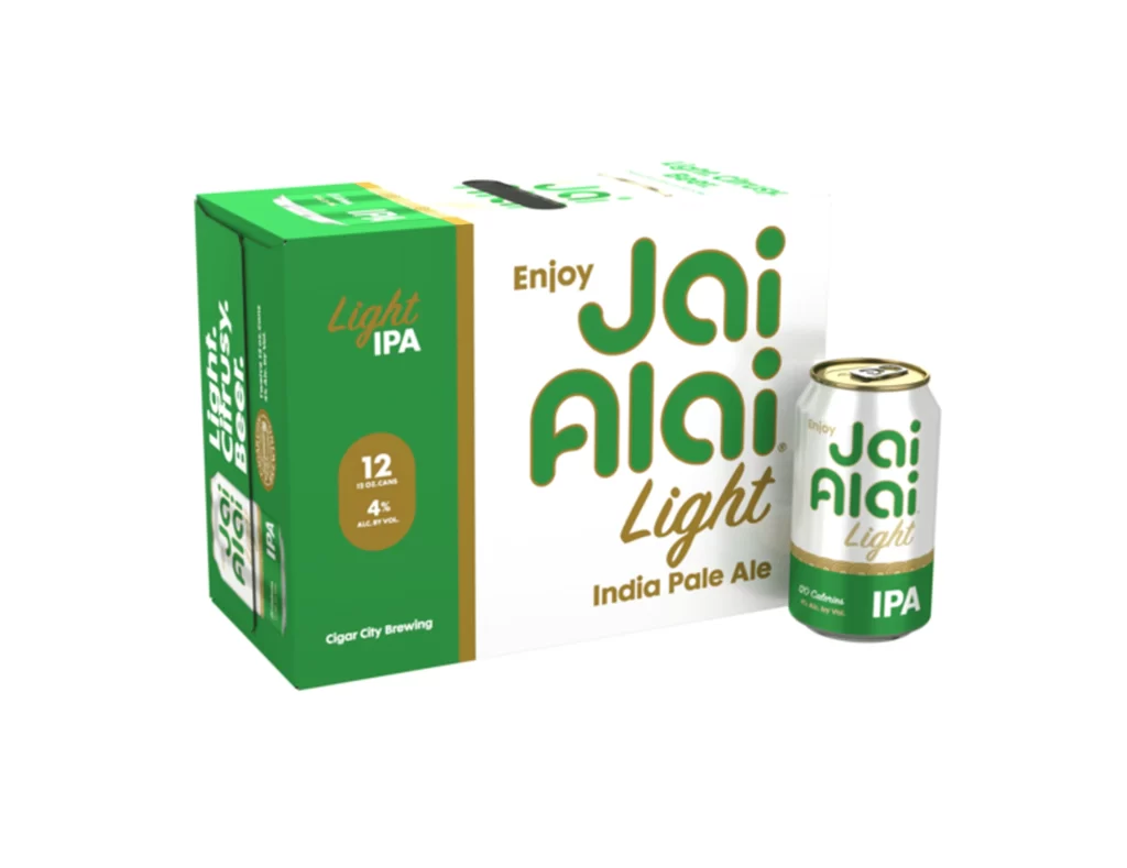
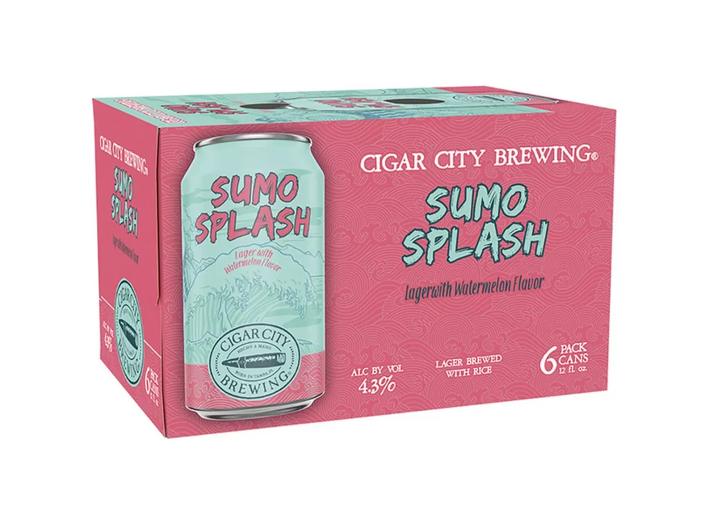
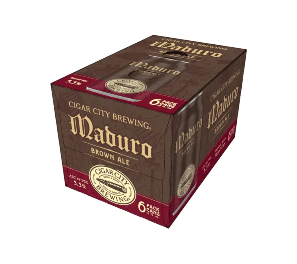
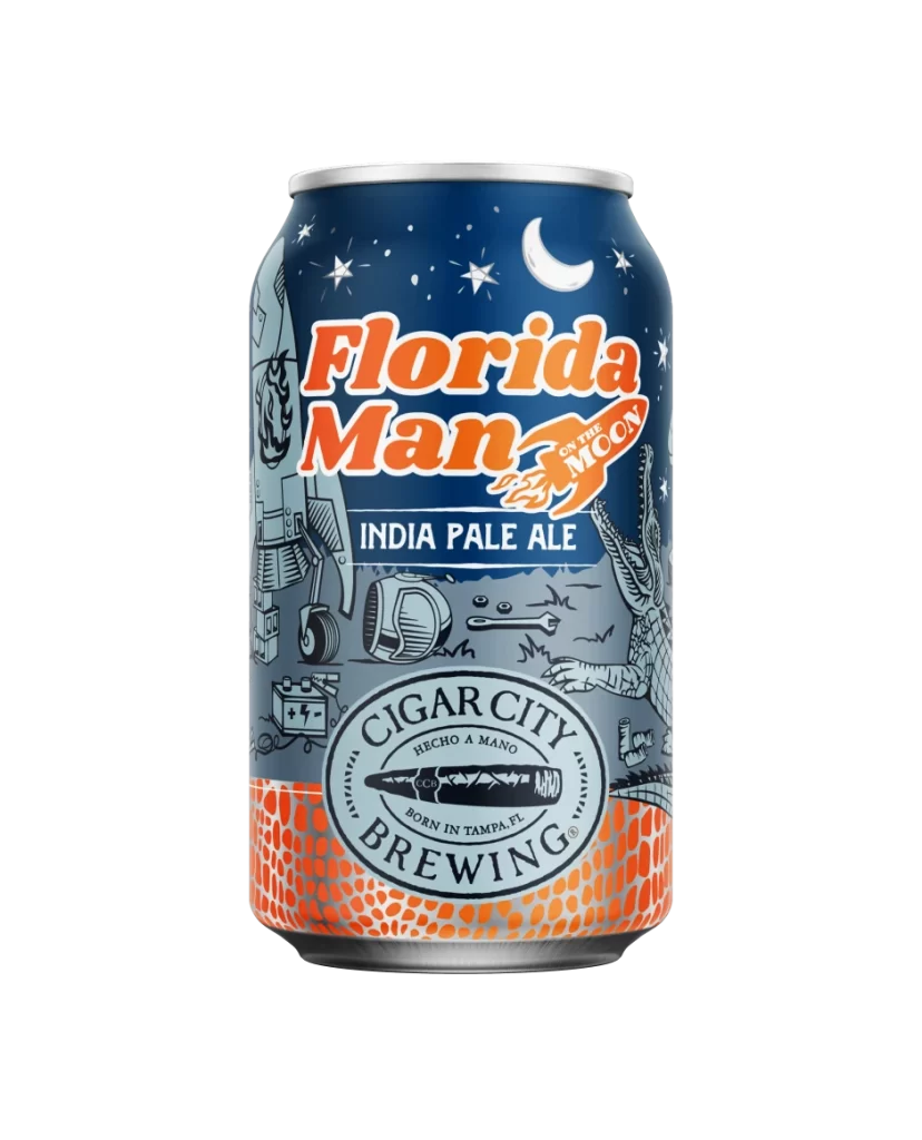
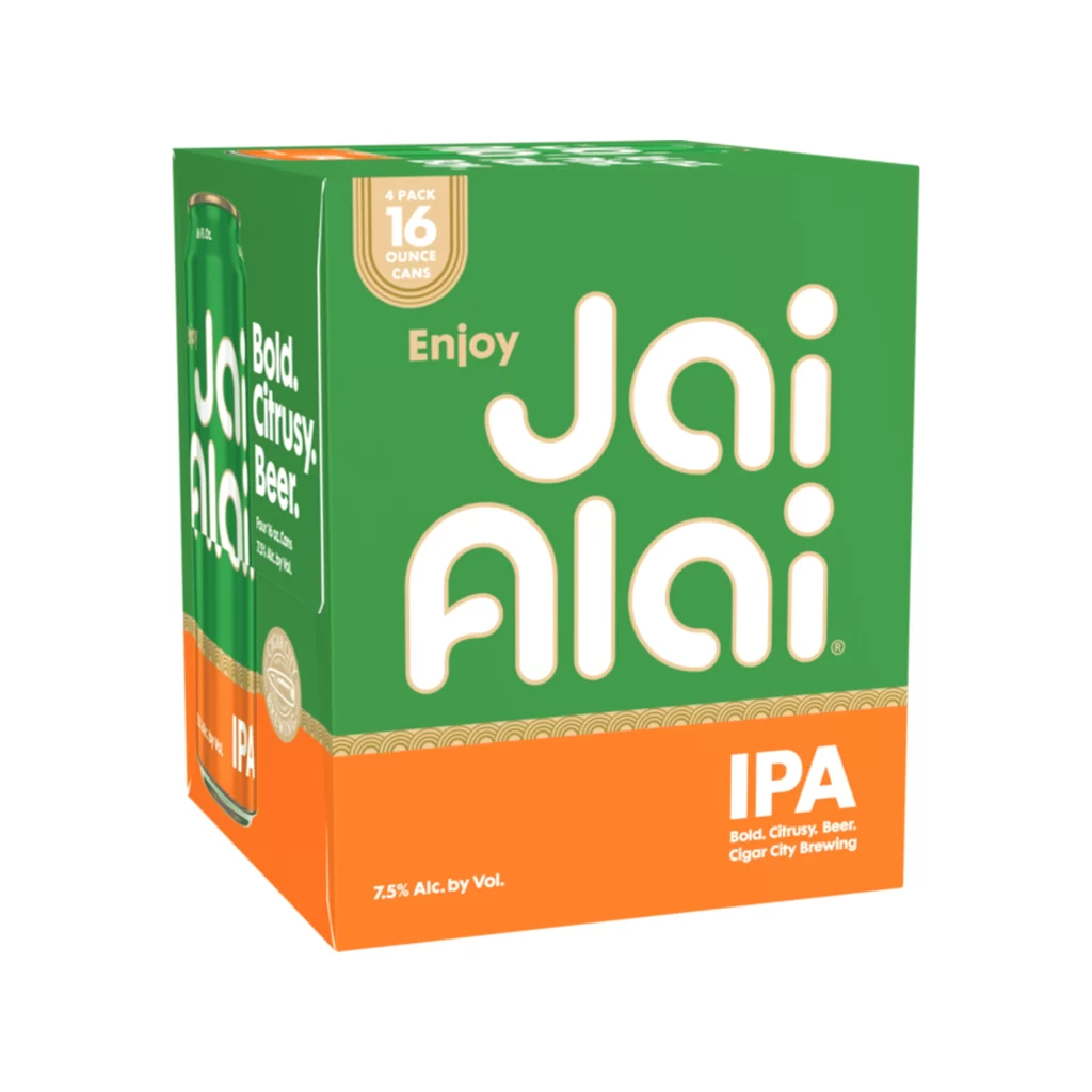
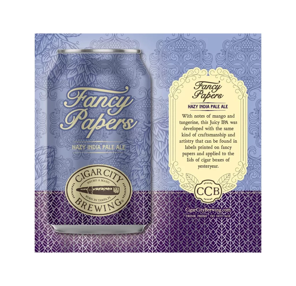
A twelve-can beverage carrier from Cigar City Brewing showcases a muted, earthy color palette dominated by beige, forest green, and slate blue, resting on a white surface. The front face displays the words 'Mixed Pack' in a heavy, black, vintage-style serif font, surrounded by intricate line-art illustrations of Tampa architecture and hop vines. A slight three-quarter
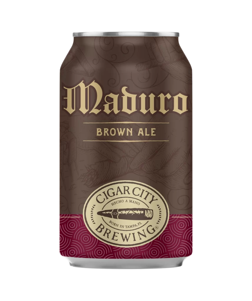
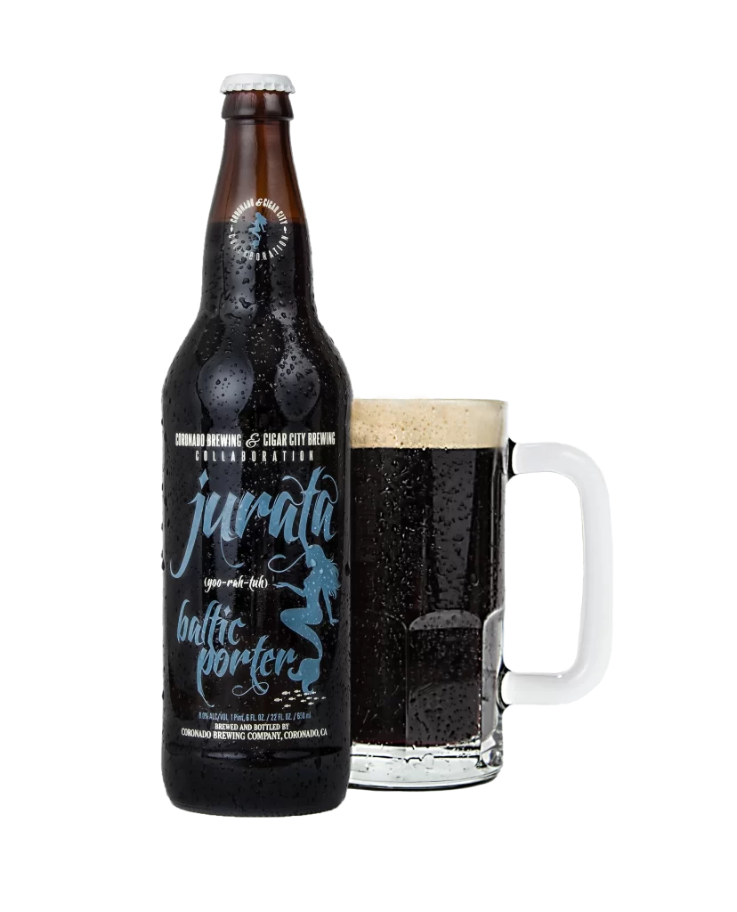
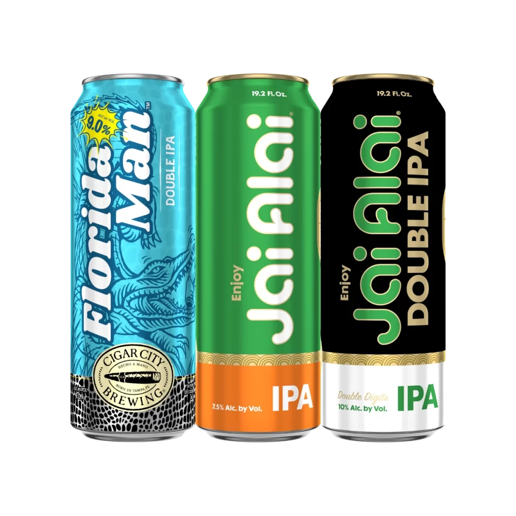
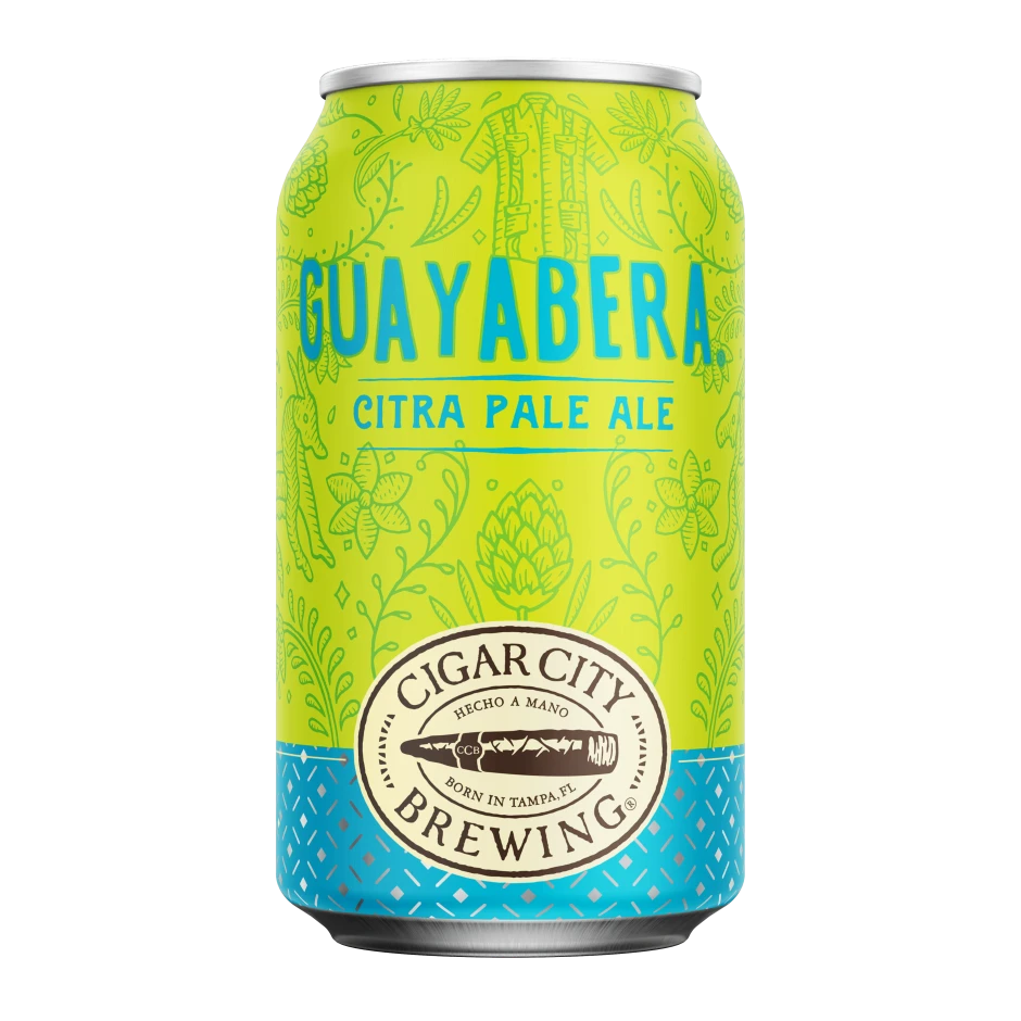
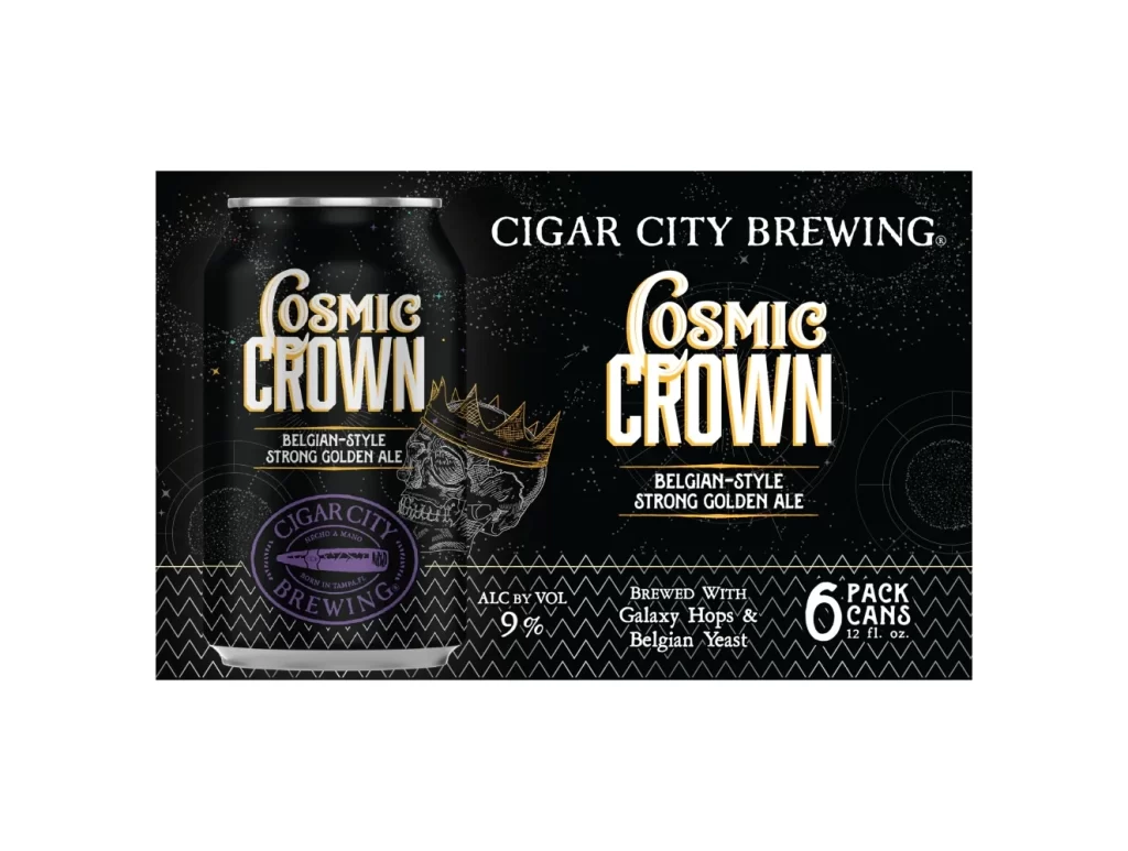
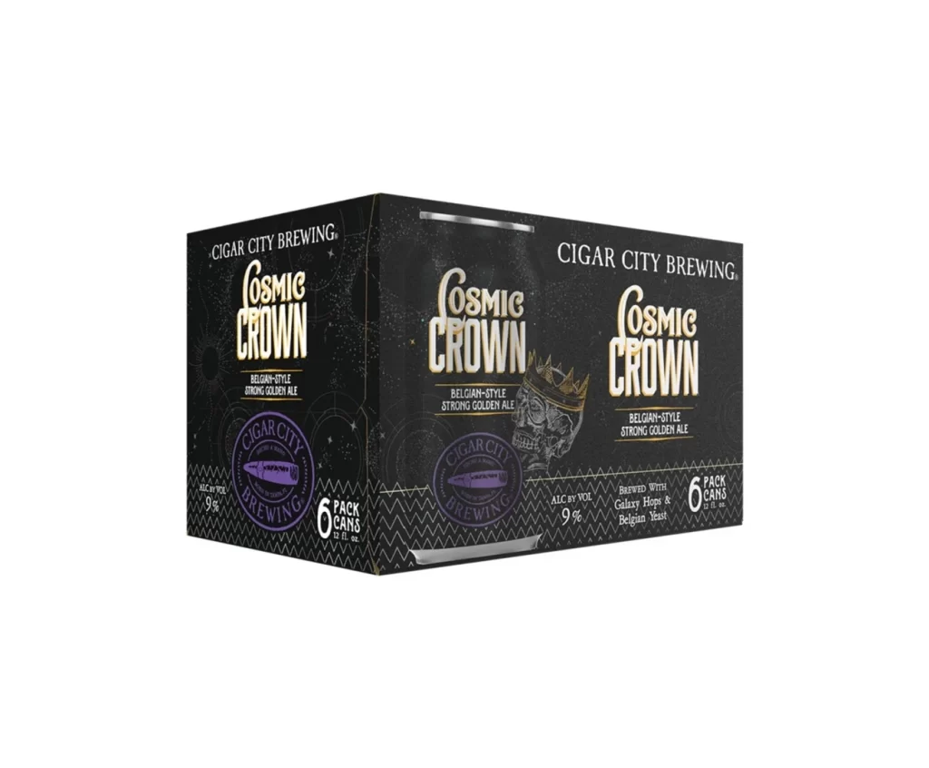
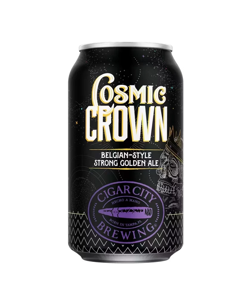
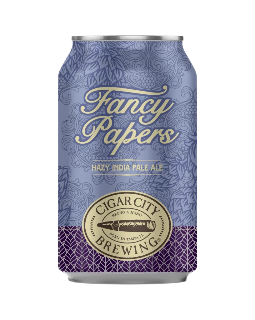
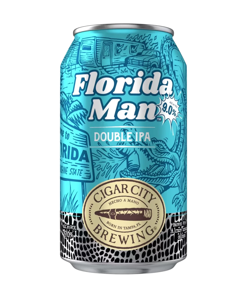
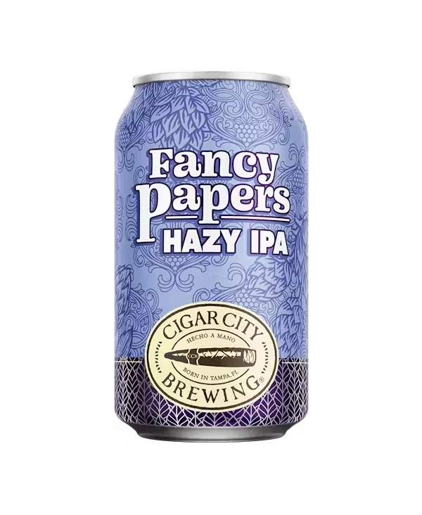
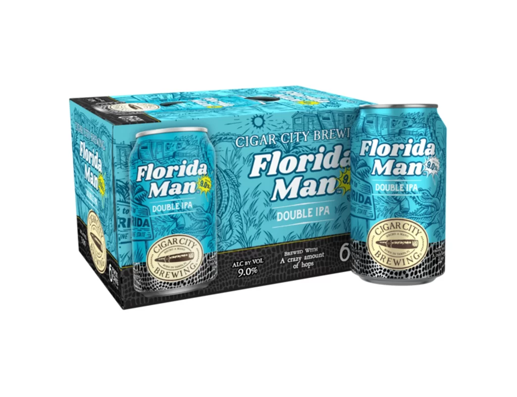
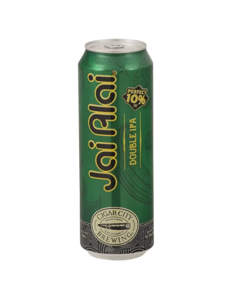
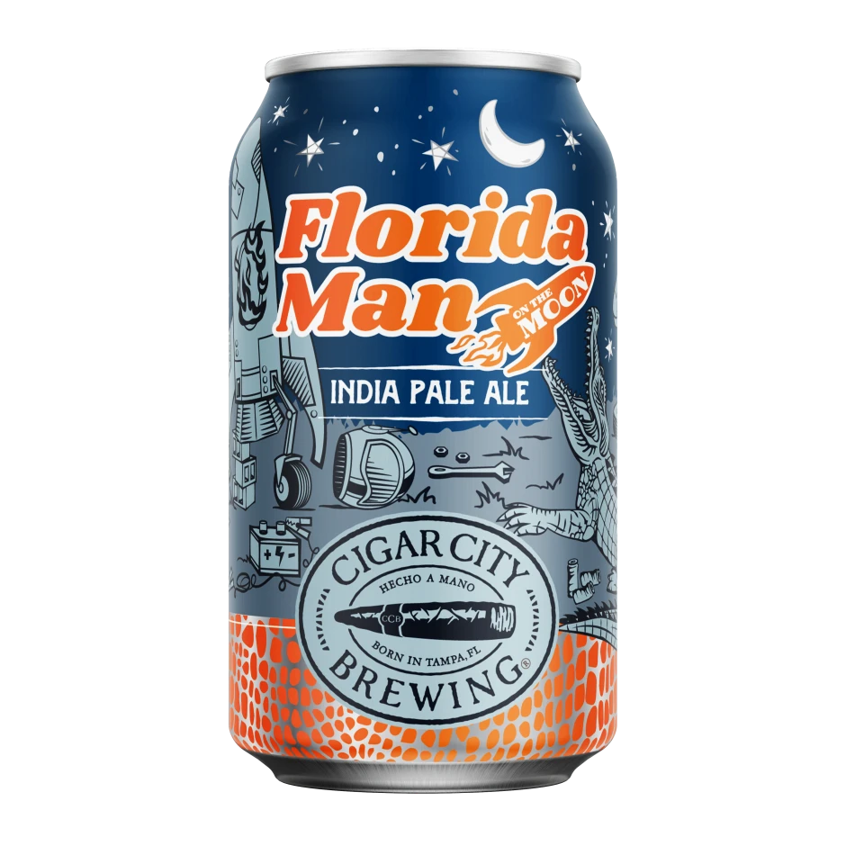
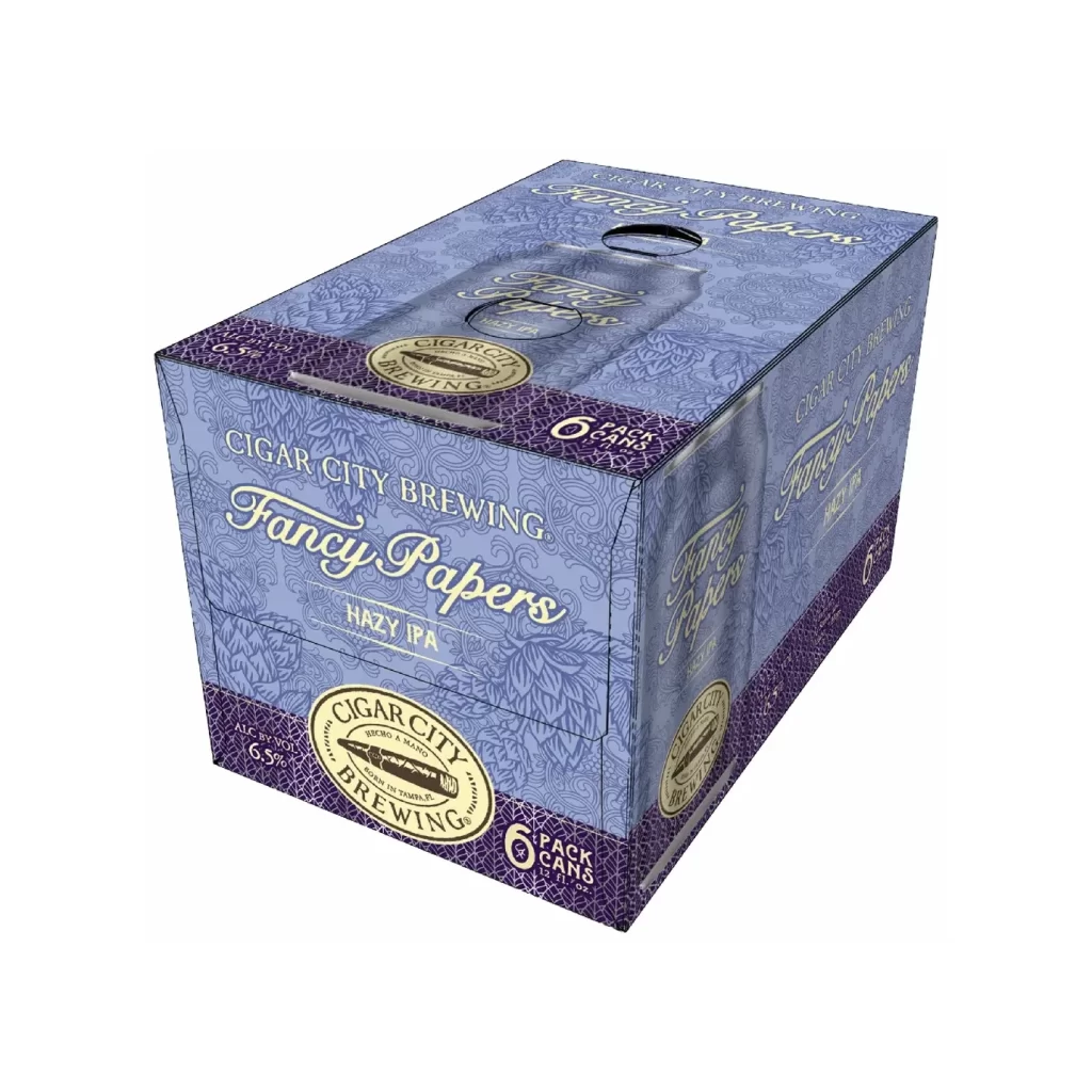
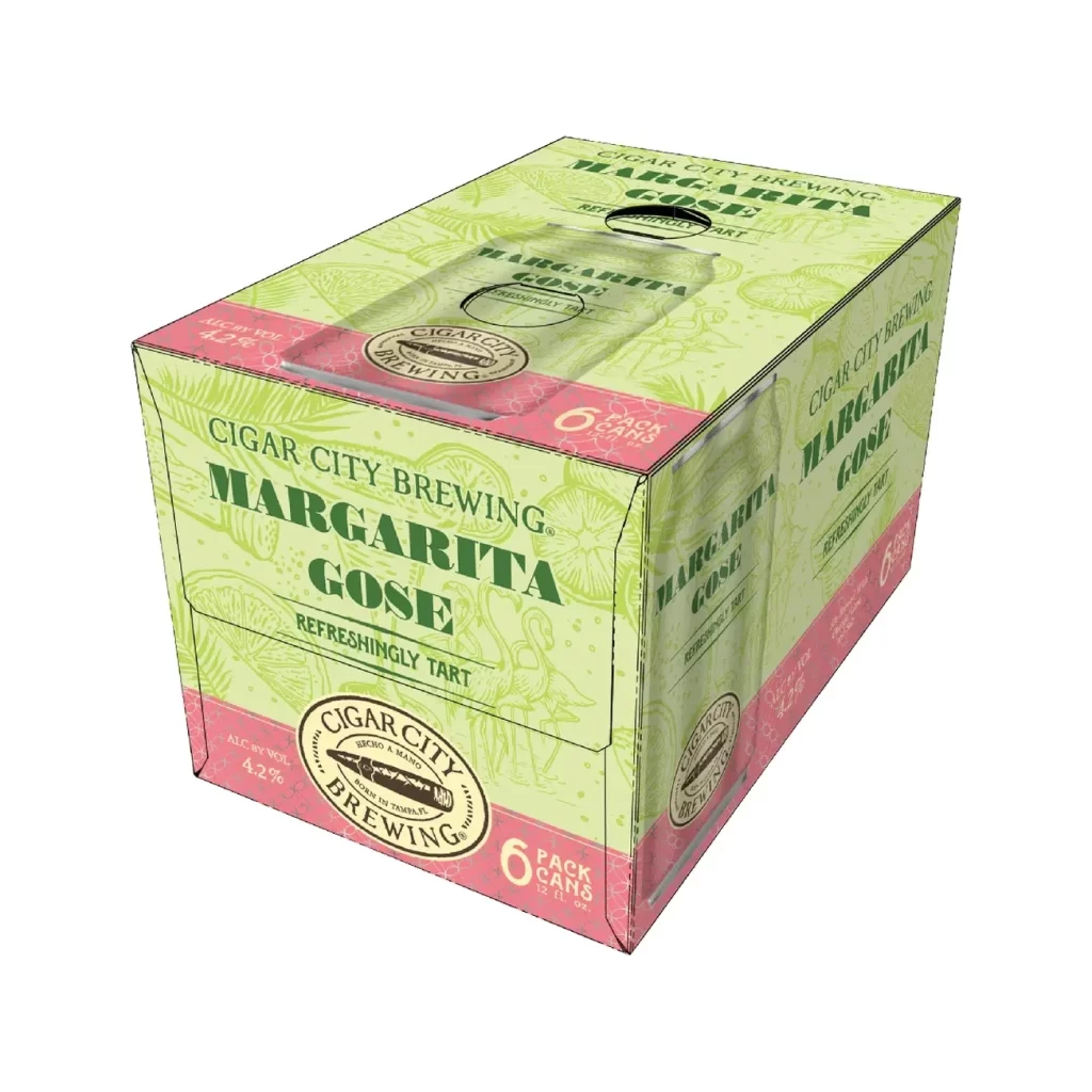
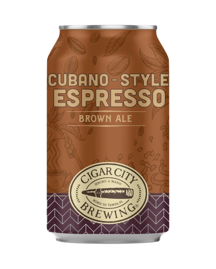
Visual interest is generated through the juxtaposition of hand-drawn architectural sketches with bold, modern typography and clean geometric blocks of color at the bottom. The packaging successfully balances a sense of local heritage—evident in the detailed cityscape renderings—with the clear, functional requirements of retail product identification. Such a layout offers a masterclass in organizing multiple sub-brands within a single cohesive family design without creating visual clutter.
Brand managers studying regional craft beer markets will find this useful for analyzing how to structure variety packs that maintain distinct product identities. Illustrators looking to emulate a specific ‘vintage travel poster’ aesthetic can study the line weight and shading techniques used in the background artwork. Furthermore, packaging engineers might reference the specific placement of the volume indicators and brewery seals to optimize their own label hierarchy designs.

![Cigar City Brewing Beer Packaging ]](https://gropicture-1323946364.cos.na-siliconvalley.myqcloud.com/wp-content/uploads/2026/07/cigar-city-white-oak-jai-alai-ipa-4-pack-cans-2566-823x1024.webp)