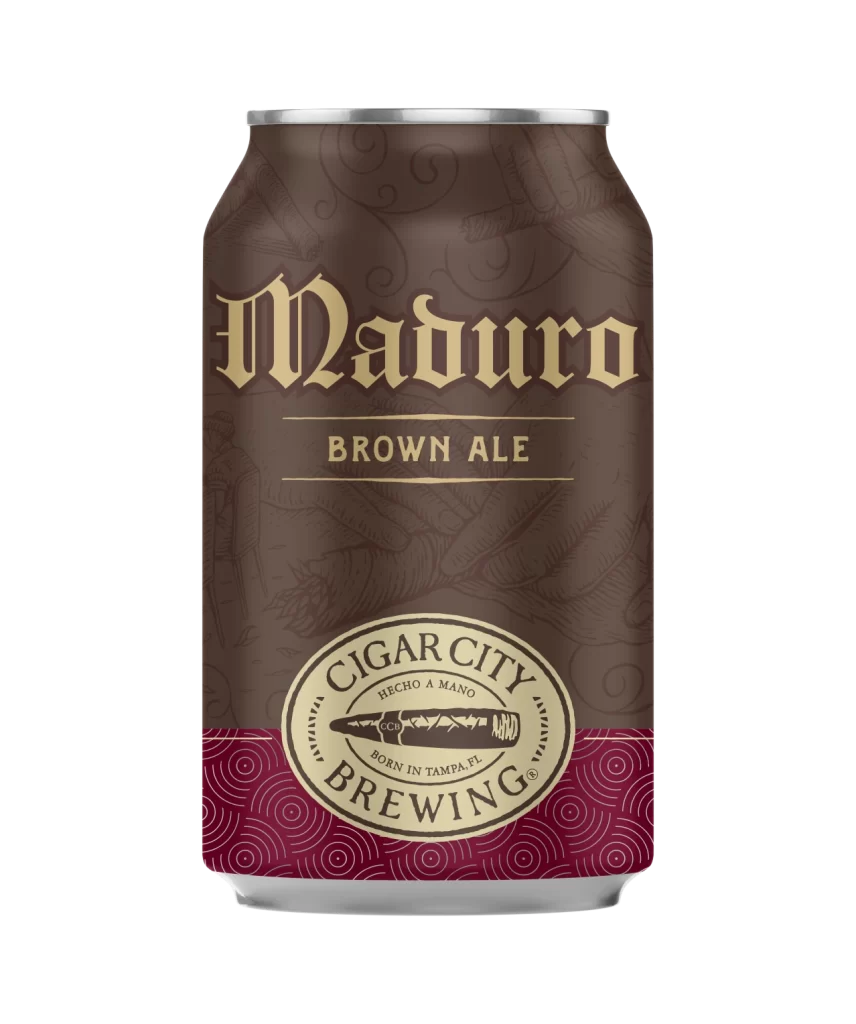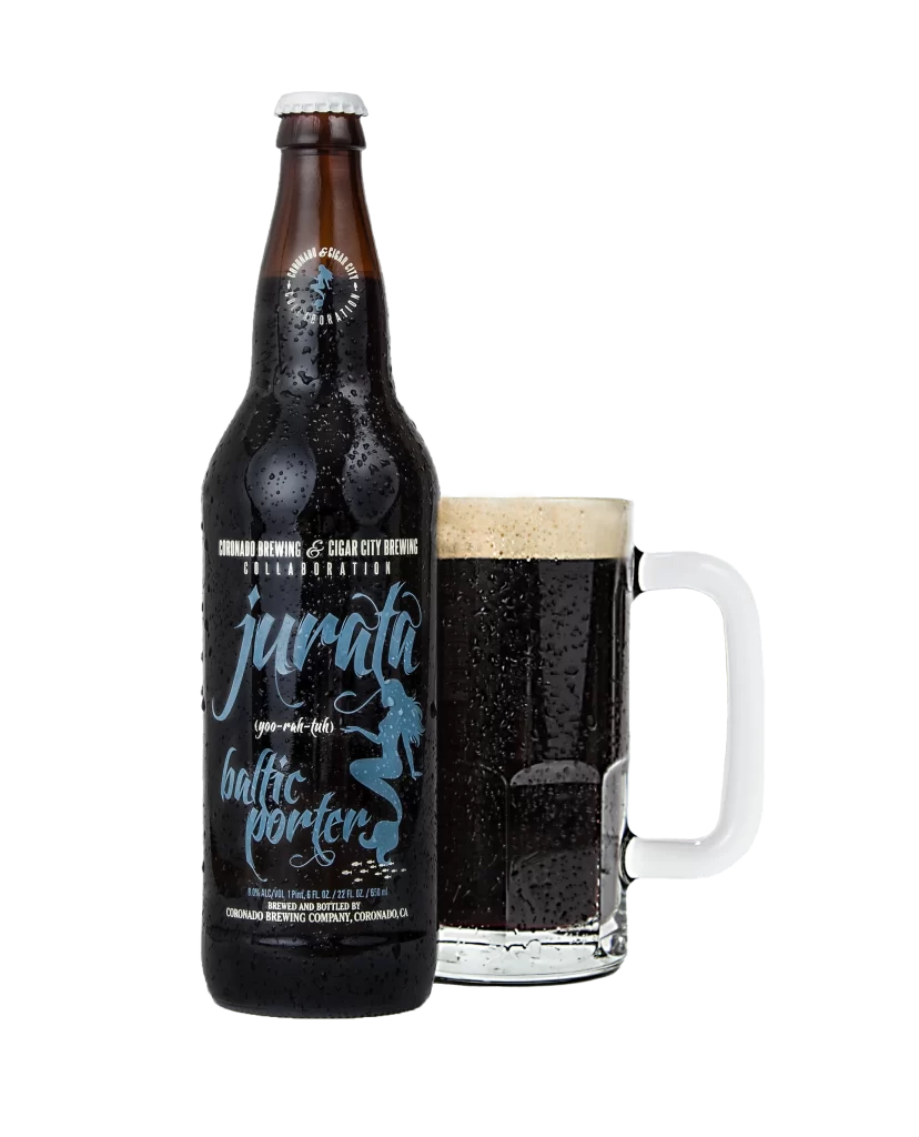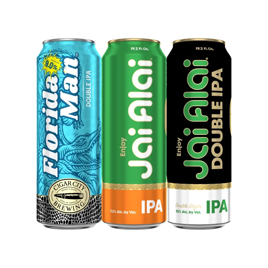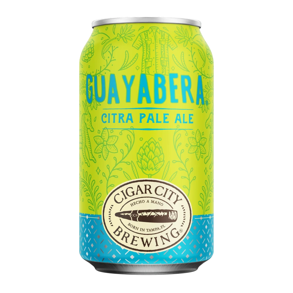
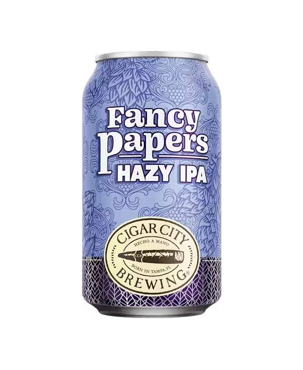
Cigar City Brewing Fancy Papers Hazy IPA Can Packaging
Topics
Details
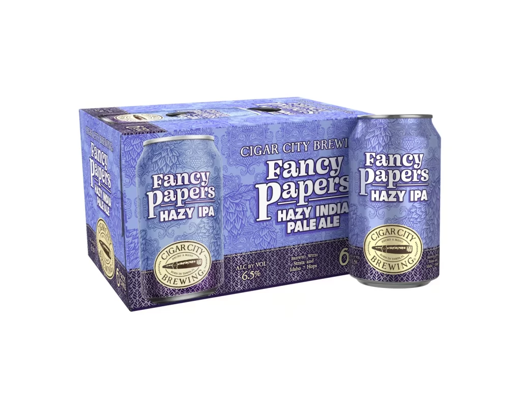
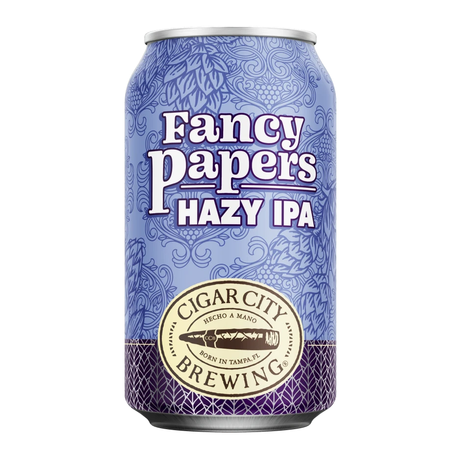
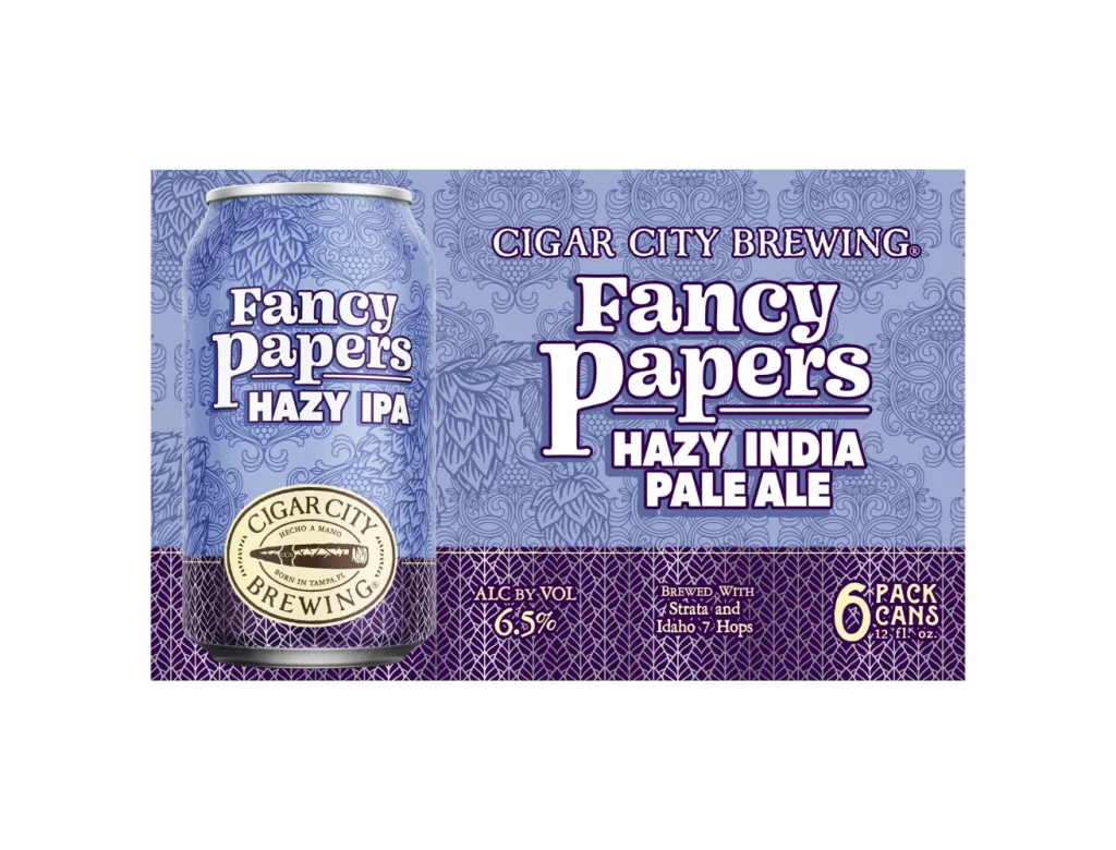
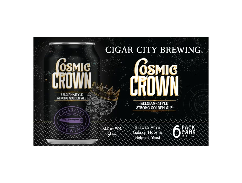
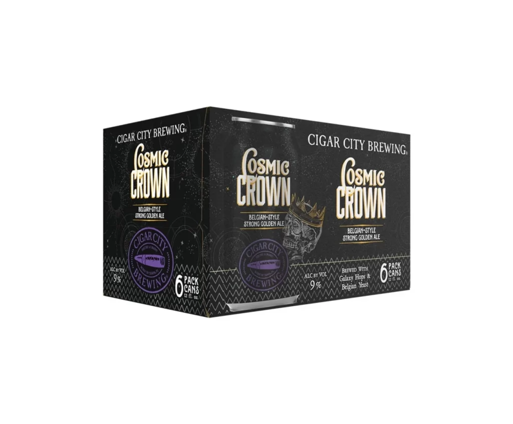
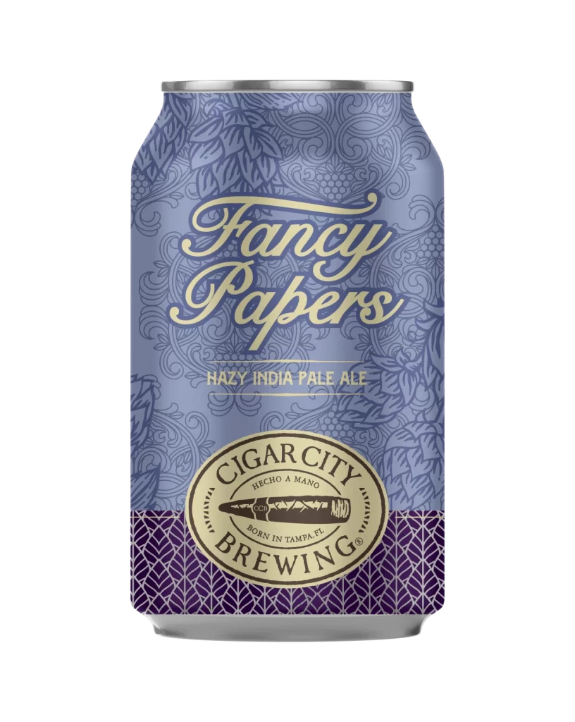
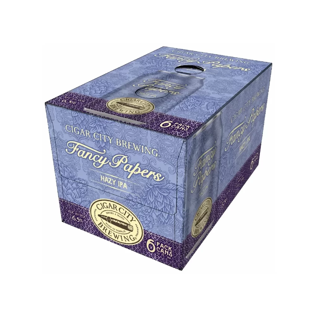
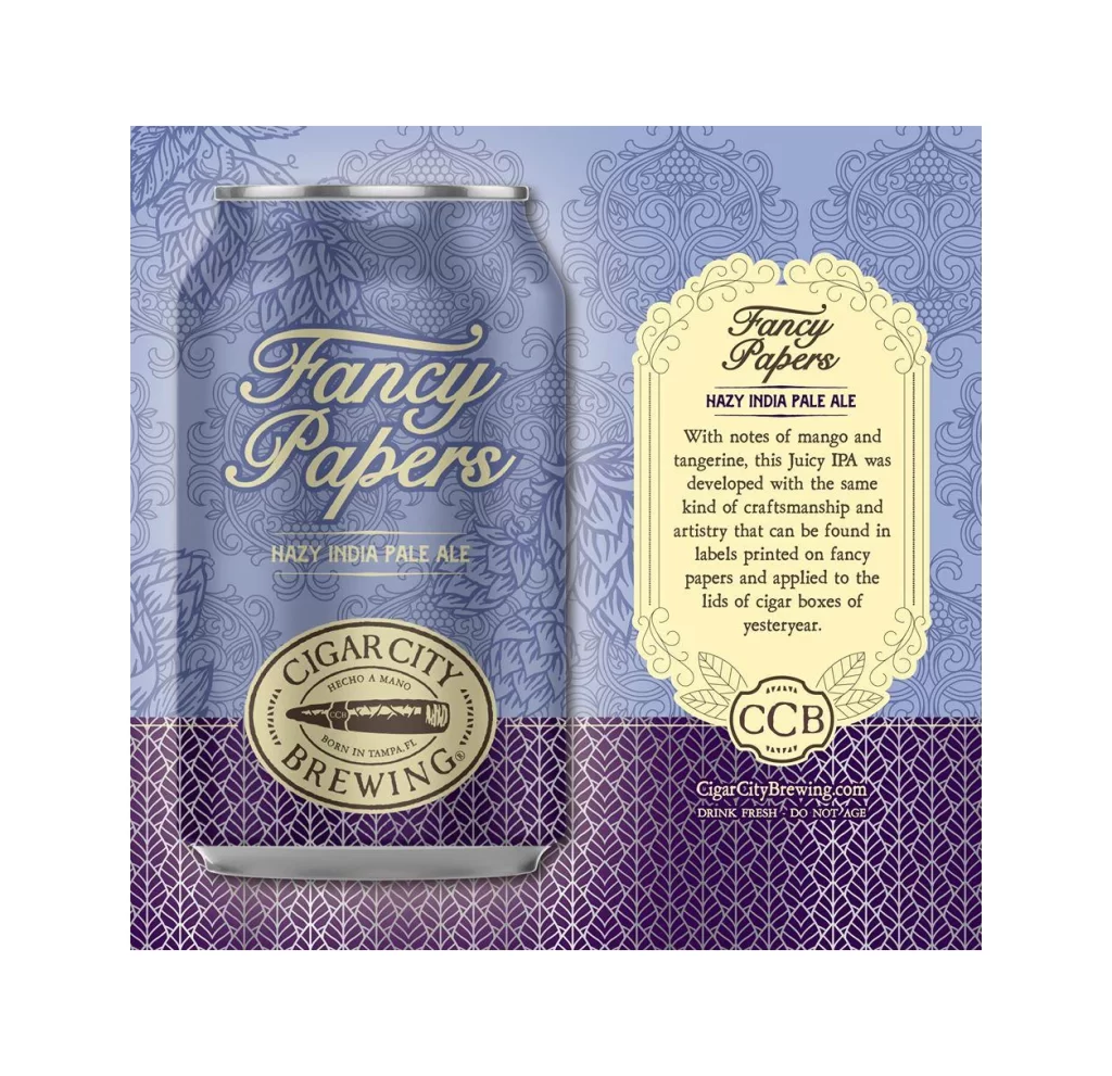
A periwinkle blue field dominates the composition, featuring an intricate, repeating floral damask pattern that serves as the backdrop for both the six-pack carrier and the single aluminum can. The can itself, positioned on the left third of the frame, displays bold white serif typography for 'Fancy Papers' with a smaller sans-serif subheading for 'Hazy IPA,' all anchored by a circular cream-colored badge containing the Cigar City Brewing logo. To the right, the carrier panel mirrors this typographic hierarchy in a larger scale, while the bottom section transitions into a deep violet geometric lattice that houses the alcohol content, hop varieties, and pack size information in clean, legible white text.
Visual interest is generated through the sophisticated interplay between the delicate, almost vintage wallpaper-like texture and the modern, heavy-weight lettering of the product name. The color palette creates a distinct mood, moving from the airy, light blue of the upper portion to the dense, grounded purple at the base, which effectively separates the branding elements from the technical specifications. Furthermore, the consistent application of the ornate pattern across both the cylindrical container and the flat carrier surface demonstrates a cohesive identity system that maintains readability despite the complex background.
Brand strategists and packaging designers might utilize this visual to study how traditional patterns can be successfully integrated into contemporary beverage marketing without appearing dated. Illustrators could analyze the specific line-work of the floral motifs to understand how to create textures that do not compete with foreground typography. Additionally, art directors working on craft beer projects may reference this layout to see how to effectively balance a large product shot with extensive textual information on a single promotional plane.

![Cigar City Brewing Beer Packaging ]](https://gropicture-1323946364.cos.na-siliconvalley.myqcloud.com/wp-content/uploads/2026/07/cigar-city-white-oak-jai-alai-ipa-4-pack-cans-2566-823x1024.webp)