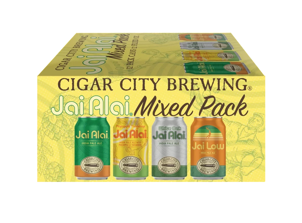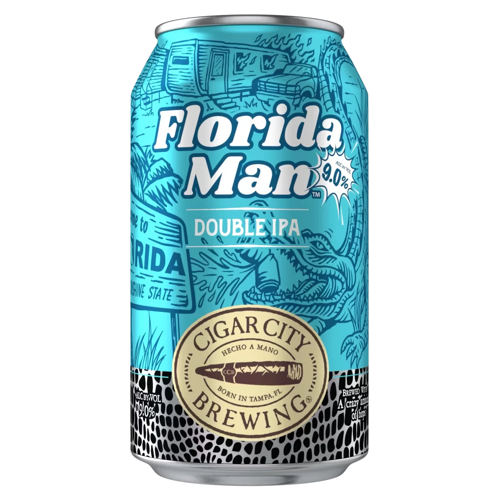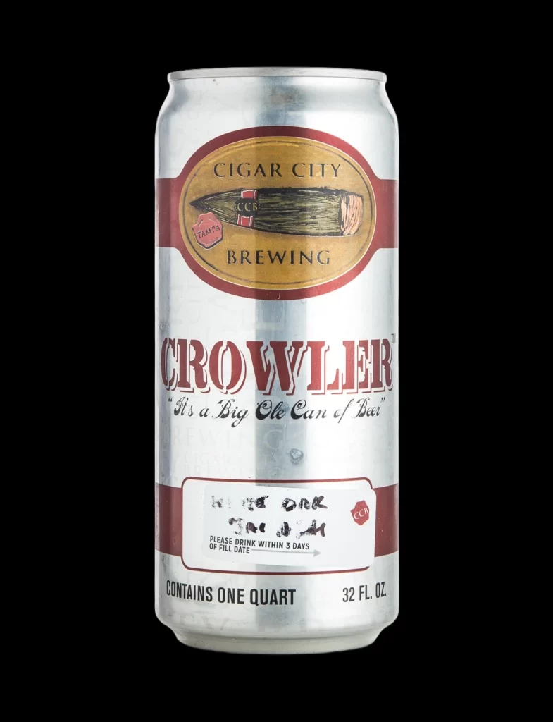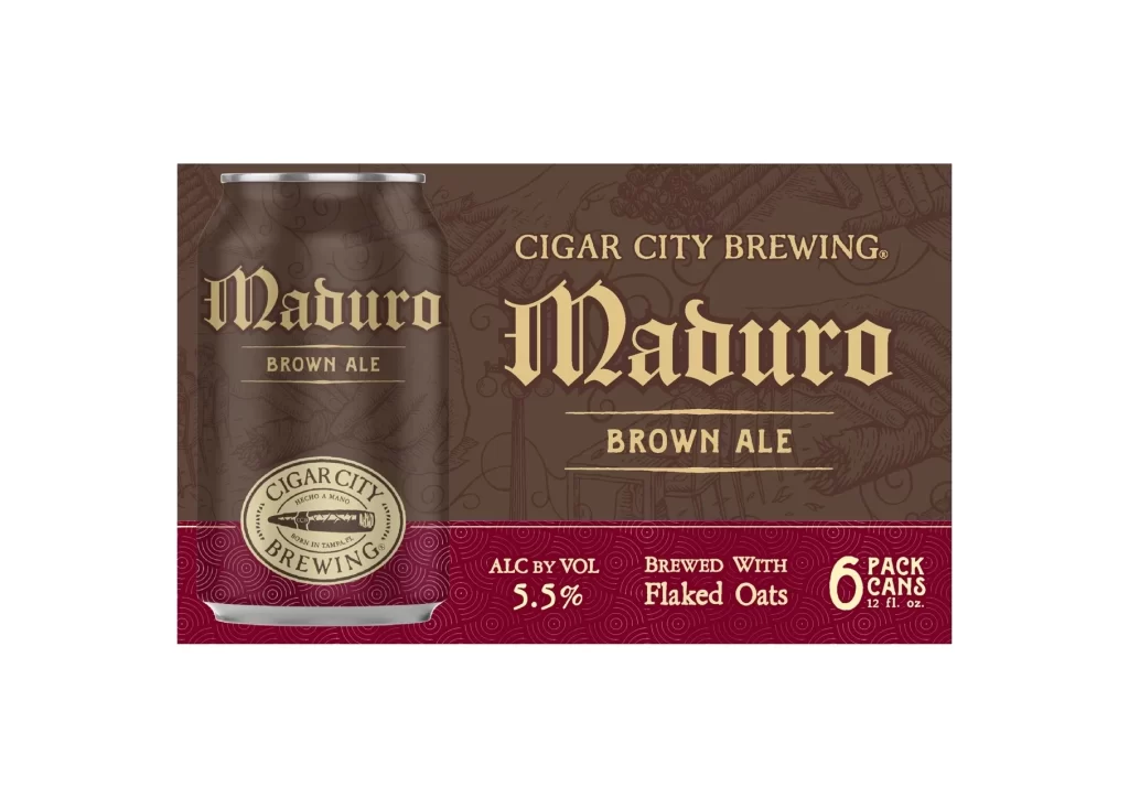
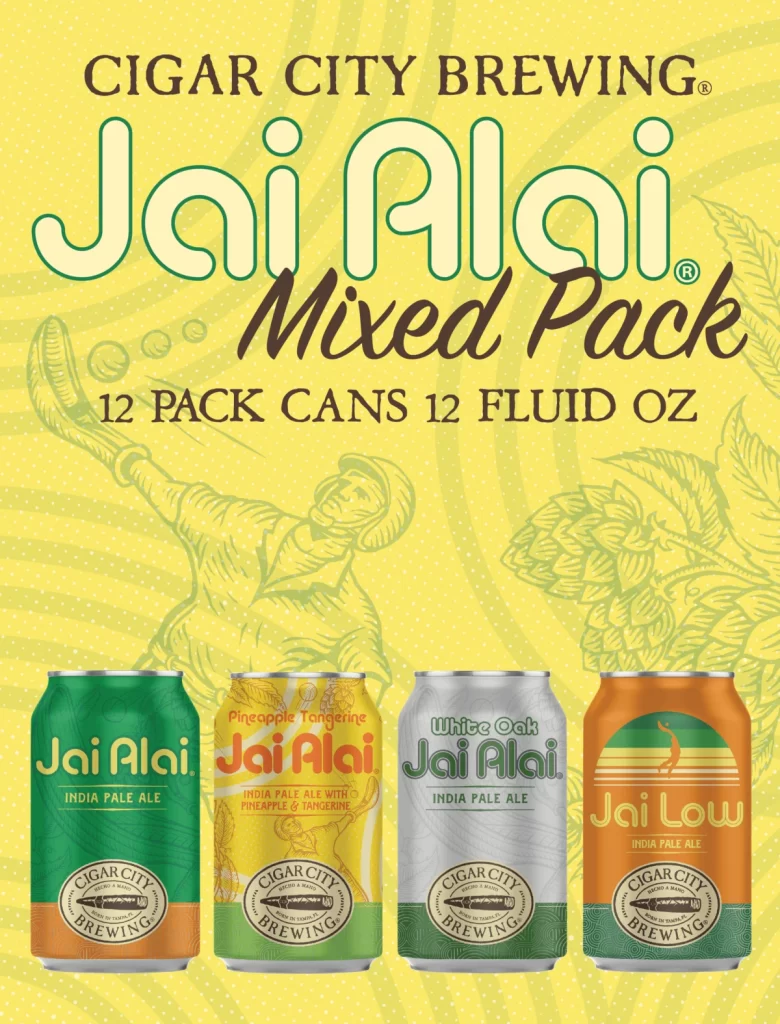
Cigar City Brewing Jai Alai Mixed Pack Box Packaging
Topics
Details
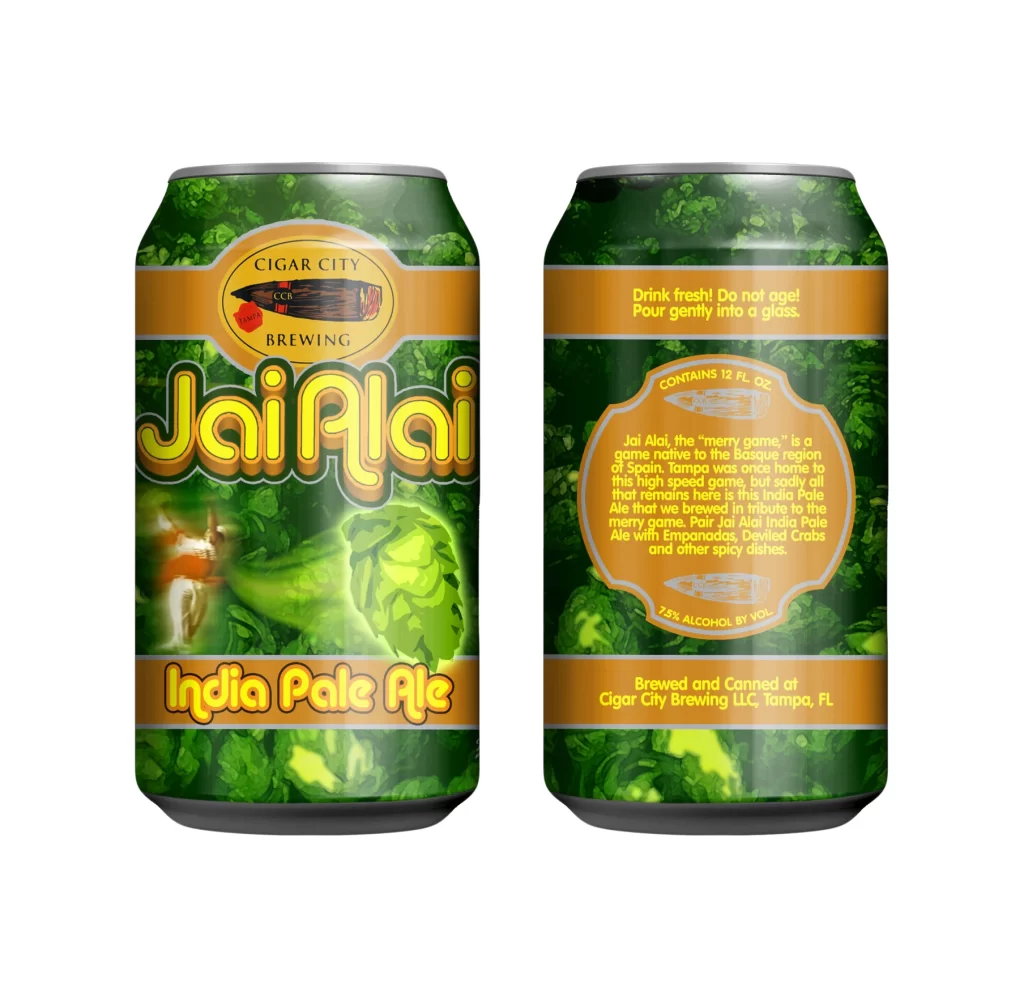
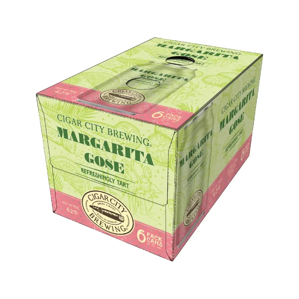
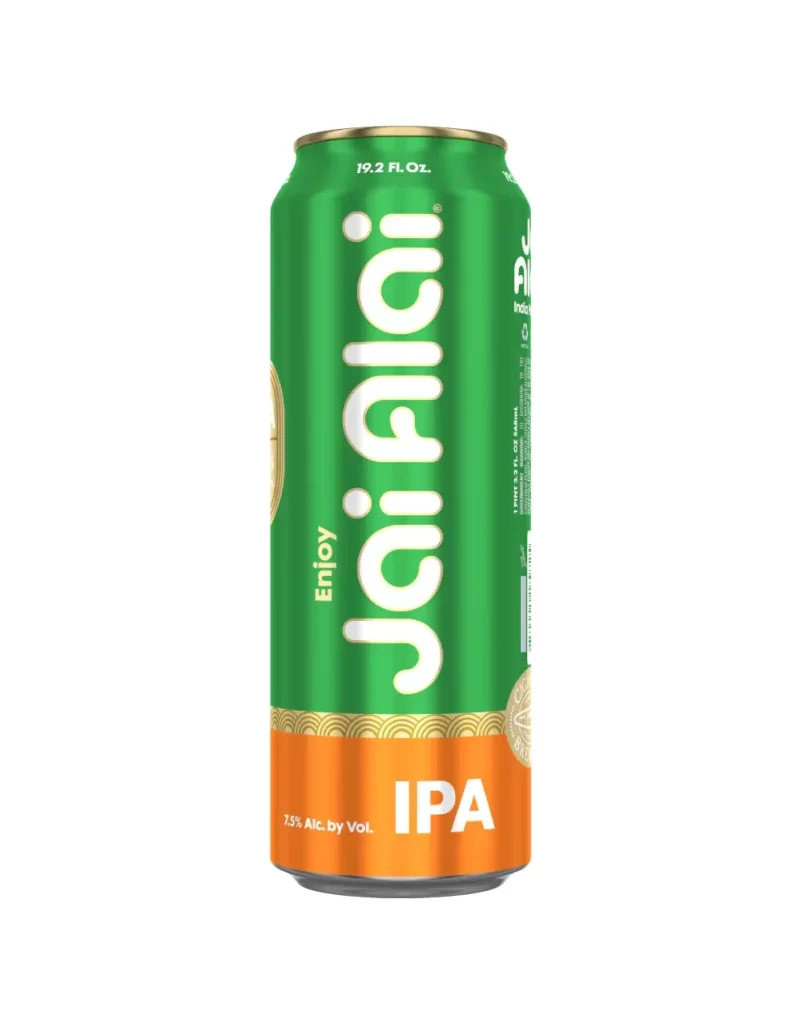
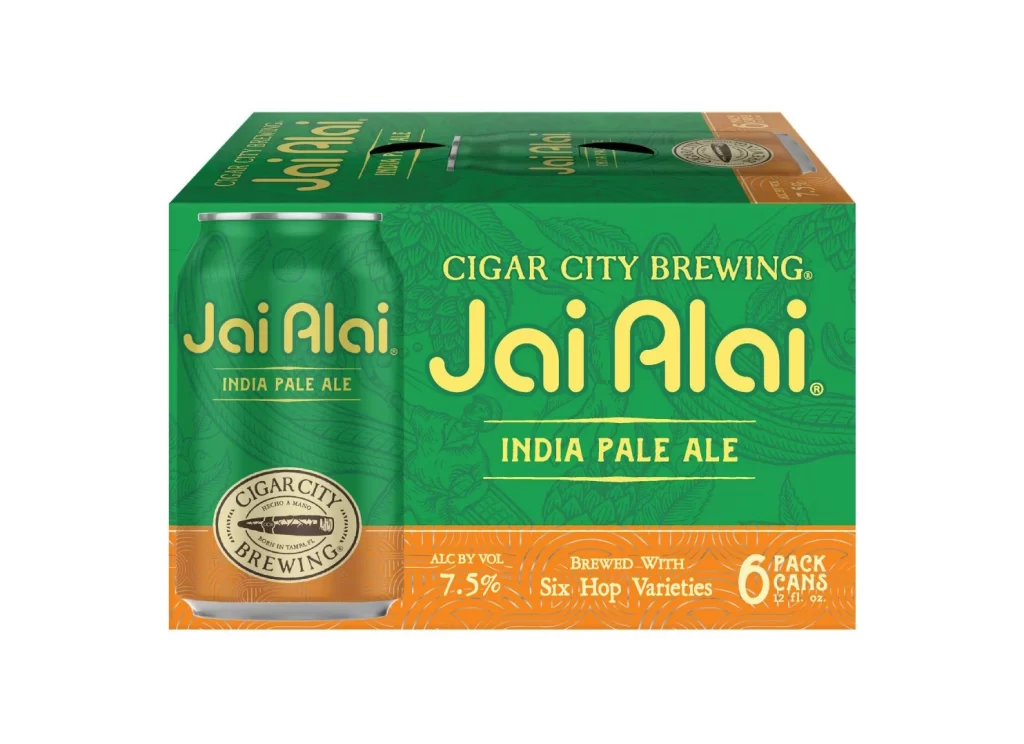
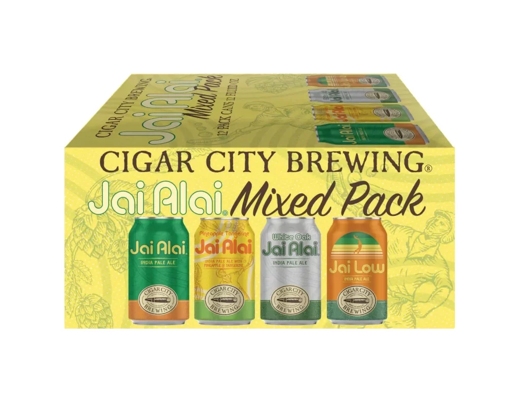
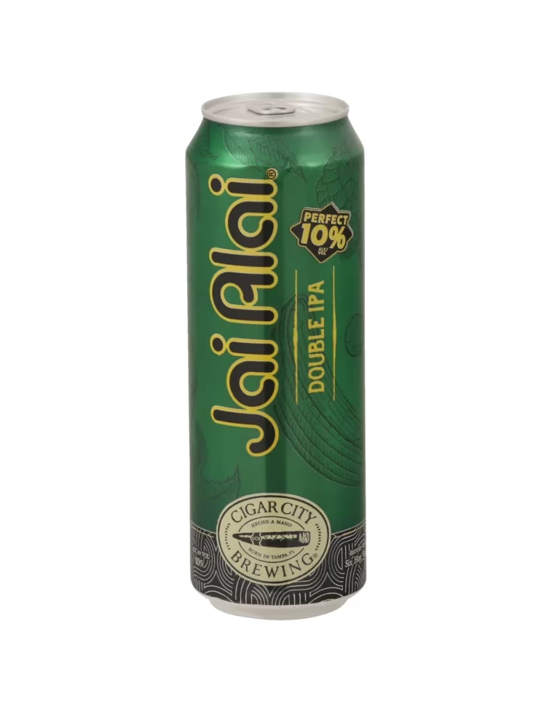
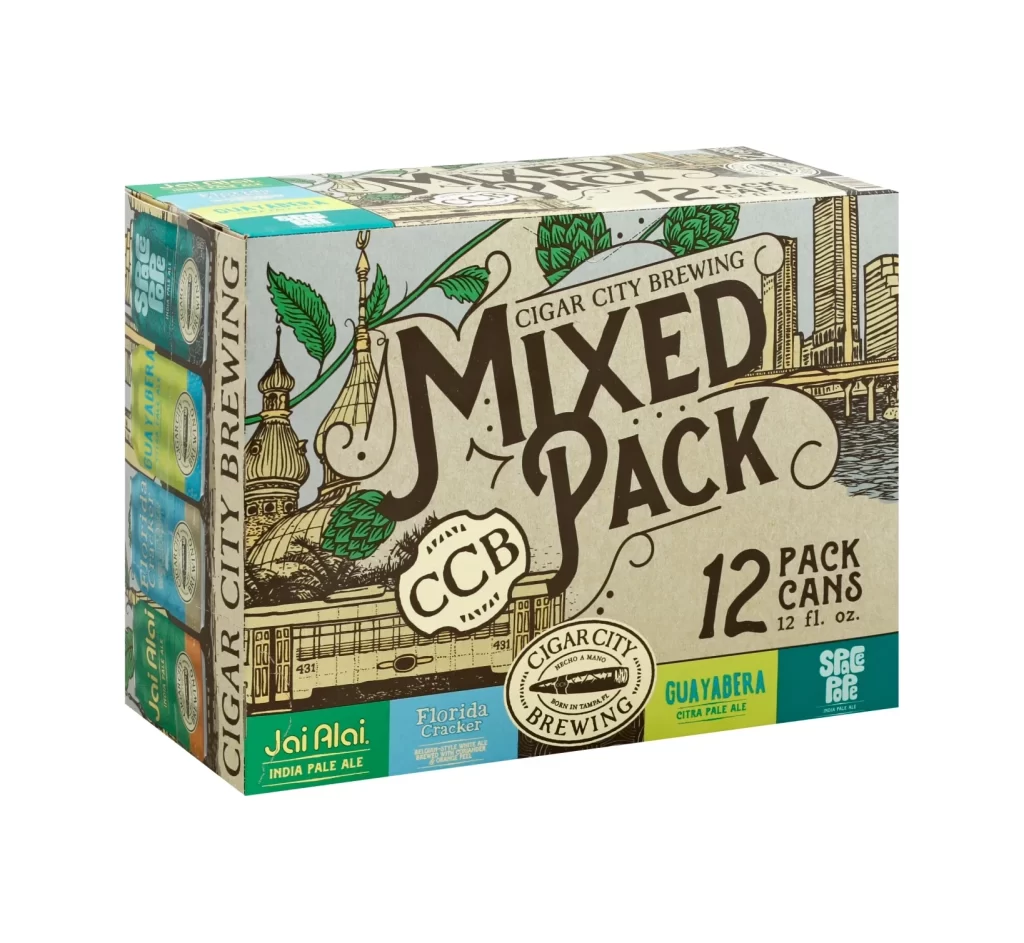
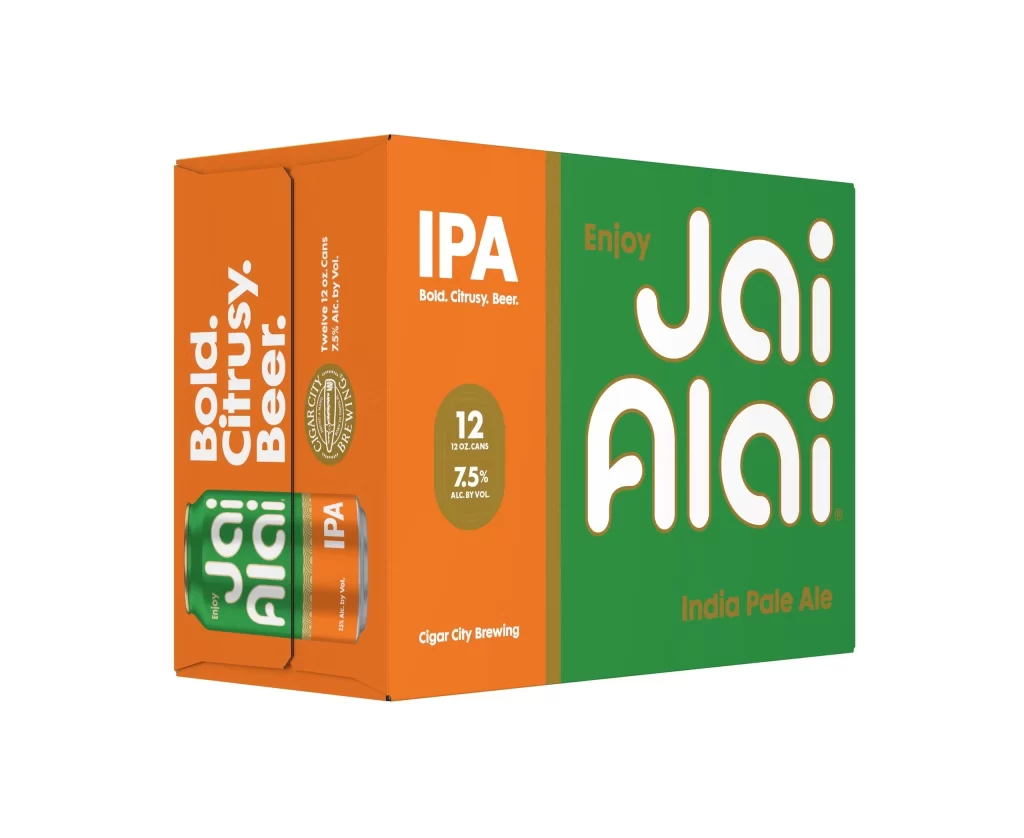
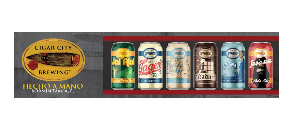
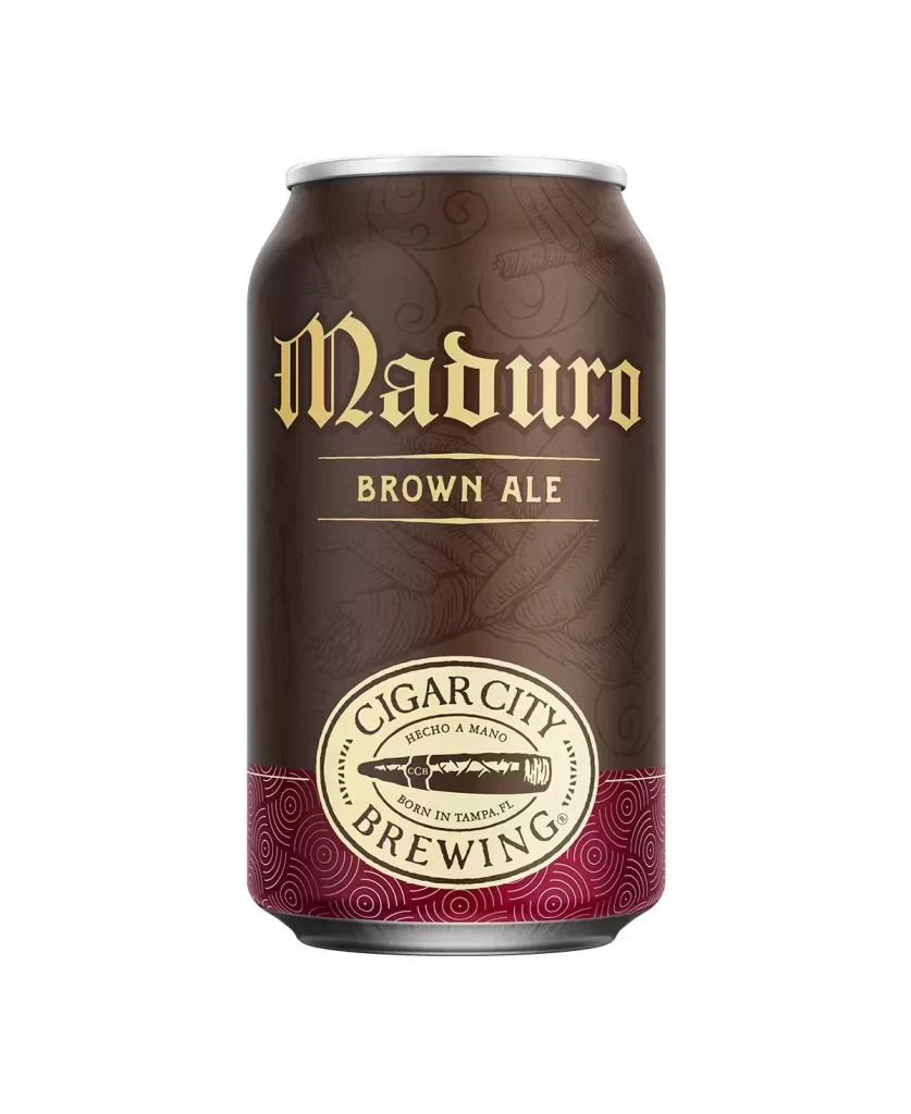
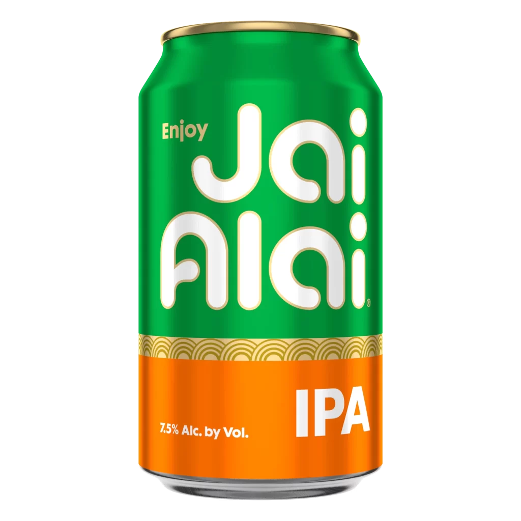
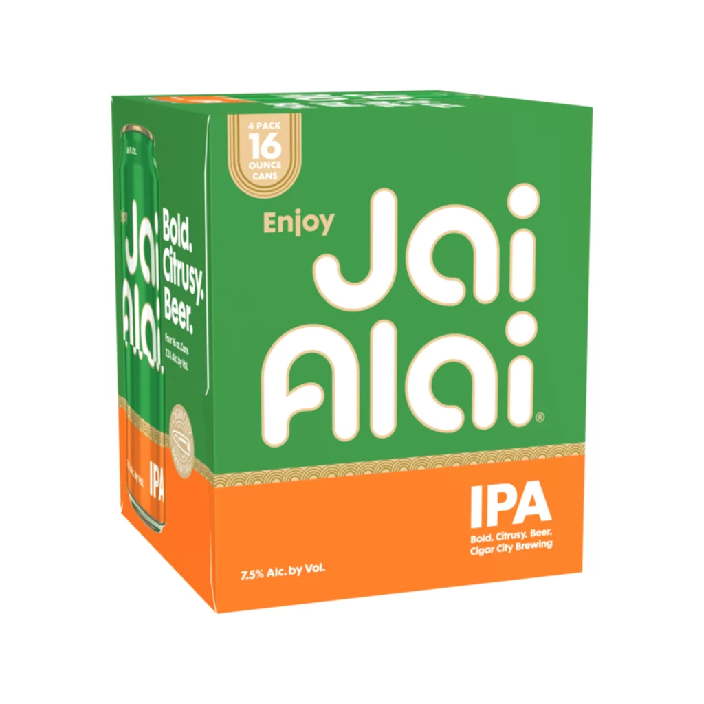
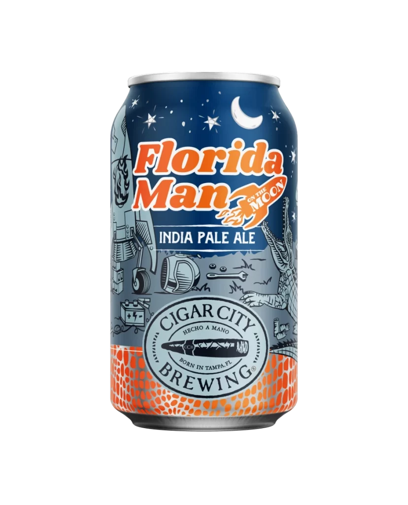
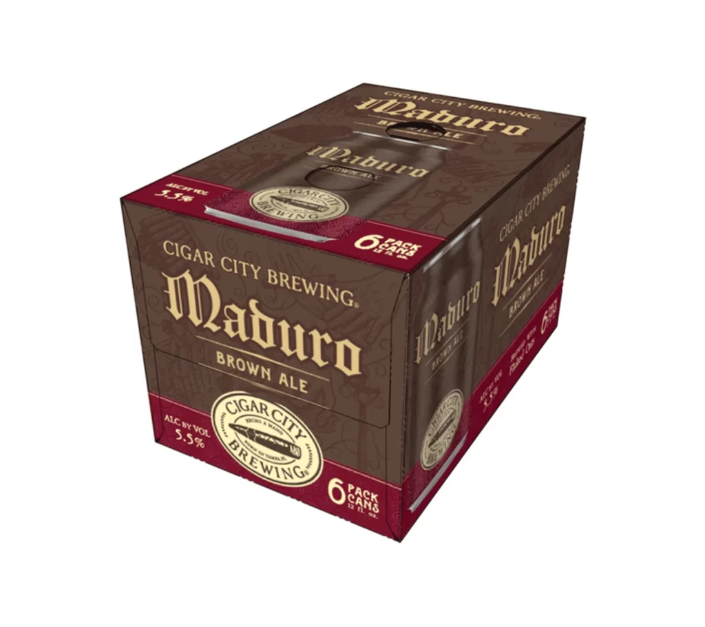
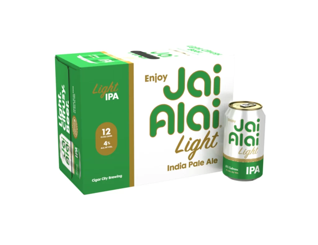
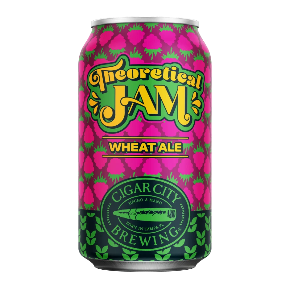
A bright, sunny yellow dominates the rectangular cardboard box, which is photographed from a slightly elevated three-quarter angle to reveal both the front face and the top surface. The packaging features the bold, dark brown 'CIGAR CITY BREWING' brand name at the top, followed by a stylized 'Jai Alai' logo in green and white script. Centered on the front are four distinct aluminum cans—green, yellow, silver, and orange—each displaying unique flavor variants like India Pale Ale, Pineapple Tangerine, White Oak, and Jai Low against a subtle background of faint botanical line drawings.
Visual hierarchy plays a key role here, as the mix of serif fonts for the brewery name and playful scripts for the product line creates an approachable yet established feel. The color-coded cans offer immediate differentiation between the brews, making the variety pack easy to parse at a glance while maintaining a cohesive tropical aesthetic through the consistent use of warm tones and circular logos. Such a layout effectively balances information density with breathing room, ensuring that every element from the small text on the cans to the large header remains legible and engaging.
Brand managers studying beverage packaging trends would find this example useful for analyzing how to organize multiple SKUs within a single retail unit. Illustrators looking to understand how to integrate subtle patterns without overwhelming the main graphics can study the delicate hop illustrations in the background. Additionally, marketing teams planning a seasonal release could reference this structure to effectively communicate variety and brand identity simultaneously on a crowded store shelf.

![Cigar City Brewing Beer Packaging ]](https://gropicture-1323946364.cos.na-siliconvalley.myqcloud.com/wp-content/uploads/2026/07/cigar-city-white-oak-jai-alai-ipa-4-pack-cans-2566-823x1024.webp)