Cigar City Brewing IPA Beverage Packaging
Topics
Details
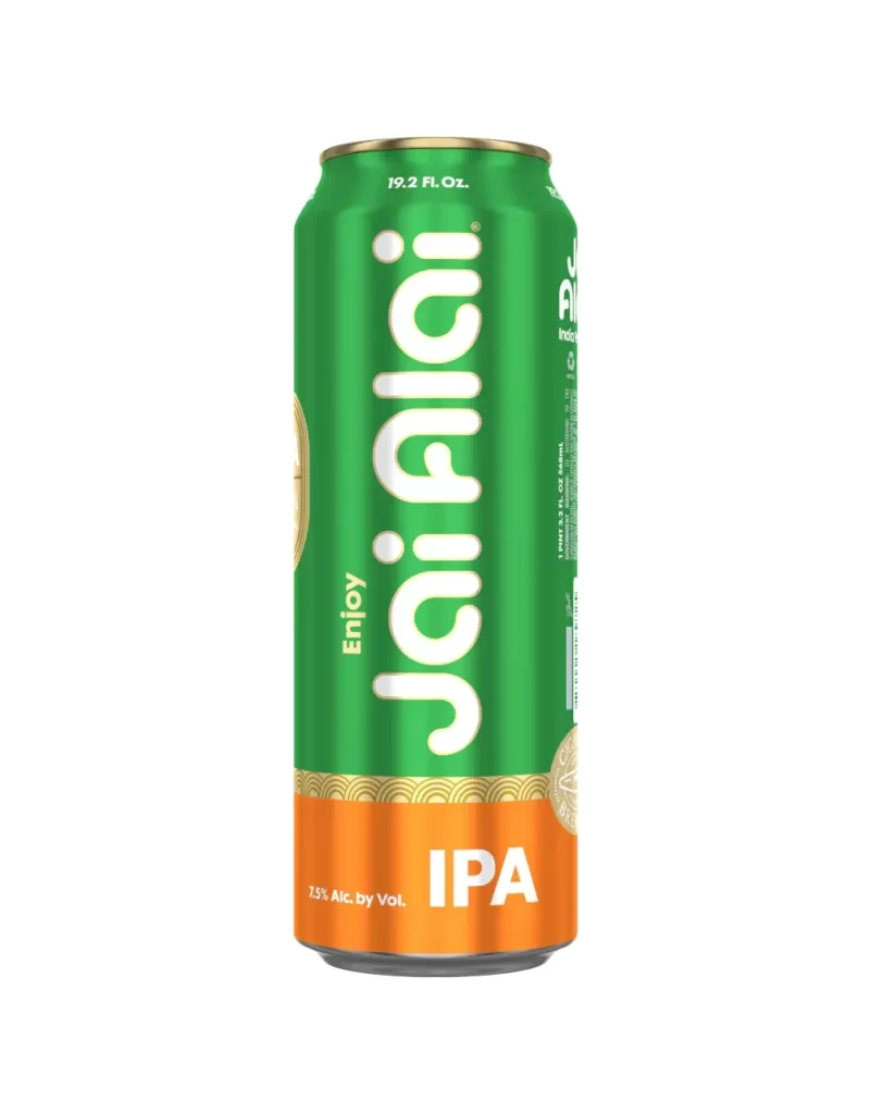
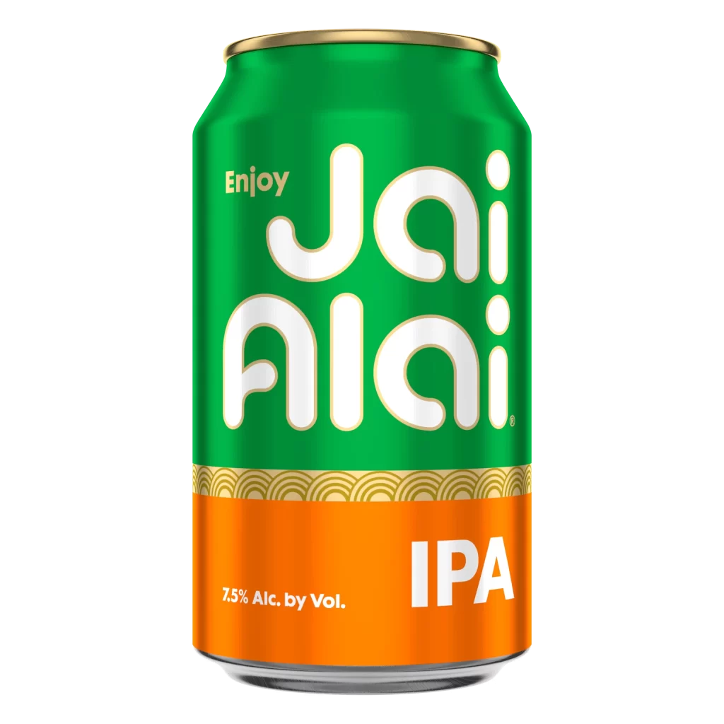
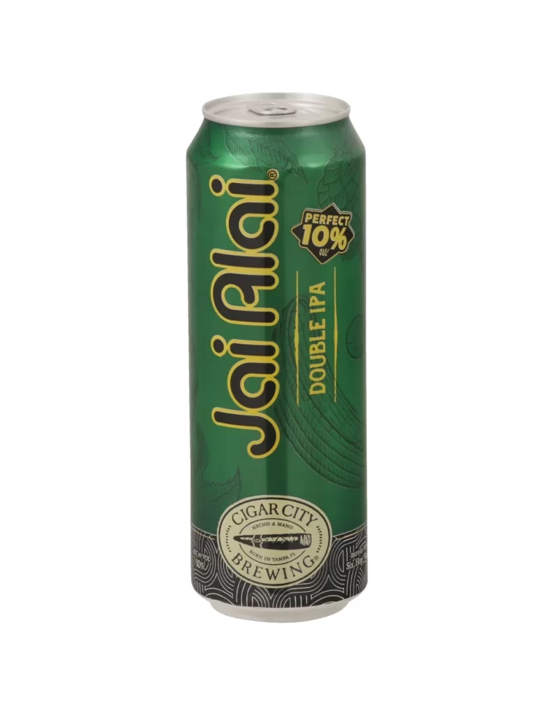
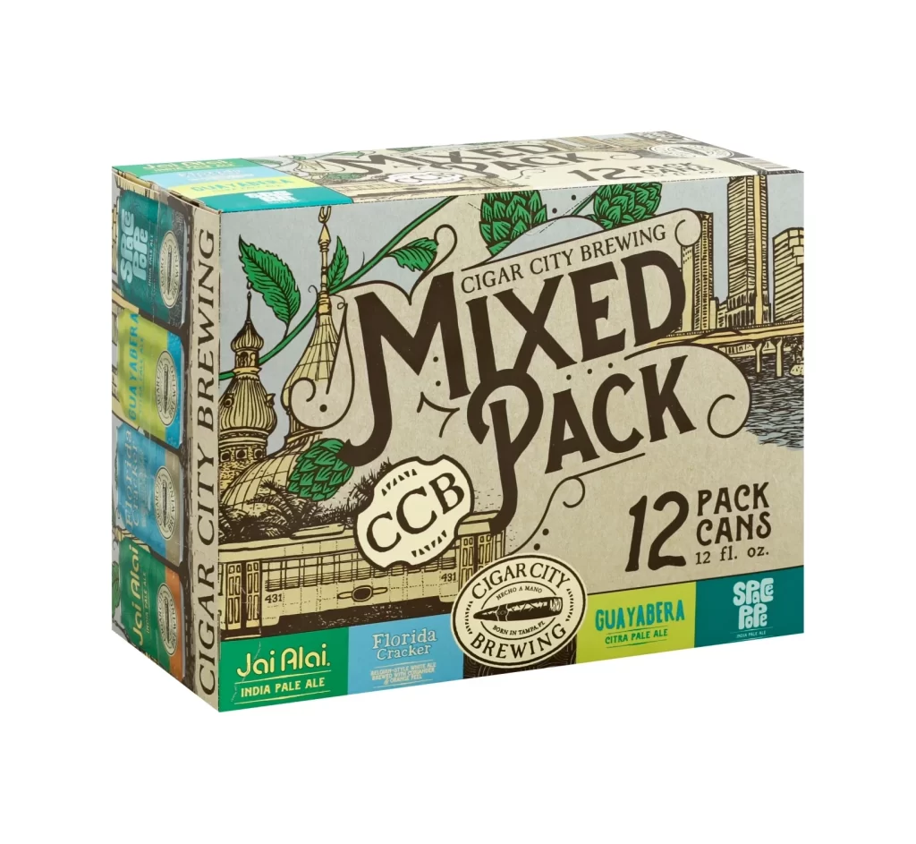
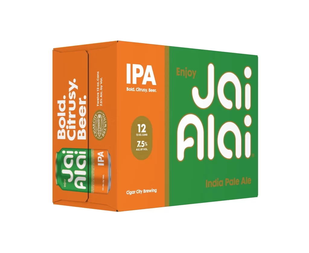
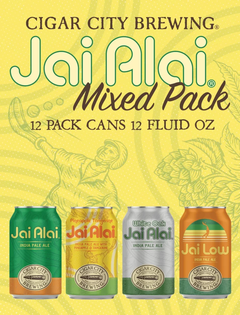
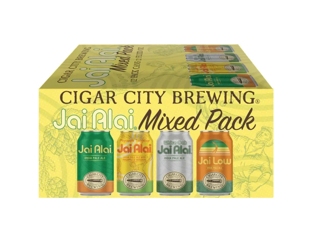
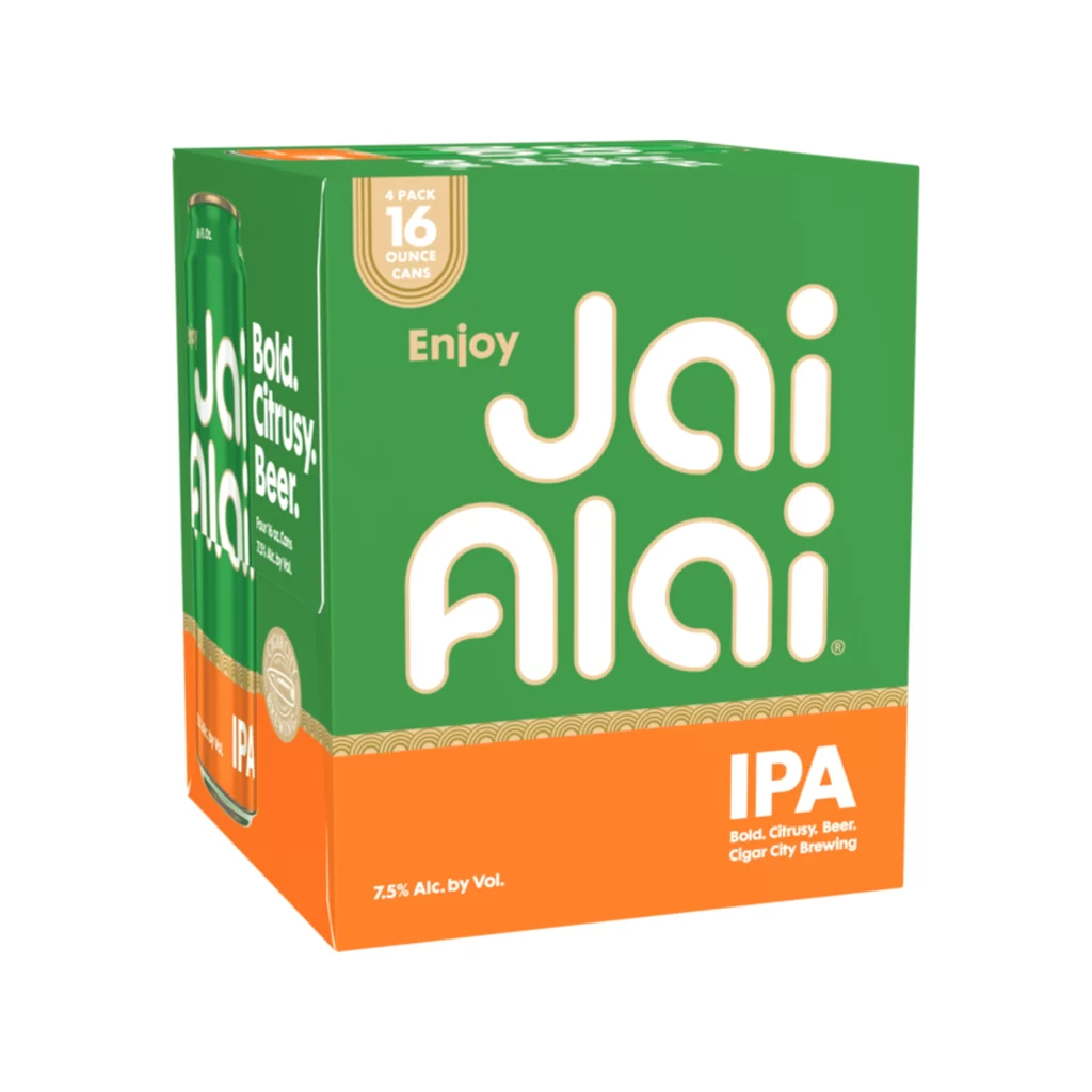
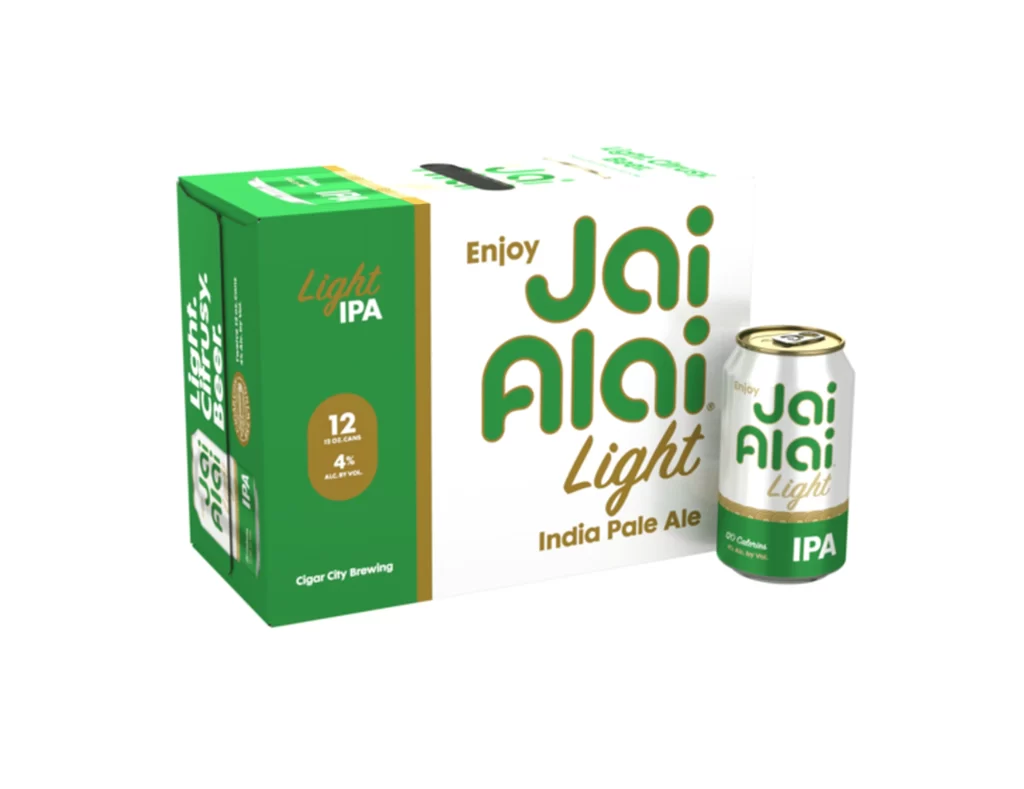
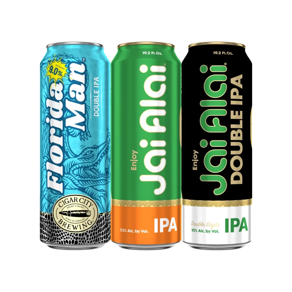
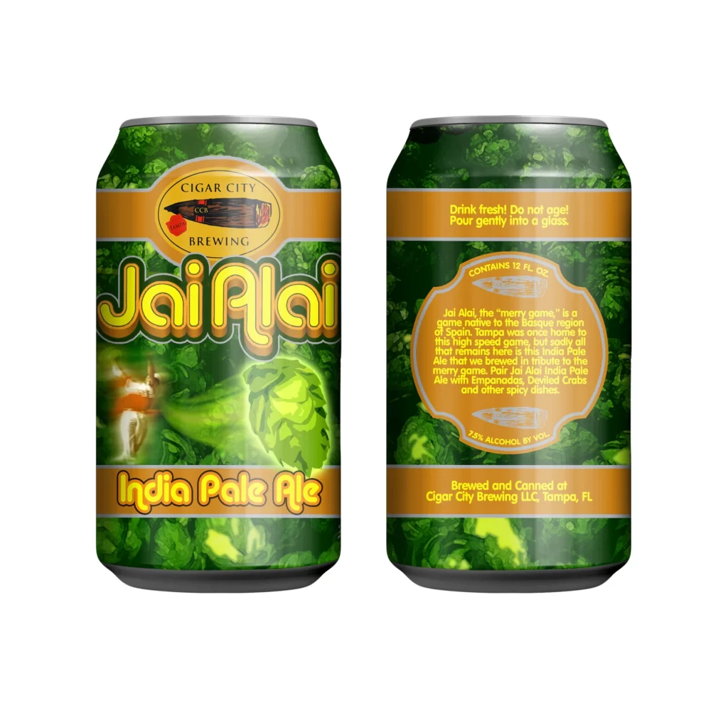
A cylindrical aluminum can with a gold-toned rim displays a two-tone color scheme, with the upper two-thirds covered in vibrant emerald green and the lower third in saturated orange, divided by an intricate gold wave pattern. Large, rounded white lettering spells out 'Jai Alai' across the green field, accompanied by the word 'Enjoy' in smaller gold text positioned to the upper left of the brand name. The orange base section features bold white 'IPA' typography on the right side alongside '7.5% Alc. by Vol.' text on the left, all presented against a white background.
Visual impact derives from the high-contrast palette and the playful, almost bubble-like typography that dominates the can’s face. The decorative gold border acts as a sophisticated transition between the primary colors, adding a touch of traditional flair to the otherwise modern, minimalist layout. Such a clear division of space creates an immediate hierarchy, guiding the eye from the brand name down to the specific beer style with effortless fluidity.
Brand strategists might analyze this composition to understand how color blocking can effectively categorize product information for consumers. Packaging engineers could study the balance between the large logo and mandatory regulatory text to optimize their own label designs. Additionally, illustrators looking to render metallic surfaces would find the subtle reflections on the curved aluminum body particularly instructive for practicing material textures.

![Cigar City Brewing Beer Packaging ]](https://gropicture-1323946364.cos.na-siliconvalley.myqcloud.com/wp-content/uploads/2026/07/cigar-city-white-oak-jai-alai-ipa-4-pack-cans-2566-823x1024.webp)