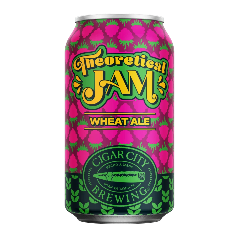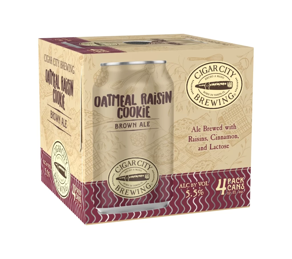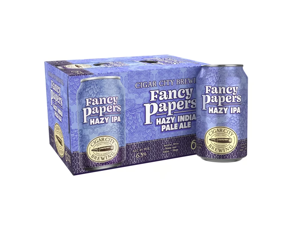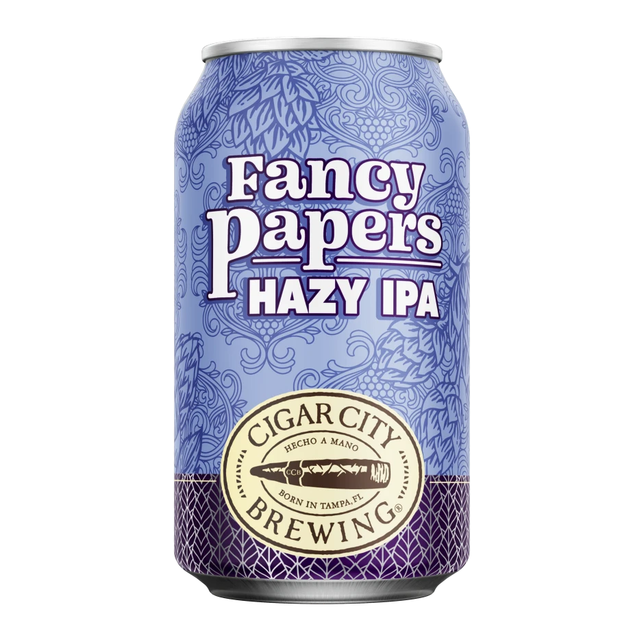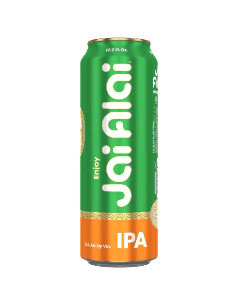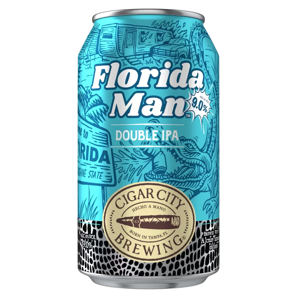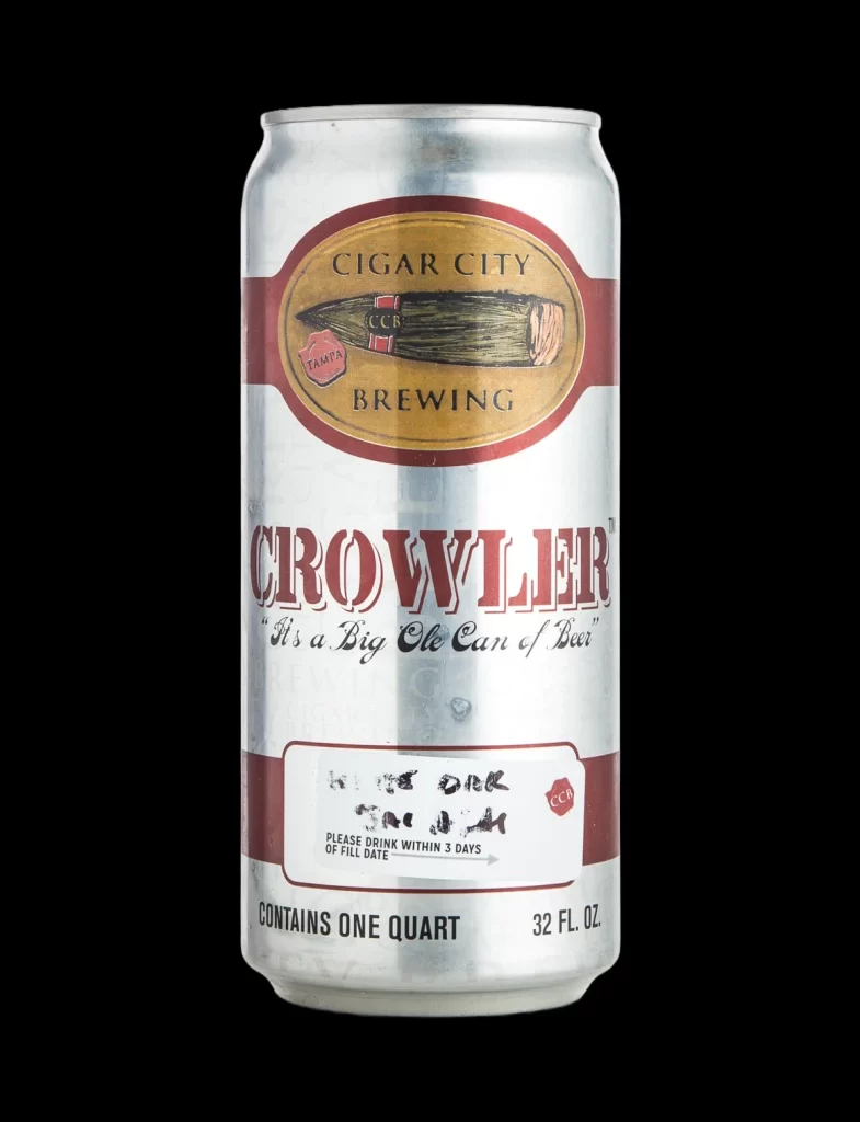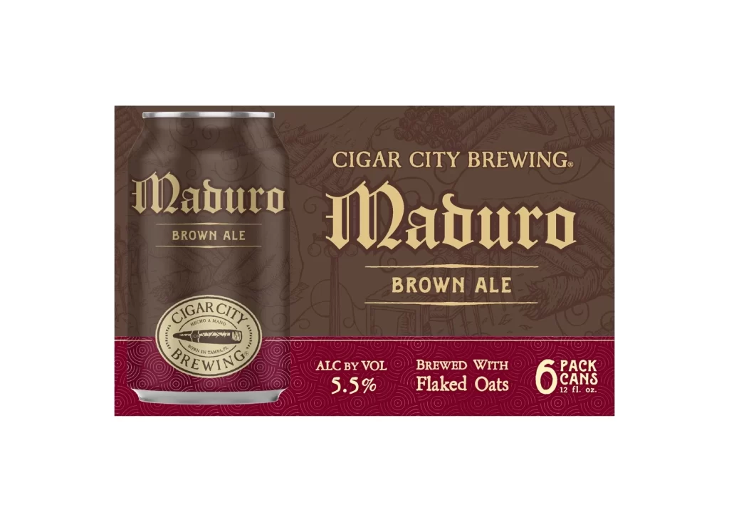
Cigar City Brewing Brand Logo Packaging
Topics
Details
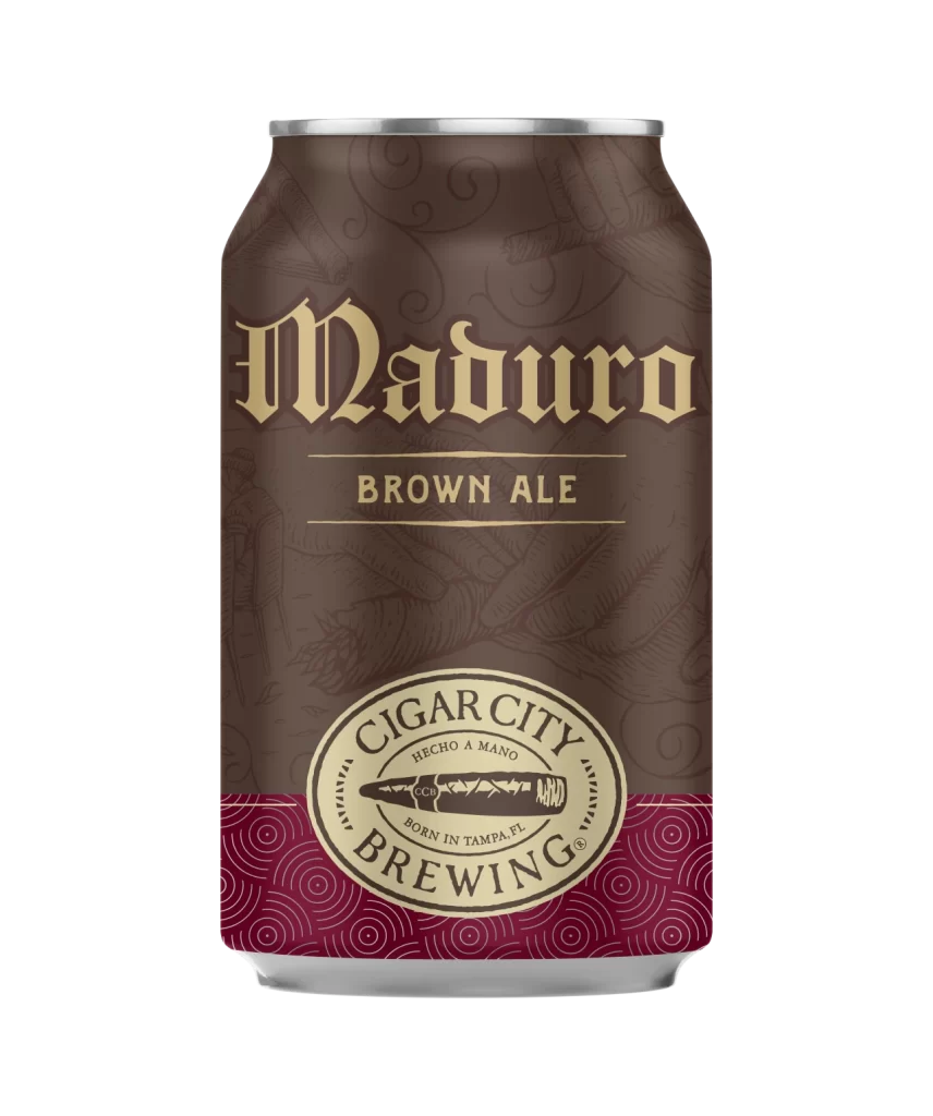
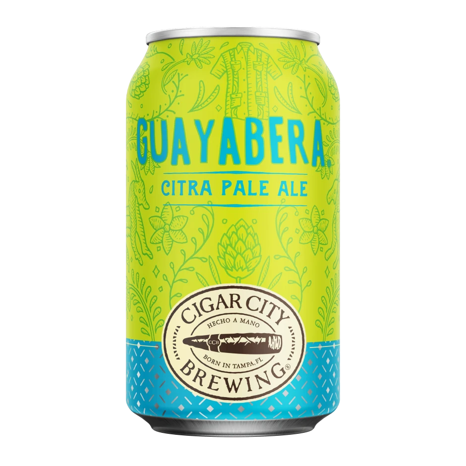
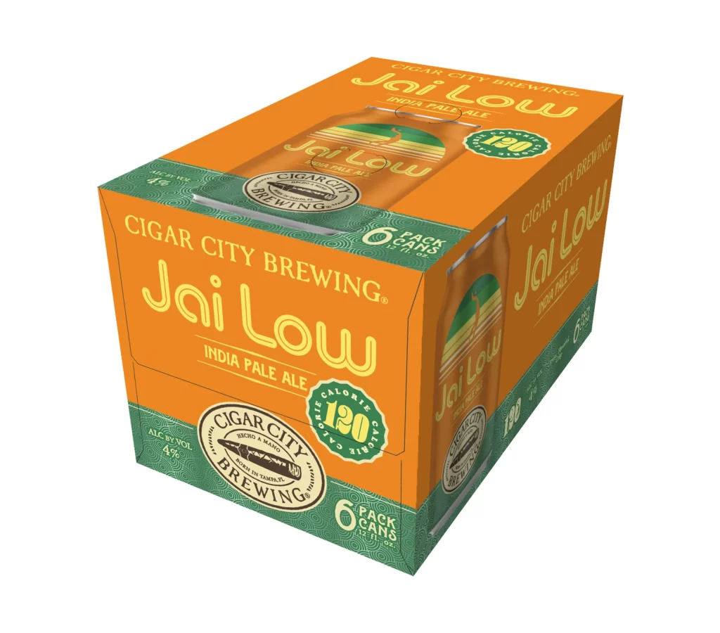
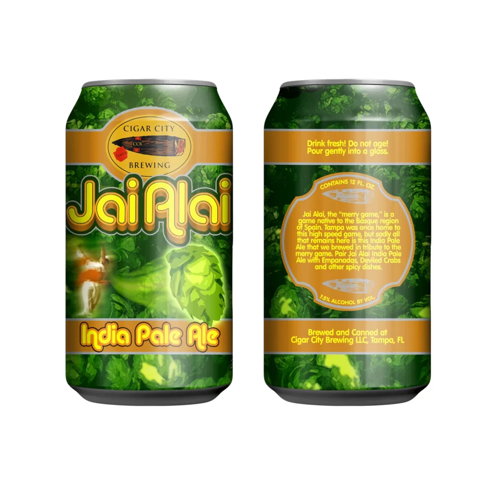
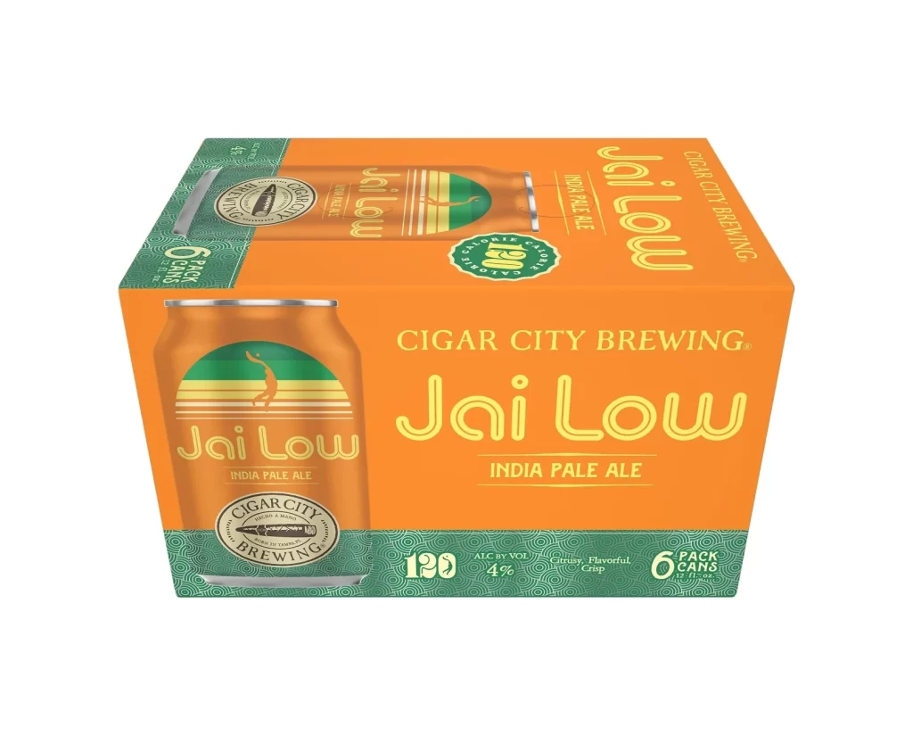
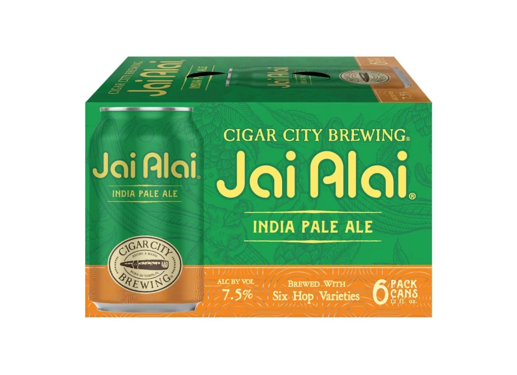
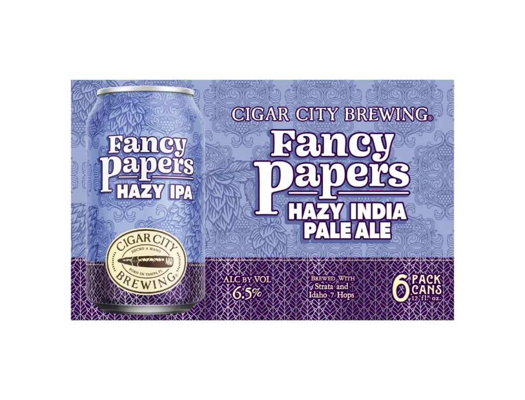
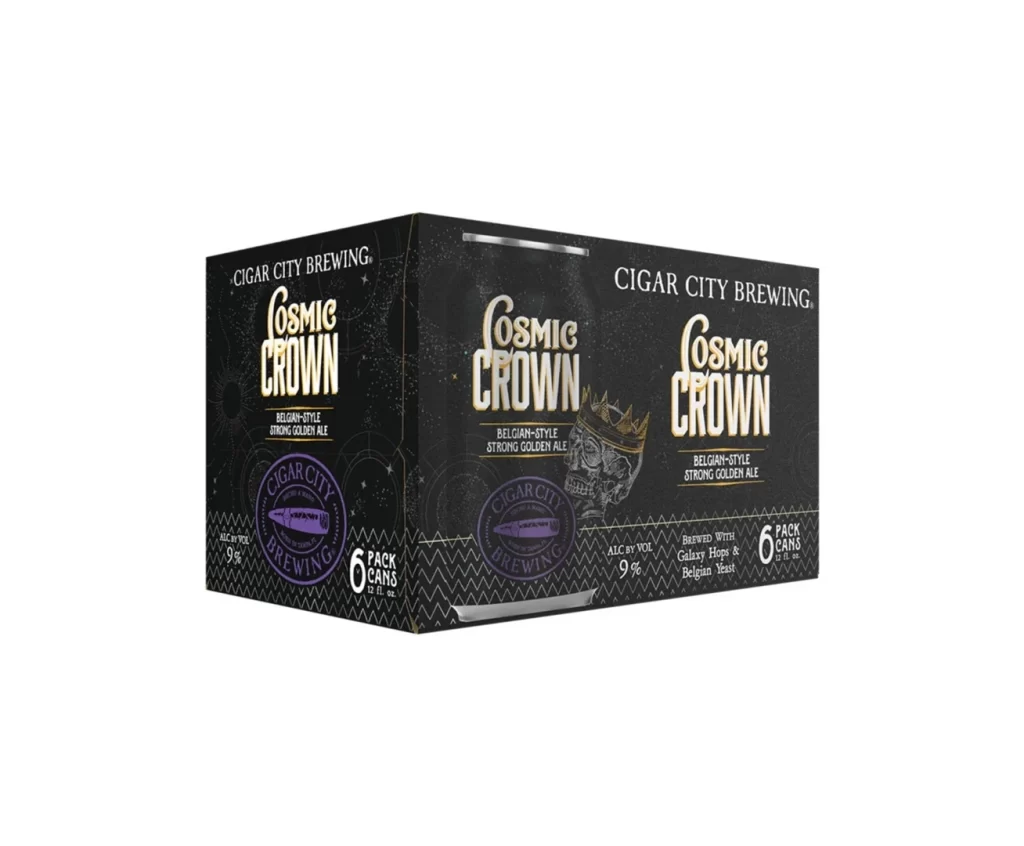
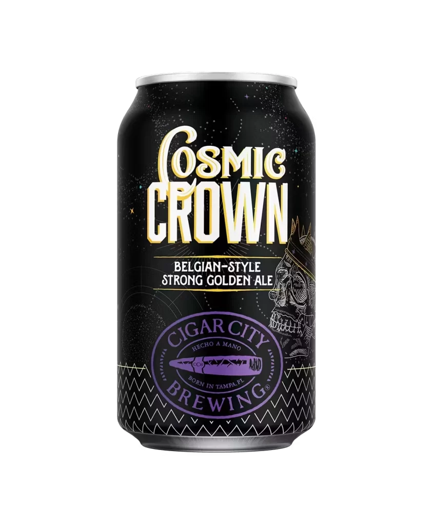
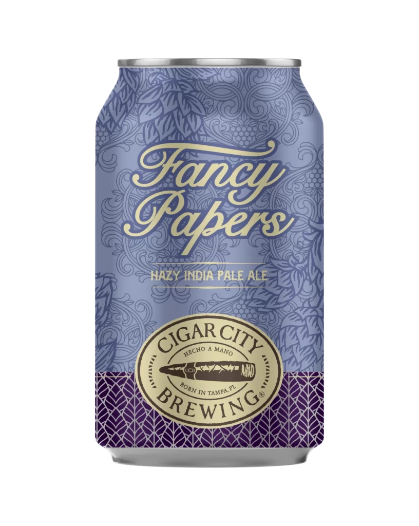
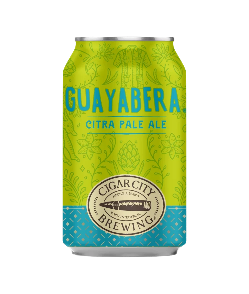
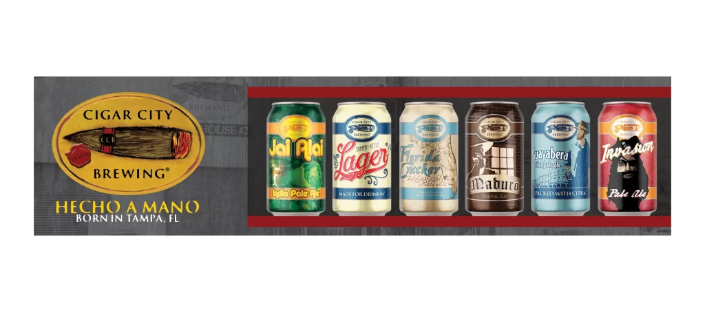
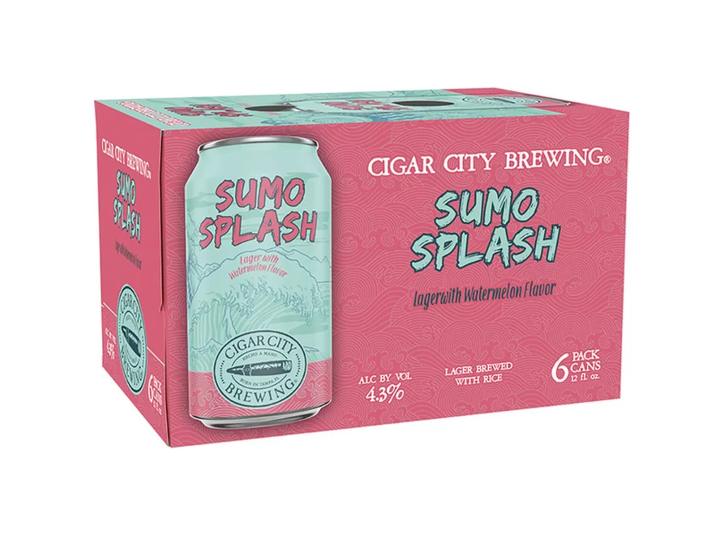
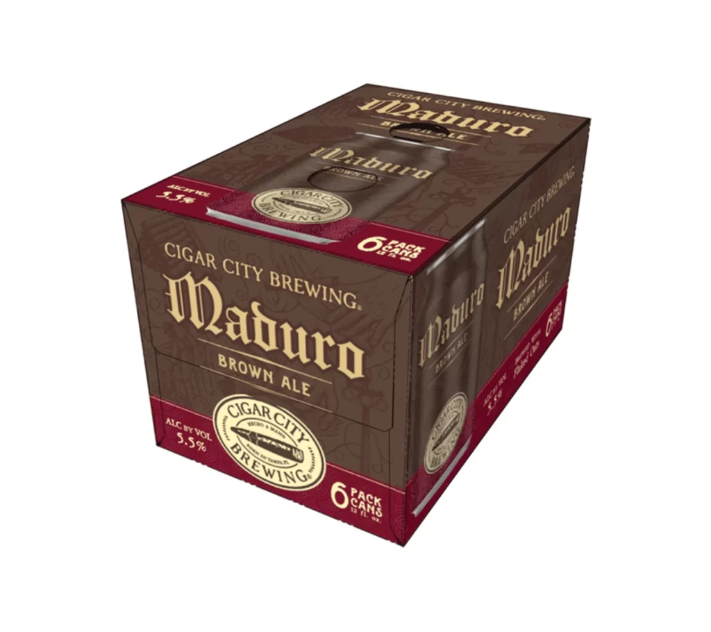
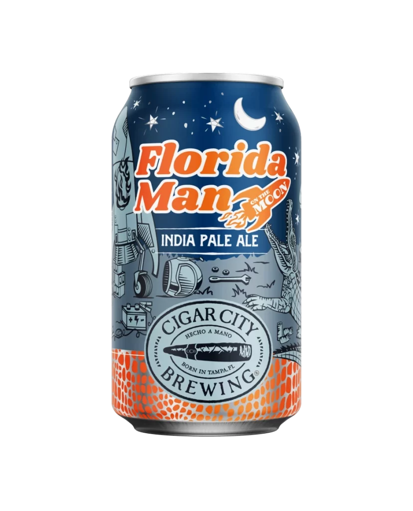
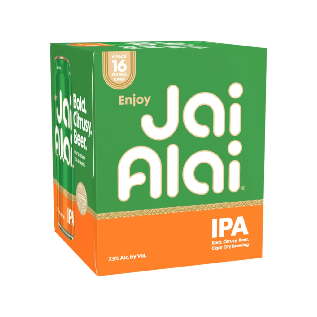
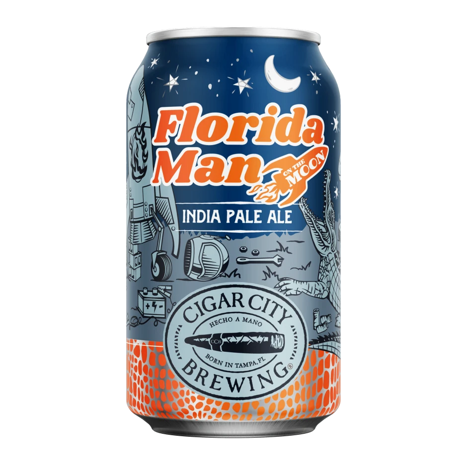
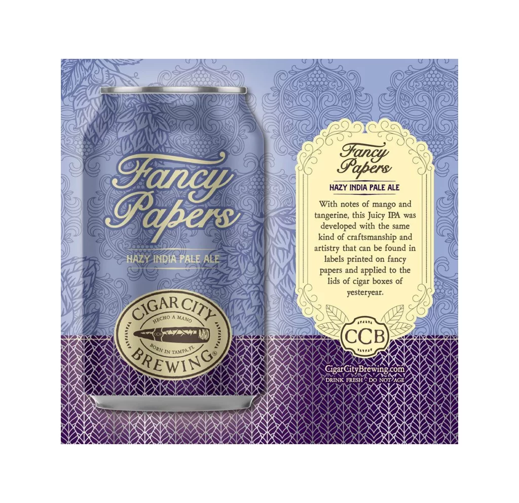
An oval emblem with a warm cream-colored interior and thick dark brown border displays the Cigar City Brewing brand identity. A detailed cigar illustration in deep brown occupies the center, featuring textured leaf patterns and a band marked 'CCB', while arched text reading 'CIGAR CITY BREWING' dominates the top and bottom curves. Smaller text within the design includes the Spanish phrase 'HECHO A MANO' above the cigar and 'BORN IN TAMPA, FL' below it, all set against a clean white background.
What makes this mark particularly compelling is its seamless blend of industrial brewing identity with artisanal tobacco craftsmanship. The hand-drawn aesthetic of the cigar graphic suggests authenticity and manual skill, reinforcing the Spanish phrase ‘hecho a mano’ that appears above it. Symmetrical balance between the bold outer typography and intricate central imagery creates a badge-like quality that feels both established and approachable.
Brand historians studying Florida’s craft beer evolution would find this useful for analyzing how regional heritage shapes corporate visual language. Packaging designers working on vintage-inspired labels could examine the interplay between serif fonts and organic illustrative elements. Marketing teams developing heritage-focused campaigns might reference how geographic specificity strengthens brand storytelling through simple textual placement within circular frameworks.
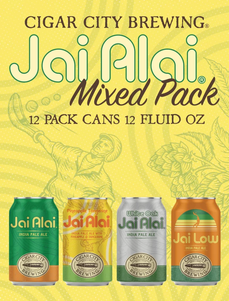
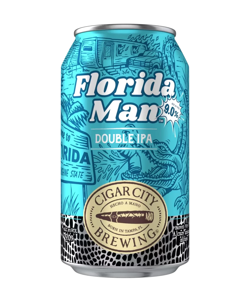
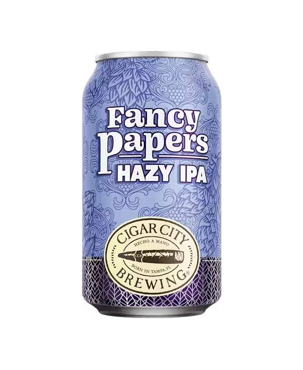
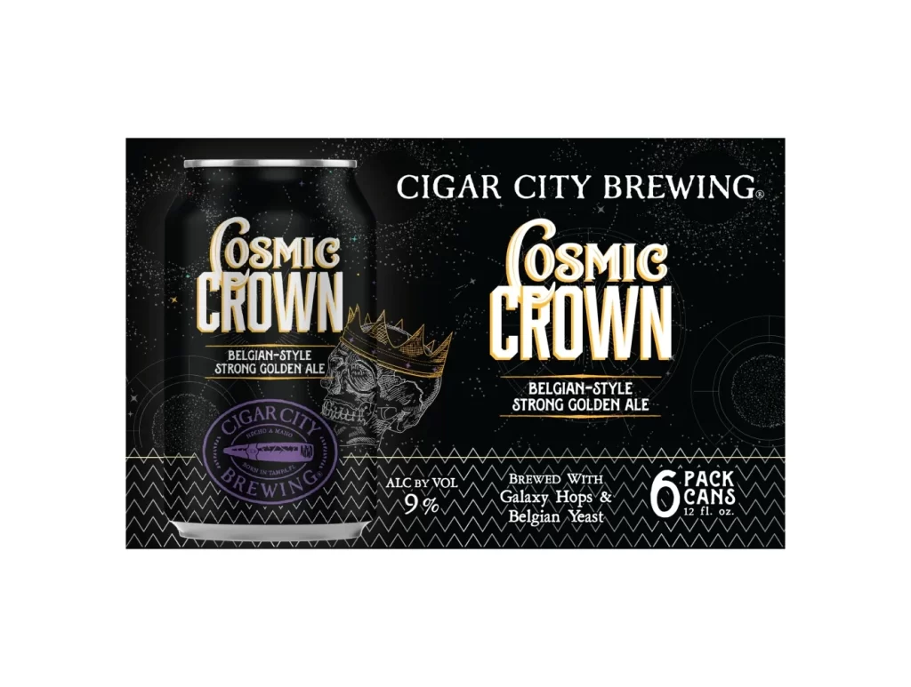
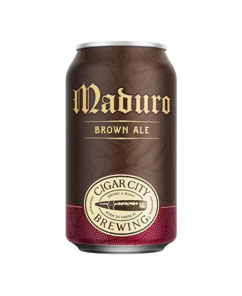

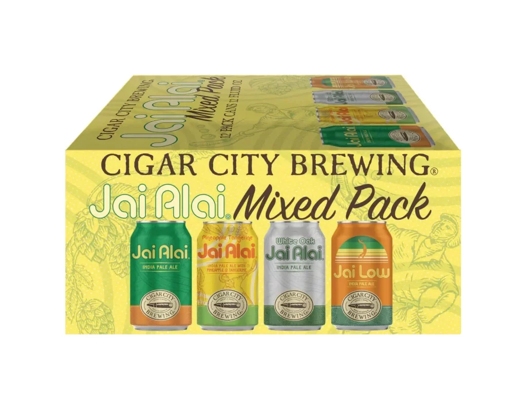
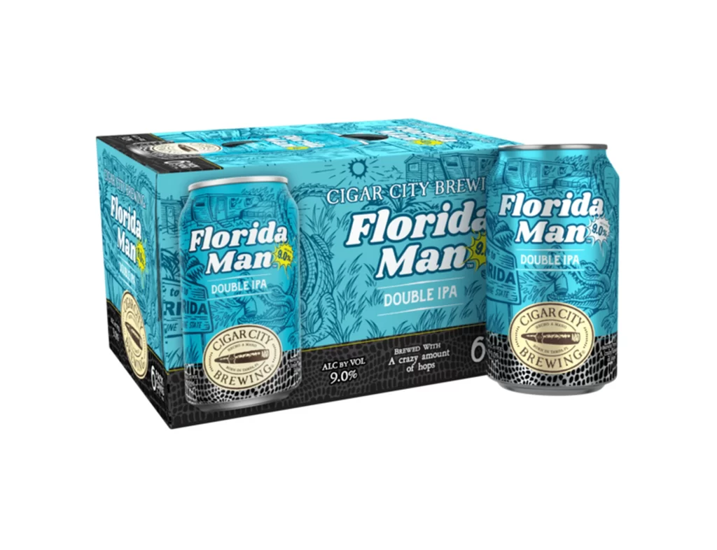
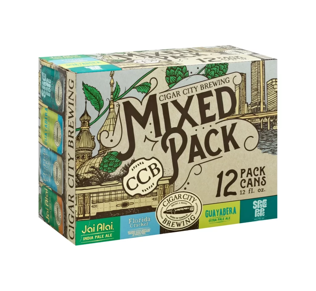
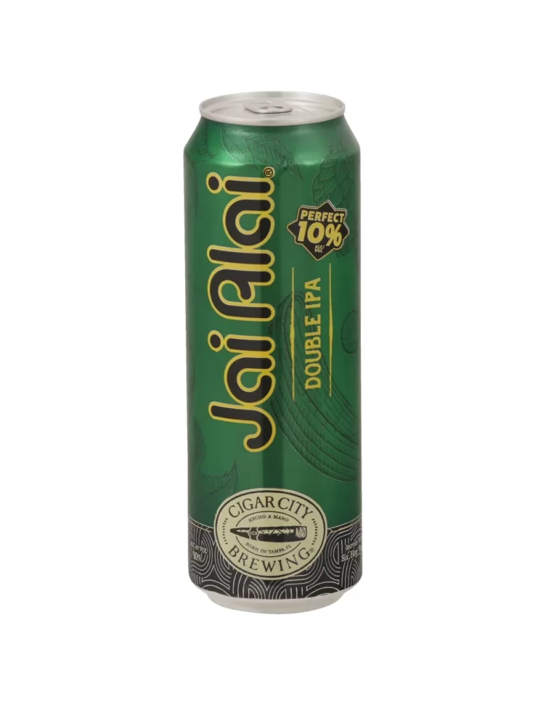
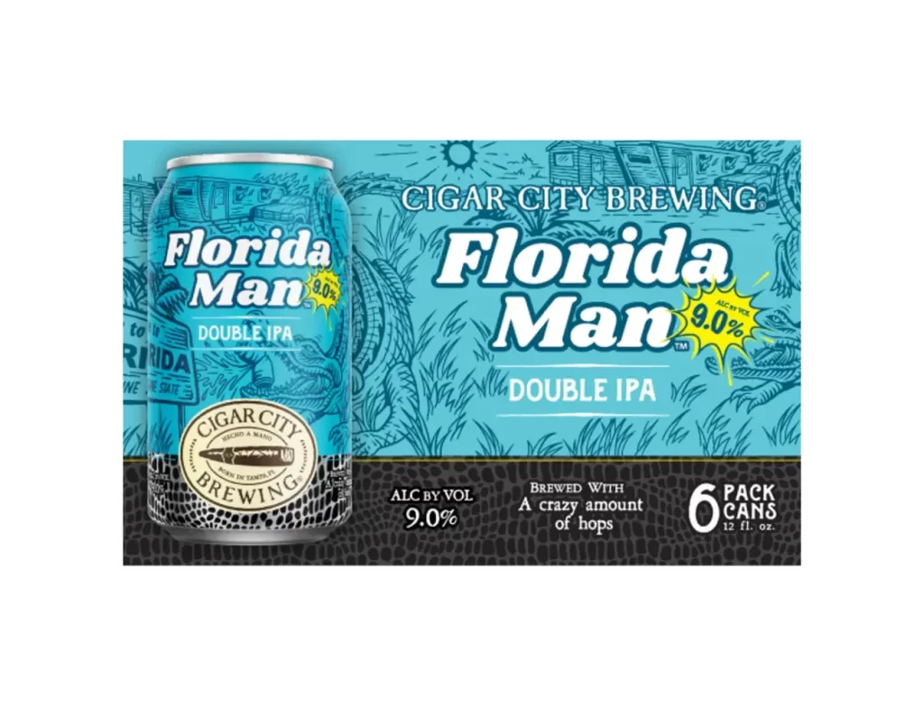
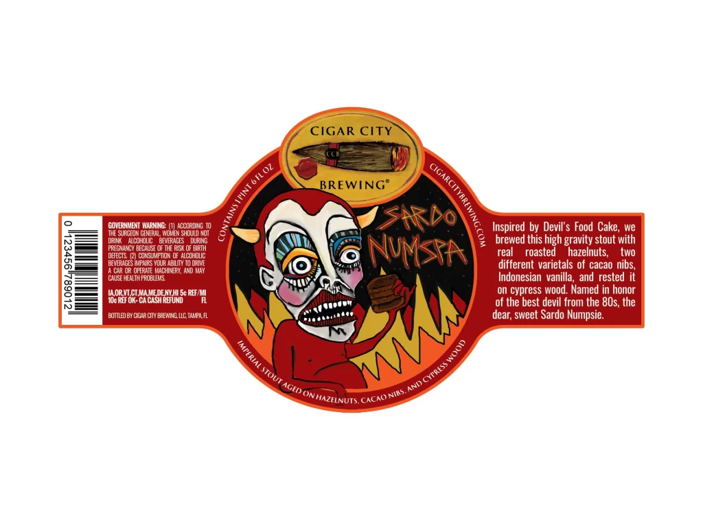
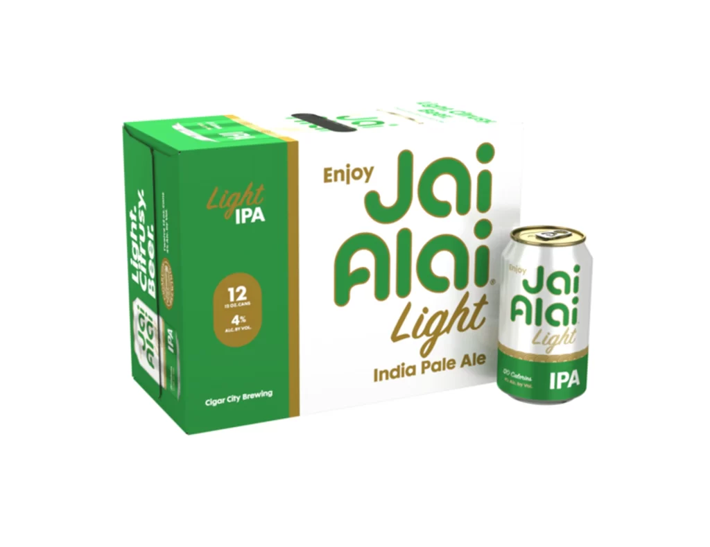
![Cigar City Brewing Beer Packaging ]](https://gropicture-1323946364.cos.na-siliconvalley.myqcloud.com/wp-content/uploads/2026/07/cigar-city-white-oak-jai-alai-ipa-4-pack-cans-2566-823x1024.webp)