Robust Beverage Bottle Drink Packaging
Topics
Details
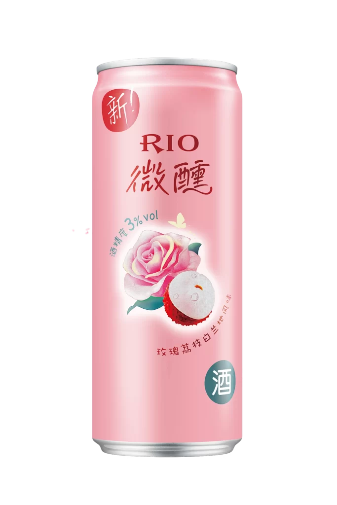
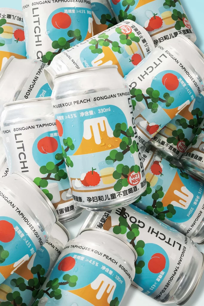
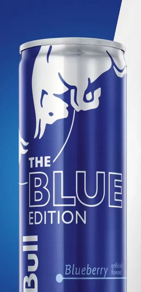
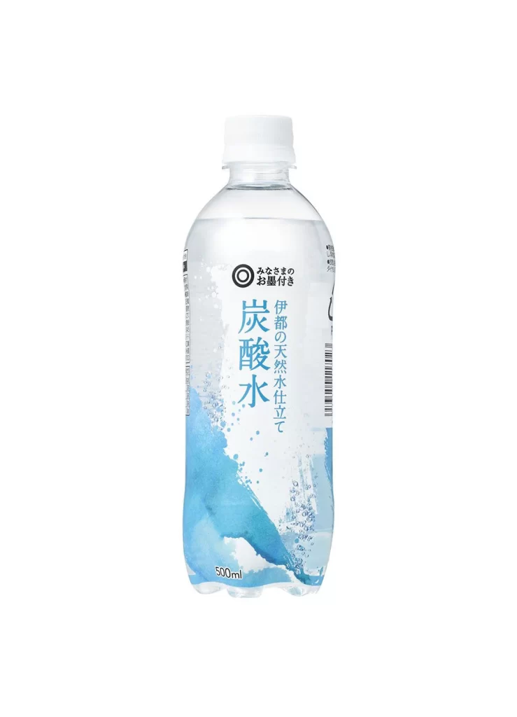
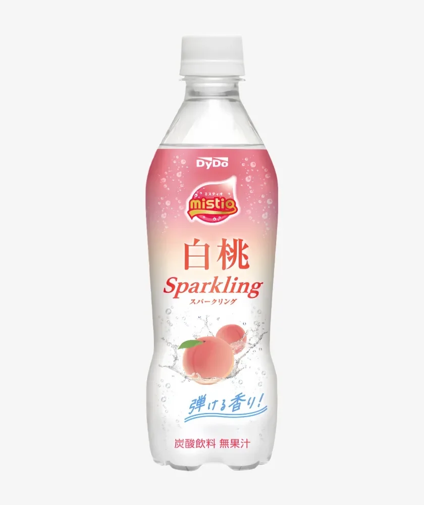
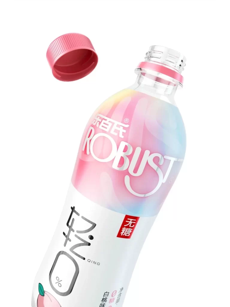
A clear plastic beverage bottle with a pink-to-blue gradient body sits at a slight angle, its red screw cap hovering just above the threaded neck. The white label features the brand name 'ROBUST' in bold silver letters above large Chinese characters for 'Qing', while a small red box indicates 'Sugar-free' and a peach icon marks the flavor. Bright, even lighting eliminates harsh shadows across the smooth surface of the container.
The soft color transition from coral to sky blue creates a fresh, airy aesthetic that immediately signals a light, fruity taste profile. Combining modern English typography with traditional Chinese calligraphy gives the packaging a contemporary yet culturally grounded identity. The floating cap adds dynamic movement to the composition, suggesting the drink is ready to be enjoyed.
Brand strategists might study this layout when developing bilingual product lines for Asian markets. Packaging designers could reference the gradient technique for creating visual depth on transparent materials. Marketing teams analyzing health-conscious beverage trends would find the sugar-free labeling placement particularly useful for their own concept development.