Sandro Desii Gourmet Ice Cream Box
Topics
Details
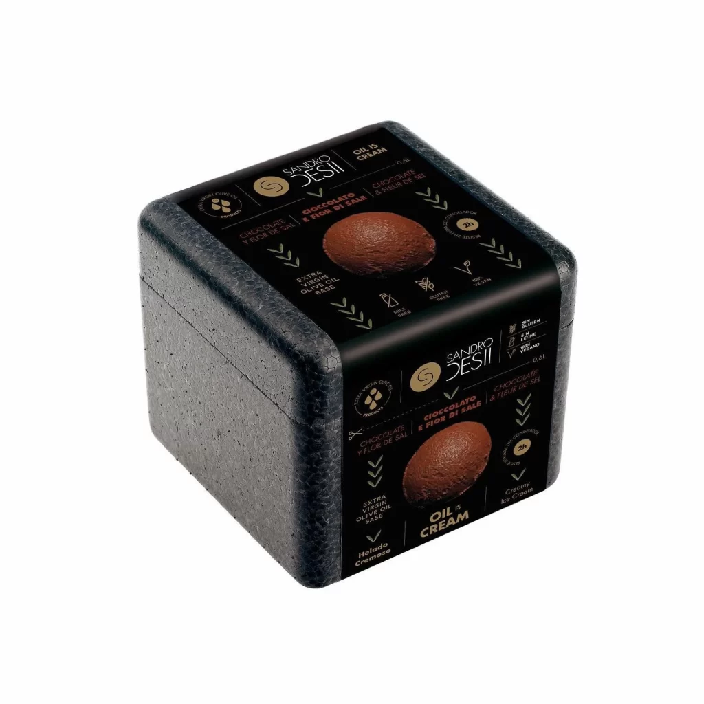
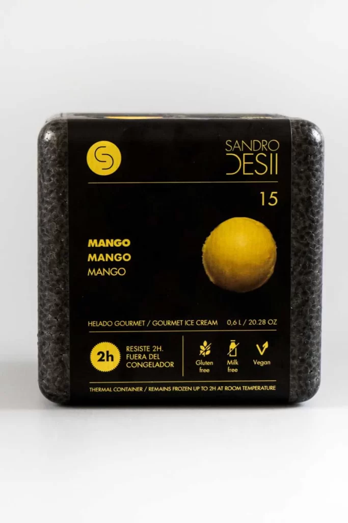
Centered within a seamless white void, a square thermal container presents a stark black label dominated by golden-yellow typography. The packaging features a textured, pebbled gray exterior that contrasts with the smooth matte finish of the central graphic panel. Prominently displayed text includes the brand name 'Sandro Desii' in a refined sans-serif typeface, the number 15, and the word 'Mango' repeated three times in bold capitals beside a spherical yellow fruit illustration. Below this, technical specifications denote a 0.6 liter capacity alongside icons indicating gluten-free, milk-free, and vegan certifications, while a circular badge emphasizes the container's ability to resist thawing for two hours outside refrigeration.
Visual hierarchy is established through the disciplined use of a two-tone palette, where the luminous yellow elements pop against the deep black background to ensure immediate legibility. The repetition of the flavor name creates a rhythmic typographic pattern that draws the eye downward toward the product's functional benefits. Such restrained minimalism allows the photographic representation of the mango sphere to serve as the primary focal point, anchoring the composition with organic warmth amidst the industrial geometry of the box.
Packaging designers studying premium frozen goods would find value in analyzing how thermal materials are branded for luxury retail environments. Brand identity specialists could examine the integration of dietary certification marks without cluttering the primary visual field. Students of commercial photography might reference the even, shadowless lighting technique used to emphasize surface textures and label clarity for e-commerce applications.