Sandro Desii Ice Cream Box View
Topics
Details
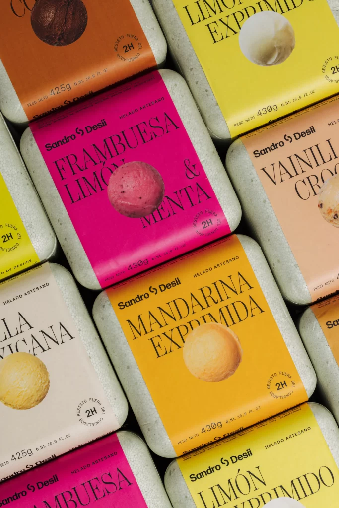
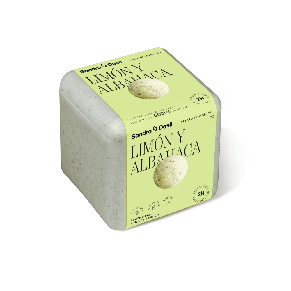
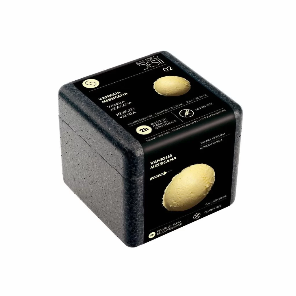
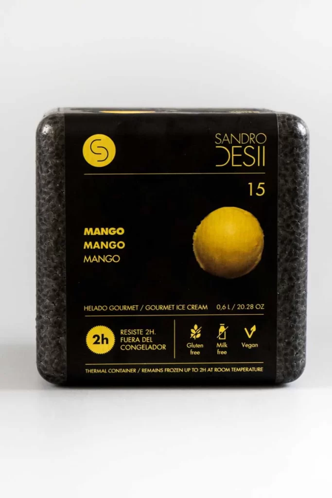
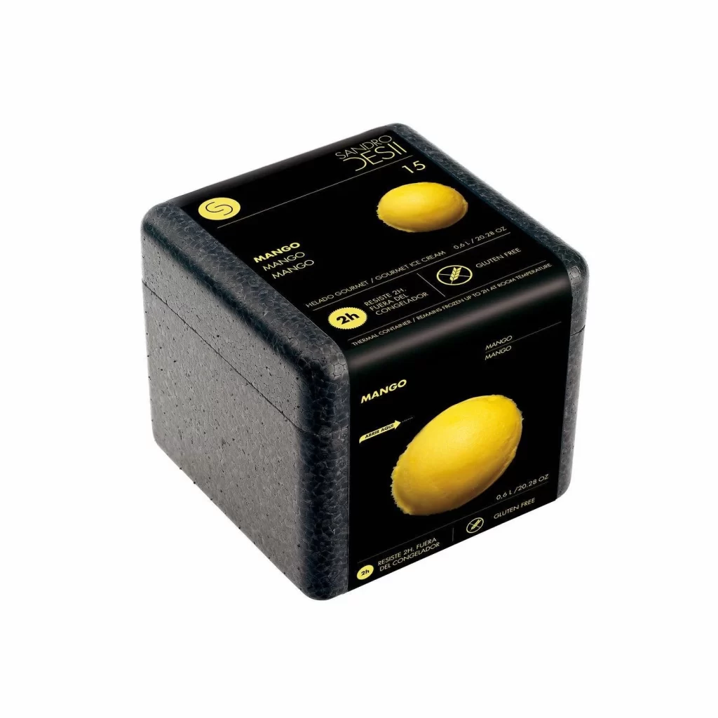
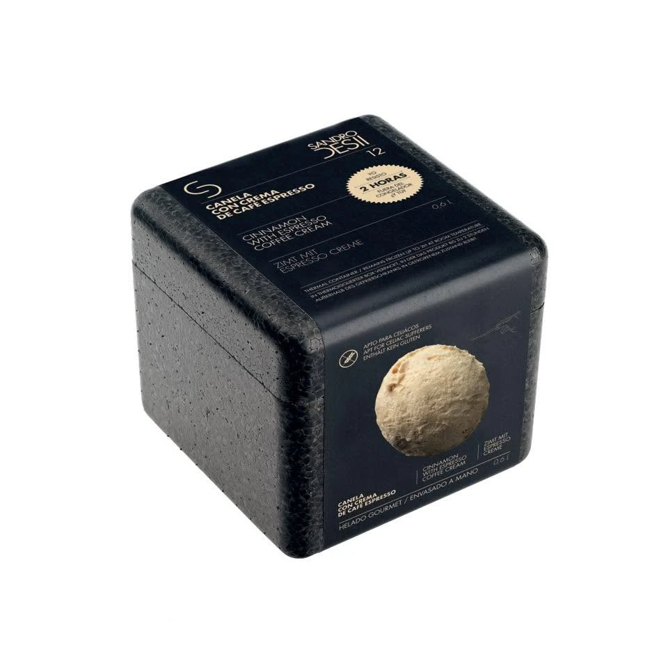
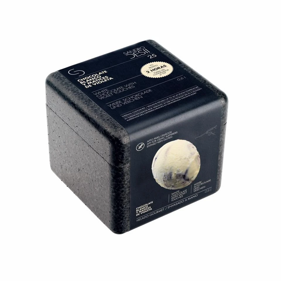
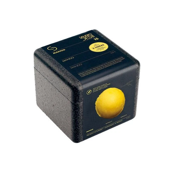
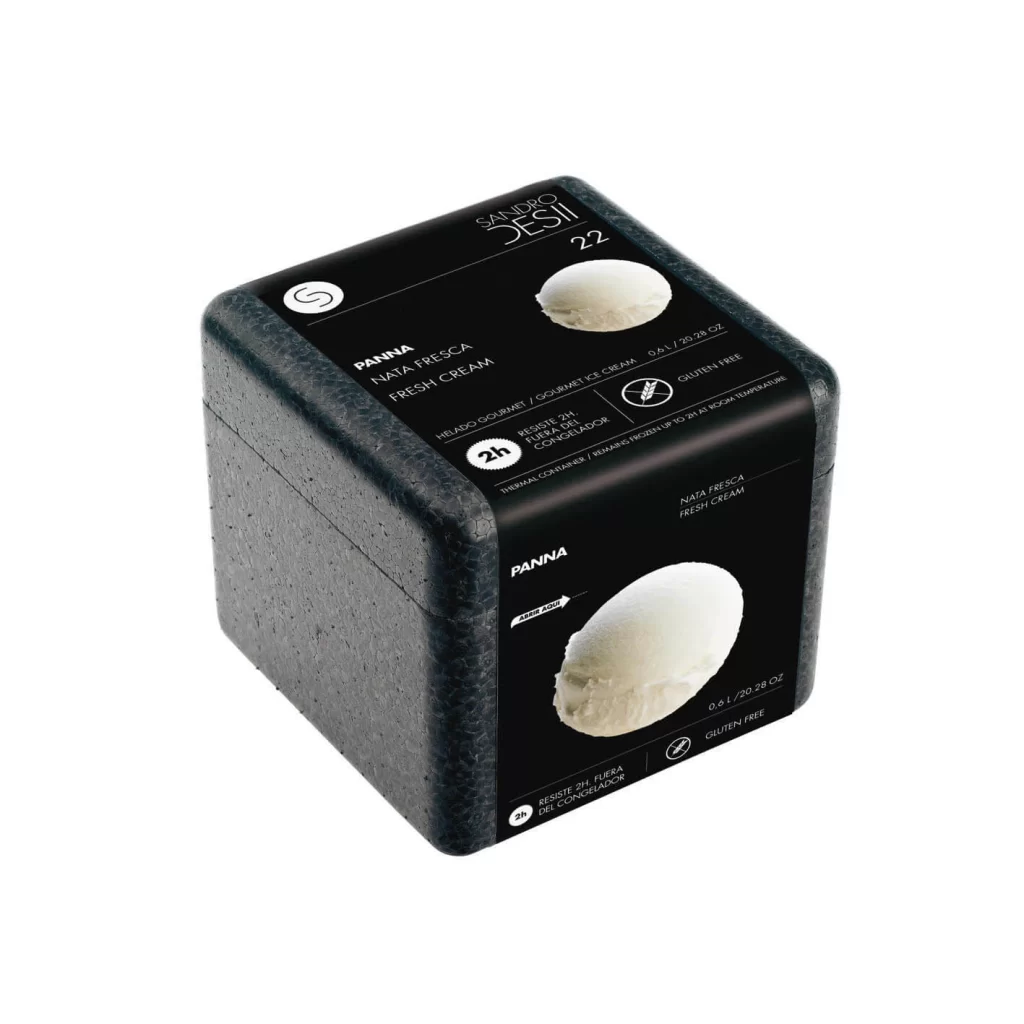
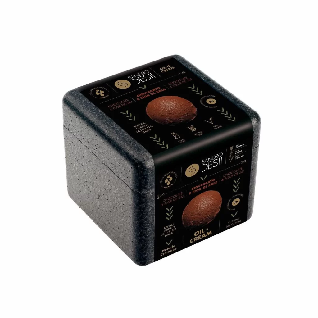
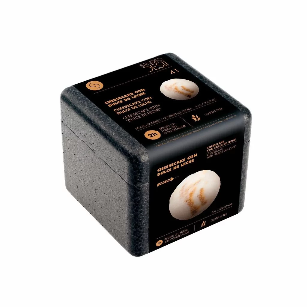
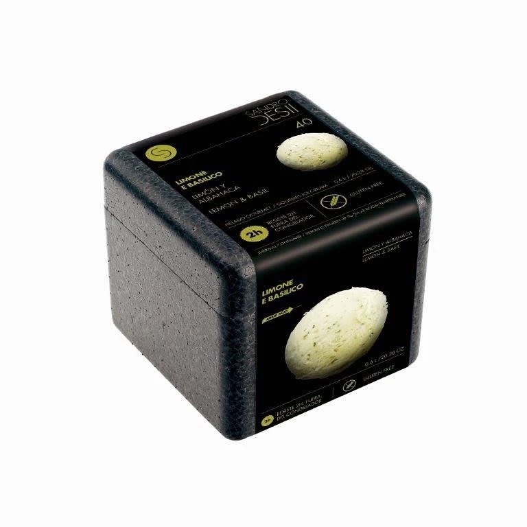
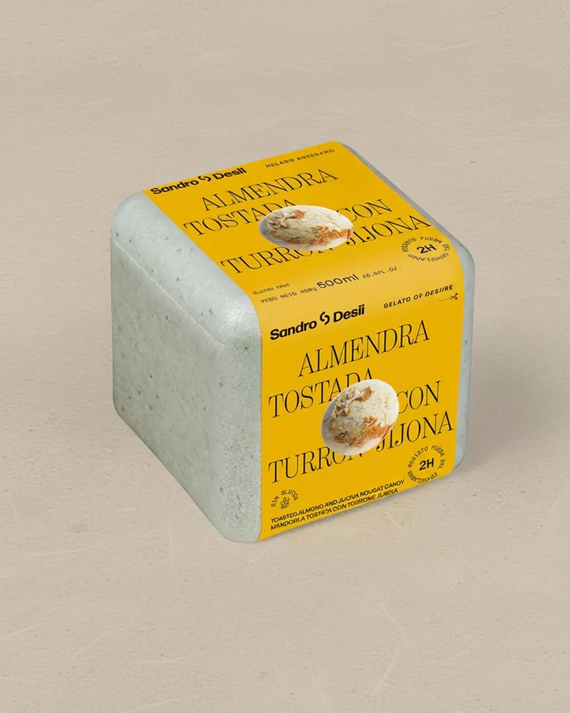
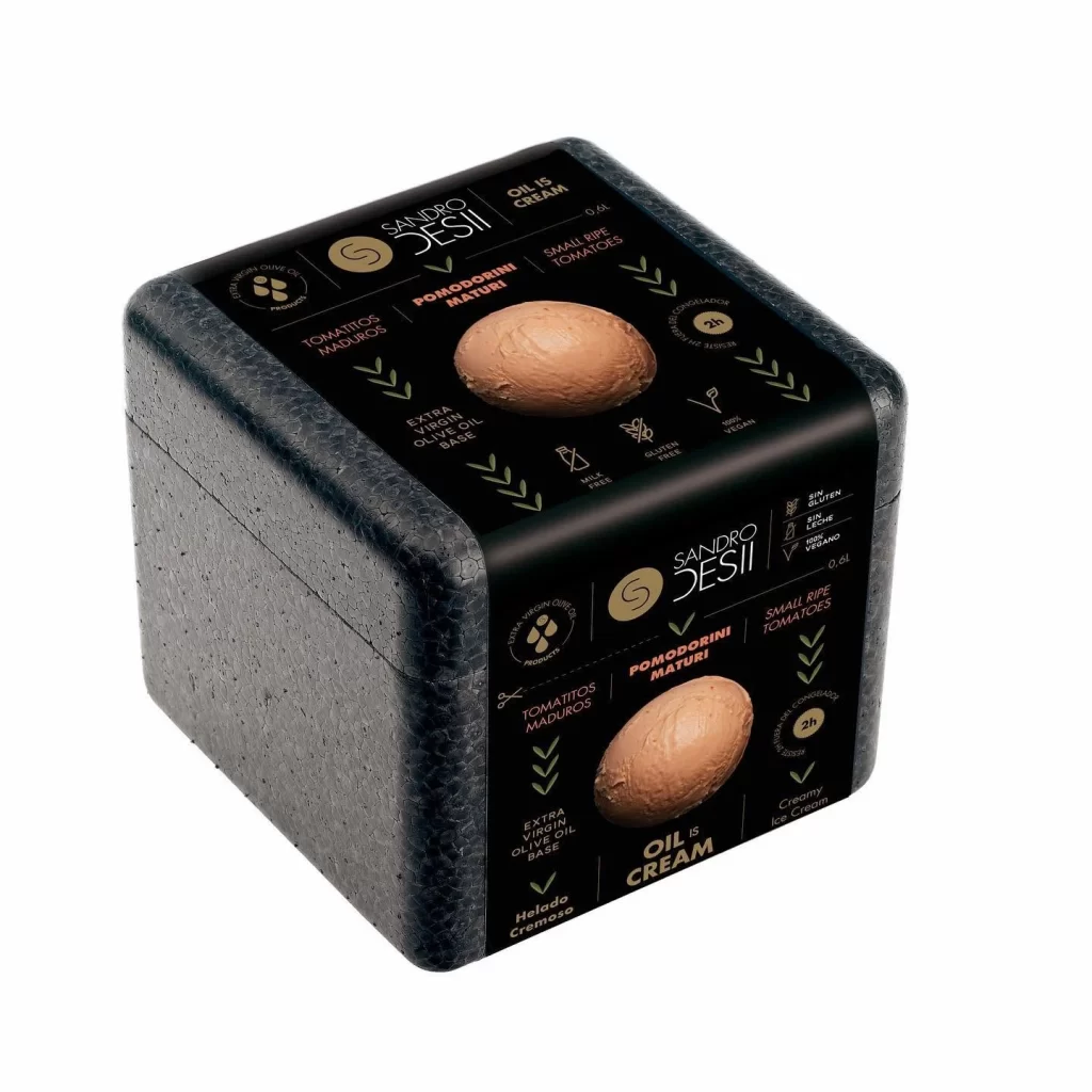
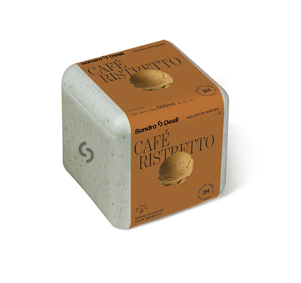
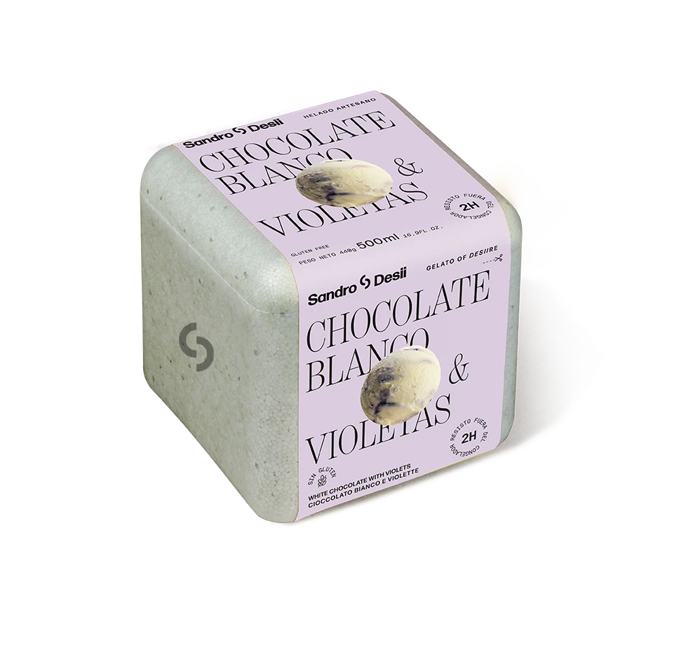
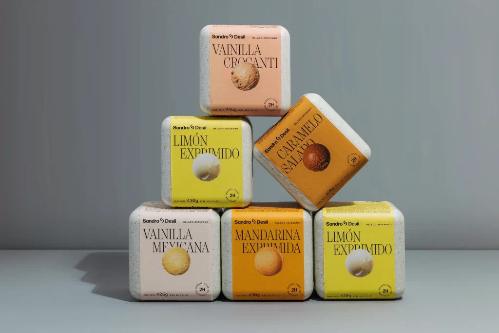
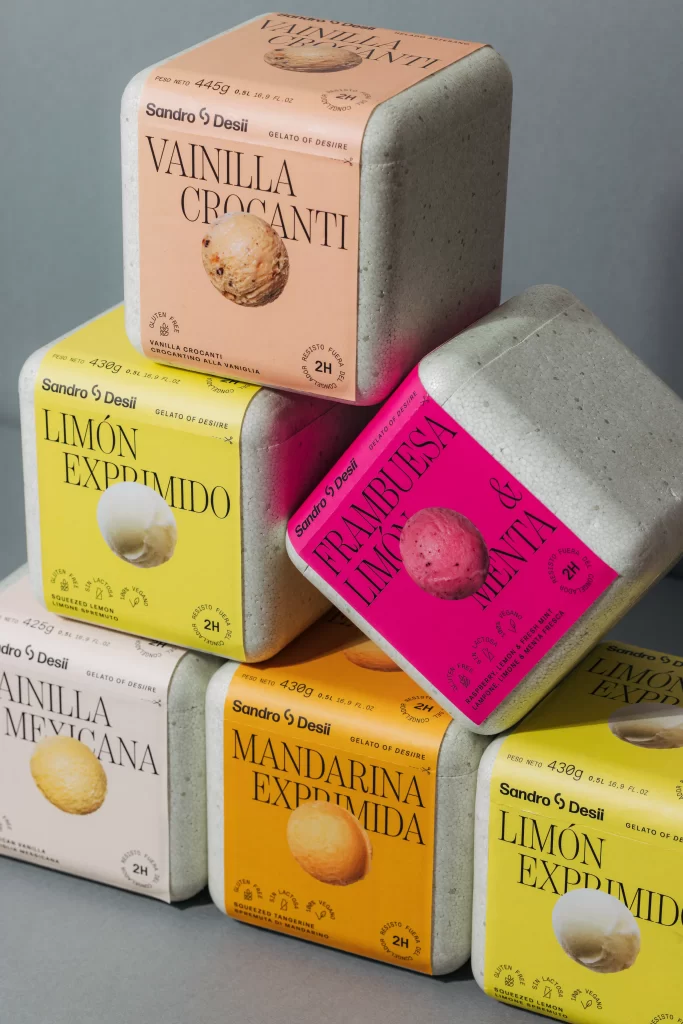
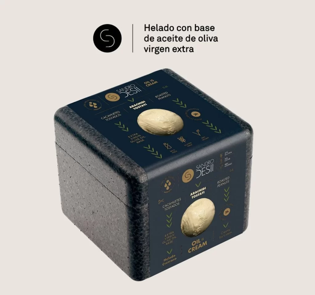
Against a neutral off-white backdrop, a cubic foam shipping container presents itself at a three-quarter angle, revealing both the top and side panels. The exterior features a dark, speckled texture resembling dense expanded polystyrene, while the flat surfaces display a deep navy blue label system. Gold and white typography identifies the brand as Sandro Desii, highlighting ingredients like 'Cacahuetes Tostados' (roasted peanuts) and 'Extra Virgin Olive Oil Base' alongside a central circular window revealing the pale cream product within.
Visual hierarchy is established through the disciplined use of metallic gold accents against the matte dark ground, creating a premium aesthetic that contrasts sharply with the utilitarian nature of the protective foam packaging. The typographic layout employs a modular grid with directional chevrons guiding the eye between nutritional claims, ingredient callouts, and the brand monogram. Such a juxtaposition of industrial insulation material with refined editorial graphics generates a compelling tension between function and luxury branding.
Packaging engineers might study this composition to understand how thermal containers can maintain brand identity during transit without sacrificing structural integrity. Art directors working on gourmet food products could analyze the color palette and spatial distribution of information to inform their own cold-chain packaging designs. Additionally, 3D visualization artists may utilize the specific lighting falloff and material subsurface scattering evident on the foam edges to refine their own rendering techniques for porous synthetic materials.