Sandro Desii Penne di Mais e Riso Box
Topics
Details
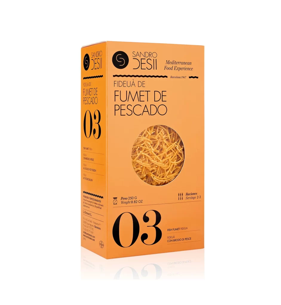
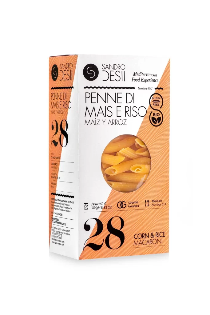
A rectangular pasta box stands upright, displaying a crisp white and vibrant orange color scheme with bold black typography. The front panel features the brand name 'SANDRO DESII' at the top in clean lettering, followed by 'PENNE DI MAIS E RISO' and its Spanish translation 'MAÍZ Y ARROZ' in large, elegant font. A circular transparent window reveals golden penne pasta inside, while the number '28' appears prominently in black on both the front and left side panels. Two certification badges for gluten-free and organic (BIO) products sit to the right of the product name, and the bottom right corner reads 'CORN & RICE MACARONI' in smaller text.
Visual interest arises from the dynamic geometric composition where the sharp diagonal division creates immediate movement across the package surface. The contrast between the minimalist black text on white space and the textured orange field establishes a clear hierarchy of information, while the integration of multilingual labeling reflects Mediterranean market positioning. Circular graphic elements, including the product viewing window and the organic certification seals, provide softening curves that balance the otherwise angular box architecture.
Packaging designers studying contemporary food branding would examine this example for its effective use of color blocking and typographic scale in premium organic product presentation. Marketing teams developing gluten-free product lines could reference the placement strategies for dietary certifications and ingredient transparency. Students of visual communication might analyze how the combination of Italian and Spanish text alongside universal symbols communicates quality across different consumer demographics without relying on photographic food styling beyond the simple window reveal.