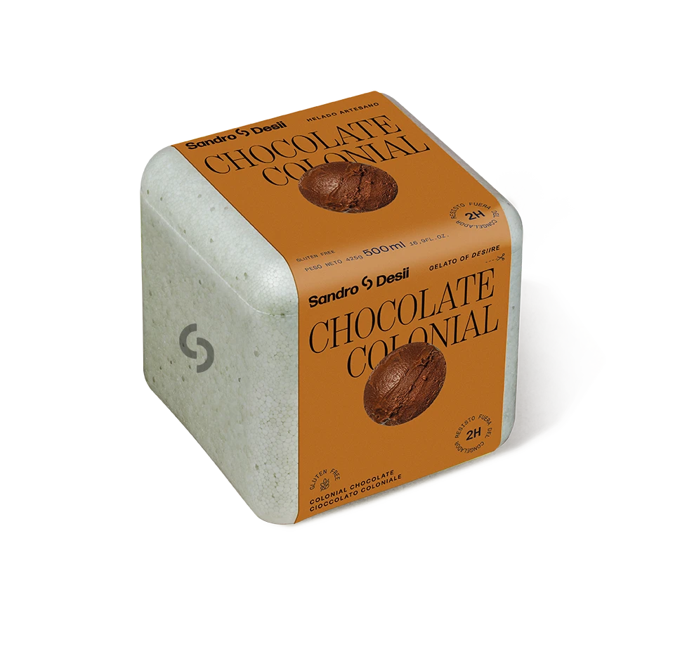
Sandro Desii Chocolate Colonial Box
Topics
Details
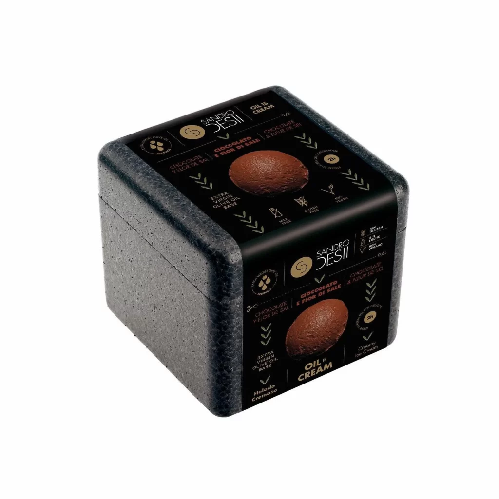
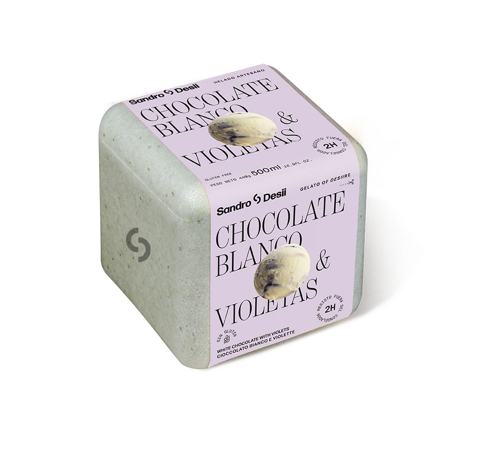
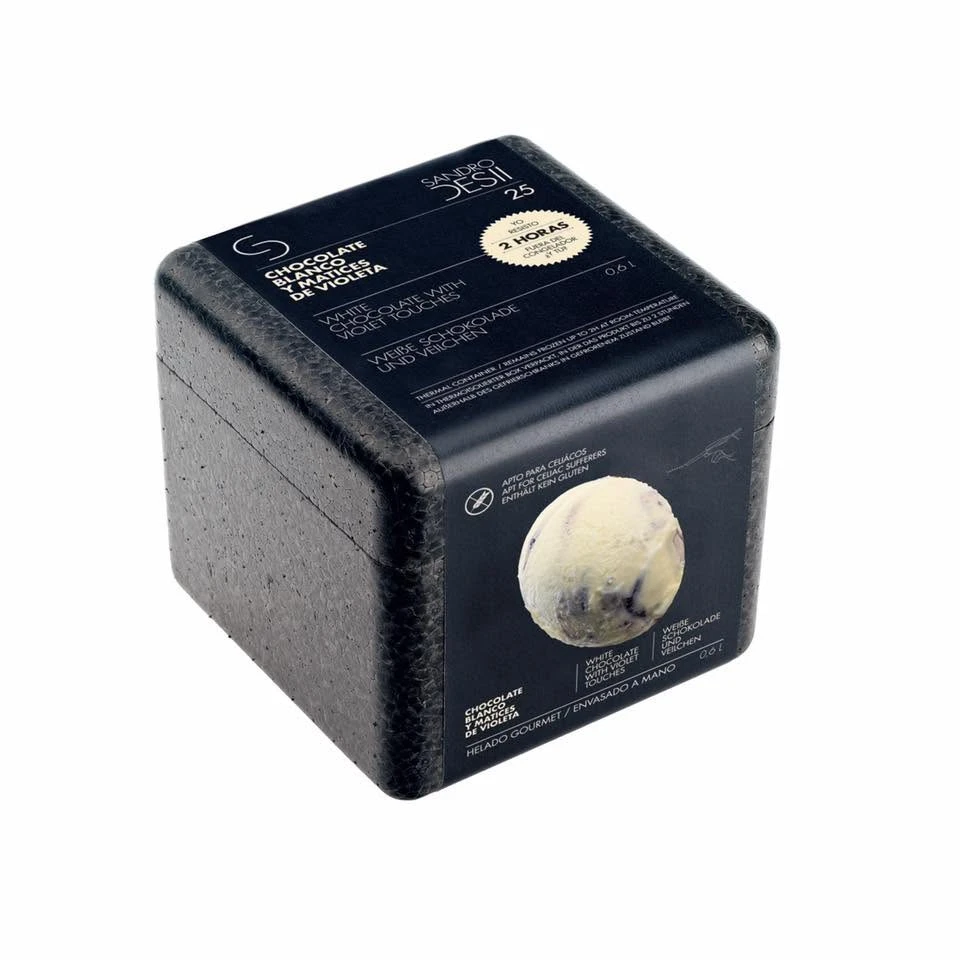
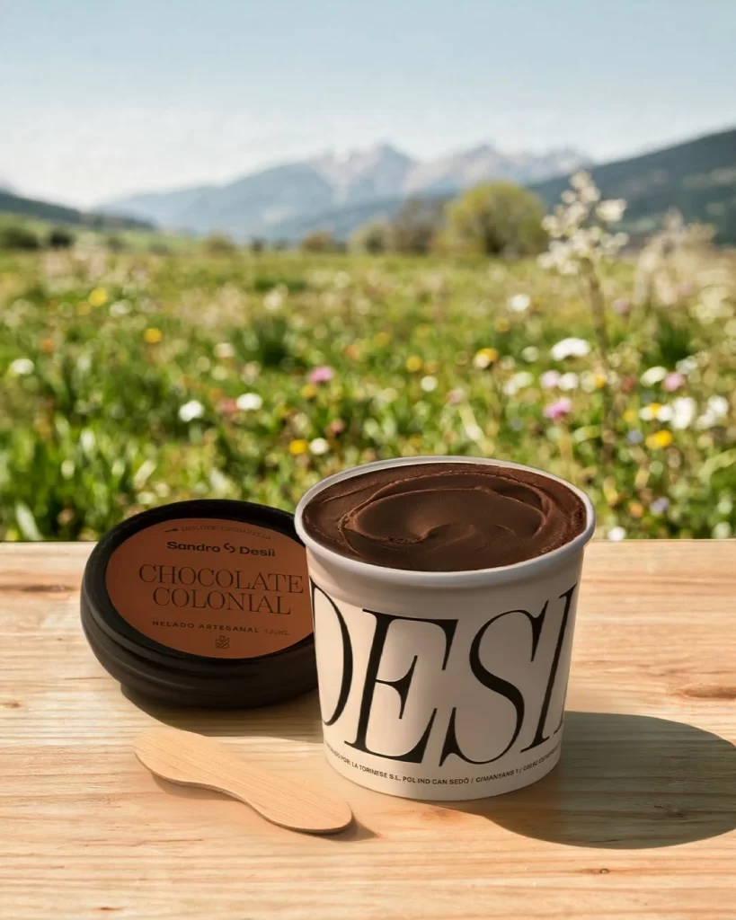
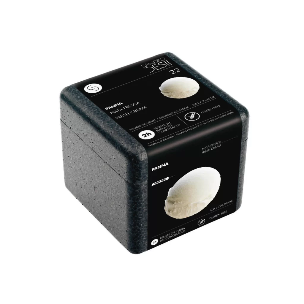
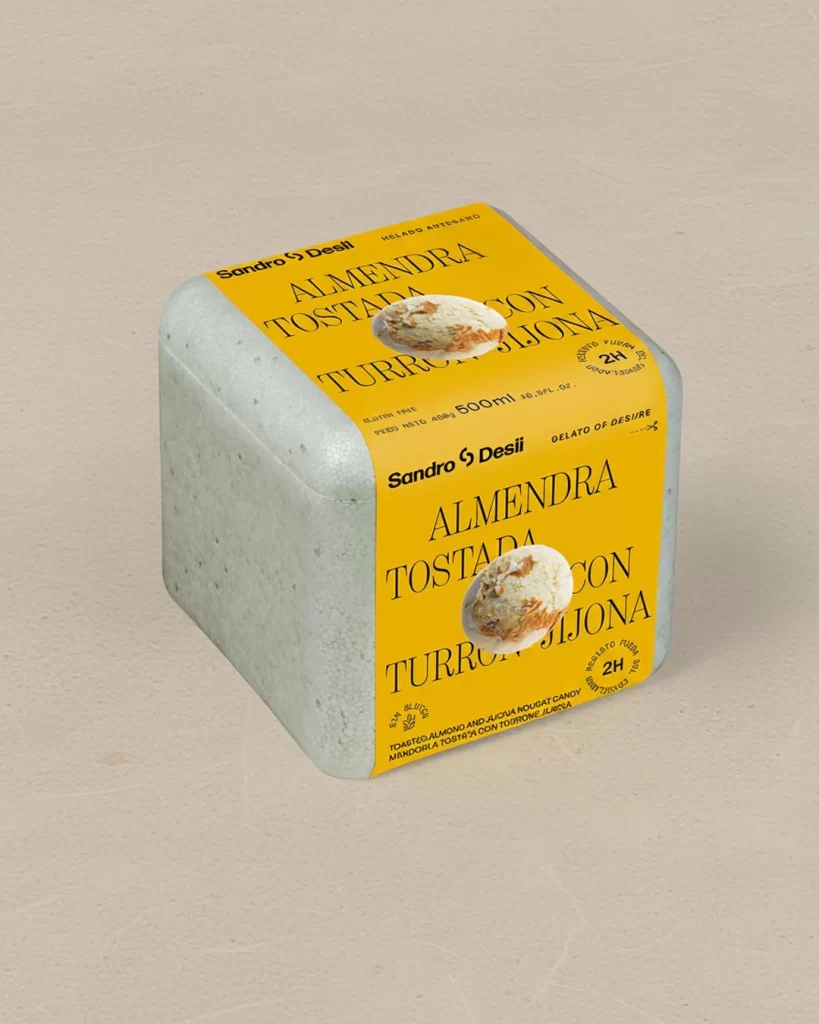
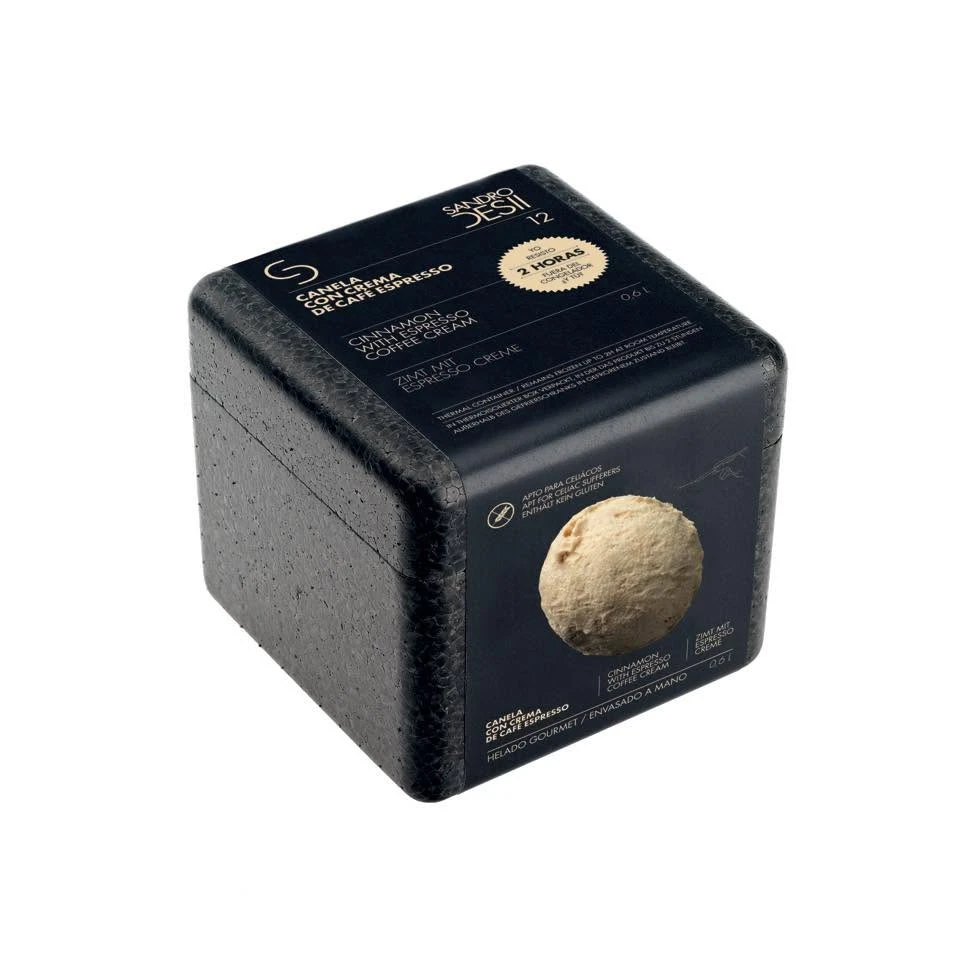
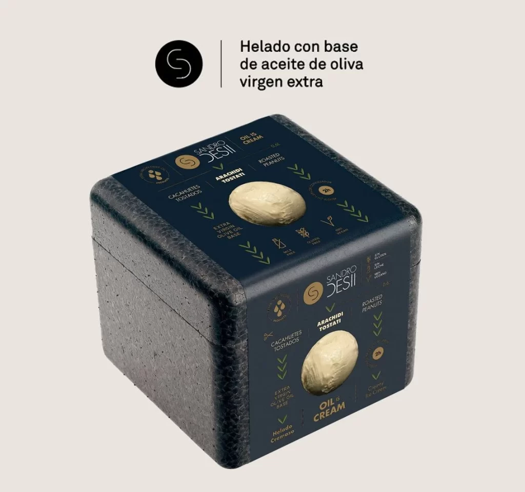
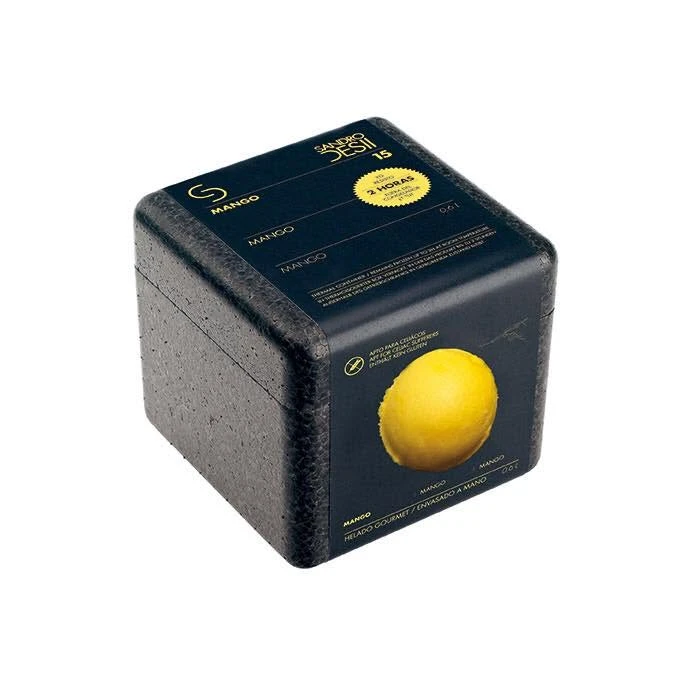
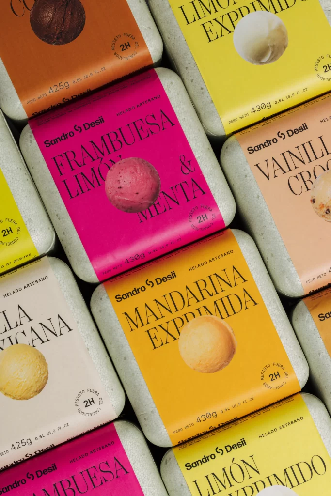
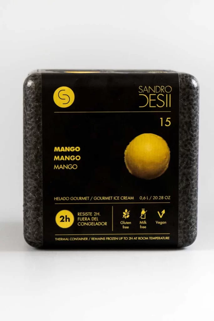
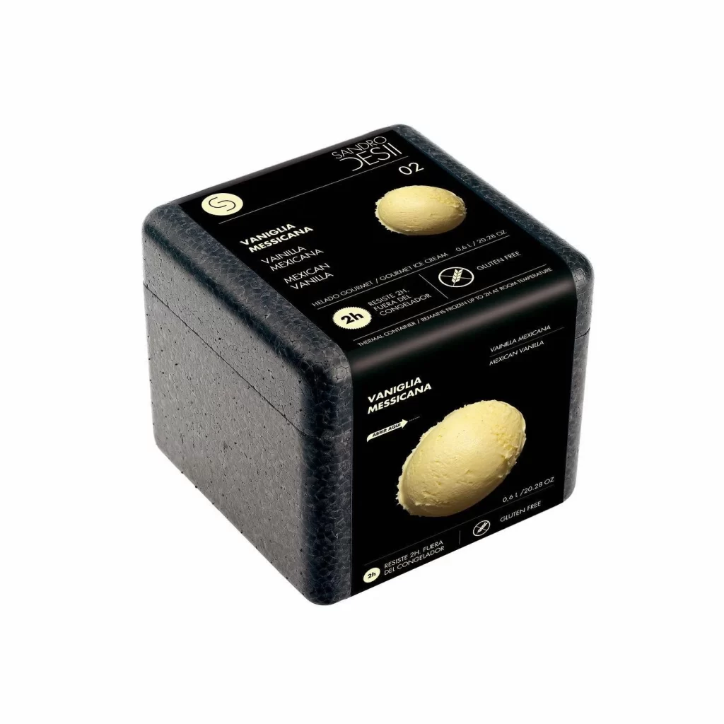
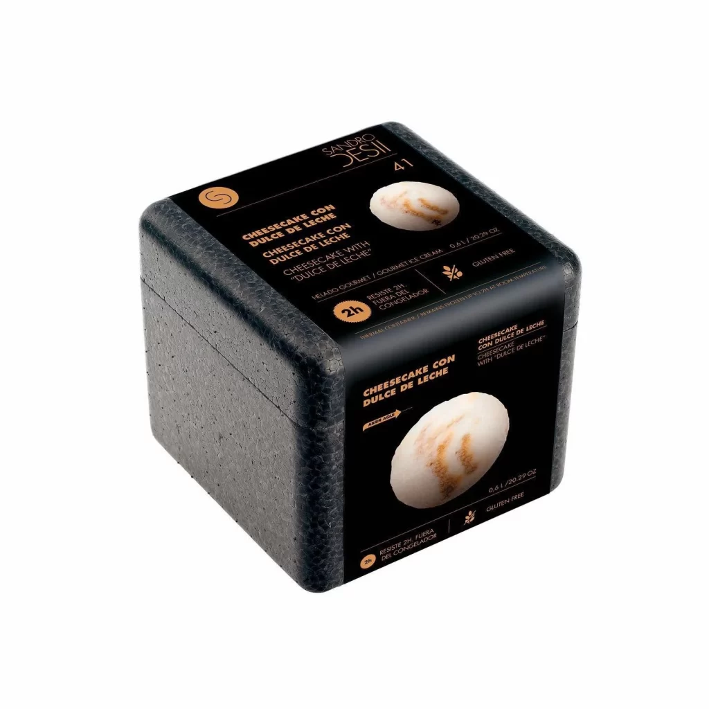
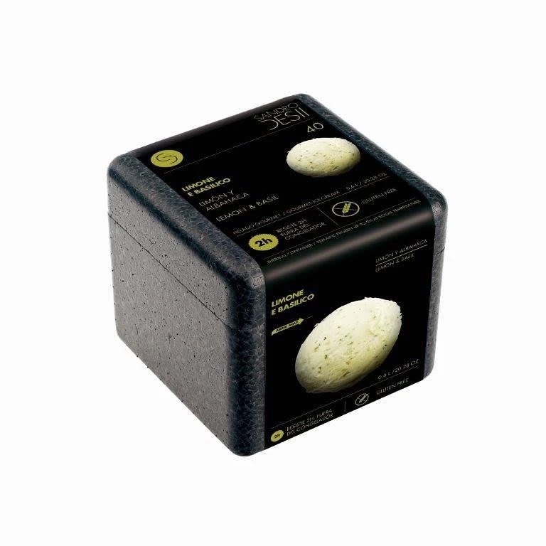
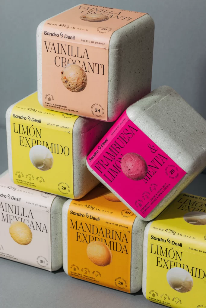
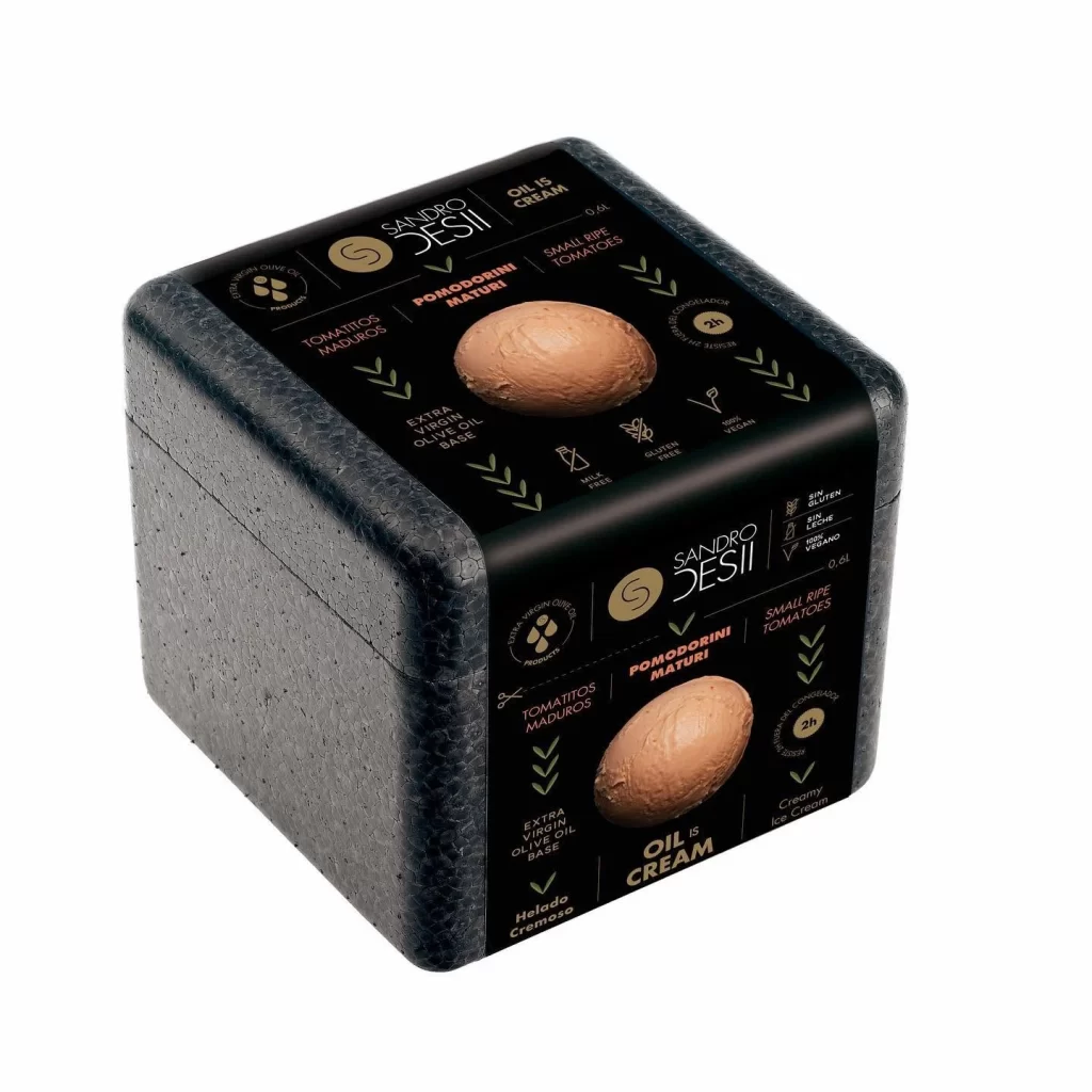
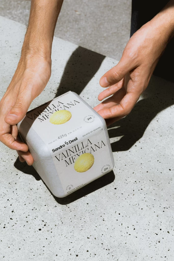
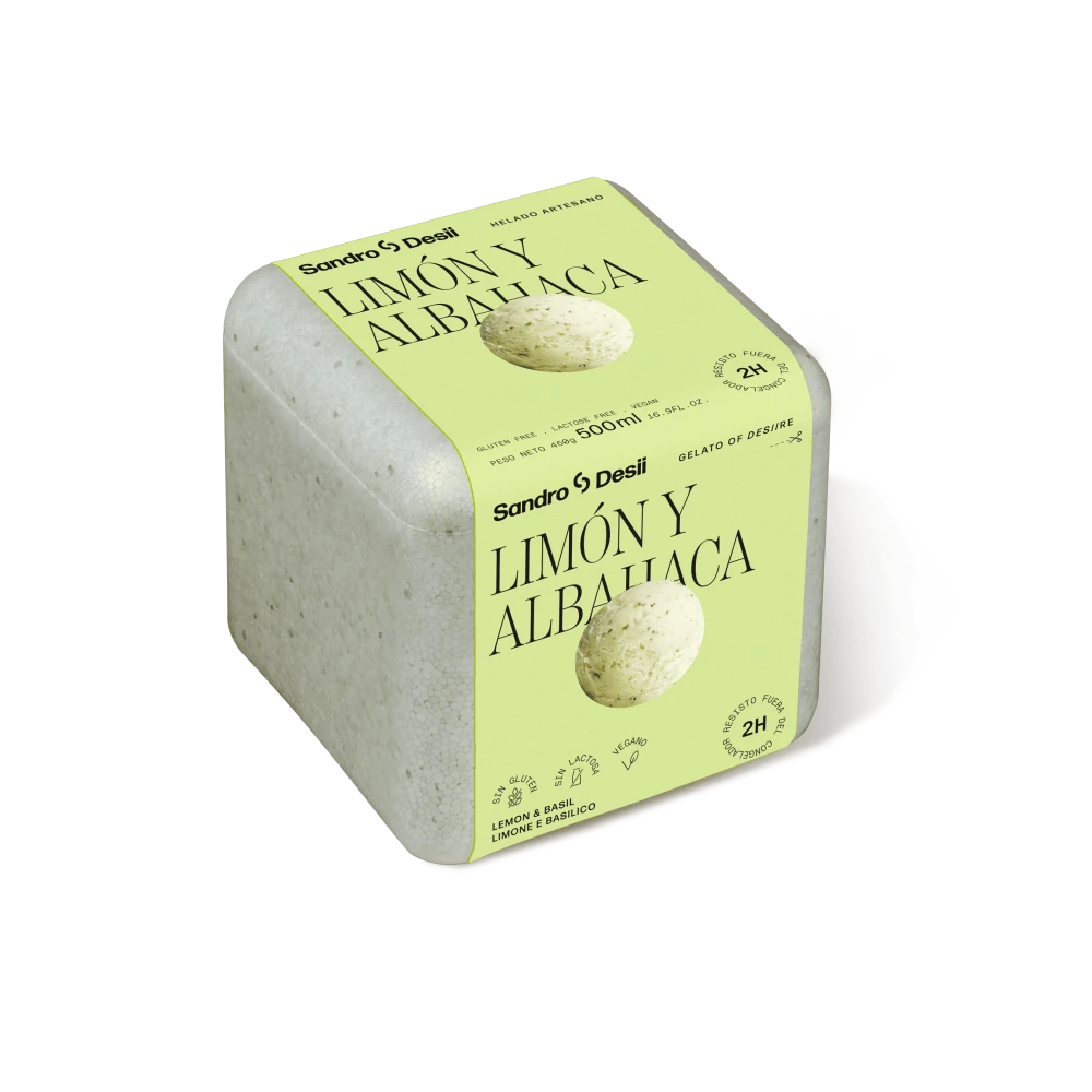
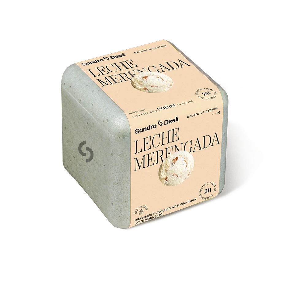
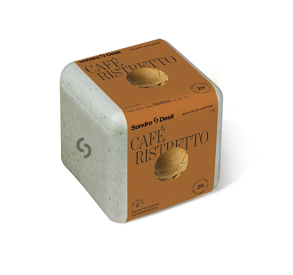
A muted, speckled gray container with softly rounded corners sits at a three-quarter angle, revealing two faces of its cubic structure. The front and top surfaces are wrapped in a warm terracotta label featuring the brand name "Sandro Desii" in bold black lettering above the elegant serif typeface of "CHOCOLATE COLONIAL." A realistic photograph of a dark chocolate gelato scoop anchors each label, while smaller text indicates 500ml volume, gluten-free status, and a 2H freshness stamp. The entire object rests on a clean white surface under even studio lighting that casts subtle shadows to the right.
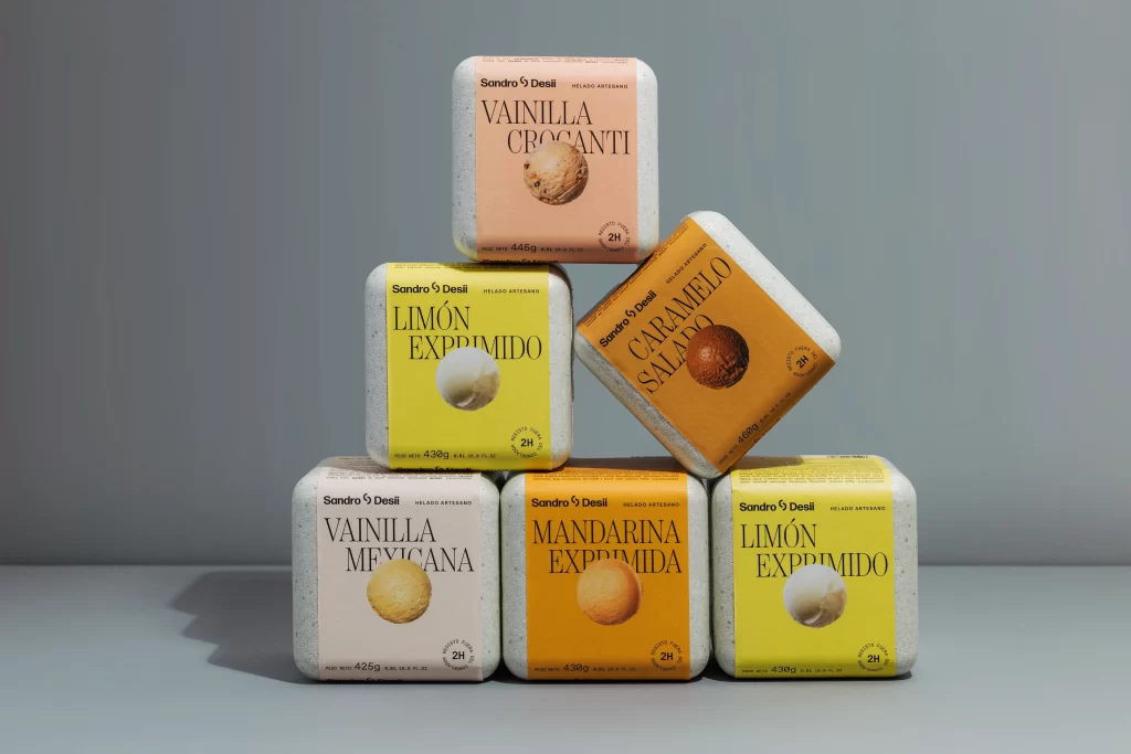
What sets this packaging apart is the striking material contrast between the cool, stone-like texture of the base and the earthy warmth of the paper sleeve. The minimalist typographic hierarchy balances modern sans-serif branding with classical serif product naming, creating a sophisticated visual tension that feels both artisanal and contemporary. That tactile-looking gray finish suggests premium quality before the consumer even opens the package, while the consistent color palette across multiple viewing angles ensures shelf presence from any direction.
Packaging designers studying luxury food branding would find this reference particularly useful for understanding how neutral base materials can be elevated through strategic color blocking and typography choices. Art directors working on artisanal ice cream or gourmet chocolate products could analyze the spatial relationships between the logo, flavor name, and product photography to inform their own layout decisions. Anyone developing visual identity systems for boutique food brands might examine how the subtle speckled texture adds perceived value without competing with the printed graphics.