Chillu Ice Cream Can
Topics
Details
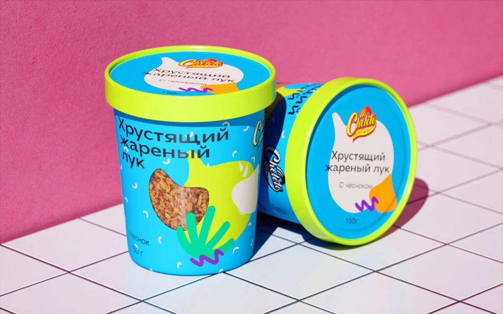
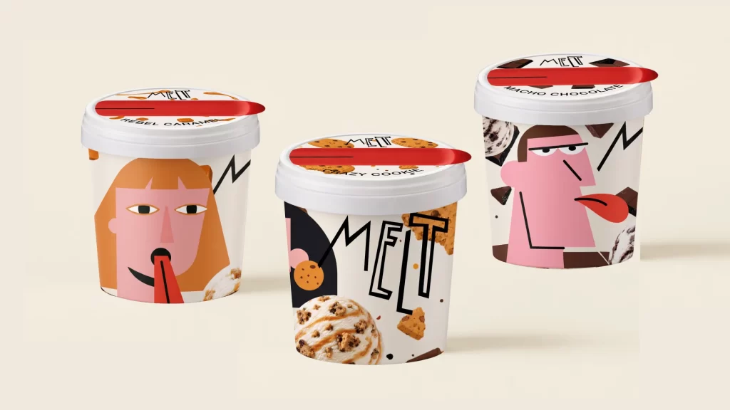
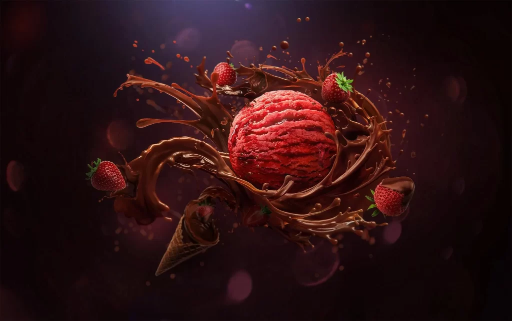
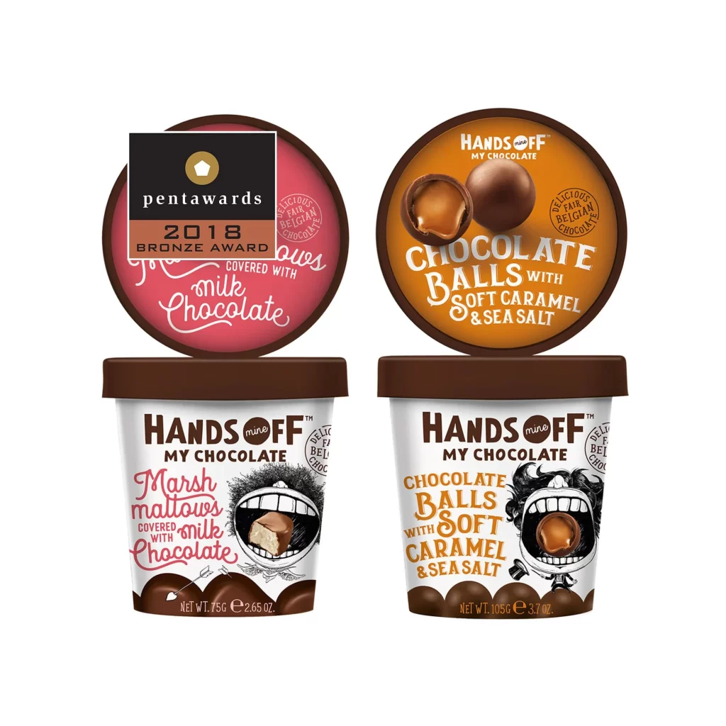
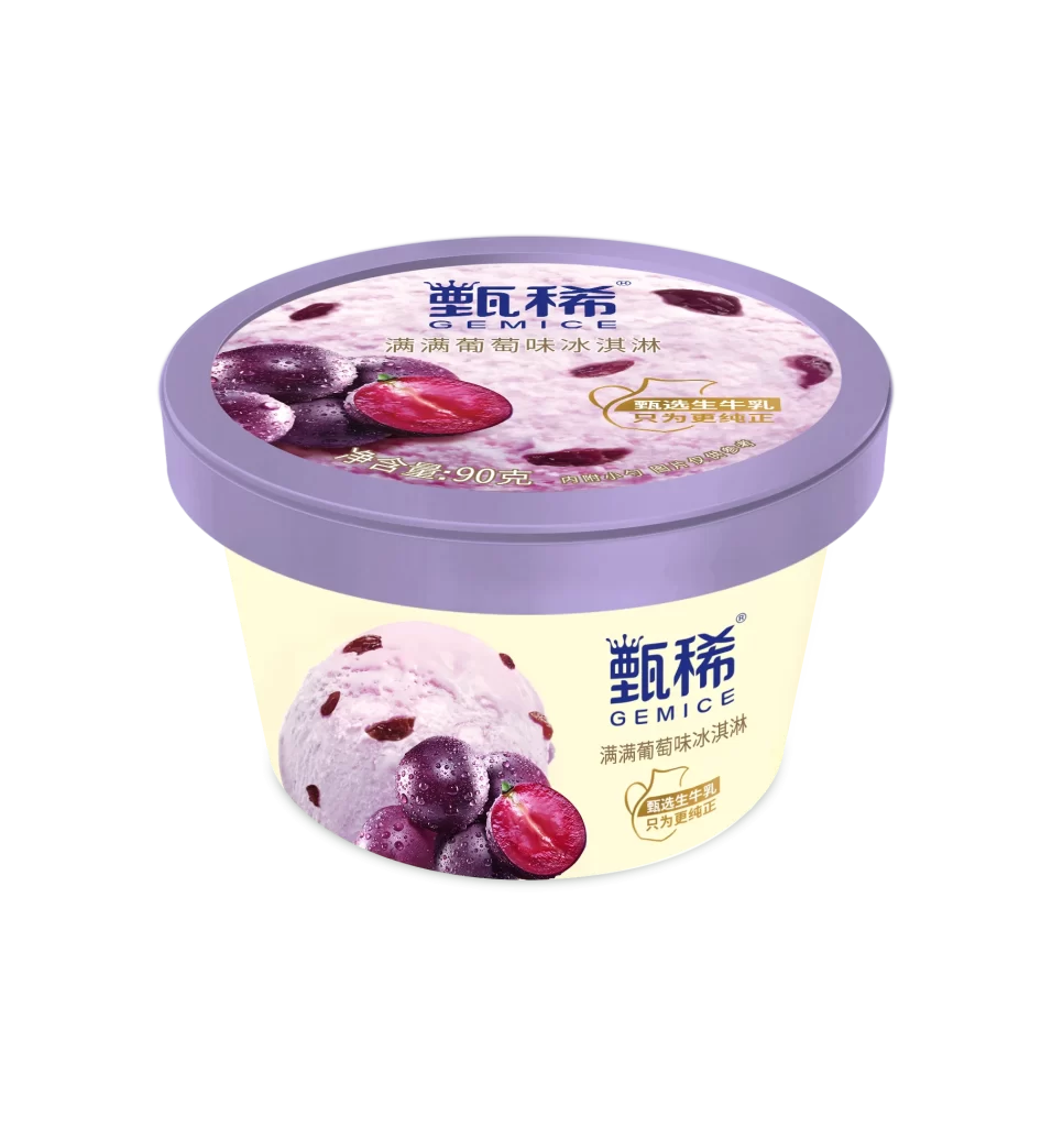
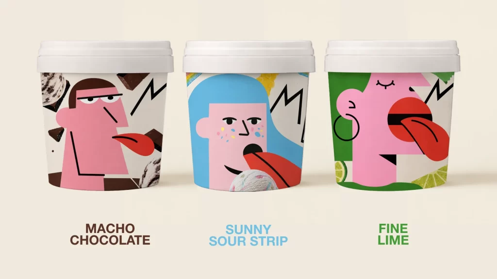
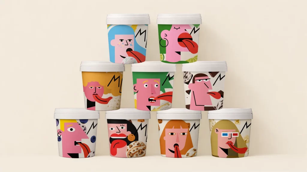
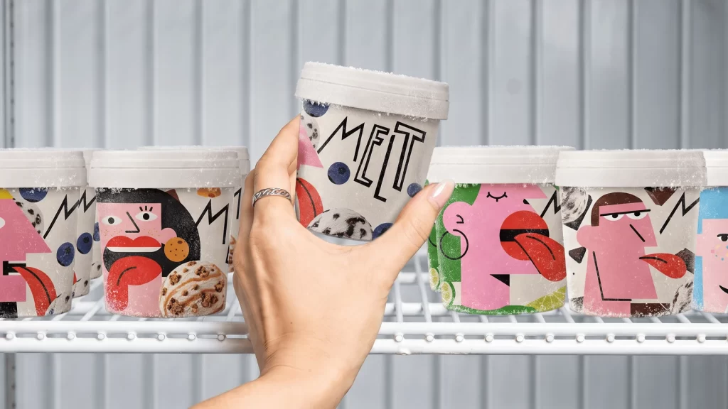
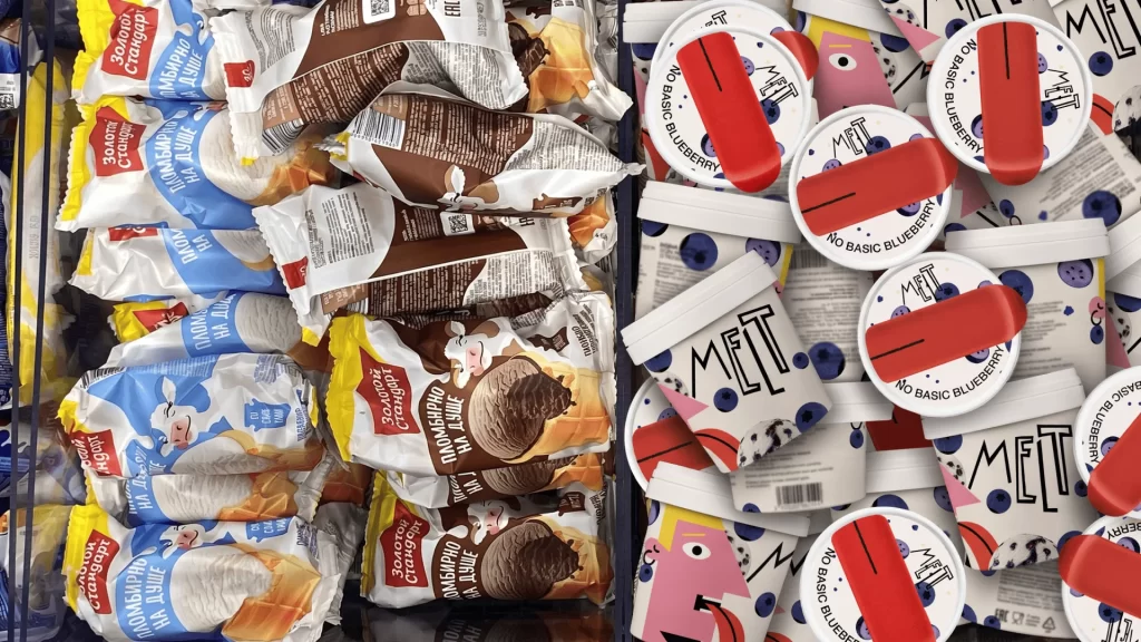
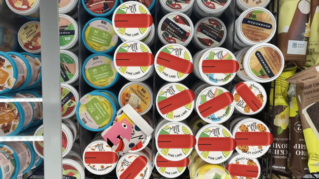
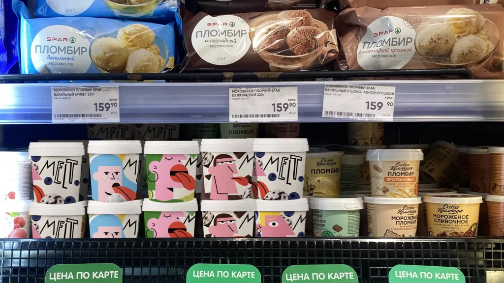
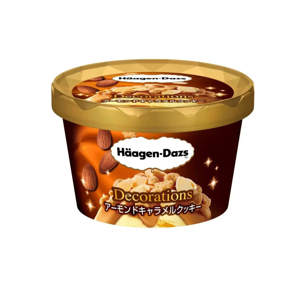
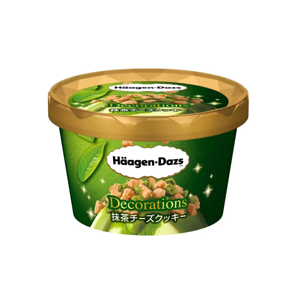
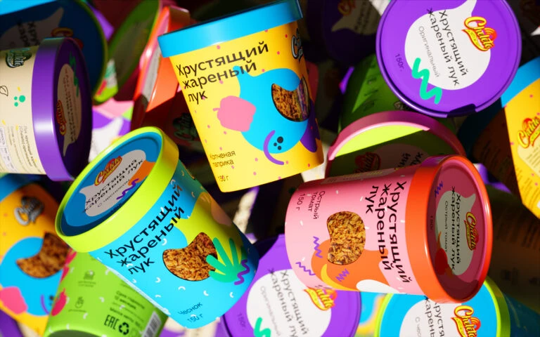
Vibrant cylindrical tubs of 'Chillu' ice cream fill the frame in a dense, overlapping cluster, shot from a high-angle perspective that emphasizes their three-dimensional form. Each container features a distinct color combination—ranging from electric blue and sunny yellow to hot pink and lime green—with bold Cyrillic text reading 'Хрустящий карамели лук' (Crunchy Caramel Onion) printed vertically along the sides. The packaging showcases playful, abstract graphic elements like wavy lines, polka dots, and heart-shaped windows revealing the textured caramelized onion topping inside, all illuminated by bright, even lighting that makes the saturated hues pop against a softly blurred background of additional containers.
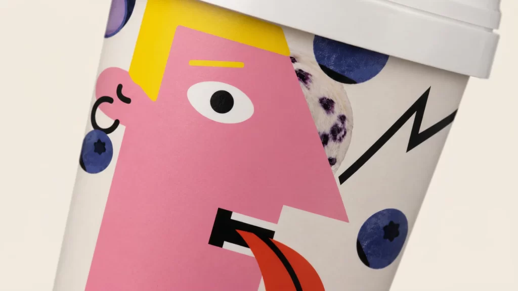
What sets this packaging apart is its fearless collision of appetizing food photography with irreverent, almost toy-like illustrative aesthetics. The unexpected flavor concept—crunchy caramelized onion ice cream—is visualized through a deliberately chaotic color palette that rejects traditional dairy-product whites and pastels in favor of neon intensity. Typography dances across curved surfaces at dynamic angles, while the transparent ingredient windows create tactile depth, transforming a standard frozen dessert container into a collectible art object that demands attention through its sheer visual audacity.
Brand strategists developing quirky FMCG products could mine this composition for insights on balancing legibility with maximalist decoration, while 3D artists studying cylindrical mapping and material rendering will find valuable lessons in how light interacts with glossy plastic lids versus matte paper bodies. Packaging students analyzing cross-cultural design trends might examine how Cyrillic script integrates with universal pictorial elements, and food photographers could reference the way transparent product windows are styled to show texture without compromising the overall graphic impact of the label design.