Chillu Ice Cream Can View
Topics
Details
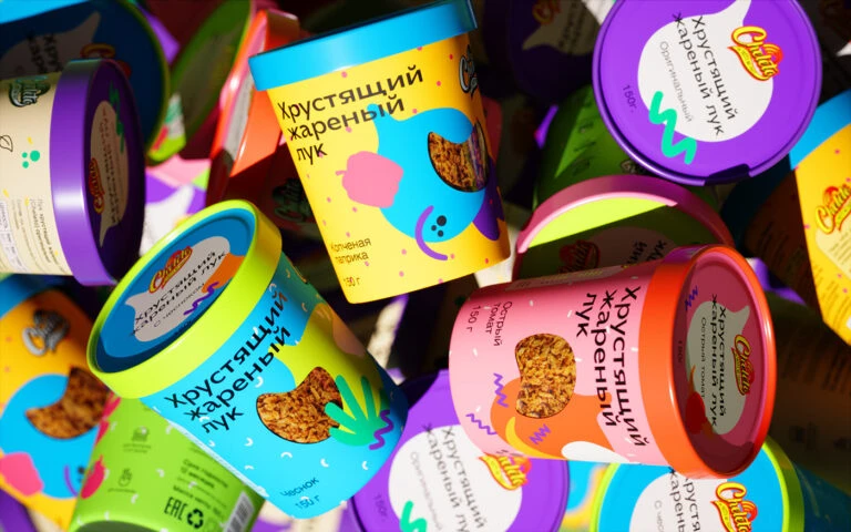
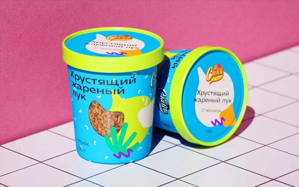
Set against a saturated magenta wall, two cylindrical containers of 'Chillu' brand ice cream rest on a white grid surface. The primary vessel stands upright while its companion lies on its side, revealing the circular lid design. Both feature a vibrant cyan body topped with a neon lime-green rim, decorated with abstract organic shapes in lime and teal alongside a photographic cutout of fried onions. Cyrillic text identifies the flavor as 'Хрустящий жареный лук' (Crispy Fried Onion), with a weight of 150g noted near the base.
Visual tension emerges from the unexpected pairing of dessert packaging conventions with savory ingredient imagery. The playful, hand-drawn squiggles and leaf motifs clash deliberately with the realistic texture of the caramelized onion piece visible through the die-cut window. This juxtaposition creates a memorable identity that subverts typical ice cream color palettes, utilizing electric contrasts between the cool blue substrate and acidic green accents to command attention.
Brand strategists analyzing niche market positioning would examine this composition for its bold risk-taking in flavor communication. Packaging engineers might reference the structural balance between the standing and reclining orientations to evaluate label visibility across different retail shelving scenarios. Color theorists could deconstruct the specific hex values of the cyan-lime-magenta triad to understand how high-saturation combinations influence consumer perception of novelty food products.