Chillu Ice Cream Can
Topics
Details
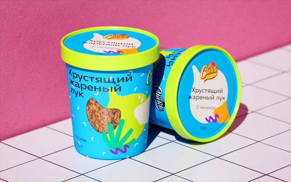
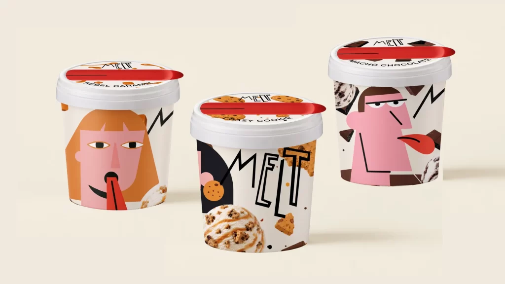
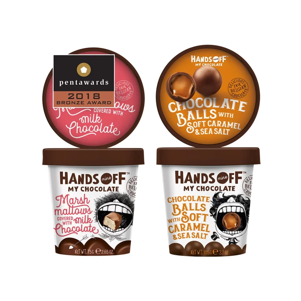
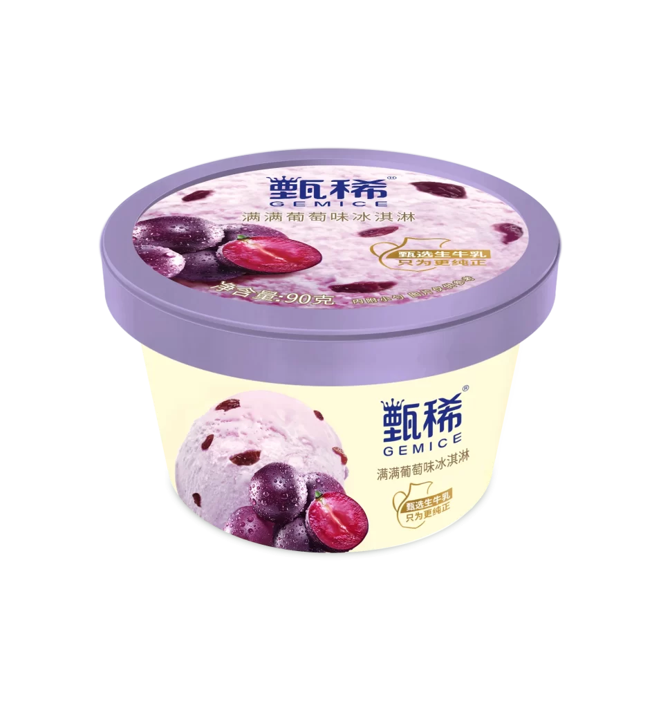
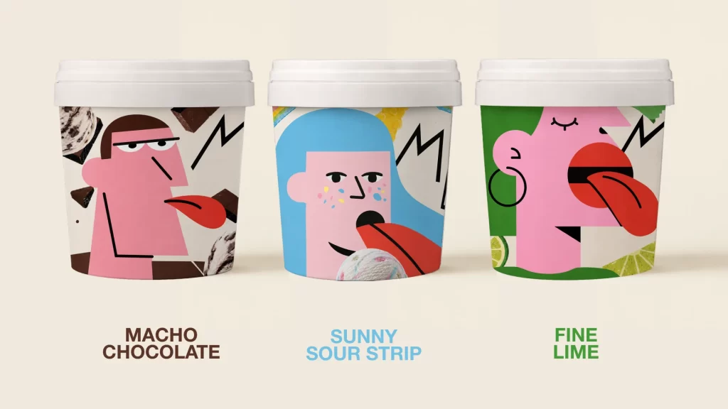
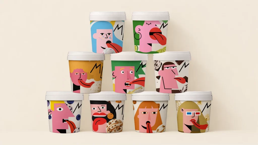
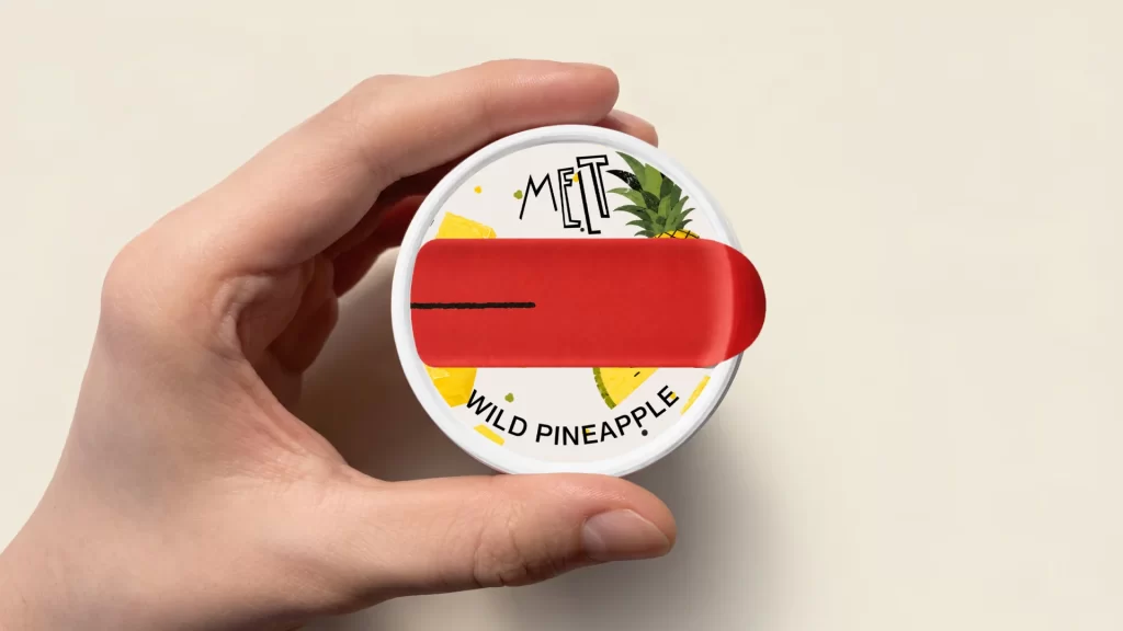
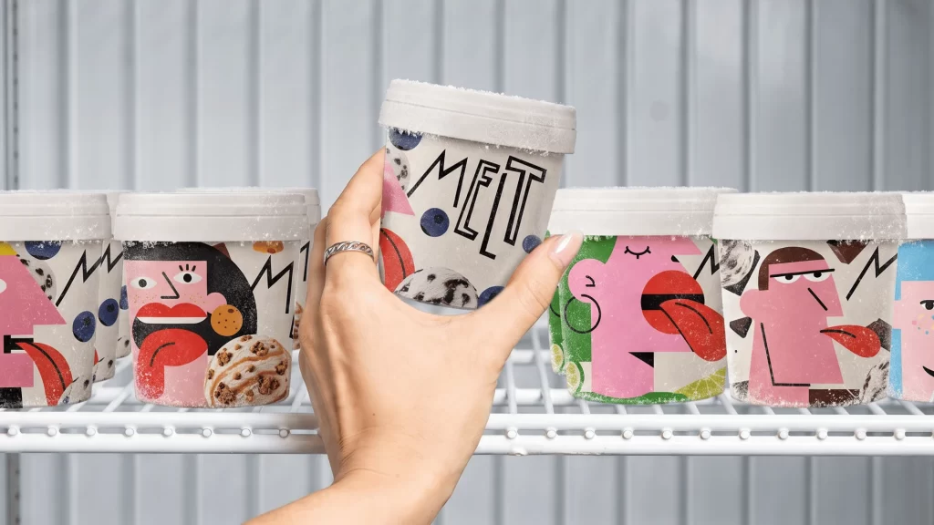
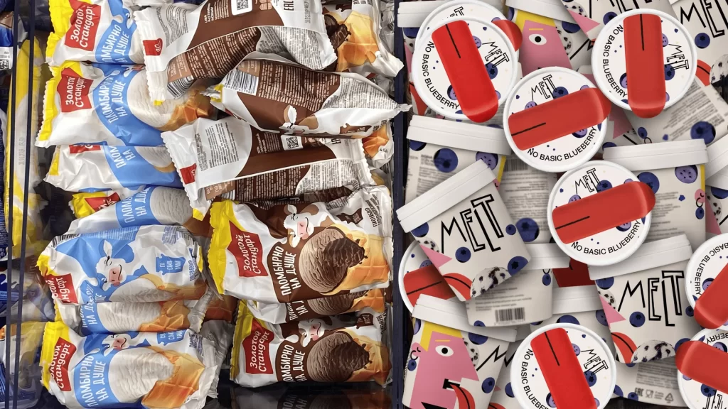
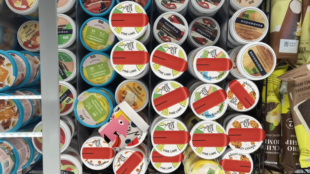
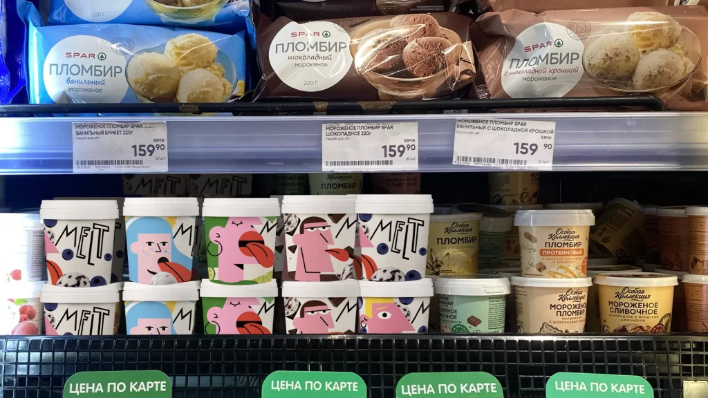
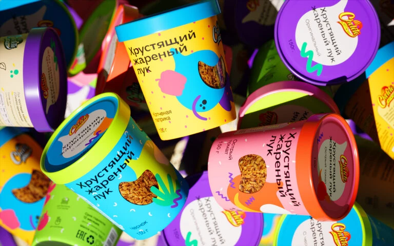
Scattered across the frame in a dense, overlapping arrangement, cylindrical containers of 'Chillu' brand ice cream display a riot of saturated hues including electric cyan, vivid lime green, sunny yellow, and deep violet. Each tub features a contrasting colored rim—purple, blue, or orange—and bears the Cyrillic text 'Хрустящий карамельный лук' (Crunchy Caramelized Onion) alongside a transparent window revealing the textured brown topping inside. Bright, direct lighting creates sharp highlights on the glossy surfaces and casts soft shadows between the tightly packed items, while a slightly elevated camera angle emphasizes the three-dimensional depth of the composition.
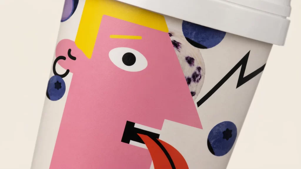
Visual distinction emerges from the bold, almost psychedelic color blocking that pairs unexpected complementary tones, such as turquoise bodies with neon green lids or pink bases with red-orange rims. Playful graphic elements—including abstract blob shapes, squiggly lines, and dotted patterns—surround the product photography, creating a youthful, energetic aesthetic that defies traditional ice cream packaging conventions. The typographic hierarchy balances the prominent brand logo with clear nutritional information and flavor descriptors, ensuring legibility despite the maximalist background graphics.
Packaging designers studying contemporary trends in dairy product branding would find this composition valuable for analyzing how vibrant color psychology influences consumer perception of indulgent treats. Marketing teams developing campaigns for Gen Z audiences could reference these visual strategies to understand how playful illustration styles differentiate commodity products in crowded retail environments. Industrial designers evaluating structural packaging solutions might examine the interplay between cylindrical forms and color-coded lid systems for potential applications in their own product line extensions.