Title

Magnum Double Chocolate 44% Cacao Ice Cream Packaging


Topics

Ice CreamMagnum

Details

Uploaded user: Leo

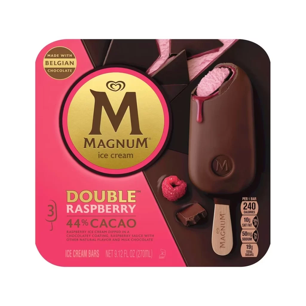
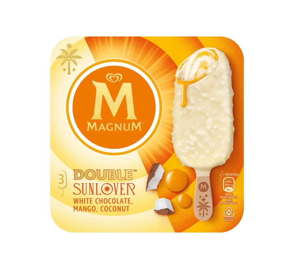
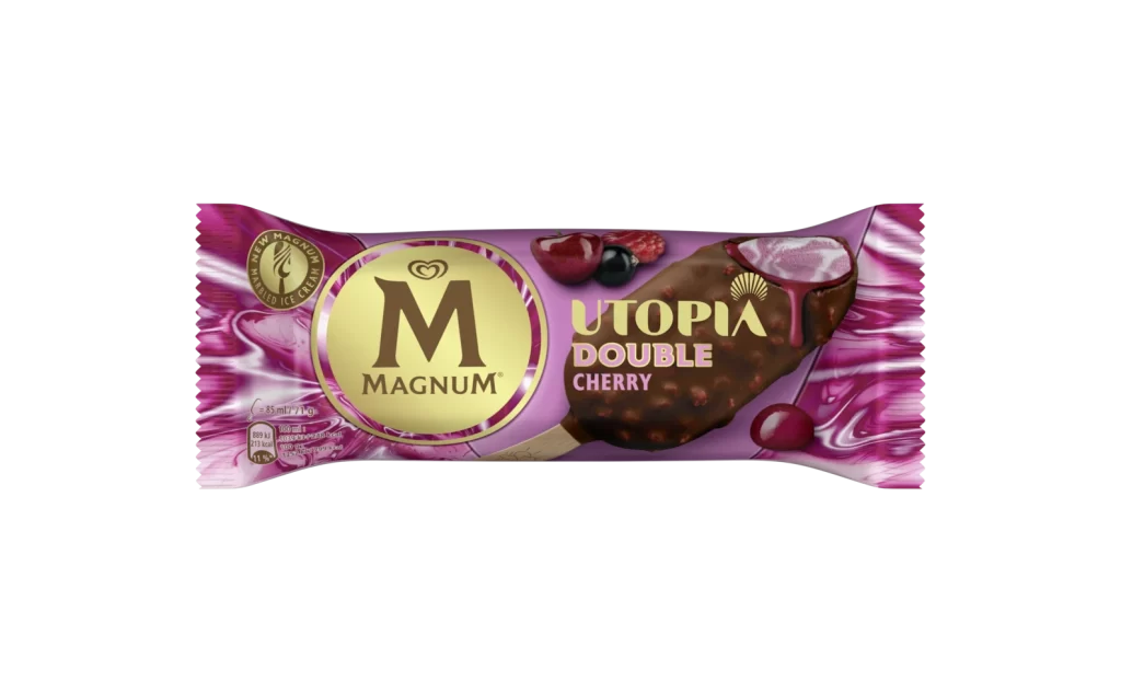
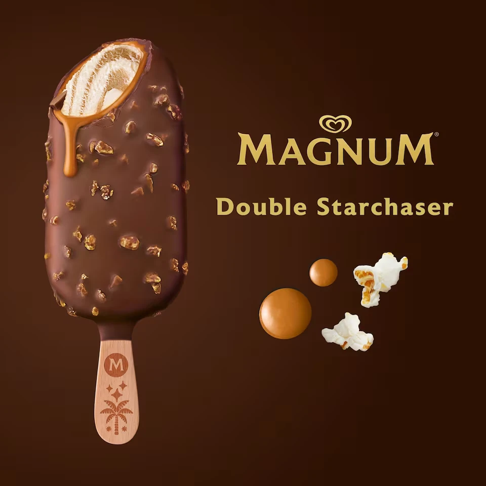
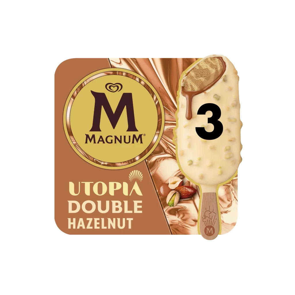
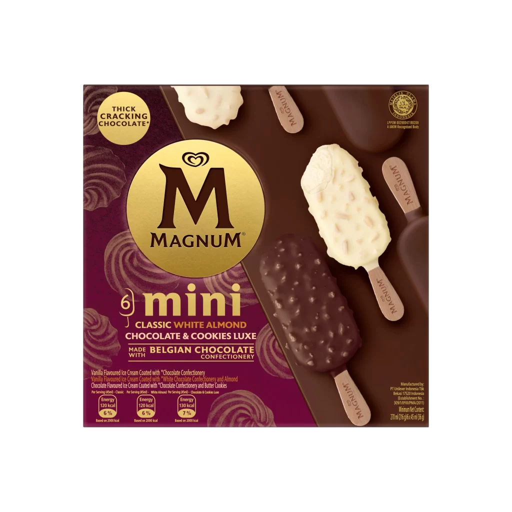
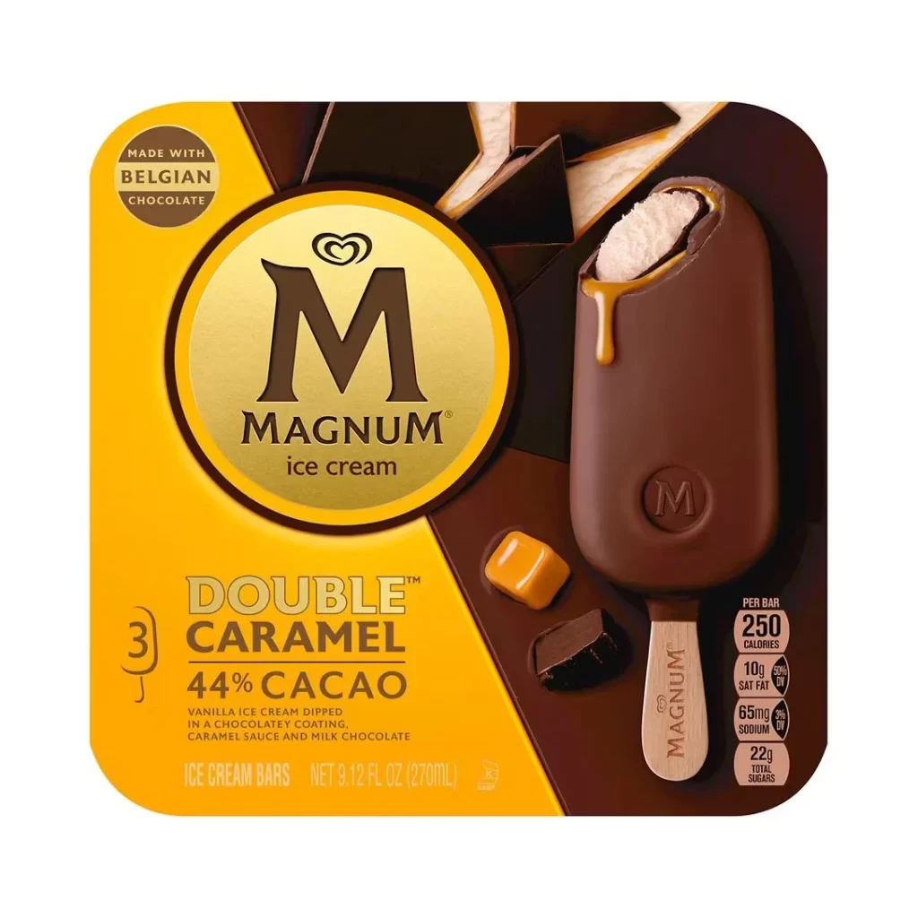
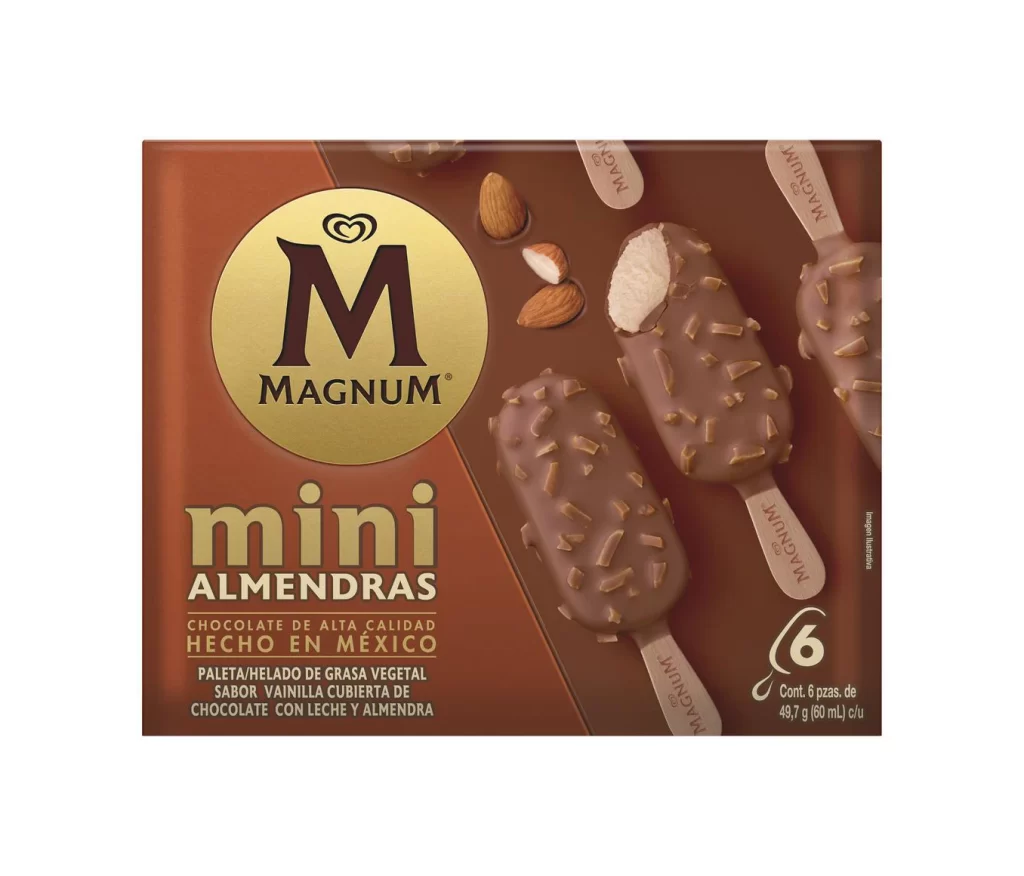
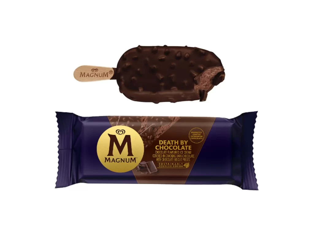
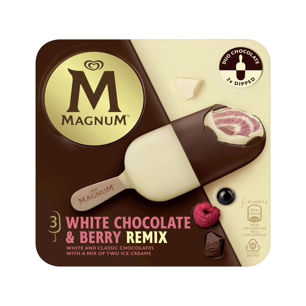
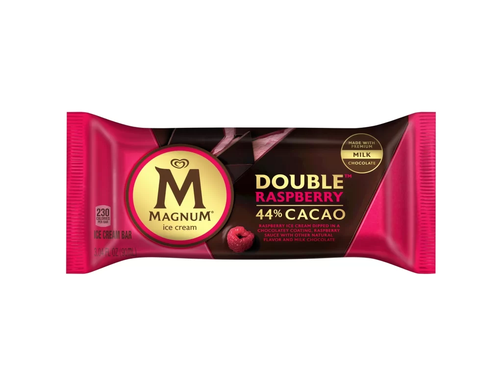
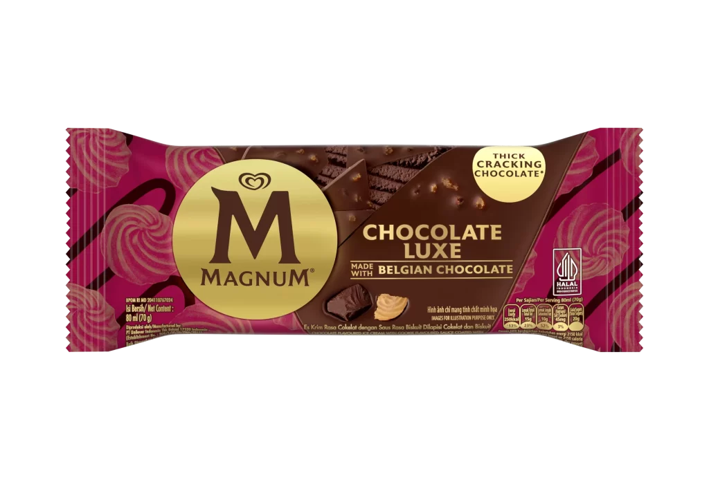
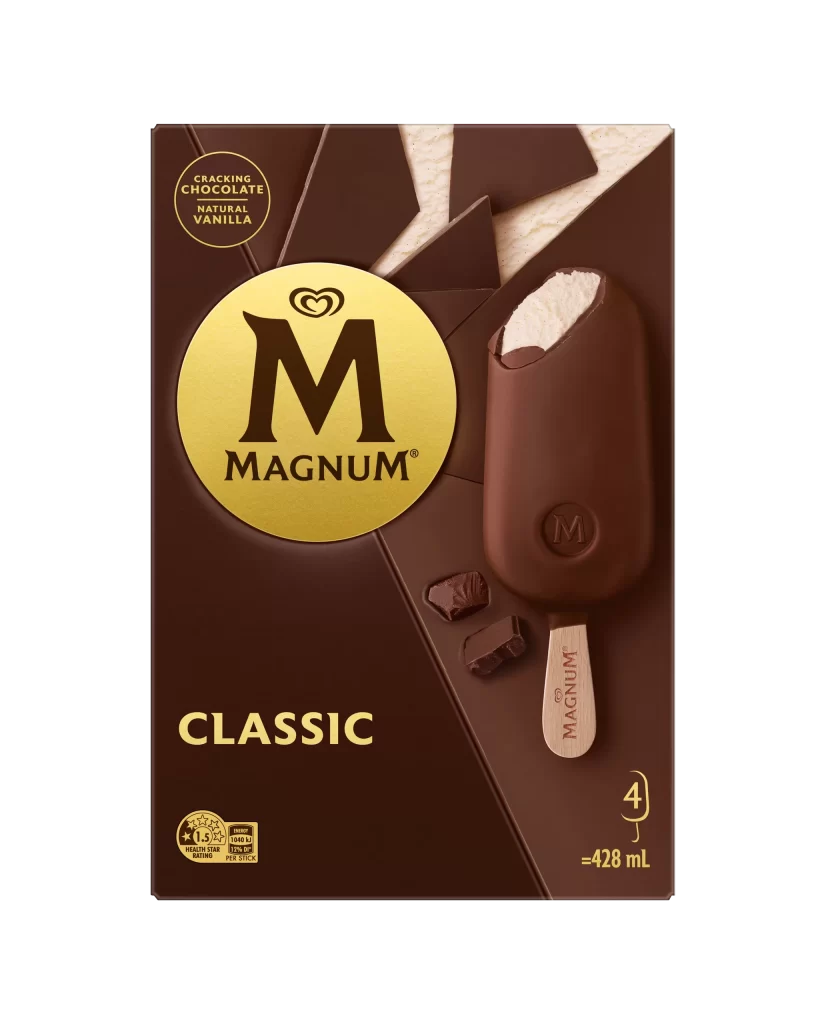
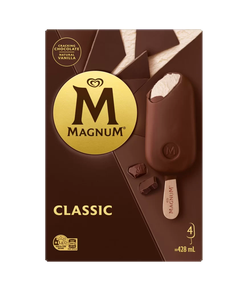
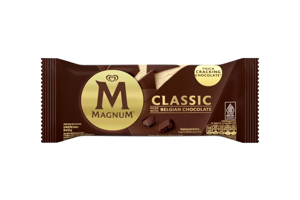
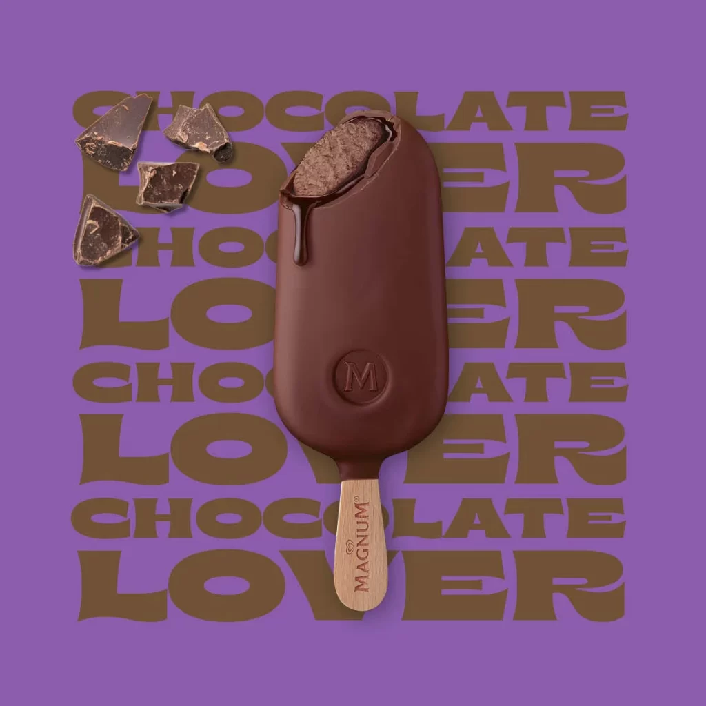
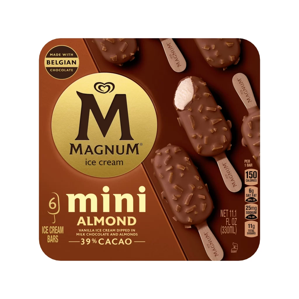
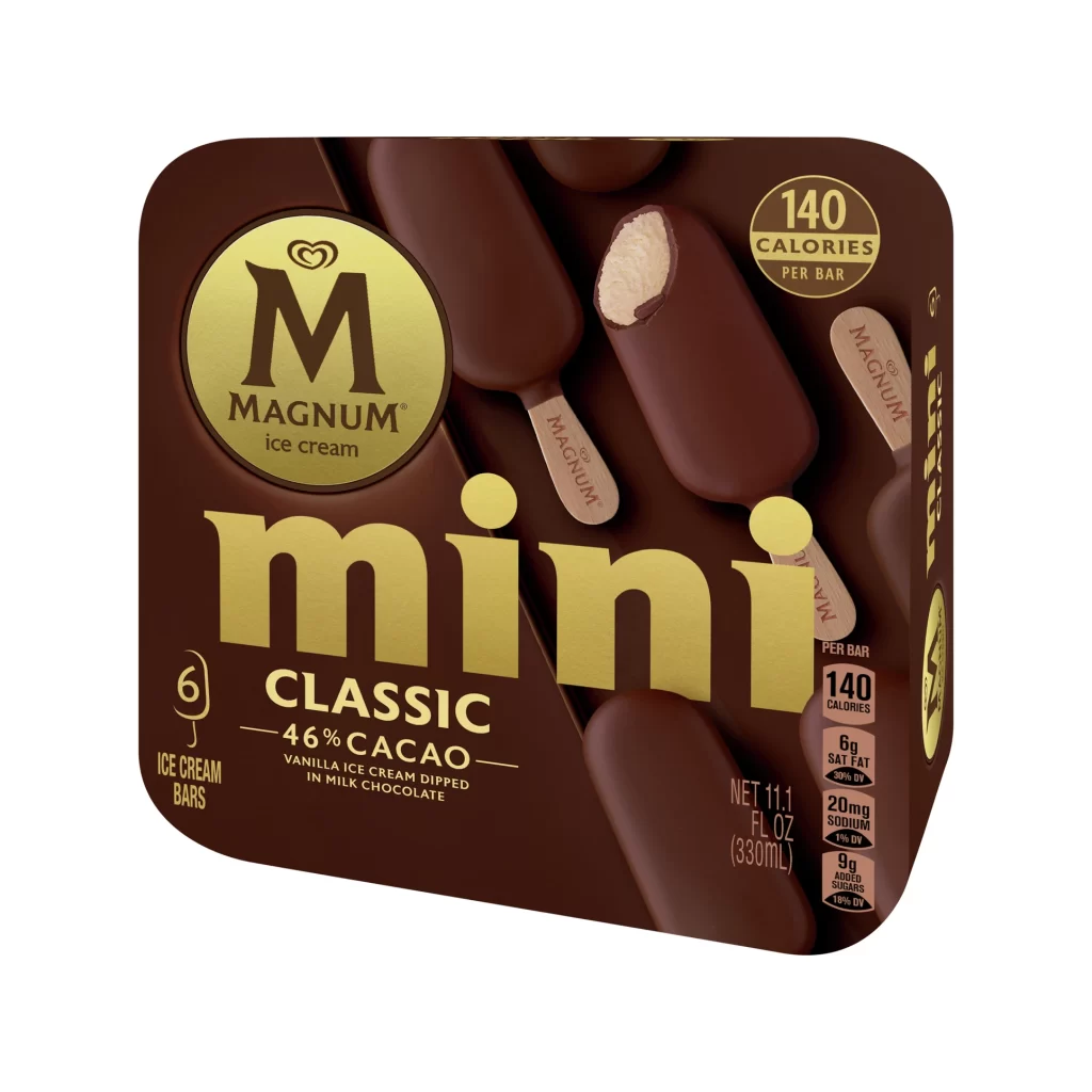
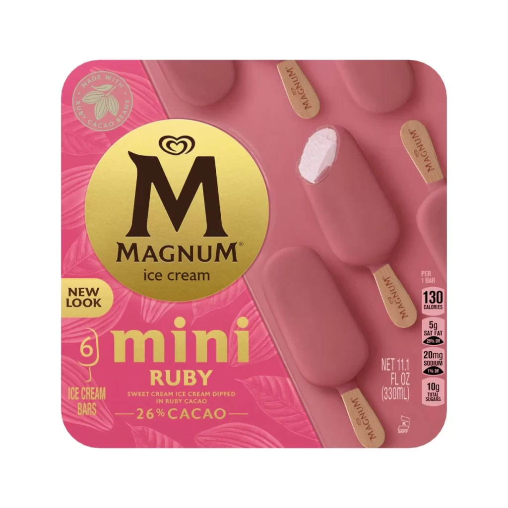
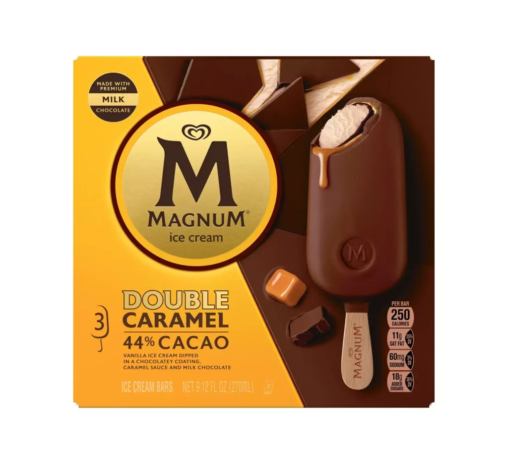
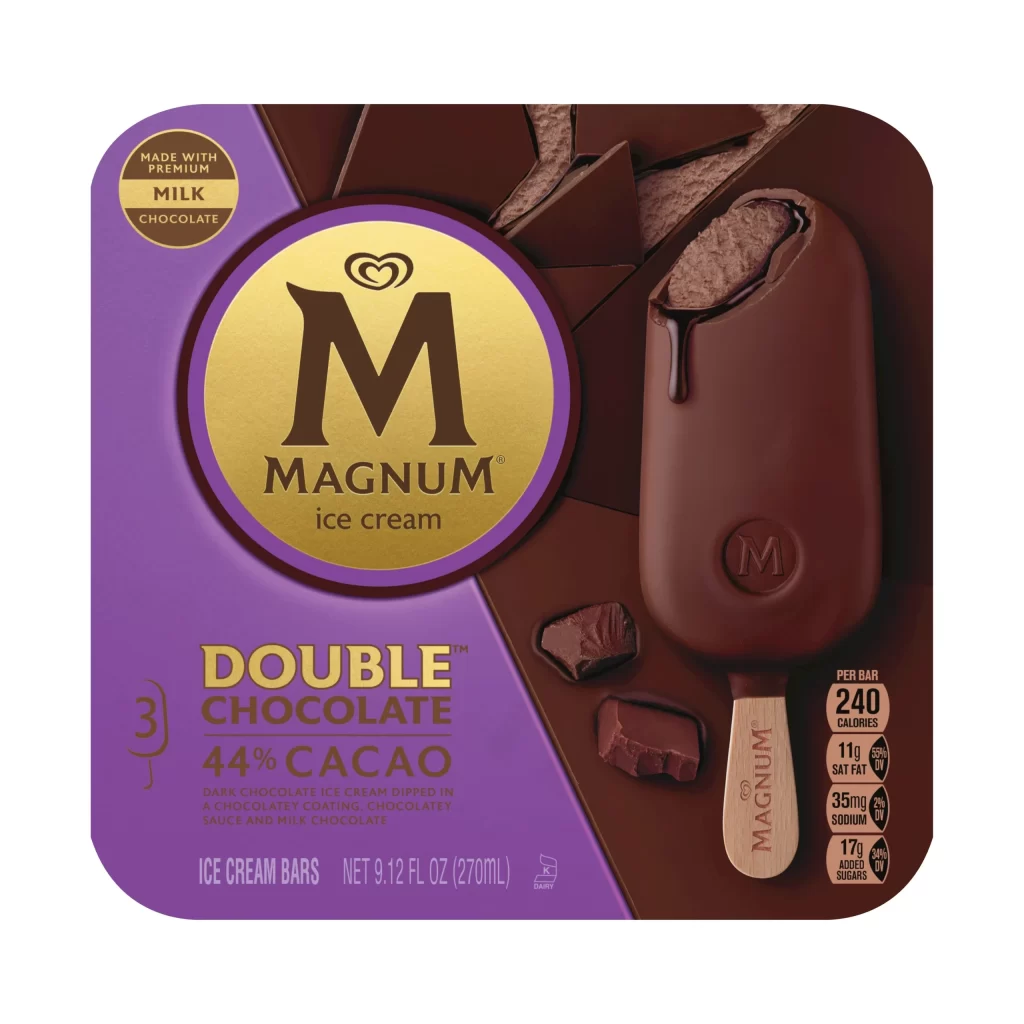
Deep violet and rich chocolate brown dominate the composition, bisected by a sharp diagonal that separates the informational left quadrant from the photographic right. A prominent circular gold emblem anchors the upper center, featuring the iconic Magnum 'M' and heart logo in dark espresso tones, while the product itself—a glossy, dipped bar with a wooden stick—rests against a backdrop of fractured chocolate shards. The lighting emphasizes the wet sheen of the coating and the matte texture of the broken pieces, creating a tactile contrast that draws the eye to the bitten section revealing the interior ice cream.
Visual hierarchy is established through the aggressive use of the diagonal split, which forces the viewer's gaze between the typographic data and the appetizing product shot. The specific choice of a regal purple background for the text area creates a luxurious counterpoint to the organic browns of the chocolate, suggesting premium quality before any text is read. Furthermore, the embossed 'M' on the stick and the dripping sauce add kinetic energy to an otherwise static layout, reinforcing the indulgent nature of the double chocolate variant.

Brand strategists might analyze this layout to understand how color blocking can effectively segregate nutritional information from emotional marketing imagery without losing visual cohesion. Packaging engineers could study the balance of negative space around the central logo to ensure brand recognition remains strong even when the box is partially obscured on retail shelves. Additionally, food photographers may reference the specific angle of the bite and the placement of the scattered shards to replicate this sense of casual luxury in their own studio work.