Title

Magnum mini Classic 46% Cacao Ice Cream Packaging


Topics

Ice CreamMagnum

Details

Uploaded user: Leo

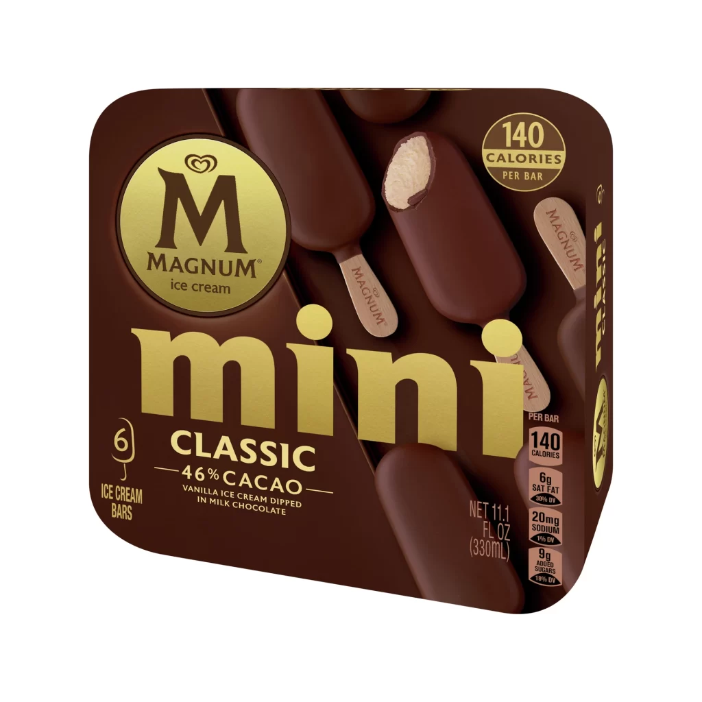
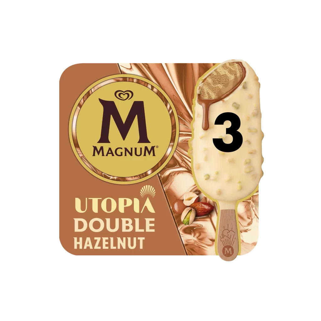
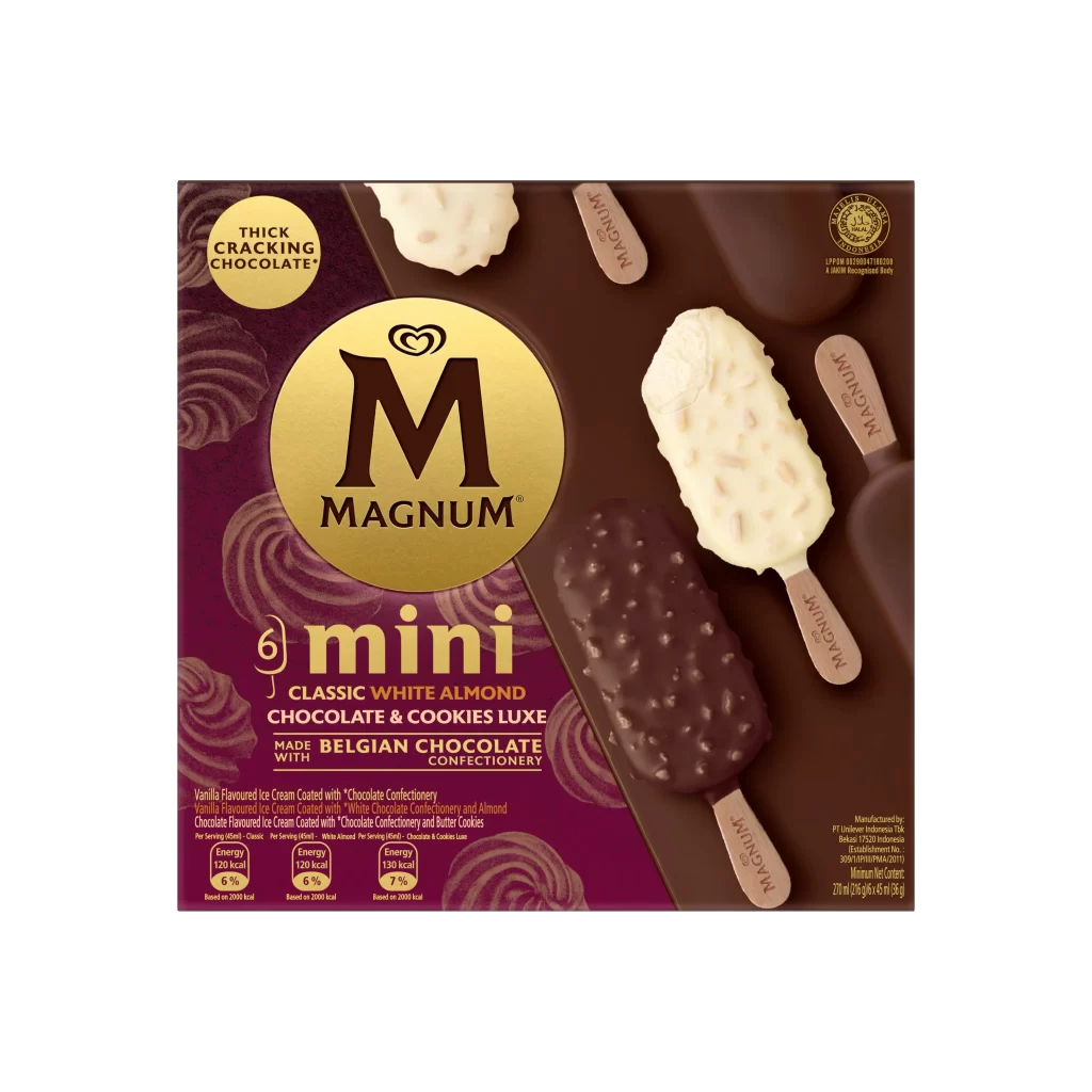
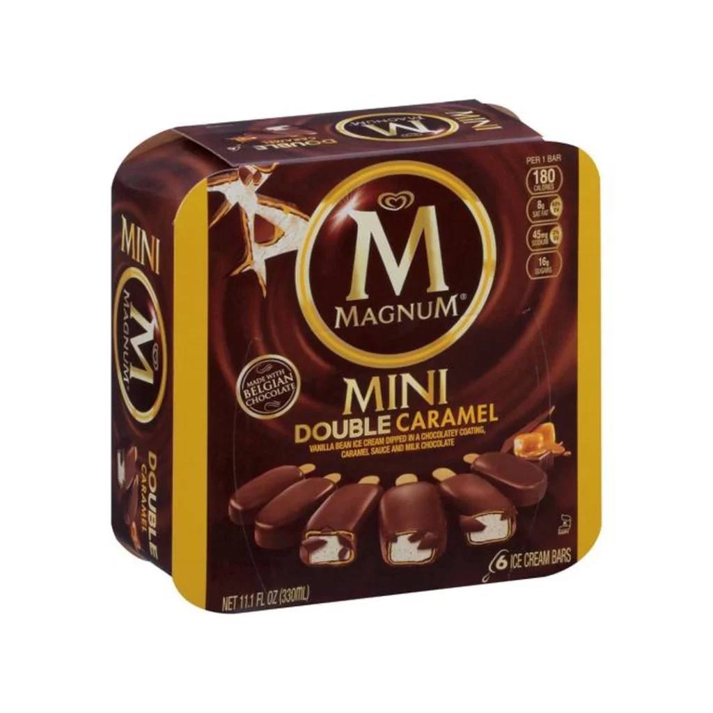
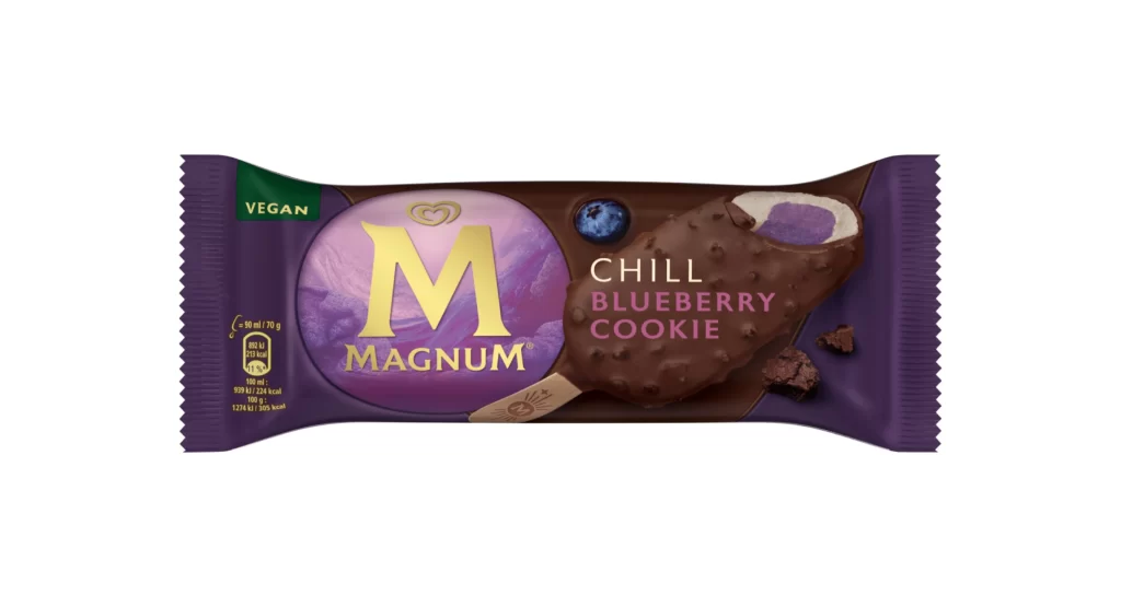
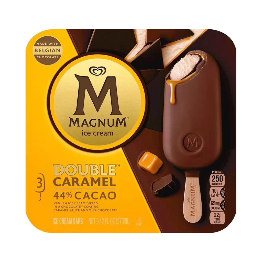
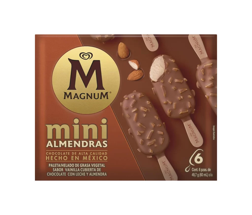
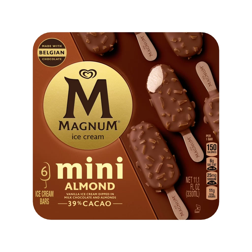
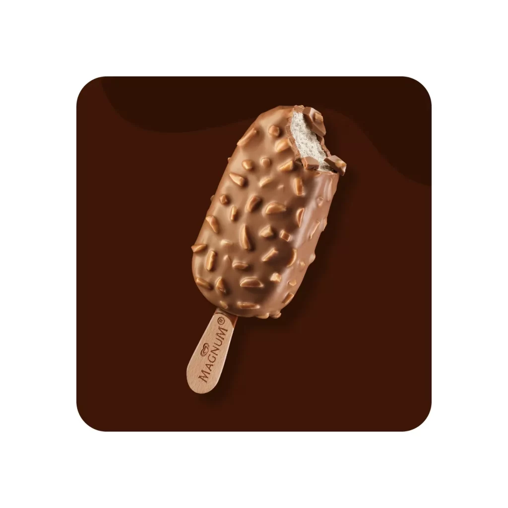
A deep, matte chocolate brown dominates the rectangular carton, serving as a rich canvas for the bold, metallic gold typography that spells out 'mini' across the center. The Magnum logo sits prominently in the upper left within a circular gold seal, while the right side features a clean nutritional breakdown and a '140 Calories' badge. Several ice cream bars are artfully arranged in the background, showcasing their smooth milk chocolate coating and wooden sticks engraved with the brand name, all captured from a slight three-quarter angle that emphasizes the box's depth.
Visual hierarchy is established through the striking contrast between the dark substrate and the luminous gold foil elements, which draw the eye immediately to the product name and key selling points like '46% Cacao'. The photography utilizes soft, directional lighting to highlight the glossy texture of the chocolate-dipped bars, creating an appetizing sheen that suggests premium quality. By integrating the product imagery seamlessly with the packaging graphics, the design creates a cohesive narrative that feels both luxurious and accessible.

Brand strategists might analyze this layout to understand how color psychology is leveraged to convey indulgence within a lower-calorie snack category. Packaging engineers could study the spatial arrangement of text and imagery to optimize information density without cluttering the visual field. Furthermore, food photographers may reference the lighting setup and prop placement to achieve similar appetizing results in their own commercial shoots.