Magnum VS Midnight Berry Protein Display Packaging
Topics
Details
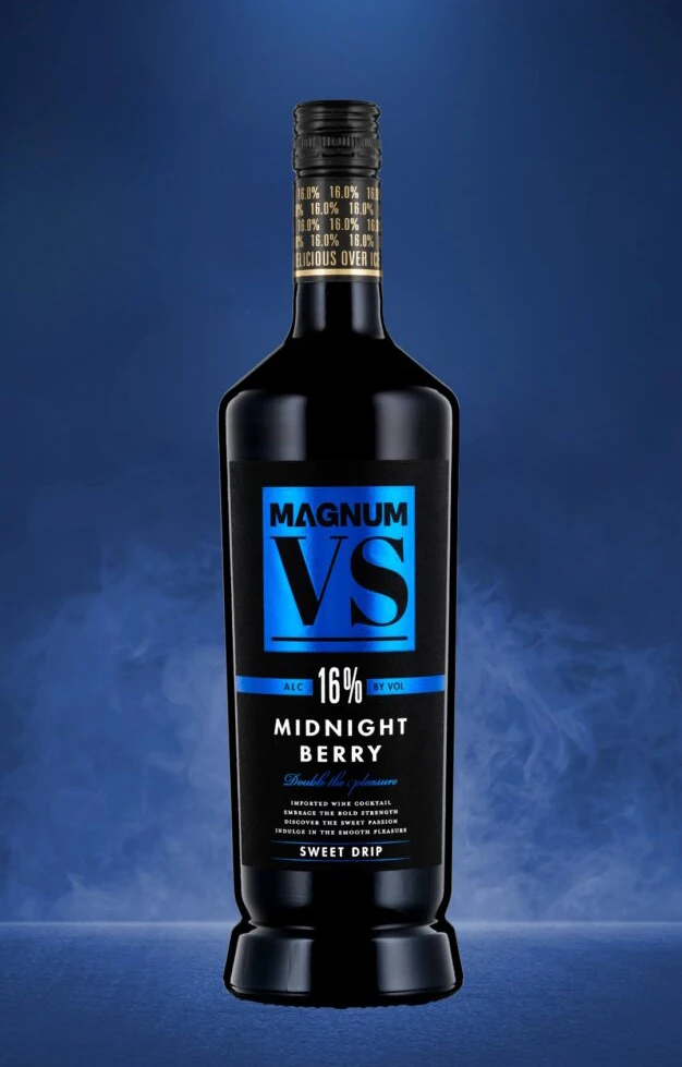
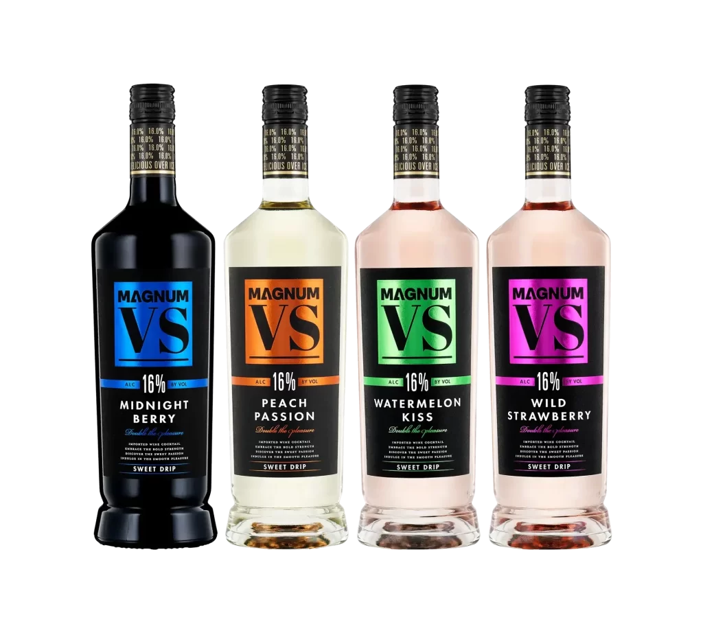
Four bottles of Magnum VS stand in a rigid, evenly spaced row on a white surface, captured from a direct frontal perspective that emphasizes their verticality. The leftmost vessel features an opaque black glass body, while its three companions transition through clear to pale pink hues, all crowned with identical matte black screw caps bearing gold foil text. Dominating each label is the brand name 'MAGNUM' stacked above a large 'VS' logo, with the Midnight Berry variant displaying blue accents, Peach Passion showing orange, Watermelon Kiss in green, and Wild Strawberry in magenta.
Visual hierarchy is established through aggressive color-coding that allows consumers to distinguish flavors instantly across a retail shelf. The high-contrast pairing of white sans-serif lettering against saturated backgrounds—cyan for berry, orange for peach, green for watermelon, and magenta for strawberry—creates a modular system that remains consistent despite the varying liquid colors within. Such deliberate chromatic separation ensures that the ‘Sweet Drip’ sub-branding and flavor descriptors remain legible even from a distance.
Brand managers analyzing competitive packaging strategies in the ready-to-drink alcohol sector would find this arrangement useful for studying how color theory influences product differentiation. Industrial designers tasked with creating cohesive yet distinct label families can study the grid structure used here to maintain unity across multiple SKUs. Furthermore, 3D artists requiring accurate reference for rendering translucent liquids or metallic cap textures will appreciate the clarity of the materials shown under studio lighting conditions.